wowgetoffyourcellphone
-
Posts
11.444 -
Joined
-
Last visited
-
Days Won
598
Everything posted by wowgetoffyourcellphone
-
300 Spartans Mod
wowgetoffyourcellphone replied to wowgetoffyourcellphone's topic in Game Modification
GitHub repository (SVN compatible only; Alpha 24): https://github.com/JustusAvramenko/300 -
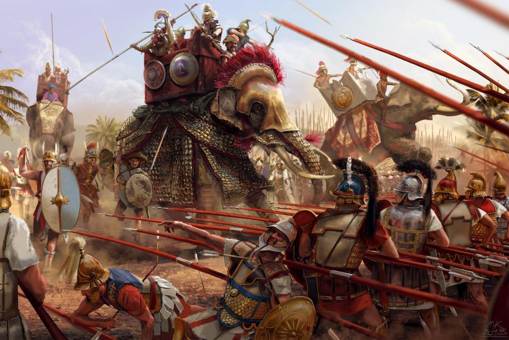
I've recently mused about asking for reflection maps for the engine or some kind of reflection material. I think though they wouldn't be much use except for elephant armor as you indicated. It would be nice to have for mods for certain. More code to maintain though.
-
I can show you what I'm doing for DE, just for reference. It can certainly be improved.
-
I honestly think that is a great improvement in scale. I've always felt the game's war elephants to look kind of underwhelming in size. Can you center the tower prop point a little more on the elephant's back? Right now it looks like it's sliding backward.
-
Specific Name Review: Units
wowgetoffyourcellphone replied to Doktoreus's topic in Game Development & Technical Discussion
I just want the option to turn the bloody specific names off. But about the Cretan Archers specifically, I think I'd want the name to be as descriptive as reasonable. But that's as far as my opinion goes in this case. -
Civ: Imperial Romans (Principates)
wowgetoffyourcellphone replied to wowgetoffyourcellphone's topic in Delenda Est
nope -
300 Spartans Mod
wowgetoffyourcellphone replied to wowgetoffyourcellphone's topic in Game Modification
These particular textures I am editing their colors to fit the 300 theme, so we'd have to curate the core game textures separately. But I'm glad you see the same potential for improvement I do. -
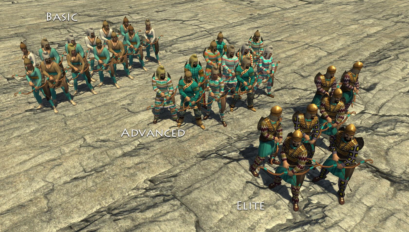
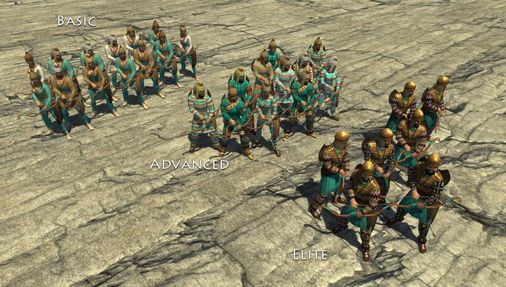
300 Spartans Mod
wowgetoffyourcellphone replied to wowgetoffyourcellphone's topic in Game Modification
Biomes for the 300 mod: 300-Sparta and 300-Thermopylae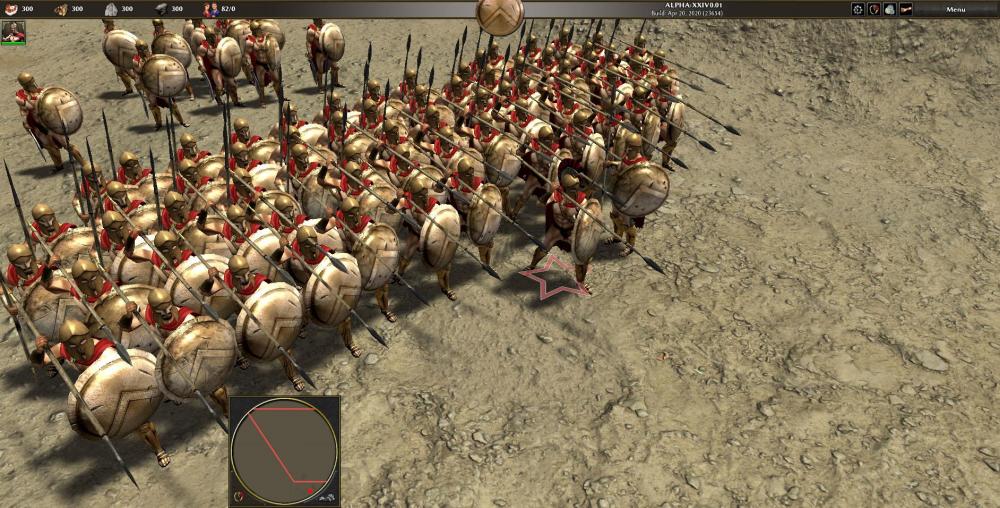
-
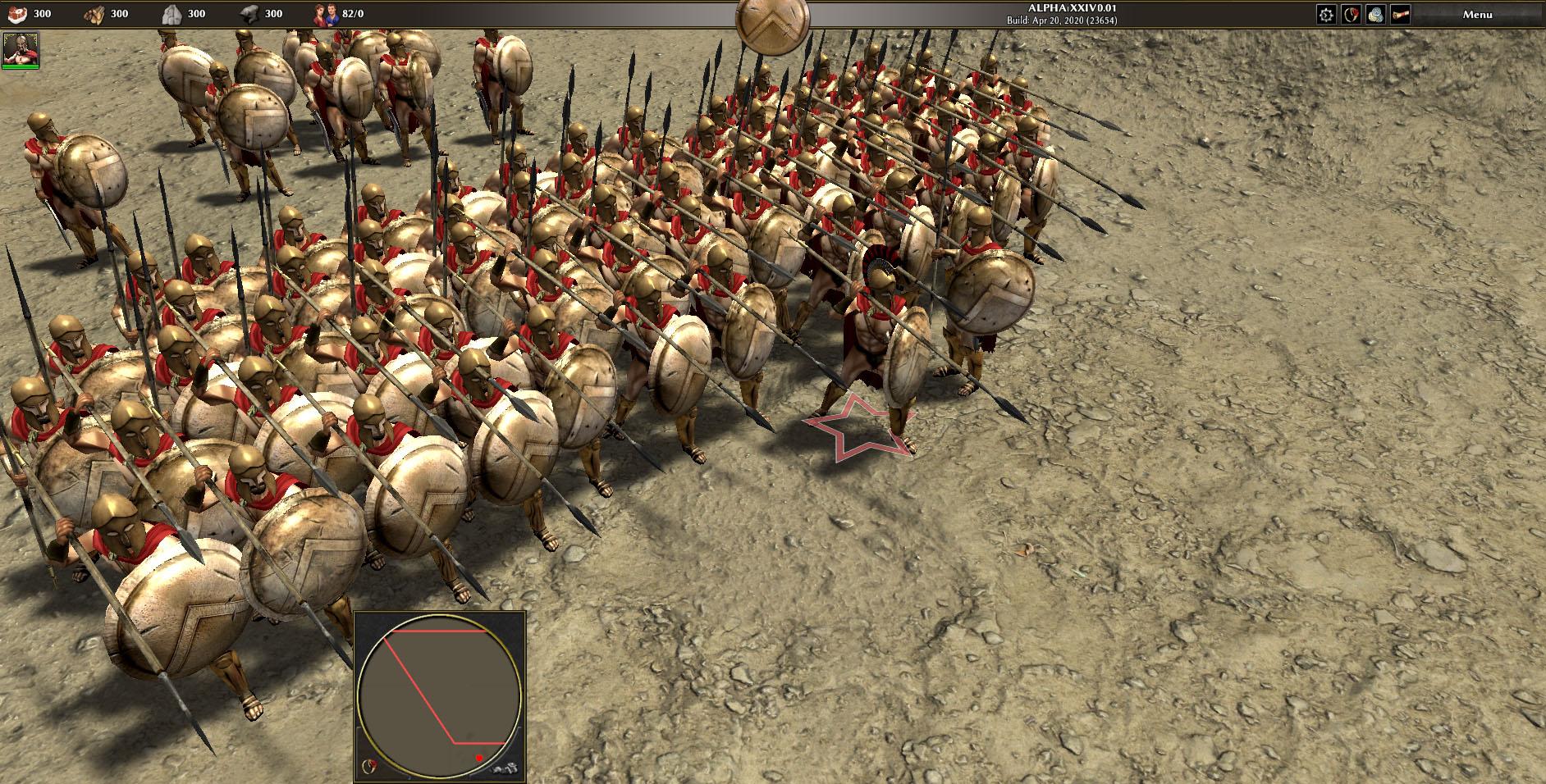
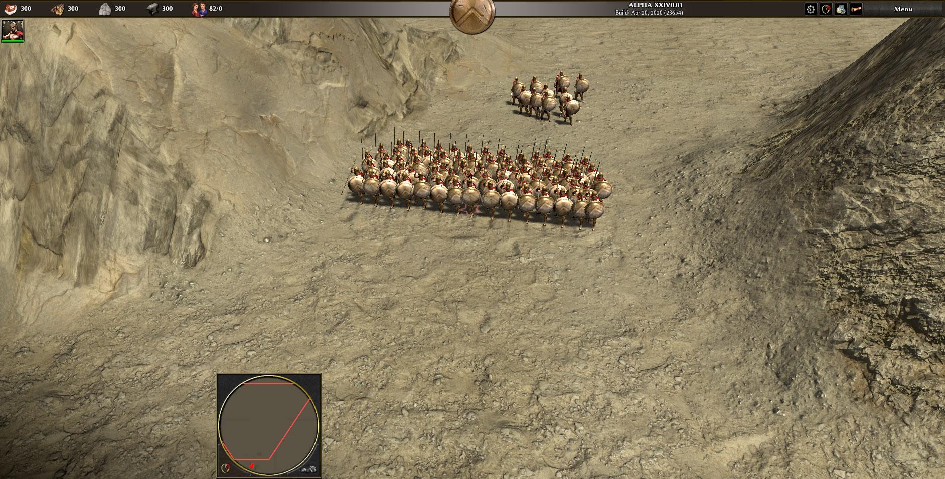
300 Spartans Mod
wowgetoffyourcellphone replied to wowgetoffyourcellphone's topic in Game Modification
New Terrain tests. To me, this clearly shows that the core game's terrains can be improved greatly, perhaps for Alpha 25 make that a big art push to update the terrains. https://cc0textures.com/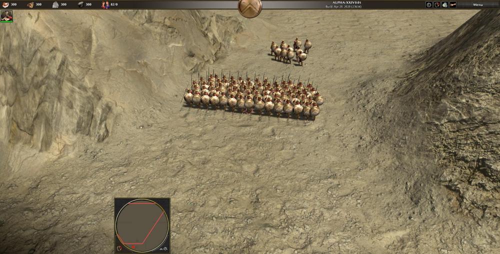
-
Civ: Imperial Romans (Principates)
wowgetoffyourcellphone replied to wowgetoffyourcellphone's topic in Delenda Est
Renaming the public mod could be a first step. But also in public communications it would be good to emphasize the name more. "Presenting 0 A.D. Empires Ascendant..." and from then on refer to the game as only Empires Ascendant. -
Civ: Imperial Romans (Principates)
wowgetoffyourcellphone replied to wowgetoffyourcellphone's topic in Delenda Est
I think we should have to make choices. Etruscans (they can fight Gauls and Romans) and Judeans (to fight Seleucids and Romans) might make sense while the other maybe not. That's just my view. Part 2 could be a prequel, yeah. Mycenaeans, New Kingdom Egyptians, Minoans, Hittites, Babylonians, Old Judeans, Assyrians, Wilusa (Troy), Phoenicians, a couple others. Right, we could get really creative with Centurions. Incredible references. I think we could make Proto-Cataphracts the Fortress cavalry champions while moving the Praetorians (who perhaps can switch back and forth from infantry to cavalry) to the Civic Center. -
Civ: Imperial Romans (Principates)
wowgetoffyourcellphone replied to wowgetoffyourcellphone's topic in Delenda Est
Nope. There can still be a Part 2 (Bronze Age), Part 3 (Medieval Period), etc., all "0 A.D." 0 A.D. is the franchise. Empires Ascendant is the game. -
Civ: Imperial Romans (Principates)
wowgetoffyourcellphone replied to wowgetoffyourcellphone's topic in Delenda Est
Thanks! I think they'd have fewer variants per unit than other civs, but they wouldn't be completely uniform as depicted in films and TV. I need help from the resident artists for unit textures and props! The good thing is, anything anyone does for DE's Imperial Romans can easily be put into the core game, either as Atlas units/structures or as a full Imperial Roman civ. I'm slowly inceptioning the idea that Empires Ascendant should cover the entire classical time period instead of stopping at 1 BC (and Imperial Romans should be a separate civ from the Republican Romans; the differences are just too great). -
Which map?
-
Civ: Imperial Romans (Principates)
wowgetoffyourcellphone replied to wowgetoffyourcellphone's topic in Delenda Est
-
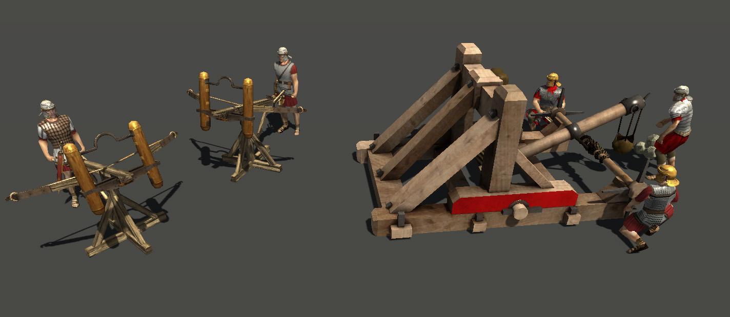
Civ: Imperial Romans (Principates)
wowgetoffyourcellphone replied to wowgetoffyourcellphone's topic in Delenda Est
Cheiroballista and Onager
-
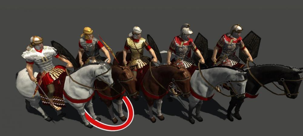
Civ: Imperial Romans (Principates)
wowgetoffyourcellphone replied to wowgetoffyourcellphone's topic in Delenda Est
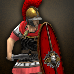
Thanks to @Alexandermb and @wackyserious for their awesome work. Above are the Imperial Roman infantry units so far.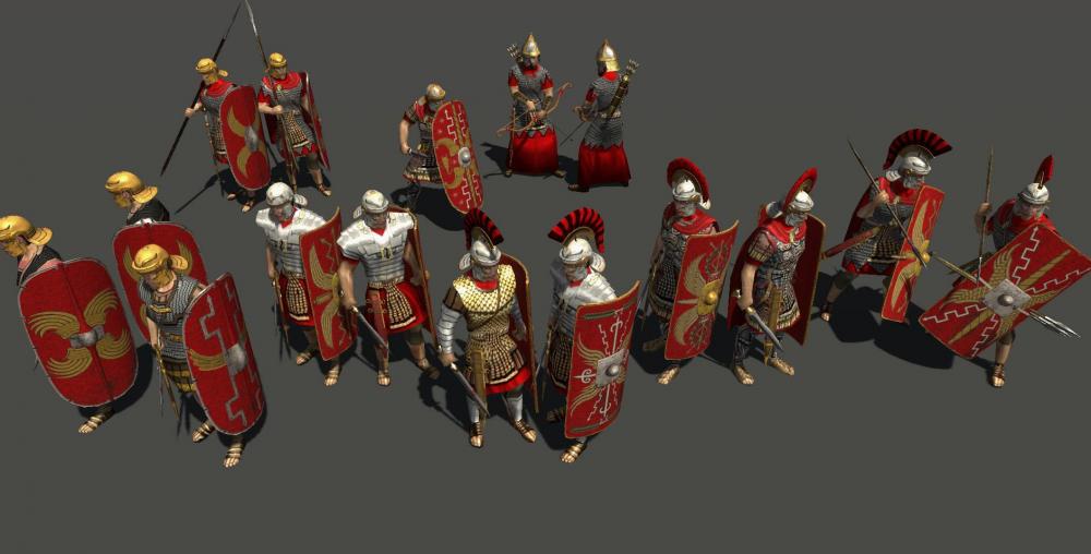
-
-
On the contrary, that was one of the chief ways of taking down a war elephant. They used to use axes and chop at the elephant's legs and hamstrings.
-
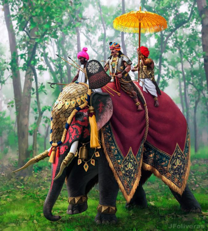
I think the Asian elephant is too small, yes. Should only be 2 or 3 hands shorter than the African Bush elephant. We can also justify it by saying they used the biggest and strongest elephants for war.
-
Greek Shield Factory
wowgetoffyourcellphone replied to Stan`'s topic in Eyecandy, custom projects and misc.
Straighter, at an angle. Not curved. The curved makes it look feminine, like Aphrodite. Example: -
-
Could we scale them up in-game? They seem a little small to me. That way we could do cool things like have 2 or 3 dudes in a howdah.
-
Greek Shield Factory
wowgetoffyourcellphone replied to Stan`'s topic in Eyecandy, custom projects and misc.
The headband should be more like the original. It's a diadem, worn by kings and paupers alike, though on coins indicated royalty.