Leaderboard
Popular Content
Showing content with the highest reputation on 2022-01-20 in all areas
-
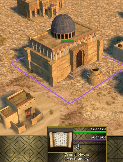
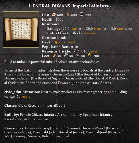
- More historically centered had been the introduction of an additional building to the Umayyad faction that allows to unlock advanced techs that reflect the high sophistication of their civilization. They were called "diwans" and were various councils that administered the bureaucracy, organization and decision within the caliphates. https://en.wikipedia.org/wiki/Divan The main concept behind this administrative building (similarly with Carolingian's library) was to offer more options and decisions to take also in the late game, hopefully improving the longevity of the game experience that, in my personal experience, tend to slump towards the end. All of this is still obviously a beta test to try out some possible options that can be explored as gameplay Anyway open to feedback / suggestions! EDIT: forgot, credit to @Lopess for the 3D model of this and also many other buildings of the Umayyad civilization4 points
-
Gameplay mod altering Civic Center & Military Colony cost and territory range. I feel like the currently exorbitant cost of CCs and their vast territory completely negates any interesting gameplay elements the territory mechanic can bring and only ends up with it being a negative. Players have all resources they could ever want in reach and the vast price of CCs makes securing new territory needless or trying to squeeze your opponent out of resources almost impossible. The mod also includes some economy bonus ideas, which already have patches made and are more detailed in: The territory changes will be made into a patch if after some test games the changes are liked. Territory: Reduce Territory influence gain from 30% to 25% in P2 and from 50% to 25% in P3 Reduce Civic Center cost to 350 Wood + 300 Stone Reduce Colony cost to 200 Wood + 200 Stone and no metal Increase Mil Col Territory Radius to 95 Meters from 80 Meters. Eco: Kush Pyramid eco bonus (Available in P1, cost from 300Stone + 100Metal to 150Stone, Range from 60m to 50m Sele Farming eco bonus (+15% farming speed in 20m radius of farmstead Mace Storehouse eco bonus (Instant research time) Rome pop bonus (Eco and Military structures give +2 pop space, like the old briton and gaul bonus) Athen research time bonus (15% faster tech research) TerritoryMod.pyromod TerritoryMod.zip3 points
-
3 points
-
First impressions after 2 4X4 vs AI: In a normal sized Mainland game (or in any smallish map) its nice that the second CC does not dominate as big a chunk of the map. I can claim a fair amount of resources without blocking my allies from their own expansion. Plus I can put down a CC earlier to protect the nearest ally on the edge if I'm in the pocket. If I'm on the edge I can use that CC to hem in the enemy I'm facing on the border. Usually I would have to use barracks and towers. The CC gives me many more options for a more reasonable price. Its Also with the Romans that little housing plus from other buildings gives more wiggle room when close to being housed. The only downside that I've yet to see is the annoying tendency of the AI to want a build a CC on any obscure corner or gap on the map. I would expect the smaller CC coverage to leave many new holes to build on. But that at the same time makes it more interesting for everyone.2 points
-
Read for a general overview at https://trac.wildfiregames.com/wiki/Modding_Guide and for the GUI modding look at https://trac.wildfiregames.com/wiki/ModdingGuiAndSimulation. You can also look at the code of some of the GUI mods listed here https://github.com/0ad-matters2 points
-
2 points
-
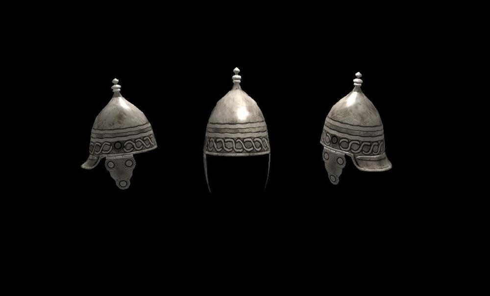
Added specular and normal maps, also added a hair prop This will be added in the main game as props/units/helmets/iber_helmet_montefortino_01.xml2 points
-
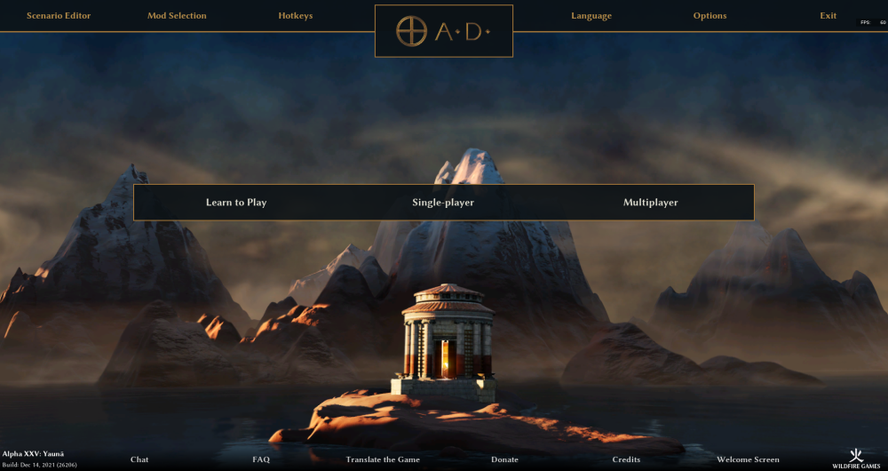
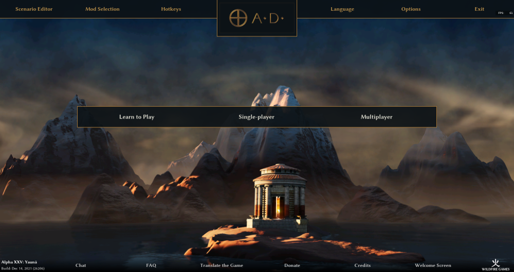
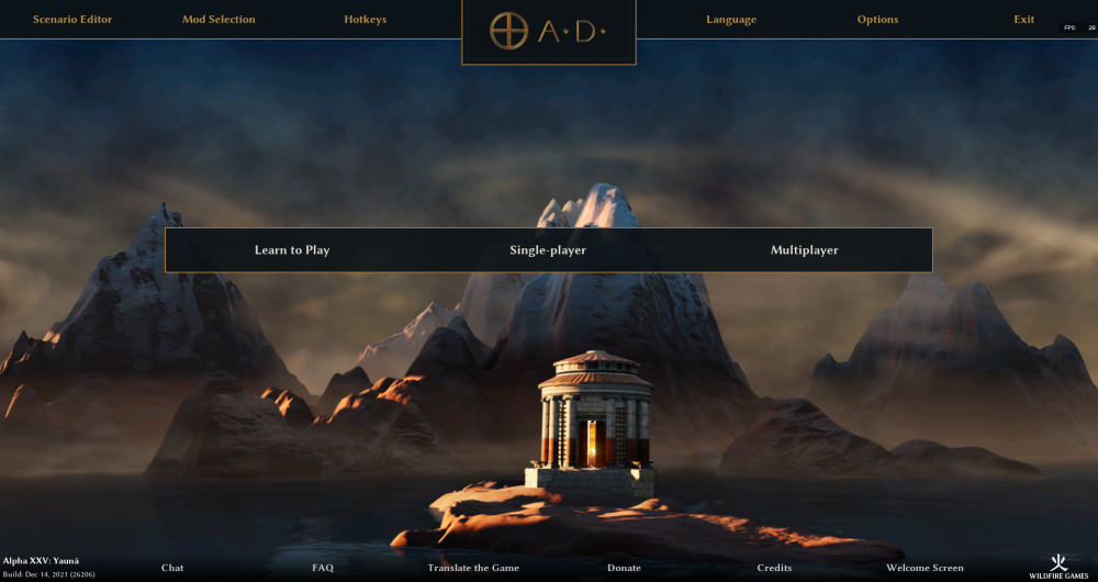
alright, before I update the mod this time, I just want to show how it would look like. This includes the adjustments for the following remarks: logo & background box smaller | added dots in the logo | logo background more minimal | brightness of the top menu text slightly increased | position of the center menu shifted towards the top What is still missing is the 'Empires Ascendant'. I mostly like how it looks; just the logo background is _very_ minimal now. Maybe I will shift it more towards something like @Radiotraining's draft in the future2 points
-
by the way - sorry guys, I hope I'm not spamming too much here..! I'm just trying to share some of the progress and concepts that I worked on, so everyone can have a taste and also give their own opinions. Let me know, in case!2 points
-
I know I'm probably not the first to bring this idea up but I found it worth discussing. What are your thoughts on making some resources renewable, meaning they either regrow or regenerate? I namely had three in mind which would make a lot of sense in my view: Tree regrowth is one of the first that seems logical. With how often you struggle to find wood on some maps and how difficult everything gets if you run out, this would help from a gameplay perspective too alongside added realism. Best implementation feels like having trees spawn saplings near them when there's enough room: The little tree offers fewer resources but gradually grows if you don't cut it right away... since trees are static models they should be easy to just resize without requiring any new assets. For example: A sapling can be 0.25 the scale of a grown tree and offer 50 wood if cut, but if you wait 15 minutes it grows into a full tree offering 200. Animals should be able to reproduce too. Not going to suggest a realistic simulation as this isn't a Pokemon game, just a simple mechanism to have some animals spawn another identical animal on random occasion. Like trees we could simulate babies by having them start out small and offer less food if killed until they grow up... for animals this might be more complicated than it's worth though, simple probabilistic duplication might be enough for starters. Fish banks are prolly the easiest to do. As fishing boats consume them, the resource should slowly regenerate over time and have its "health" climb back up... once they're gone though they stay gone forever. Regeneration should be very slow, just enough to emphasize fish in that bank reproducing. This would require players to be more careful about how fast they consume fish if they don't want to run out, fish too fast and the source is gone!1 point
-
I noticed that you stretched some unit textures and details got distorted or placed wrongly in the skeleton mesh UV map, I have edited your unit textures to fix it and the results are below. Asking for your permission to make changes over at the repository with the unit textures and helmet prop below @Duileoga Also I think the new helmets and helmet props that you created could still be improved (chain prop looks nice but I am wondering if the poly numbers are worth it for a simple helmet prop) I can help you with the textures if you could give me a mesh with a good UV map placement.1 point
-
AHA awesome! To keep everyone in the loop: - currently I'm working together with @Lopess (thanks so much man!!) to clean-up files, redundancies and fix minor bugs, so things are still a bit in progress. @asterix I'll let you know when we reach a stable phase! - guys let me know if you have also ideas and proposals! Not everything can be done and the mod must keep coherence with Vanilla. But, at the same time, fun and playability will benefit from different perspectives, historical elements and concepts. So, if someone is interested in this game, don't hesitate to express your opinions!1 point
-
1 point
-
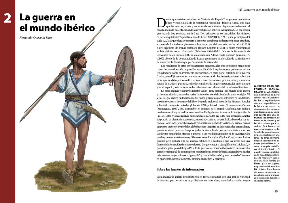
"And this people, it would appear, provide for warfare not only excellent cavalry but also foot-soldiers who excel in prowess and endurance. They wear rough black cloaks, the wool of which resembles the hair of goats. As for their arms, certain of the Celtiberians, carry light shields like those of the Gauls, and certain carry circular wicker shields as large as an aspis [Greek shield], and about their shins and calves they wind greaves made of hair and on their heads they wear bronze helmets adorned with red crests(*Purple in other translations). The swords they wear are two-edged and wrought of excellent iron, and they also have dirks a span in length which they use in fighting at close quarters. And a peculiar practice is followed by them in the fashioning of their weapons; for they bury plates of iron in the ground and leave them there until in the course of time the rust has eaten out what is weak in the iron and what is left is only the most unyielding, and of this they then fashion excellent swords and such other objects as pertain to war. The weapon which has been fashioned in the manner described cuts through anything which gets in its way, for no shield or helmet or bone can withstand a blow from it, because of the exceptional quality of the iron. Able as they are to fight in two styles, they first carry on the contest on horseback, and when they have defeated the cavalry they dismount, and assuming the rôle of foot-soldiers they put up marvellous battles." Diodorus Siculus 5,33(1st century BC)1 point
-
I forgot to comment this. Yes, they would be accurate. Diodorus Siculus said that the Celtiberians wrapped strips of goatskin around their feet. It is possible that the Iberians had the same tradition but it is not reflected in their representations.1 point
-
IMHO The name 'Empires Ascendant' is not part of the interface - as it is the name of one of the game's many mods If you enable a third-party mod and disable mod "0ad" - the display of hardcoded line 'Empires Ascendant' will be an error. Should display "Description of my super mod"1 point
-
I very much like this design, I would like Empires Ascendant to be put below 0ad logo with smaller font and because it is a name and thus it should not be translated. The only drawback I see is that I would put the single-player, multi-player and learn to play in this order to the side because I would like to see the beautiful artwork, just an opinion.1 point
-
Excellent work on the new shield texture too. They've needed updated for a long time.1 point
-
I don't know maybe wrong doubts from myself, maybe the fonts could be more shiny then and the zero ad logo at the top or something ... don't care about that talk much im just wondering around and grooming a little ... love1 point
-
Yeah that's true just I am missing some balance in the whole picture because it seems that there is some gradient at the bottom of the screen what I really like but its missing at the top. Maybe adding it as a slight idea to the top panel too in some manner? Not that I wouldn't like the flat design just as an idea to get more perspective depth ;-). much love <31 point
-
By the way if the exit button is not so important, is it VIM? I suppose it's not so stretched. It's aligned to the left (right if RTL) with a fixed padding. Which a bit different type of layout in UX. Blender: Office: Browser: The problem with your approach is that you need to skip by eyes a lot of empty spaces to find the each next visual anchor (button text). macOS users I agree that the grouping is a good thing. Though I believe that it needs to be grouped in a more natural way, without a lot of empty space.1 point
-
Thanks for the feedback! Kind of true, that's part of the design. I can only say that I always have the mod enabled, because the old layout is a bit too small and complicated for my liking. Arguably there are only very few important buttons a player uses frequently (especially a new player). That's why I decided to put the buttons to start a game prominently in the middle of the screen. Without having data to prove it, I think this is the first thing you see when looking at the page, which I think is important. That the top menu is very stretched out is a bit unfortunate, but I would argue that this is the standard layout of most desktop programs. Every browser / office software / 2D/3D art software ect. I have ever used, has a top menu which holds the options. Especially the exit button on the top right corner is what I would call "standard". So according to Jakobs law https://lawsofux.com/jakobs-law/ it is a good idea to copy that design decision as users are already used to it. The bottom menu could be placed elsewhere, those are the less important buttons imo, my only goal was a symmetrical layout. So they could also be columns on the left and right, but I think this doesn't address your concern that everything is far apart. So overall I would say I like this design, because it clearly separates the thematically similar functionalities, which makes navigation easier for me. You got your options at the top, the game buttons in the middle and informational elements at the bottom. And it is only one click to get to the mod page, which I use very frequently. But yes a looks a bit like it's made for mobile1 point
-
1 point
-
Seems like designed for mobiles, not PC displays. Eyes have to walk for a long distance to find important buttons. Which leads to Brownian motion of eyes.1 point
-
1 point
-
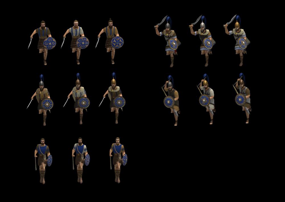
Helmets including the Chalcidean occur in variations together with the Roman and Celtic Montefortino and the Iberian leather caps for the elite units. The greaves can be removed, I will remove them now for the champion unit, but what about greaves from the Punic wars? Like those that could possibly looted by veterans? This is the reason why I added a greave on one foot of the elite rank sprearmen. Added the slinger quilted cloth as suggested.1 point
-
1 point
-
They are reconstructions of Numancia, in the Celtiberian area. (*Metal greaves are an interpretation error)1 point
-
About the helmet, I think it's good since the game's "Iberians" are Iberians/Celtiberians. The greaves look to be the generic greave props already in the game, so those are easily removed from the actor.1 point
-
Could you reuse the slinger design? It looks like one of the Despeñaperros figures (4th century BC) so it's pretty accurate1 point
-
1 point
-
Maybe the logo without the grey background halfoverlapping the background in the upper Bar? or is in design terms depending on the background image that maybe a mismatch? just curious. i love that design man. jesus1 point
-
I must say I'm really fond of it. The width of the logo border seems smaller than the other border. You might also make the top square extend to the top instead of a closed box.1 point
-
CAROLINGIANS Special features The Carolingian faction was already one of the most complete in the original game. I only made available in the game the model of Lorsch Abbey that @Alexandermb has made and gave it purpose as a library. Here a tech dedicated to the Carolingians allows to unlock fire arrows as weapon to attack buildings and add more damage power to the archers. Another unit available in the city phase is the Maceman, available in the barracks. Is an expensive, but weak unit that can deliver a crush damage to units and buildings, making it a valuable support element during sieges or intense melee fights.1 point
-
Thanks everybody for your opinions! Yes, the main points I'm still not satisfied with are the logo / logo background. This is now about the 30th draft I've made and there are always some minor issues (and different opinions from people ) should the logo be horizontally centered in / towards the middle of the top menu as seen in @Radiotraining's draft or should it be centered at the bottom line of the top menu ( current version)? How minimal / complicated should the logo background be? How big/ symmetrical / metal looking should the logo be? Anyways, I really appreciate when someone has the time to make a draft to show me how they would imagine/ like it, so thanks @Radiotraining @wowgetoffyourcellphone will considers that sure, if enough people like this I can make a patch. Otherwise I planned to put it on modio for a261 point
-
1 point
-
it is a feature, introduced in the latest alpha, referred to as "unit pushing". It makes movement of groups of units much smoother overall. You can turn it off in the pathfinder XML by setting 'Radius' to 0, or on individual unit templates by setting <DisablePushing>true</DisablePushing> in the UnitMotion component parameters.1 point
-
1 point
-
El problema es que no todo lo podemos hacer 100% histórico, hay cosas que afectan al gameplay.1 point
-
I can see that point. On the other hand, this is in a world where an entire giant empire is created and established in less than an hour: Smaller trees regrowing in half an hour doesn't seem that unrealistic when you think about that1 point
-
@MirceaKitsune(specifically) Resource regeneration is on my list. I'm already looking at various map object interactions. I'm planning on map object adjacency effects for building placement as well as building slots and tile type/object checks for foundations. Currently the game checks for cleared ground to allow placement but no reason you can't check other stuff. Enabling these functions in Mandate/GAE was quite easy but the pyrogenesis coding style is much more difficult for me to understand casually. I'm currently figuring out if I want to fork or do a major refactor vs more moderate changes. I probably won't fork unless something really messes me up. Just because I don't want to fiddle with low level stuff too much and forking would make it way harder to merge complex engine changes. I'm definitey going to be splitting several components and adding regeneration to resources would be comparably simple to other changes.1 point








.thumb.png.ce58cea22940c255f5b0a735d5abee36.png)