Leaderboard
Popular Content
Showing content with the highest reputation on 2022-01-21 in all areas
-
3 points
-
2 points
-
true that! I'm taking this advice and currently cleaning up names and files (thanks also to Lopess who's helping!). I made quite a mess in those folders because there are still many of my attempts, and each iteration I put more and more fantasy names like "file_definitive_new_new_02" ahahaha But now I'm cleaning that up and it should be much more clean and streamlined! And no uppercase!2 points
-
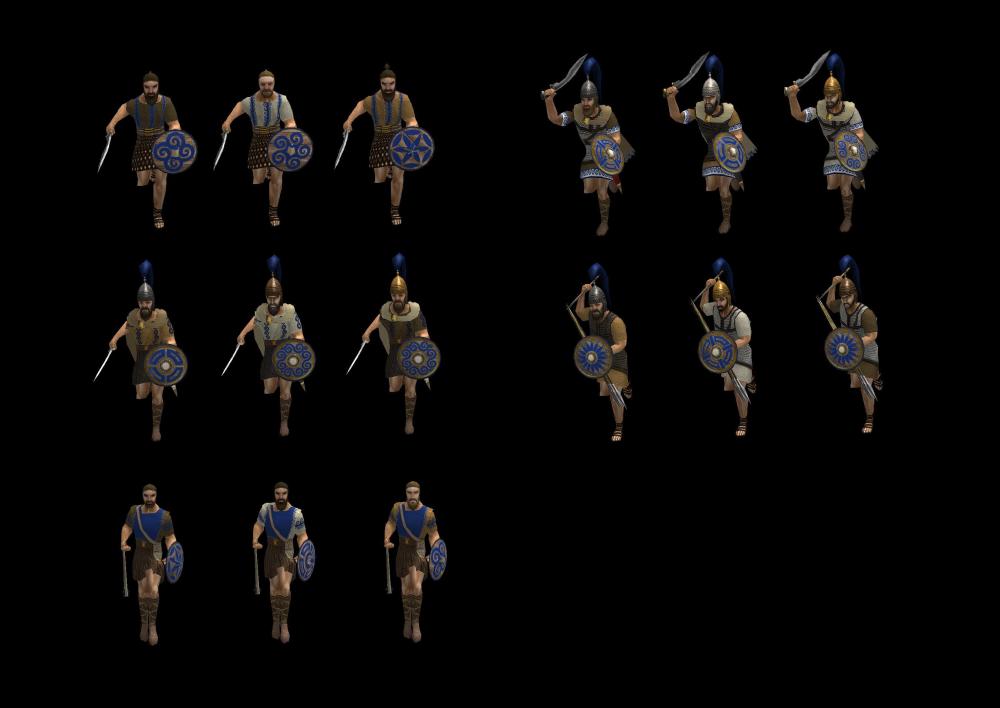
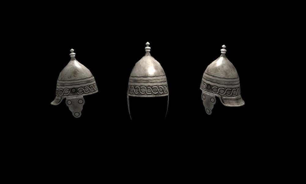
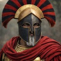
The helmet will be added into the game for the Iberian faction, so you can use it in your mod too. I tried to follow your details and recreated most of the textures that you made since your last commit at github (by most like almost every texture was corrected, I can commit it later if it is okay with everyone) Thank you also, and also I really love the texturing that you did for the Lusitanian units, why I corrected the UV map overlaps because I really liked your texture work for them.2 points
-
Just a small tip. Upper case letters in file names are a faux-pas. I've noticed it in a lot of the files you've committed. Keeping all lower case letters makes things simpler (so you don't have to worry about case sensitivity).2 points
-
Now @wackyserious you are admin too, let's wait just a bit for @Duileoga to see the previous message about helmets, maybe he has something new, about textures can be free to merge with the current mod2 points
-
I noticed that you stretched some unit textures and details got distorted or placed wrongly in the skeleton mesh UV map, I have edited your unit textures to fix it and the results are below. Asking for your permission to make changes over at the repository with the unit textures and helmet prop below @Duileoga Also I think the new helmets and helmet props that you created could still be improved (chain prop looks nice but I am wondering if the poly numbers are worth it for a simple helmet prop) I can help you with the textures if you could give me a mesh with a good UV map placement.2 points
-
2 points
-
Gameplay mod altering Civic Center & Military Colony cost and territory range. I feel like the currently exorbitant cost of CCs and their vast territory completely negates any interesting gameplay elements the territory mechanic can bring and only ends up with it being a negative. Players have all resources they could ever want in reach and the vast price of CCs makes securing new territory needless or trying to squeeze your opponent out of resources almost impossible. The mod also includes some economy bonus ideas, which already have patches made and are more detailed in: The territory changes will be made into a patch if after some test games the changes are liked. Territory: Reduce Territory influence gain from 30% to 25% in P2 and from 50% to 25% in P3 Reduce Civic Center cost to 350 Wood + 300 Stone Reduce Colony cost to 200 Wood + 200 Stone and no metal Increase Mil Col Territory Radius to 95 Meters from 80 Meters. Eco: Kush Pyramid eco bonus (Available in P1, cost from 300Stone + 100Metal to 150Stone, Range from 60m to 50m Sele Farming eco bonus (+15% farming speed in 20m radius of farmstead Mace Storehouse eco bonus (Instant research time) Rome pop bonus (Eco and Military structures give +2 pop space, like the old briton and gaul bonus) Athen research time bonus (15% faster tech research) TerritoryMod.pyromod TerritoryMod.zip1 point
-
With the introduction of A23 feature have been cut and the mercenary change probably affected your boom significantly. I was thinking about adding some features to make exploration and map control more important. 1. Corrals have the option to train cattle for free, but with increased train time. Since it requires no food to train cattle, having a corral is an strict advantage, whereas currently it is only an advantage if you consider it worthwhile to spend food on training cattle. 2. Create a map that has gaia corrals that can be captured. 3. Disable territory decay such that captured corrals in neutral territory don't decay. Steps 1&3 were easy. I would like if someone could give me the code to achieve step 2. The polar sea map gives an example on how to add owned buildings. I also was able to change the radius such that the corral is placed outside your territory, but it is still owned. However I don't know any good code to add randomly generated gaia corrals to the map. It would be desirable if these randomly generated corrals don't spawn near or very close to your territory. I also made a mod that shows progress I made with making a map. foodmod.zip1 point
-
Mostly within, also imagine again the super ultra wide display where the exit button needs half a day of mouse moving to reach1 point
-
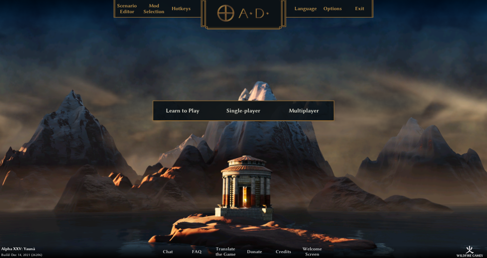
You could probably use javascript to make the width of the top-bar only extend up to a certain point, and then just have empty space on either side. This would fix Vlad's problem I think. I agree with wow, the square-box-single-line design is kinda boring for the 0 A.D. box now. I disliked the original because it looked inconsistent IMO, but now it's boring. As a matter of fact I think wow's design here is best so far, but perhaps just extending upwards instead of being closed. I would definitely go with the 'not center the logo at the bottom off the top menu' option, which looks much better than the bigger box IMO. I agree about the 'Empires Ascendant' text, but since I suggested moving the buttons upward, I would suggest putting it below the buttons (Edit -> that being said, maybe moving the buttons further down is better? Seems like it would be for DE's main menus anyways).1 point
-
If this is to be included in the main game, then the other artwork needs taken into account too.1 point
-
If moving to the side due to ultra wide screens is undesirable this is the the next best solution to preserve art. Dead center is almost always problematic. I agree on this one.1 point
-
The gradual iterations laming the top middle logo area is the perfect example of trying to please everybody (design by committee). While the dots are a good step, the removal of any character in the line work around the logo is most unfortunate.1 point
-
I can't answer about the helmets part but the textures part was already a known error and needed correction so thank you very much. I am adm of the repository and I will send you an invitation for you to participate too.1 point
-
Read for a general overview at https://trac.wildfiregames.com/wiki/Modding_Guide and for the GUI modding look at https://trac.wildfiregames.com/wiki/ModdingGuiAndSimulation. You can also look at the code of some of the GUI mods listed here https://github.com/0ad-matters1 point
-
1 point
-
I think some symbols could spice things up and consume the empty space between the buttons. e.g. a sword for single player, crossed swords for multiplayer, two gears for options, a door for exit, a book for learn to play etc.1 point
-
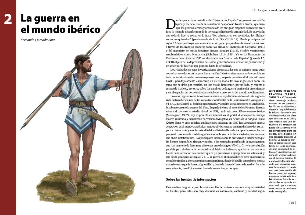
"And this people, it would appear, provide for warfare not only excellent cavalry but also foot-soldiers who excel in prowess and endurance. They wear rough black cloaks, the wool of which resembles the hair of goats. As for their arms, certain of the Celtiberians, carry light shields like those of the Gauls, and certain carry circular wicker shields as large as an aspis [Greek shield], and about their shins and calves they wind greaves made of hair and on their heads they wear bronze helmets adorned with red crests(*Purple in other translations). The swords they wear are two-edged and wrought of excellent iron, and they also have dirks a span in length which they use in fighting at close quarters. And a peculiar practice is followed by them in the fashioning of their weapons; for they bury plates of iron in the ground and leave them there until in the course of time the rust has eaten out what is weak in the iron and what is left is only the most unyielding, and of this they then fashion excellent swords and such other objects as pertain to war. The weapon which has been fashioned in the manner described cuts through anything which gets in its way, for no shield or helmet or bone can withstand a blow from it, because of the exceptional quality of the iron. Able as they are to fight in two styles, they first carry on the contest on horseback, and when they have defeated the cavalry they dismount, and assuming the rôle of foot-soldiers they put up marvellous battles." Diodorus Siculus 5,33(1st century BC)1 point
-
Excellent work on the new shield texture too. They've needed updated for a long time.1 point
-
1 point
-
the castro is 10 I love it and the market is really well done, reminds me of the ruins where I live. very good spectacular designs, I am looking forward to see the civ in an alpha.1 point
-
0 points



.thumb.png.f3f47d08fd1bf1063ea4b371390681b4.png)
