Leaderboard
Popular Content
Showing content with the highest reputation on 2018-04-24 in all areas
-
Yes, your mock-up looks aesthetically more pleasing than what 0 A.D. currently has. However, 0 A.D.'s GUI is designed to work at a minimum width of 1024px. I have a 3840px screen, but I've set 0 A.D.'s zoom at 2.0 and I often play at half a screen, thus my effective resolution is actually 960px. Your mock-up seems to be wider than the current GUI, therefore it'll probably be problematic for lower resolution screens. You can browse the relevant files at https://trac.wildfiregames.com/browser/ps/trunk/binaries/data/mods/public/gui/session (Editing GUI files can be a bit frustrating, though.) Probably the best approach would be to turn your idea into a mod, play around with things, try it at different resolutions, and if it works, ask others to test it. Afterwards you could propose it then to have it integrated in 0 A.D.'s main distribution.4 points
-
Comments/Notes Overall style looks great to me. The "paper" sections could be different colors/textures/have different edge detail for each culture, while the metallic elements can change to match as well, such as silver, iron, stone, wood, bronze, gold, etc. Keeping the same shapes and overall look. 1. These buttons are unit actions, so should go with the buttons [2] around the unit portrait [3]. 2. I think these should be centered over the top arrowhead. If [9] can be extended a few pixels leftward, then the additional buttons at 1 can be placed radially around the portrait. Initially there would be too many, but if WFG adopted my suggestion to simplify stances to 3 selectable stances only [Aggressive, Defensive, Stand Ground], then there is enough room for all of the buttons, a total of 9. 3. The portrait needs a spot for the Rank insignia. I like the "gloss" overlay. Nice touch. I also agree that if the selection is multiple units but just 1 type, then the large portrait should remain, with a large number overlain. 4. This is nice, I like this. Makes the formations prominent. Would look even nicer if, again, number of formations were reduced. Box, Skirmish, and Flank formations are useless. 5. Need a yellow bar for resource count. 6. Minimap buttons can go radially here, all the way around. Total of 8 possible minimap buttons. Plenty. Or just go with the 5 buttons you have there, bunched together. That works too. I don't think we really want more than about 5 different minimap features anyway. 7. I like how this gives room for 1 more additional icon [9 wide instead of the current 8 wide]. This panel here is where this UI can adapt to different screen widths. On narrower widths, there can be an arrow-over to scroll this over to show any hidden icons. 8. I like the negative space around the icons here. Gives "breathing room." 9. May I suggest a nifty little feature here? Perhaps clicking here toggles between GenericName and SpecificName. Does a quick little rollover animation. The "Drakkar" detail you have there on the right side can further customize for each culture. On lower resolutions the feature wouldn't even show up, but it would on 1600+px widths. I'd like to see the above, but using the real 0 A.D. logo. I like the style and the buttons at the bottom.4 points
-
Starting points for information about Scotland are: Saint Columba https://en.wikipedia.org/wiki/Columba Dalriada https://en.wikipedia.org/wiki/Dál_Riata Lord of the Isles https://en.wikipedia.org/wiki/Lord_of_the_Isles Picts https://en.wikipedia.org/wiki/Picts Archeological information suggests that there were Gaelic speakers in the west of Scotland dating from before the Dalriada though. It makes sense, because you can see Ireland from Scotland, and travel by boat was easier than travel by land. For Scotland, it might make sense to have 5 factions: Gaels (Both Scottish and Irish) https://en.wikipedia.org/wiki/Gaels Picts (Brythonic? Not enough linguistic evidence) https://en.wikipedia.org/wiki/Picts Rheged (Brythonic) https://en.wikipedia.org/wiki/Cumbria Angles (Northumbria) https://en.wikipedia.org/wiki/Cumbria Norse (Vikings, Colonized first Shetland and Orkney, then raided all the way down to Ireland. Integrated into the population in the Outer Hebrides) https://en.wikipedia.org/wiki/Outer_Hebrides#Norse_control4 points
-
Hayo 0AD! Here is a scrap for a not very simple UI. Adapted it from some previous design made for AOE3. Sadly for now i have no idea how to implement this, so its pretty much eye candy. (Feels like this would fit well for 1000 AD thou). Any critizing and opinions are welcome!3 points
-
The screenshot looks exciting. There are some restrictions like 1024x768 minimum resolution and logical constraints as mentioned by the other guys already. If those are met, then the most difficult task would be to position all the elements correctly (figuring out the right X, Y coordinates for each button). The engine certainly supports transparency already, so it should be possible to implement that.3 points
-
Tbh i like the logo as it is, i just think the letters are too spread , and the dots are a little too proeminent. Also the bevel in the 0 cross seems a bit too obvious.3 points
-
2 points
-
2 points
-
If you have game downloaded from here https://play0ad.com/download/ this bug should be fixed in new release A23, coming soon. Else I would like to ask you to attach log files. Here are paths, where you find them https://trac.wildfiregames.com/wiki/GameDataPaths Have nice day2 points
-
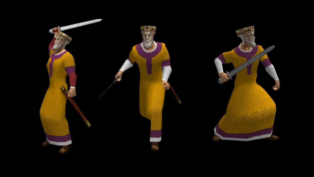
If we are going to follow the minister unit approach, I would suggest that the minister unit actor file would be three infantries banded together. One bishop, and two noblemen. https://en.wikipedia.org/wiki/Capitulary_of_Servais2 points
-
2 points
-
Are these nations already planned? I think it could be awesome to have the whole british/irish civs in the mod... Some features: Let's start with... Welsh: Emblem: dragon of Wales : Y Ddraig Goch: Maybe there were other symbols used at the time of the game, I will have a deeper look into heraldry history Possible heroes: - Rhodri the Great (c.820-878) king of Gwynedd, contemporary to Alfred the Great, - Gruffudd ap Cynan, king of all Wales, unified the welsh resistance to the Norman rule Traditional unit: Longbowman, pride of welsh medieval armies, long distance archer also called Saethwyr: http://wiki.totalwar.com/w/Saethwyr_(M2TW-K-BC_unit) Other units: http://m2tw.warlore.org/units/Meirionnydd_Spearmen_?campaign=britannia http://m2tw.warlore.org/units/Welsh_Skirmishers?campaign=britannia1 point
-
I also think it is not our job to remove IP violating mods, as moddb is the one hosting them and not us.1 point
-
In some cases it's pretty hard to tell that a mod breaks IP laws. Because we need to check all data, find its sources and check licenses to be sure, that the mod doesn't break IP laws. Even steam may sometimes publish games with broken IP laws. Another side is different IP laws for different countries. So I think, the possible solution is to check mod only for basic and security things, and remove the mod/make an investigation if someone reported about broken IP laws.1 point
-
@Itms you will sign mods that break IP laws? It can be argued that you're not hosting the service and it's not your responsibility regarding that aspect. Moddb holds a lot of mods that breaks the IPs.1 point
-
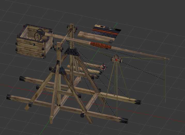
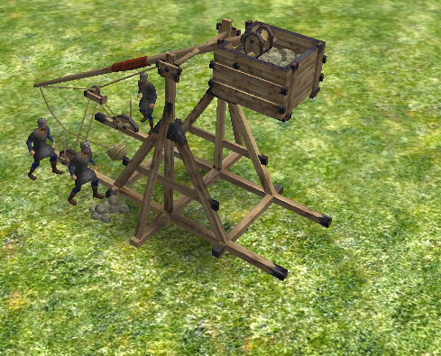
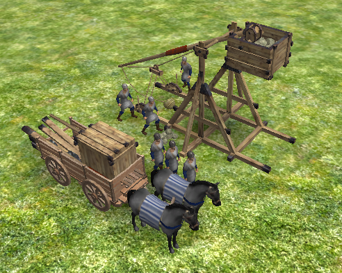
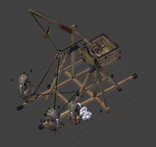
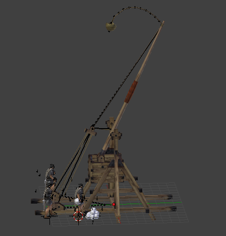
Yes, traction trebuchets (or mangonel) existed in Europe since the 6th C AD, and possibly centuries earlier in China, however, the one you animated clearly uses a counterweight, not torsion.1 point
-
Plus it will be useful in the future since part 2 of the mod will cover the middle ages proper and the late middle ages.1 point
-
in page 10 or 9 IIRC theres a text who speaks about a lever "catapult" using cilinder wood, two arms and sling as a stolen technology from chinese for trowing rocks but is also seen in two referencial paintings and none of the 3 references has any relation since 1 is in spanish good information page, 2nd is at Age of Charlemagne Osprey book wich was used for both norse and anglo factions and 3rd is another book "Charlemagne's Early Campaigns (768-777): A Diplomatic and Military Analysis".1 point
-
Please correct me if I'm mistaken, but I was under the impression this mod is supposed to cover the 500-1000 AD timeframe. Counterweight trebuchets first appear in the 12th C AD, thus postdating the Carolingians.1 point
-
You mean in the /public code? Or the elevations? By the code, i didnt changed anything, just used the Atlas as it is. About the elevations, well, i can post them without any buildings so you could have a idea of the mess Added new icons for the bug and translate buttons. ^^ Oh, and sure, i can give a go with a bit more warmish tone for the stone lightning1 point
-
You could design a 1920 wide GUI, of course, that's up to you, but that would only be useful as a mod for players who would play 0 A.D. at at least that width. If you want to redesign the GUI and create a mod that might be included in the main distribution and replace what we currently have, then yes, I'm afraid you'll have to limit yourself to using 1024 pixels, which is certainly challenging.1 point
-
Height is not a problem; if something works for 16:9, it will also work for 16:10, 3:2, 4:3, 5:4, and other aspect ratios. Width, in pixels, is the limiting factor. 0 A.D.'s GUI does not handle "stretching and cropping"; it's always 1024 pixels wide, regardless the size of the screen or window used. So if you want to implement your ideas, it's better if all GUI elements are located within 1024 pixels, even if your mock-up's 1920 wide. Those two things are certainly desireable to have, but probably also quite hard to implement.1 point
-
True, there is no point on implementing this if it cant support native 4:3 resolutions. Would act as a mod for those who want it but it will never make it to the main build. Actually my earlier design took this into consideration, since i left half screen alone for scretching and cropping, but since we added the left bar now were locked up on 16:10 logic. Ill give some thought about the options we have here before going deeper with this. Nonetheless, heres the last iteration with some of WowGetOff additions.1 point
-
Yes, Fedora can also support arbitrary sizes, of course. Half a screen is just more convenient for me personally (pressing two keys is much faster than resizing a window by moving around a cursor or having to look up a configuration file to specify a size in pixels). And yes, I suppose I could use 1920/1024=1.875 as gui scale. However, that's besides the point. What matters is the mock-up is 1920×1080, 0 A.D.'s current GUI's width 1024. If the GUI is to be redesigned, it's important to keep in mind that not everyone has the same resolution screen, and some of those who could support it might want to play the game in a different size too. Just extending the used width from the current 1024 to 1280, 1600, 1920, or whatever might be welcomed by some but be inconvenient for others.1 point
-
Lol i could handle the hoplites, im more worried about the might ox they brought to the siege. Who need rams anyway. XD1 point
-
Much better! The main background doesn't have sense (hoplites standing in a middle of siege?). The four icons look nice, but they aren't intuitive to know what they mean. BTW there should be a consistent theme across all game and UI.1 point
-
Hi! First of all thanks for the amazing mod and the hard work put into it! Will King David be a hero in this faction? Also will there be a seperate Israel faction for the remaining IsraelI tribes?1 point
-
1 point
-
1 point
-
Hello @jdaniel and thanks for the report. The tutorial was broken in A22 it should be fixed in A23. Stay tuned and a release is coming soonish.1 point
-
1 point
-
1 point
-
Haha, i got a bit carried away... xD Think its a good idea to add some blur for the paralax interations imo ^^ Uh, i just used the minimap asset to draw the portrait radials. I have to make them more runeish, but then, i couldnt use it in other civs, so i decided to go with it since its generic for many civs. Thanks man1 point
-
No, this can be better. don't change the logo. and the propose dont have same quality. I like the lower icons brilliant.1 point
-
The palace building will also function similar to the Persian apadana building. Part of the original concept for the Carolingians was for them to gain metal though taxation. Copying the function of the Apadana will also limit the training of Schola palatina at the palace building, similar to how Immortals can only be trained at the Apadana and though heroes.1 point
-
This can be implemented similar to the Nine ministers (Goverment administrators) or the Chinese faction in Terra Magna. Where the Missi Dominici can be trained at the palace building after researching https://en.wikipedia.org/wiki/Capitularia_missorum_specialia which was the edict that defined the role and functions of the said office. Similar to the ministers, a Missus dominicus can only be trained at a specific limit and requires one fortress or civic center each.1 point
-
Trebuchet, the text i quoted last night talks about a trebuchet but also the paintngs.1 point
-
Panel on the right needs to accommodate 3 rows high. You also need to show mockups for various things like formations, garrison, bartering at Market, etc. Otherwise this is awesome.1 point
-
1 point
-
Yes, the palace is the building on the left wing. That's a good idea to separate the buildings1 point
-
Addon for generating rigid body collision for death animations or that kind of stuff (Isn't free but for those who can afford it it really saves a lot of time): https://www.blendernation.com/2018/04/18/ragdoll-tools/1 point
-
@Lion.Kanzen If Aristeia is per se playable and updated to the current version, I can help in revitalizing the unit roster (and maybe add up missing units too)1 point
-
1 point
-
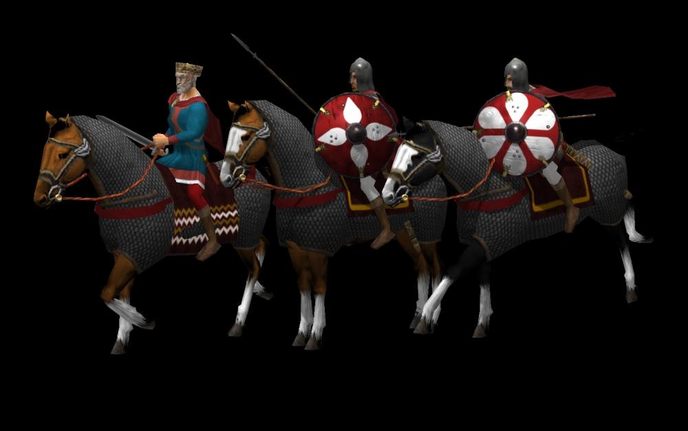
So, at the moment we have two champion units for the Carolingians. Royal Companion Cavalry (Schola Palatina) Royal Companion Infantry (Schola Palatina) Clergy can now also be trained at the church1 point
-
1 point





.thumb.jpg.b85f1db9873287a0d10cd2c7e88579c0.jpg)


.thumb.png.ce58cea22940c255f5b0a735d5abee36.png)
