-
Posts
780 -
Joined
-
Last visited
-
Days Won
11
Everything posted by maroder
-
I'm not a 100% sure, but comparing it to fireworks.xml, which I guess should look close to what you want to achieve, it looks like veloxity.y is actual the vertical direction while x & z are the horizontal directions. So I would suggest trying a similar/ the same small (possibly negative) value for x & z and a higher (positive) value for y. nice hills btw
-

Fruit trees are too difficult to tell apart from other trees.
maroder replied to AIEND's topic in Gameplay Discussion
sounds unnecessarily harsh and generalized. but I agree that having a clear distinction between trees=wood and berries=food does make it easier to understand. The question is if we should copy that or if there is another way to make the food trees visually more distinct? something like this for example. But tbh, I wouldn't mind switching to just berries for food. We can still keep the models for the trees, only that they would only supply wood then. -
I like the layout, but I think I would prefer a more natural canyon look (and then maybe call the map canyon) But do whatever design you like.
-

Feedbacks from A26 SVN tests
maroder replied to Yekaterina's topic in Game Development & Technical Discussion
Should be fixed in the newest svn: https://code.wildfiregames.com/rP26651 -

mod shiny - alternative main menu & UI theme
maroder replied to maroder's topic in Game Modification
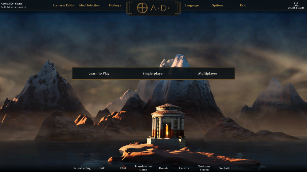
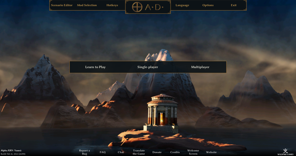
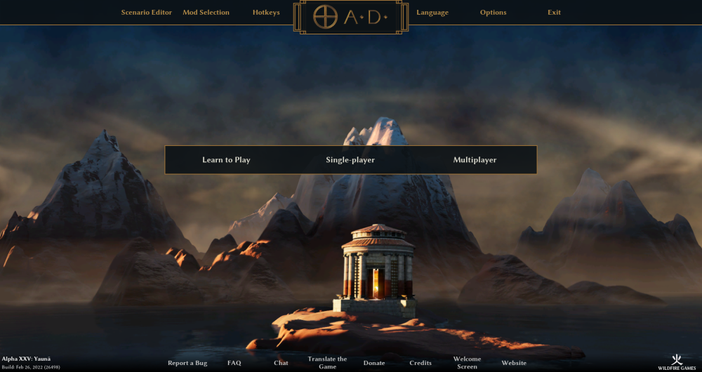
Alright, some progress was made. This is the version I'm considering for the next release. It is adaptive and compatible to small 1024 screens. The bottom menu is a bit crowded and I would like to maybe remove some of the stuff, but that is more a consideration of the base game. -

Athenian Champions Are Locked to Technology, Instead of City Phase
maroder replied to kul's topic in Bug reports
Off topic: I would actually support moving the champions back to the fortress again. Now it is just a big tower, which is a bit sad. Also makes it harder to spam champions, which is imo good. -

Feedbacks from A26 SVN tests
maroder replied to Yekaterina's topic in Game Development & Technical Discussion
can reproduce, same for me. It doesn't trigger with every building and sometimes you have to move it around quite a bit outside of the map boundary to trigger. interestingly my error just says: (error while formatting error message) and I can click continue without crashing. -

mod shiny - alternative main menu & UI theme
maroder replied to maroder's topic in Game Modification
I know that there is generally a way to do that my problem is more that the pyrogenesis engine is not designed to build that kind of UI. The combination of javascript and xml that is used for the UI is good at producing static elements (or semi adaptive), but what is normally used in combination with javascript to produce reactive graphic elements is CSS -> and that is not part of pyrogenesis. So every element that should be reactive has to be coded with a custom logic, which is just much work. But as I said, I will look into it, maybe it's not so complicated. -
I would be ok with those (but I also wouldn't mind sticking with the current default and just changing the other two). Bronze might be a nice touch. idk. Nitpicking: I would prefer if they all had the exact same diagonal angle. And I would prefer if that angle would be rather steep (Looking at the default windows cursor where the left side of the arrowhead is vertical). Maybe not that much, but you get the idea, for me the attack-sword is a bit too diagonal.
-

mod shiny - alternative main menu & UI theme
maroder replied to maroder's topic in Game Modification
I mean yeah there probably is a way to do that. Although it's sound very cumbersome and the question is what should happen to those elements? are they not displayed at all on small resolutions? But I can look into it, maybe it's easier to do than I think. -
https://code.wildfiregames.com/D4511 as a proposed patch
-

mod shiny - alternative main menu & UI theme
maroder replied to maroder's topic in Game Modification
Alright seems like some people like this draft, but unfortunately: This is not possible. the min resolution width of 1280 offers not enough space to put the wfg logo and the build / alpha name in the top menu. This would be possible when dropping support for everything under 1920, but that seems like a bad idea. So here are some alternative drafts: (Do note that those are fixed width menus -> so they don't stretch over the whole screen anymore) -

Provincial centers and Ionian mercenary hoplites.
maroder replied to LetswaveaBook's topic in Gameplay Discussion
The idea does sound good and has been discussed a few times in different threads already, as far as I can remember. The problems that were discussed in those threads (iirc): It should have different art and what are the differences to the military colony? I still have the idea that it could be a good idea to use this territory claiming mechanic to diversify the civs, see here -
There is a patch that proposed this as a side effect: https://code.wildfiregames.com/D4474
- 1 reply
-
- 1
-

-

Commit Feldmap to A26
maroder replied to Yekaterina's topic in Game Development & Technical Discussion
Sure, you can just increase the number of starting berries and chicken and push the random spawns further away. Or randomly spawn more or less resources close to the CC. The question is if this is perceived as balanced or what option the multiplayer would prefer. -

Commit Feldmap to A26
maroder replied to Yekaterina's topic in Game Development & Technical Discussion
ping @chrstgtr since they also had opinions on this iirc. Would you be ok with just replacing mainland with balanced mainland? -

Commit Feldmap to A26
maroder replied to Yekaterina's topic in Game Development & Technical Discussion
My opinion: I am against the duplication, but if everybody favors the balanced version -> why not just replace it? Include the function to generate the balanced resources in the script instead of making it a library function and then replacing it with D4232 in the long run. -

Feedbacks from A26 SVN tests
maroder replied to Yekaterina's topic in Game Development & Technical Discussion
I like that there is now a distinct cursor for attack-move -

Neutral (Gaia) Mercenary Camps 2.0
maroder replied to Lion.Kanzen's topic in Game Development & Technical Discussion
Is definitively possible. The question is if the majority of people want this. -
disagree. As long as it balanced with other strengths and weaknesses, I don't see a reason why this value has to be set in stone.
-

mod shiny - alternative main menu & UI theme
maroder replied to maroder's topic in Game Modification
Poll might be an idea, yes. No update at the moment due to lack of time, but I plan to get it done for a26. -

Proposal for a new map category: Mainland-like maps
maroder replied to LetswaveaBook's topic in Gameplay Discussion
No, You just need one script that randomly or by input from the game starting page chooses what to place on the map. So actually this could even be included in the "normal" mainland, when it is controlled by user input. Generally I think such a "mainland variation" map could be interesting.


