maroder
-
Posts
780 -
Joined
-
Last visited
-
Days Won
11
Everything posted by maroder
-
 I guess if it is supposed to look like this it's ok. I wasn't thinking directly about creating a specific unit that holds the banner, more like why not just assign the banner to a unit within the formation, instead of the controller. The banner would still "float" but maybe look less ghost like.
 -
Some observation: The animations of the banner when the formation is in movement looks too jittery. I would be nice if an actual unit could "hold" it. The flank formation looks very funny with the banner floating in the middle. Couldn't the banner just be assigned to the exact position of a unit within the formation, instead of the formation controler?
-
It does look nice, only the lag part is unfortunate.
-
I mean if people feel that strongly that nothing should ever be removed ok , but then at least moving the bad maps under a separate tag/ folder should be done. It just doesn't make sense to have a wild mix of high quality and mediocre maps. That kind of choice is super confusing and will give new players a bad impression of the game.
-
I generally like the idea. Makes it more of a strategical decision in what building you want to invest your resources. Also, since the art is already there, it would be a shame to not use it.
-
When reading through the old thread most people seem to agree that a cleanup would be good. Just didn't happen yet.
-
To continue the topic of what maps should be included in the game that has started here: I have been going through the random maps folder again and would suggest: remove: Sahel & Anatolian Plateau - they are basically biomes for Mainland. remove: Atlas Mountains & African Plains keep: Syria - they are very similar and the first two use eiher bad textures or they have a bad terrain painting/forest creation remove Belgian Upland keep: Rhine Marshlands - Belgian Uplands is imo one of the unfairest maps and if you get a good seed it just looks like a biome of Rhine Marshlands, but still somehow worse. merge: Arctic summer & Botswana Haven - basically the same map with a different biome. remove: India - Basically Lake remove: Sahel Water Holes - That's just Rivers remove: Phoenician Levant - It's a square map and it is similar to northern lights remove: Kerala - It is a mixture between Hycranian Shores and Hellas, which are imo better. remove: Volcanic lands - Looks like a biome of African Plains & Syria and looks worse than Pompeii in terms of "volcano" _________________________________________ After that I would make new categories to put the maps in that offer a unique experience but are optically not on the same level as the good maps or that are just too 'special' I.e. 'Old maps' who are unique but should receive a texture update or have some other issue e.g.: Mediterranean - Latinum 'Arena maps' the very unnatural looking ones. e.g.: Snowflake Searocks ect. _________________________________________ So with that being said, I would like to mention that "remove" does not mean they can never be played again. They can be put in a separate mode for people who really enjoy playing them. Now a question to everybody: What is your opinion on this? Do you enjoy playing any of the maps I suggest for removal? Anybody any concerns regarding this?
-
It is always nice to have new and especially eyecandy looking skirmish maps, but I can't say much about the process how to submit them for the main game. The last batch of new skirmish maps was afaik done by @wowgetoffyourcellphone who made them originally for DE. So I guess you can get in touch with him and or @Stan` , but I think the trick is just to spend much time in atlas until you have something that looks nice Personally I am at the moment more interested in an update for the random maps, as many of them lack behind in the level of refinement some of the skirmish maps have.
-
apparently people have downloaded that rating quite a bit (Or one person just wanted it very many times ) and no one complained much about it. So one could think again about moving some of the lower rated maps into a separate mod to clean up the maps and to show only the best ones to the user?
-
imo the AI should prioritize attacking units in p1 and p2, but the main point is that capturing should be a choice and not the default
-
very nice @Radiotraining ! I really like the look. Have you ever thought about making some for the main game?
-
To revive this topic: I support the idea of decoupling attack and capture and would be happy to see a patch for that. Capturing is an interesting mechanic, but it should only be done when directly tasked. Current situation is still subpar. It is not only annoying for the player when UnitAI decides to waste the time of your troops by capturing a building, it also severely impairs the strenght of the AI. See this video for example at min 9: The AI runs straight towards the houses and tries to capture them, which is a huge waste of time and gives @ValihrAnt an very easy time defending. Another problem is when your troops capture an enemy building on enemy territory. As you immediately start to loose influence over the building again, your troops have to keep "capturing" it until they are killed or you notice it and manually send them away.
-
Hey there, You can try to disable the TLS encryption in this case. See here: https://trac.wildfiregames.com/attachment/wiki/FAQ/lobby_tls.jpg
-
Since there has been some mods made recently which change the territory dynamics: I thought this might also be something that could be used for more differentiation. So just to put the idea out somewhere: What if we would group the civs into different classes who have different ways to claim new territory? These classes could be based on their history ( or at least what most pepole know them for ). I was thinking of something like: the 'Imperial/ conqueror' civs - they get only one CC, but every building of them has a larger territory influence and they have buildings like the theatron. So they are constantly building outwards or are trying to capture the buildings of the enemy (possibly with a higher capture rate?) the 'governor' civs - they also only get one CC but can build build cheap military colonies / satrapys of some sort who give less territory compared to the starting CC the 'tribal' civs - multiple regular CC to represent the different tribes the 'nomad' civs (yet to come) - territory doesn't matter As you can see the only thing that would change are the imperial civs (and the nomads).
-
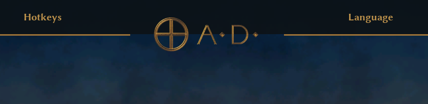
mod shiny - alternative main menu & UI theme
maroder replied to maroder's topic in Game Modification
mockup: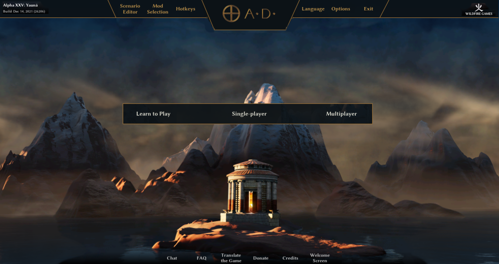
-
mod shiny - alternative main menu & UI theme
maroder replied to maroder's topic in Game Modification
same, that's why I made it. haha yes. The problem is that I have then to come up with some css like js/xml stuff to manage that. I.e. switching between fixed position and a relative position depending on the screen size. That may take a while. -
mod shiny - alternative main menu & UI theme
maroder replied to maroder's topic in Game Modification
indeed, but that's always the case at the minimum resolution. Only option would be to make the font smaller (which I don't want to do). And having nothing on there? Yeah it's the same one, just shifted to the top. See, the problem is the that the pictures wow posted were just the first design I did with those double lines. But then I asked @Stan` and @wowgetoffyourcellphone how they liked it or if they would prefer one of my other drafts and they both choose the current design you don't like. So ... you see my problem? Kind of going in a circle :/ -
mod shiny - alternative main menu & UI theme
maroder replied to maroder's topic in Game Modification
The left and right seems a bit empty Note: this is fixed width, meaning that this would look different on all screen sizes. Bigger screens would have more empty space on both sides, while the min resolution has no empty space.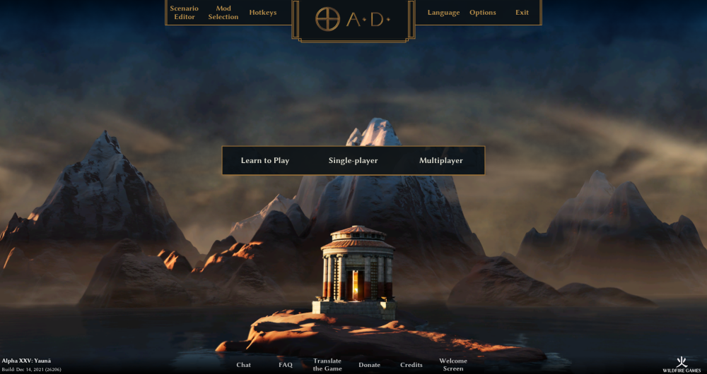
-
mod shiny - alternative main menu & UI theme
maroder replied to maroder's topic in Game Modification
true. It's just hard to come up with a design that works equally well from 3,440x1,440 to 1024x768. Best would be to just center everything around the vertical axis -> but that also covers most of the art and would be very crowded with the many buttons there are. If someone wants to show me a draft of how they would imagine it I would be _very_ interested -
mod shiny - alternative main menu & UI theme
maroder replied to maroder's topic in Game Modification
very true. Not a good idea since there is a drop down menu that opens to the bottom. That's why I generally wouldn't want to move the center menu lower then half of the screen. sure, would be possible, but I'm still not 100% sure if they were referring to the space within or between the menus. -
mod shiny - alternative main menu & UI theme
maroder replied to maroder's topic in Game Modification
didn't know that expression. kind of true -
mod shiny - alternative main menu & UI theme
maroder replied to maroder's topic in Game Modification
well they choose to pay for the quirks different ideas welcome ™ Also, you mean the empty space within the different menus (i.e. learn to play -> Single-player) or between them (top menu, center menu)? -
mod shiny - alternative main menu & UI theme
maroder replied to maroder's topic in Game Modification
Thanks for the feedback! Kind of true, that's part of the design. I can only say that I always have the mod enabled, because the old layout is a bit too small and complicated for my liking. Arguably there are only very few important buttons a player uses frequently (especially a new player). That's why I decided to put the buttons to start a game prominently in the middle of the screen. Without having data to prove it, I think this is the first thing you see when looking at the page, which I think is important. That the top menu is very stretched out is a bit unfortunate, but I would argue that this is the standard layout of most desktop programs. Every browser / office software / 2D/3D art software ect. I have ever used, has a top menu which holds the options. Especially the exit button on the top right corner is what I would call "standard". So according to Jakobs law https://lawsofux.com/jakobs-law/ it is a good idea to copy that design decision as users are already used to it. The bottom menu could be placed elsewhere, those are the less important buttons imo, my only goal was a symmetrical layout. So they could also be columns on the left and right, but I think this doesn't address your concern that everything is far apart. So overall I would say I like this design, because it clearly separates the thematically similar functionalities, which makes navigation easier for me. You got your options at the top, the game buttons in the middle and informational elements at the bottom. And it is only one click to get to the mod page, which I use very frequently. But yes a looks a bit like it's made for mobile -
mod shiny - alternative main menu & UI theme
maroder replied to maroder's topic in Game Modification
Well, that's a good question: Is the 'Empires Ascendant' part of the logo and should look the same all the time (latin letters, saved as png) or is it more of a description / title that is made up of strings, which could be translated to other languages/ alphabets? -
mod shiny - alternative main menu & UI theme
maroder replied to maroder's topic in Game Modification
It's possible, but I like it more with a background. Also not sure what to do with the lines on the left and right side in this case.