-
Posts
780 -
Joined
-
Last visited
-
Days Won
11
Everything posted by maroder
-

mod shiny - alternative main menu & UI theme
maroder replied to maroder's topic in Game Modification
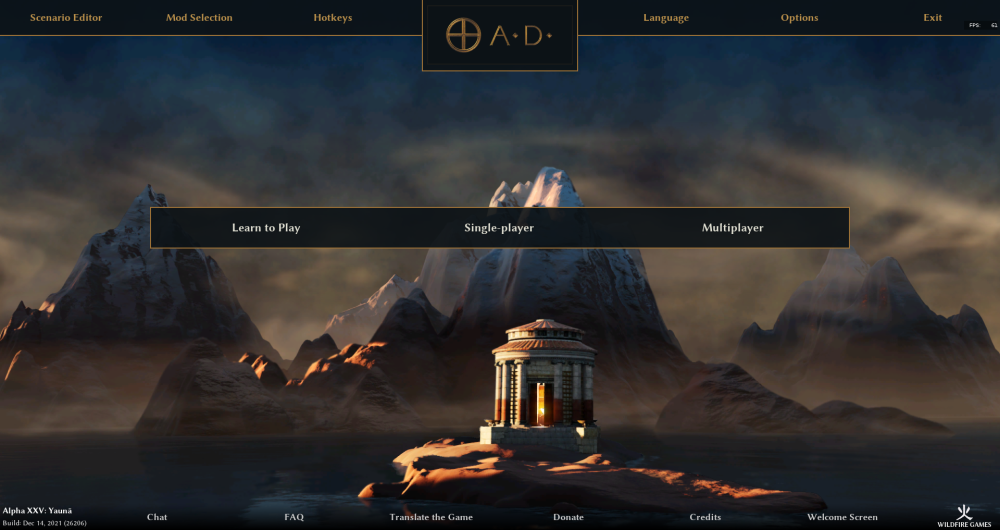
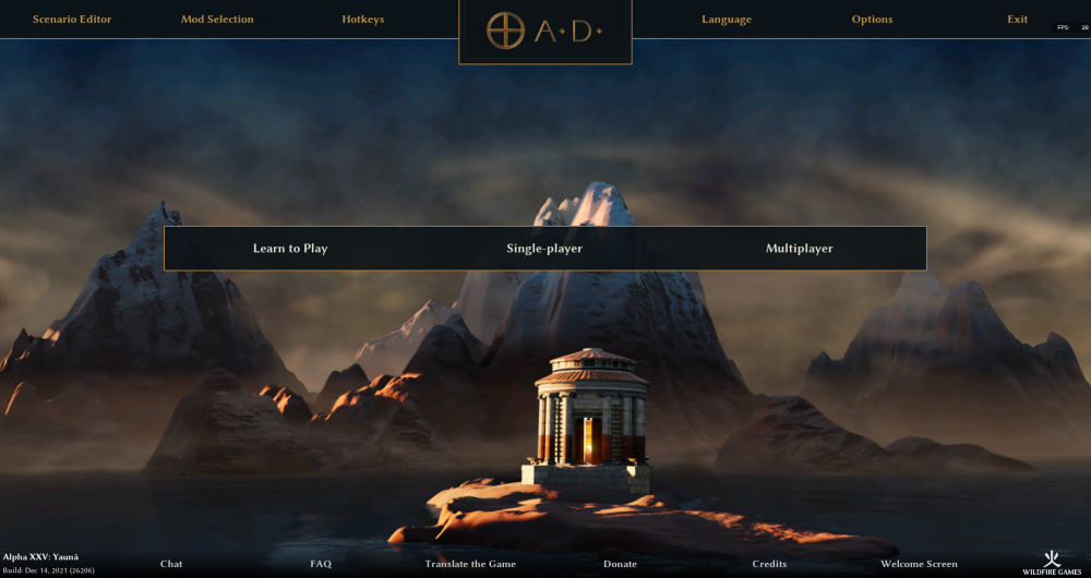
True, the width should be uniform. Extending the edge of the logo towards the top of the screen means also lowering the bottom part of the box to keep it symetrical. So the box looks a bit bigger this way. The other option would be to not center the logo at the bottom off the top menu: -

mod shiny - alternative main menu & UI theme
maroder replied to maroder's topic in Game Modification
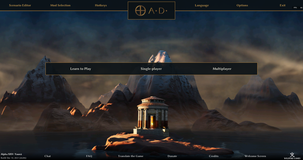
alright, before I update the mod this time, I just want to show how it would look like. This includes the adjustments for the following remarks: logo & background box smaller | added dots in the logo | logo background more minimal | brightness of the top menu text slightly increased | position of the center menu shifted towards the top What is still missing is the 'Empires Ascendant'. I mostly like how it looks; just the logo background is _very_ minimal now. Maybe I will shift it more towards something like @Radiotraining's draft in the future -

mod shiny - alternative main menu & UI theme
maroder replied to maroder's topic in Game Modification
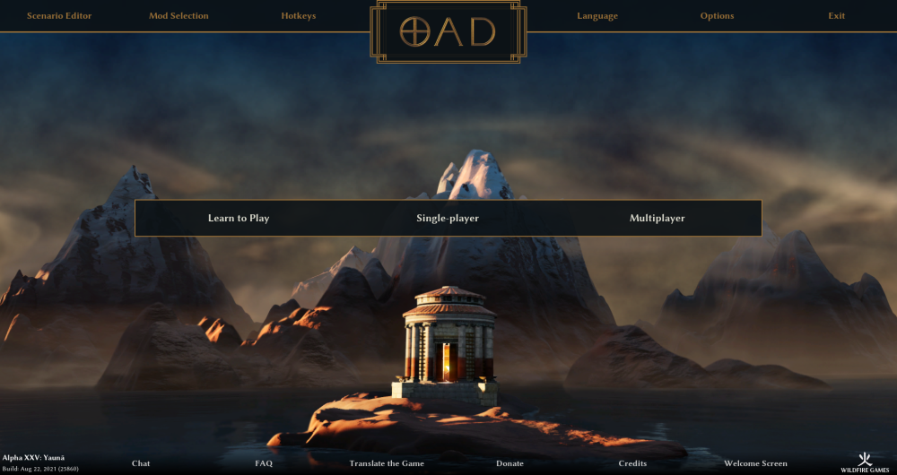
Thanks everybody for your opinions! Yes, the main points I'm still not satisfied with are the logo / logo background. This is now about the 30th draft I've made and there are always some minor issues (and different opinions from people ) should the logo be horizontally centered in / towards the middle of the top menu as seen in @Radiotraining's draft or should it be centered at the bottom line of the top menu ( current version)? How minimal / complicated should the logo background be? How big/ symmetrical / metal looking should the logo be? Anyways, I really appreciate when someone has the time to make a draft to show me how they would imagine/ like it, so thanks @Radiotraining @wowgetoffyourcellphone will considers that sure, if enough people like this I can make a patch. Otherwise I planned to put it on modio for a26 -

mod shiny - alternative main menu & UI theme
maroder replied to maroder's topic in Game Modification
yeah I put the dots there in a draft, but they just seem a little "off". I have to find a position and size that doesn't make them seem too small or the logo to imbalanced. And for the Empires Ascendant -> same, still searching for a nice place to put it -

mod shiny - alternative main menu & UI theme
maroder replied to maroder's topic in Game Modification
small update to 3.2. featuring a slight transparent main menu, experimental new logo design and other small fixes people mentioned. -

Attack-ground: include in A26 or not?
maroder replied to real_tabasco_sauce's topic in Gameplay Discussion
Well, the testing bundle that includes this is already out for testing, but has not generated any big reactions so far: -

lag investigation thread
maroder replied to maroder's topic in Game Development & Technical Discussion
After having thought about it a bit more: You're insights explain why ranged attack causes more lag then melee and why this is hard to improve, but even the melee attacking (and especially the unit death part) causes much lag. Do you think this could be a better area for improvements? -

lag investigation thread
maroder replied to maroder's topic in Game Development & Technical Discussion
might also be worth asking if @badosu has any knowledge or insight how the range queries/ attacking is handled over in BAR (and if it is also performance critical there) -

lag investigation thread
maroder replied to maroder's topic in Game Development & Technical Discussion
Thanks for the insights! That explains a lot. Sad. Cause as the videos show, at least on my system it feels like this is the main reason for the lag. you mean like in every fight situation in every game? I would say that's gold standard. -

0 AD's focus on balance has crippled its design
maroder replied to Thorfinn the Shallow Minded's topic in General Discussion
Mh yes, 100% accuracy before something is included is definitely a noble goal, but it also raises the bar extremely. If we applied the good old 80/20 rule that would mean most of the work to include new civs ist still to do, despite them looking nearly finished and them being fun and playable. Which, as we can see in the video is frustrating when looking at it from the outside (Ofc there are also other considerations) -
The question is what is the ratio of multiple people playing in one household vs people using smurf accounts. From what is written in this thread I'm lead to believe that one is much rarer. And I guess those people could be granted the right to do so (maybe they would have to prove that they can indeed play at the same time to further reduce the chance of it being smurfs). But manual approval of multiple accounts seems to me a better approach than just "allowing"/tolerating it by default.
-
So people seem to agree that smurfing is kinda dumb and makes it harder to balance team games, but that sometimes you just want a new account. So how about actually enforcing the "only one account rule" everyone accepted when joining the lobby, by deleting older account from the same IP/ machine? So every player would still be able to create new accounts, but would need to accept that every account before that (including the rating) is deleted.
-

0 AD's focus on balance has crippled its design
maroder replied to Thorfinn the Shallow Minded's topic in General Discussion
Have to agree I would vote to just include every civ from DE that is over 80 percent done. Then do balancing by grouping civs. -

0 AD's focus on balance has crippled its design
maroder replied to Thorfinn the Shallow Minded's topic in General Discussion
@LetswaveaBook I'm happy to hear that you are open to new ideas, but there are some forum members who (from what I know and experienced) have a very what I would call "conservative" view of what changes should be made and what not. There have been things said like "if you want to change something put it in a mod, but please leave the main game alone" or the very liberal use of the confused smiley on every new idea and proposal. Which are very legitimate opinions, so no hard feelings, but that's doesn't create the feeling that changes are welcome. -

0 AD's focus on balance has crippled its design
maroder replied to Thorfinn the Shallow Minded's topic in General Discussion
Lol. This is why we can't have nice things. -

0 AD's focus on balance has crippled its design
maroder replied to Thorfinn the Shallow Minded's topic in General Discussion
I feel like you missed something when reading the first post. How would that fix the point that the factions are just kind of bland and lack unique features? -

0 AD's focus on balance has crippled its design
maroder replied to Thorfinn the Shallow Minded's topic in General Discussion
Lol that's not true. There are so many things that are not getting in the game for the fear that people will find it "unbalanced" and start yelling. Every decision that touches the gameplay is looked on from the angle of "what do the multiplayer think". The problem is that most devs play the game not super competitively, but just casually, so no one I know of claims to be an expert for balancing. Which is why there is an extra balancing forum now. -

===[Feature Request]== AI resignation
maroder replied to Yekaterina's topic in Game Development & Technical Discussion
@JCWasmx86 is already working on improving the AI Endgame See: https://code.wildfiregames.com/D3998 -

mod shiny - alternative main menu & UI theme
maroder replied to maroder's topic in Game Modification
As @Freagarach hinted, that's less a concern of my mod and more of the main game I only use what is already there. And yes, I think I will bring back some transparency to the main/ center menu, but I don't like the idea of moving the buttons to the side again. For one, the are the most important buttons and positioning them roughly dead center means they are the first thing you notice when looking at the screen, which highlights their importance (contrary to the buttons positioned at the edges of the screen). Also, moving them to one side would destroy the symmetry I personally find aesthetically pleasing. But yes, the reason that I made a new background is 1) that I wanted to look at something different and 2) that the old backgrounds didn't work that well with the new menu design :p Maybe I can move some stuff around in the old backgrounds to make it look better tho. -

mod shiny - alternative main menu & UI theme
maroder replied to maroder's topic in Game Modification
Thanks. Good point, I only tested English for now. Will try to include that in the next iteration. -

mod shiny - alternative main menu & UI theme
maroder replied to maroder's topic in Game Modification
Thanks, I will try and report back. -

mod shiny - alternative main menu & UI theme
maroder replied to maroder's topic in Game Modification
Thanks! yeah It took a while I am working on new images, but it's a slow process. I would like to include more e.g. the ones from DE, but the licensing of the DE ones is a bit unclear to me.


