-
Posts
780 -
Joined
-
Last visited
-
Days Won
11
Everything posted by maroder
-

mod shiny - alternative main menu & UI theme
maroder replied to maroder's topic in Game Modification
ok thanks, now I get what you mean Yeah I did that deliberately, since the logo takes up too much space otherwise. But yes maybe I will increase the margin in the next iteration or decrease the logo size. mh yes, maybe I will revert back the the last round design or a rectangular one. I just have a hard time with the logo. It's at the same time round an also not centered due to the text. -

mod shiny - alternative main menu & UI theme
maroder replied to maroder's topic in Game Modification
sorry, still don't quite get what you mean. So you would want the logo smaller in comparison to the surrounding background? -

mod shiny - alternative main menu & UI theme
maroder replied to maroder's topic in Game Modification
not 100% sure what you mean. the golden outline? -

mod shiny - alternative main menu & UI theme
maroder replied to maroder's topic in Game Modification
-
Maybe its a misunderstanding about "a lot", but I would still say it it means more micro. Since you want to make sure that the specialized units only gathers the resources it it supposed to (best at), you have to manage more different units on different resources instead of just sending your soliders from e.g. wood to stone whenever you are missing on or the other. Or maybe I'm not 100% getting the concept. But yes, you got a point with the global effect of techs.
-
on this I agree
-
Introducing more specific units types may solve the problem, but it also introduces a lot more micro. That why I'm not a fan of this idea. I would like the tech approach more. Something like: Each armor/attack upgrade makes your cs better at fighting, but worse at gathering resources.
-
Sorry yes, here are the specific points : the roof textures (straw) look ok from far away, but when you zoom it they lack details. Something with more detail and or a normal texture would be nice. Generally I guess all textures would profit from some normal maps to give them a more realistic look. Also at the moment the buildings use two different kind of roof textures: the old iberian one (e.g. arsenal) and the new one. I guess it would be better if that would be consistent. I don't particularly like how the stone texture on the temple and wonder looks. A bit too stretched. The sauna and the corral use water objects that are just a blue color. Should probably use the player_water material like the wonder. The ground texture of the wonder is much too coarse. The ground texture of the castro should be a proper texture. Looks like that is only one color. _____________________________________________ And another thing I just noticed: The castro uses unique palisades. It should just use the palisades that are already in the game (iirc how its done for the building of the britons).
-
I also like the buildings, very nice work few remarks: I think the textures could be improved they look a bit to "unreal". Something is wrong in the mesh of the wonder -> gives an strange effect when looking at it from the top. I got the following error: ERROR: Failed to find matching prop point called "projectile" in model "art/meshes/structural/lusi_piedras_short.dae" for actor "structures/lusitanians/wall_tower_stones.xml255" Why is there a castro and a fortress? Is that not the same? If you compare the scale of the vases on the wonder and in front of a normal house, there is a big difference in size. I think it would look better if the size of the props would be more uniform. Also the size of the buildings compared to each other could maybe be improved. The female citizens don't seem to have anything indicating the player color. This may be confusing I guess. and also this "dependencies": ["0ad => 0.0.26"] should be "dependencies": ["0ad >= 0.0.26"]]. But overall, really nice work, keep it up!
-
looks really nice
-

Challenge to reach 100 pop in the shortest time
maroder replied to cl2488's topic in Gameplay Discussion
I think I would be much more interested to see an complete speedrun to win vs the AI. Settings would be: two teams: team 1: player vs team 2: (one or more) very hard balanced Petra settings: Mainland, normal size, whatever biome, whatever civ, standard starting res and pop cap, (no cheats obvs) -
while I like the idea and new funny mechanics in general, I have to agree. Better to keep this on a separate branch for now
-
thanks now we just need to decide on the type of field
-
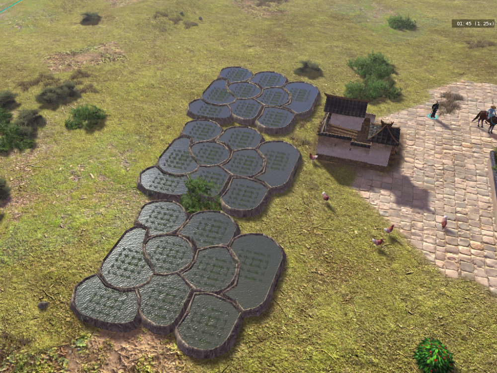
I would definitely prefer rice (mostly cause it is a nice to have something different than the usual fields) And afaik most people are not against rice per se, only the opinions on the correct depiction diverge. So imo, yes just make rice the default, so that at least people can try the mod without getting errors
-
@artoo I get the same errors something in the template is definitely wrong
-
mh, maybe @nani can give you some tips.
-
Iirc, there should just be the option to avoid these tileclasses e.g. avoidClass [clWater,3, clHill,4] (Without having looked at the code, so no guarantee)
-
I like the idea and the overall look, I just think the roads are a bit much
-
I don't want to sound too snobby, but considering how the water looks on the lowest settings that may be an improvement jokes aside yes that is a problem but none I can solve.
-
But many small rice paddys with only one worker is also an interesting idea
-
I agree that this ^ looks strange and I'm not sure which version of the fields that is, but the version that is in DE looks nice to me they could be a bit closer to the ground and the rice plants could be a bit more random but overall I like the look. Or as I already mentioned one of the drafts from this thread:
-
well doing the same work twice is wasting time I mean I will try, but that is an understatement of your work
-
Also: the field/ gathering animation for the soldiers is still missing
-
@m7600 are you already working on this? otherwise I could try to do something based based on these ones (If @Stan` has no time to continue that work)


