wowgetoffyourcellphone
-
Posts
11.198 -
Joined
-
Last visited
-
Days Won
573
Everything posted by wowgetoffyourcellphone
-
IMHO... hack damage is for melee, pierce for ranged, crush for siege. But I know Empires Ascendant enjoys using the scattershot approach.... so, why not... give it "crush" attack. lol
-
Looks good. Don't get too hung up on one animal.
-
About "clubmen", the game would benefit from an assortment of basic club actors.
-
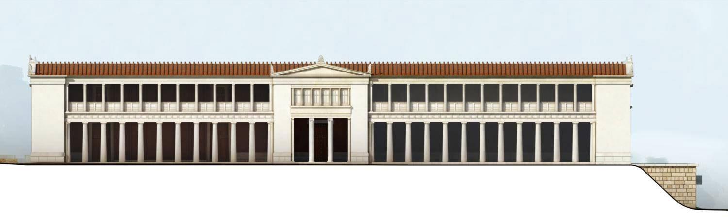
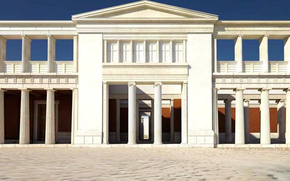
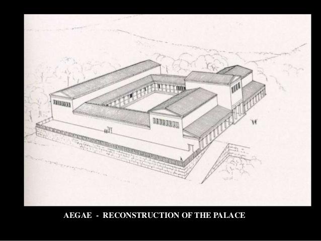
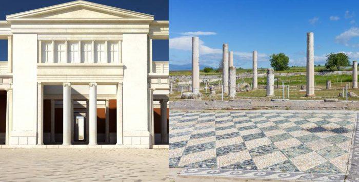
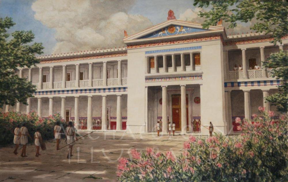
Indeed. The Royal Stoa has been problematic for a while, both for gameplay and historicity.
-
Let's discuss, shall we?
-
If only there was a mod that fixed this that could serve as a guidepost for change.
-
Ain't that the @#$%ing truth.
-
===[TASK]=== Hannibal
wowgetoffyourcellphone replied to wowgetoffyourcellphone's topic in Art Development
True, for the men. I was thinking it was a good reference more for the elephant actually. -
-
Crowd-Sourced Civ: Seleucids
wowgetoffyourcellphone replied to Mythos_Ruler's topic in Official tasks
I wish we had a spawning feature. We could do something interesting with the military colony concept (perhaps they spawn free settler infantry or something). -
Crowd-Sourced Civ: Seleucids
wowgetoffyourcellphone replied to Mythos_Ruler's topic in Official tasks
I'm not accusing you of saying anything. Maybe then, we call the citizen soldier pikeman something else. Phalangites Makedonoios, perhaps. -
Crowd-Sourced Civ: Seleucids
wowgetoffyourcellphone replied to Mythos_Ruler's topic in Official tasks
Okay, so from a gameplay standpoint it would be problematic to have 2 pike champions and no citizen soldier pikeman. Thoughts? -
Crowd-Sourced Civ: Seleucids
wowgetoffyourcellphone replied to Mythos_Ruler's topic in Official tasks
So, this indicates the Silver Shields should be the standard pikeman, while the Bronze shields (more prestigious) should be the champion? -
Crowd-Sourced Civ: Seleucids
wowgetoffyourcellphone replied to Mythos_Ruler's topic in Official tasks
Mild misinterpretation^ 20,000 "Macedonians" = 10,000 Golden Shields 5,000 Bronze Shields 5,000 Silver Shields -
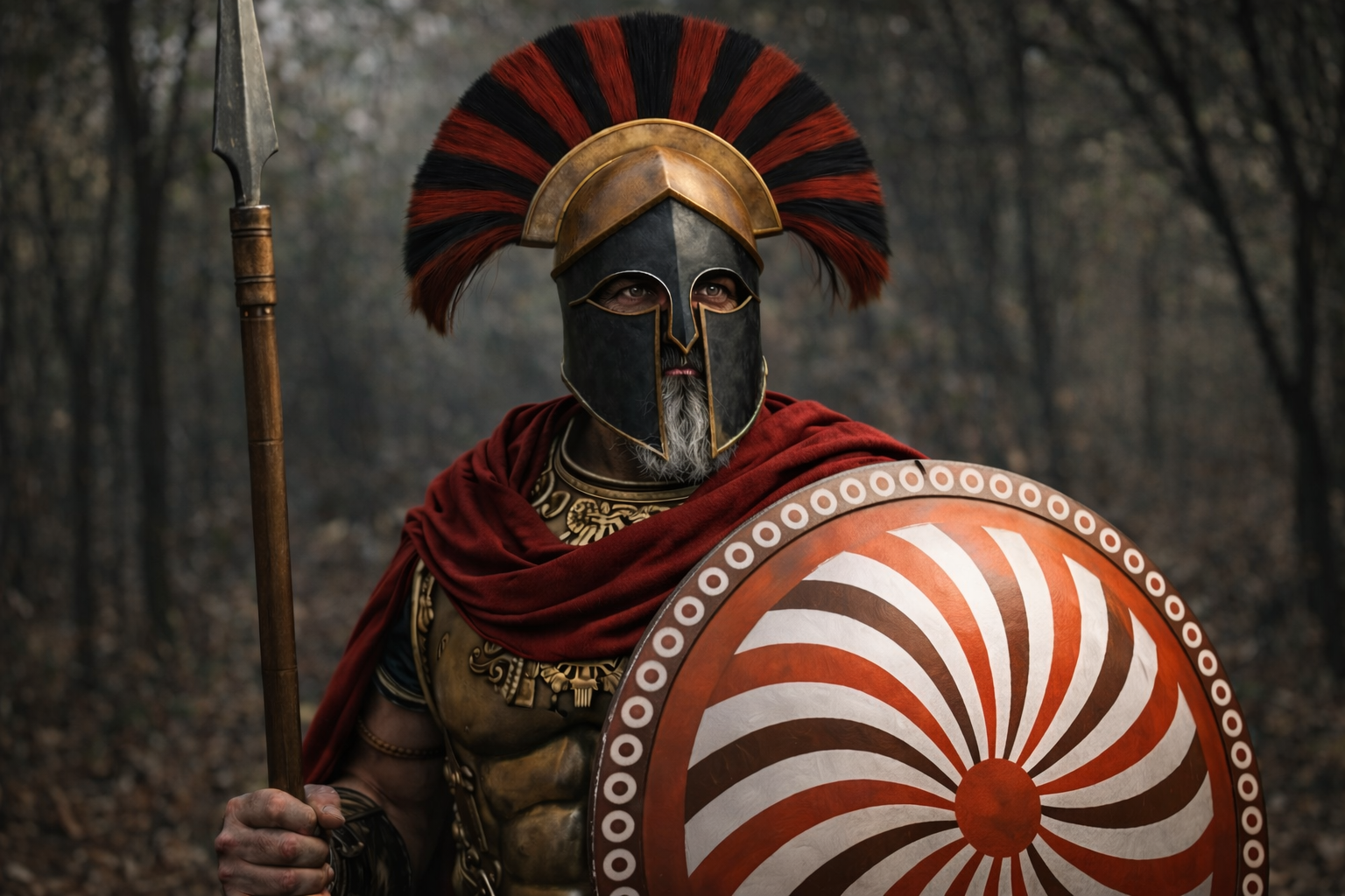
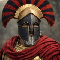
Was thinking the Carthaginian hero Hannibal could use a makeover. Maybe something like this: Any thoughts?
-
Crowd-Sourced Civ: Seleucids
wowgetoffyourcellphone replied to Mythos_Ruler's topic in Official tasks
"Argyraspides" indicates "Silver Shield." One might wonder why these guys don't have silver shields. There's no indication what this corps of men was actually called, so something more descriptive like "Romanized Swordsman," is just as good as anything else. -
I don't think it should change vision at all. And good luck finding a better technology name.
-
===[COMMITTED]=== Aspis Remake
wowgetoffyourcellphone replied to Alexandermb's topic in Completed Art Tasks
I meant that particular gorgon design is from pottery if I'm not mistaken. -
===[COMMITTED]=== Macedonian wonder
wowgetoffyourcellphone replied to Tomcelmare's topic in Completed Art Tasks

-
===[COMMITTED]=== Macedonian wonder
wowgetoffyourcellphone replied to Tomcelmare's topic in Completed Art Tasks
Ironically enough, the modeler for the Hanging Gardens was working on replacing it with the Gate of All Nations. lol @Enrique -
===[TASK]=== Gaul Wonder
wowgetoffyourcellphone replied to AgamemnonPhlemnon's topic in Official tasks
I adjust the settings on a per program basis. The NVIDIA control panel has this option. Make sure you are adjusting the right program. -
===[TASK]=== Gaul Wonder
wowgetoffyourcellphone replied to AgamemnonPhlemnon's topic in Official tasks
Nice. We have the same generation, yours just slightly better. It's obviously my graphics card settings then. I have AA and AF turned on. -
===[TASK]=== Gaul Wonder
wowgetoffyourcellphone replied to AgamemnonPhlemnon's topic in Official tasks
Perhaps my graphics card is extra better than yours. -
===[COMMITTED]=== Macedonian wonder
wowgetoffyourcellphone replied to Tomcelmare's topic in Completed Art Tasks
Thing is, you don't learn anything about the Gauls by building Stonehenge. -
===[TASK]=== Gaul Wonder
wowgetoffyourcellphone replied to AgamemnonPhlemnon's topic in Official tasks
user.cfg system_info.txt