Stan`
-
Posts
18.555 -
Joined
-
Last visited
-
Days Won
606
Everything posted by Stan`
-
Man, you should really write a blog about this. I'd read the shirt out of it.
-
Sometimes all you need is a little magic and a few orange fireflies...

-
@wowgetoffyourcellphone there you go gaul_cult_statue.zip
-
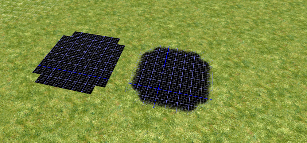
Could make this for my dwarven mod.
-
@wowgetoffyourcellphone I pushed some fixes in a pull request. If you merge it you'll be able to start fixing the other stuff. The gui will be back. Can you create an Art Dev Task Thread for DE ? I noticed a few things could be improved easily, and that would give some stuff to do when I don't have much time. Why didn't you use my modified version of @Basshunter's gaul statue with props and whatnot for instance ?
-
I don't think that is possible sadly. What you could do is sync you anims properly though @Alexandermb might have some more insight... A sound system overhaul is long due...
-
Thanks! Keep up the great work.
-
Inside is better.
-
Do you need me to do anything ?
-

Blender AddOns, Materials & Tutorials.
Stan` replied to Alexandermb's topic in Tutorials, references and art help
Since clouds use particles maybe a side render would work. Blender 2.81 is out! https://mobile.twitter.com/BlenderNation/status/1197750312578273280 -
What about modio ?
-
Can't wait to see my dwarves fight the undead.
-
I need a rifle like this for my dwarf mod! Also with @Freagarach patch units will soon be able to go mining in buildings
-
@Angen provided a fix for the capes, I'll try to review it soon @Alexandermb https://code.wildfiregames.com/D2434 https://code.wildfiregames.com/D2435
-
Adding new factions to the game
Stan` replied to wowgetoffyourcellphone's topic in Game Development & Technical Discussion
Well I maintain that mod, so no it's not forgotten But I see your point, and I am considering it. -
Adding new factions to the game
Stan` replied to wowgetoffyourcellphone's topic in Game Development & Technical Discussion
@Murder_on_the_danceflor You realise they are already in that mod (Delenda Est) ? -
The Kingdom of Kush: A proper introduction [Illustrated]
Stan` replied to Sundiata's topic in General Discussion
Kudos -
You can send corrected pictures. In theory you should be able to add them as attachments to the page and then load them using Trac markdown.
-
The Kingdom of Kush: A proper introduction [Illustrated]
Stan` replied to Sundiata's topic in General Discussion
@Sundiata Have you tried to contact these people to showcase this thread? Perhaps it would be good for us to be actually visible to the academic world?- 1.044 replies
-
- 1
-

-
- civ profile
- history
- (and 5 more)
-
@Alexandermb Can you fix the Carnyx, I can take care of the capes extra props if you'd like. Can you see if you can fix
-
Help with arc patch
Stan` replied to crazy_Baboon's topic in Game Development & Technical Discussion
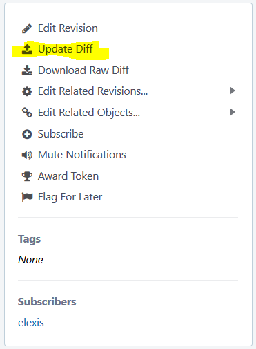
@crazy_Baboon If it's really too complex (that's alright) you can also go through the manual route. To create new diffs, in https://code.wildfiregames.com/differential/ in the top right corner: To update a diff, on the diff page click on update diff, and to download one click on download raw diff.
-
How do I Help Out With The Development Of The Game?
Stan` replied to Octofish77's topic in Announcements / News
You mean for features ? -
Unfortunately you can't you need to find a programmer to review my patch so you can do that...
-
If that helps why not As long as you keep the pages in sync
-
How do I Help Out With The Development Of The Game?
Stan` replied to Octofish77's topic in Announcements / News
EDIT: It was stupid Left+Click on the left and right click on the right