Leaderboard
Popular Content
Showing content with the highest reputation on 2021-02-08 in all areas
-
3 points
-
2 points
-
2 points
-
1 point
-
Science, Logic, Decisiveness and Hard Work, I should say. All of which this is. Going from witchcraft to optics is the science part.1 point
-
WOW! Let's do it! Think of Elon Musk. How does he beat all his competitors to a pulp? Decisiveness.1 point
-
yes, that's correct for palisades/walls/fields. I ll double check the replay, that should not happen and can't see reason from the code. I couldn't reproduce it, but maybe I am missing some variable to get this result. I was saying that if you order units to walk and fight (attack move) they will not capture by default when they find target on the way. Edit: we found something, that may be cause of the issue1 point
-
The bonus was changed. The main change is that rotation takes time - this makes unit movement less fluid. The unitMotion rewrite has changed things on the surface but I doubt it'd be very noticeable. Then formations-by-default has changed movement further, but that IMO increases fluidity. The primary objective was to make 'dancing' much, much harder (which we've succeeded at).1 point
-
It has an AO texture. See https://trac.wildfiregames.com/browser/ps/trunk/binaries/data/mods/public/art/actors/structures/ptolemies/civic_centre.xml The material xml tag + “aoTex” tells you it does. If you want to see whether it does in Blender rather than in the game look whether a mesh has too UV sets (that's usually it) Just in case it could make it easier for you, I wrote a blender plugin to import actors directly it doesn't import AO maps yet but I suppose it could. Most people play without AO specular and normal maps and parallax normal maps of for performance reasons. (Using the shader quality slider in the options)1 point
-
Right, although some models should probably be tweaked, overall I think it's a shadow rendering issue rather than a mesh problem.1 point
-
Very true. I can't sleep, so I'll tackle it right now. Probably just a matter of moving the edge on the UV map. By the way, I just notice the same shadow flickering problem on the terraces of guard towers. The strange thing is that it changes as you rotate around the tower. Going back to thinking this is algorithmic.1 point
-
From a gameplay perspective, the A23 method is far superior, even if it looks "unrealistic." The A24 way also looks unrealistic but has the addition of negatively affecting gameplay.1 point
-
Boudica yesterday in the Lobby to me: "Hi, long time no CC!" Not only a way to say hello, but also a subtle way to roast me, reminding me of the matches where he destroyed my Civic Center, which I had to rebuild then...1 point
-
1 point
-
To be fair, the boxshields can be equipped to the thureos skirmisher and spearman (both basic rank, maybe advanced), and the basic Macedonian settler cavalry (actor is still the same as the Thessalian or Seleucid Companion cavalry lancers). That way, the xyston is out, consistent with the advanced and elite (mercenary) cavalry spearman.1 point
-
1 point
-
1 point
-
We have a name ! As many of you guessed, with no Hans for A24, Xšayaṛša was the pick. It is a transliteration of the original Old Persian name for Xerxes, with Xerxes I featuring in 0 A.D. I've locked the topic, please wait with eager anticipation for the A25 name suggestion thread, and it's going to be a doozy because Y is not a common letter Thanks all for your suggestions!1 point
-
1 point
-
1 point
-
1 point
-
1 point
-
1 point
-
1 point
-
1 point
-
1 point
-
1 point
-
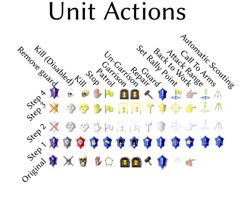
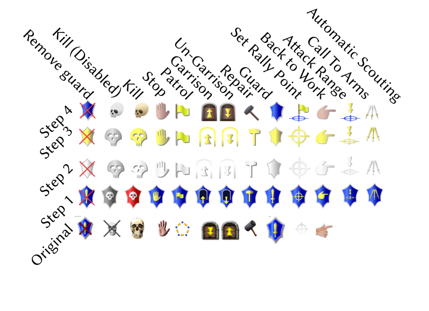
I have to say that the icons look a lot better in the way you have streamlined them. The primary point I would criticise would be the shape of the shield; obviously you were working off of the previous iteration, and I understand your desire to be conservative about the changes, but the shape seems to be ported right out of a fantasy setting. I think that the game might be better served with a simpler shape such as a legionary's scutum. Otherwise, great work.1 point
-
1 point



.thumb.jpg.b85f1db9873287a0d10cd2c7e88579c0.jpg)

