Search the Community
Showing results for tags 'gui'.
-
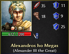
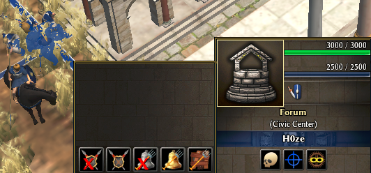
I'm happy to announce that I've been porting all features of boonGUI and proGUI into a new UI bundle for A27! Doing it made me realize once again how much work has been put into the development of 0AD but also to all those who contributed to the components of this bundle. So thank you! GitLab link: https://gitlab.com/4trik/ModernGUI DirectDownload link: https://gitlab.com/4trik/ModernGUI/-/archive/master/ModernGUI-master.zip In this mod: New exclusive features, like kill counts, flare message and more! (the skulls near unit icons indicate for Player unit kills and Gaia entities kills) Explore tones of extra options in your settings to customize your GUI! Hope you'll try it out and enjoy! Please report any bugs and feel free to suggest improvements.
- 56 replies
-
- 12
-

-

-
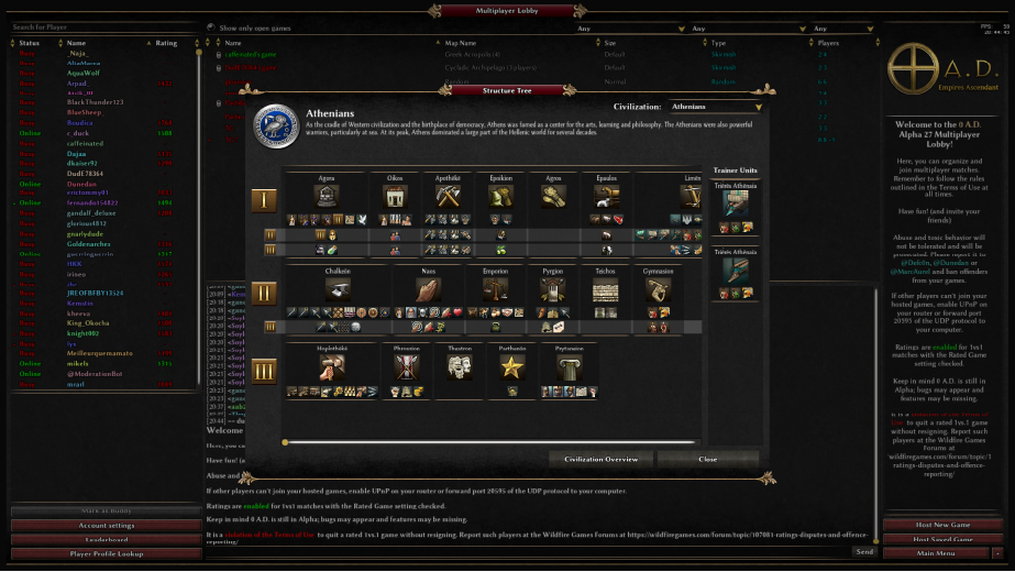
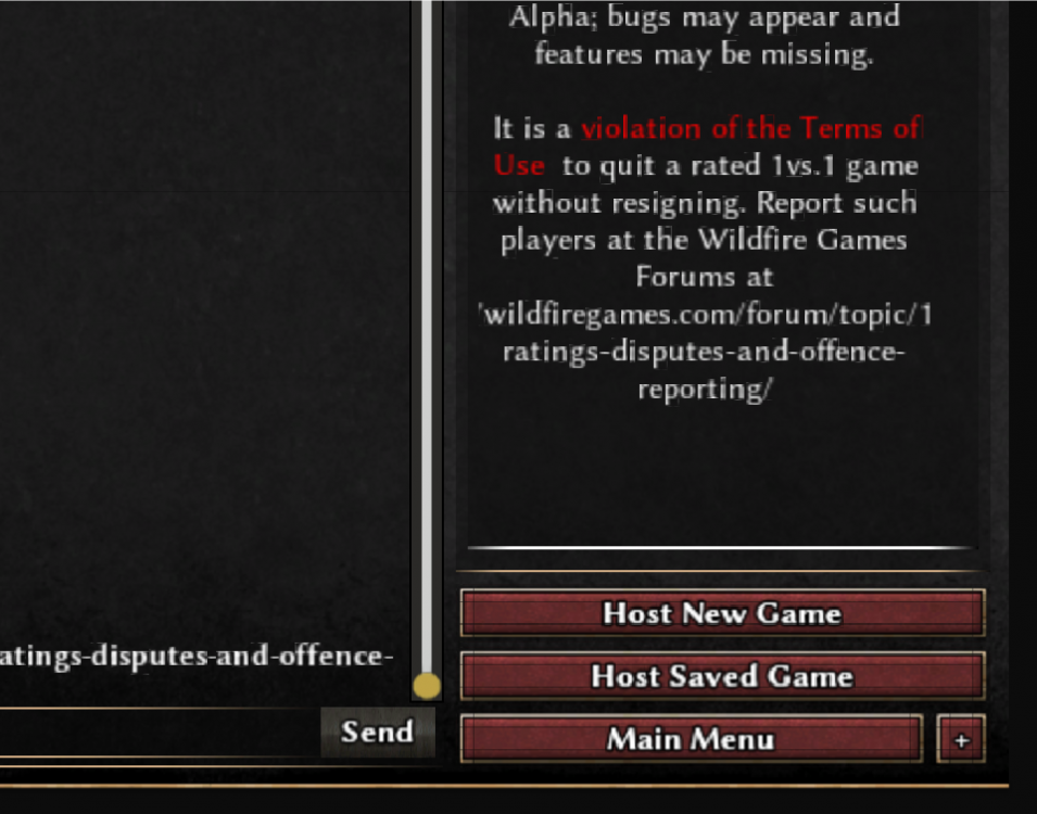
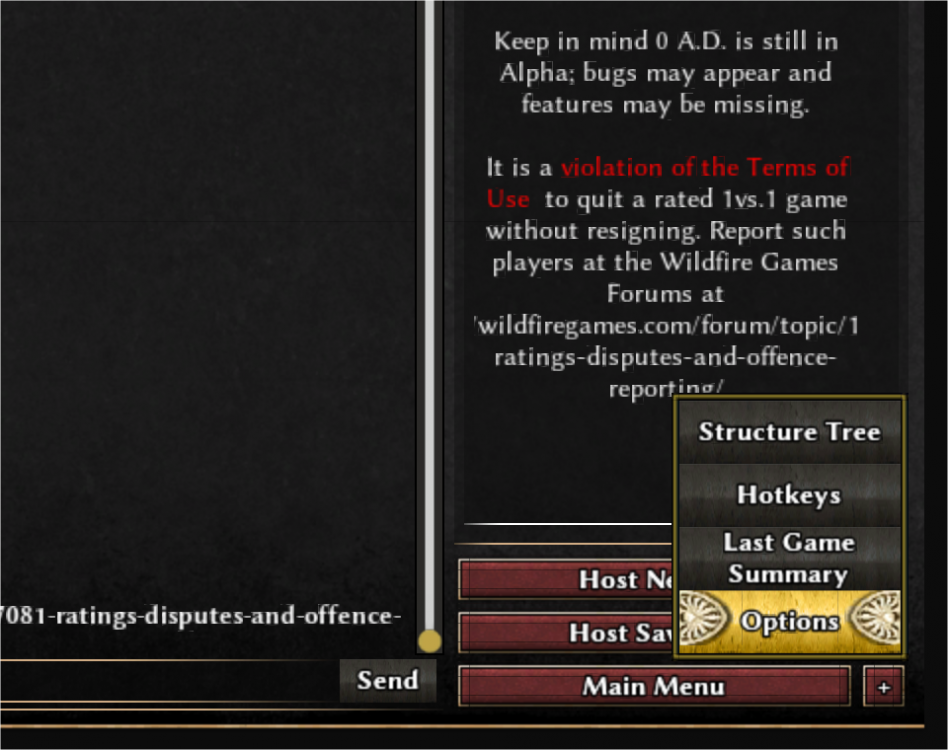
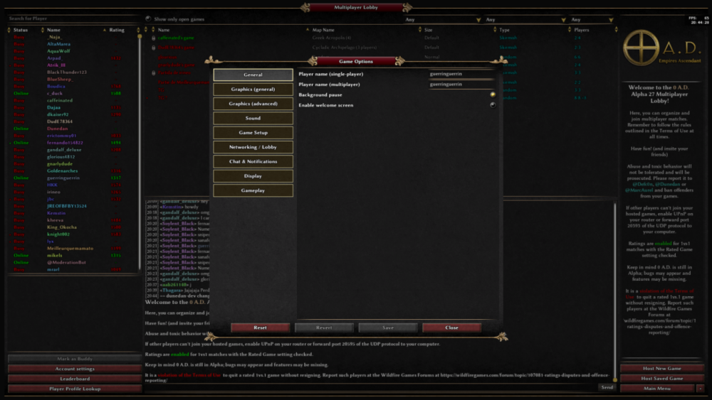
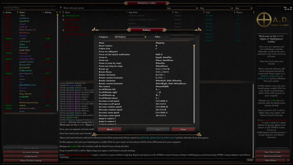
The purpose of this mod is to allow access to options, hotkeys, or the last game summary directly from the lobby without having to exit to the main screen of the game. It’s especially useful if you want to adjust some settings while waiting in a host’s gamesetup without losing your spot. Other, more robust mods like ModernGUI or boonGUI offer the same functionality, but this option is suitable for those who prefer to keep things simple and like the original lobby interface. Version 0.2 compatible with R28 To install it, unzip LobbyMenu.zipcopypaste your mod's folder. (see GameDataPaths for mor info) Or drag LobbyMenu.pyromod into pyogenesis.exe (0ad's executable file, shortcut works too) If you have any suggestions or If you find any bugs, please contact me and I’ll fix them ASAP. Note: The small black lines visible on the buttons are not caused by the mod. On my 4K monitor, the GUI appears very small, so I had to scale it to 200% in the settings, which causes those small black lines to appear. Here are some screenshots:
-
.thumb.png.ce58cea22940c255f5b0a735d5abee36.png)
==[Task]== Tiny icons set (simple)
Lion.Kanzen posted a topic in Eyecandy, custom projects and misc.
based in Wraiitis mod for the GUI I will make some icons and here a work in icons for patches. if you have a request let me know.- 79 replies
-
- lion.kanzen
- gui
-
(and 3 more)
Tagged with:
-
Why ? What is there to say: I like to look at something different once in a while. Installation note: No guarantee that it will be compatible to any other mod, but if you want to try it, it's probably best to enable this one last (after) everything else. Current version: 0.27.3 (testing/ A27 / SVN) | 0.26.3 (A26) Where to find it: For A27/ SVN: newest testing version https://api.mod.io/v1/games/5/mods/1965214/files/3658747/download (needs manual installation) For A26: It is available through the in-game mod downloader or manually from: https://mod.io/g/0ad/m/shiny Some features: In case you don't like the new backgrounds: There is now the option to enable or disable it and switch between the new and the old backgrounds. Just go to the options and click on "Disable new background" _________________________________________________________ Credits to: @Langbart who gave me the idea and with whom I discussed much about the initial design/ who generally helped, @wowgetoffyourcellphone @Stan` @Radiotraining for tips on the design and a general thanks to everybody who gave their opinions and suggestions in this thread.
- 187 replies
-
- 23
-

-

-
Is there any mods playing around with the quick group feature? I'm having hard time finding what files make it work/displayed. If you feel like you have any tip to get me started, it can help! I will try to make a variant of it duplicated on right, to help with building controls. How could I go about it? --Off-- I love tactics and town-building strategies! I'm trying modding enhanced unit controls for tactical moves on GUI. Maybe an overlay for managing building productions could be fun, even if it means less screen space.
-
Dear all, thrilled by the new Alpha 0.26 - great job folks! Though - a little user interface inconvenience: 1 - when selecting a new mod from mod.io via the 0AD mods download menu, it is not possible to see simultaneously which mods version is already installed and which mod version is available for download (I know this is a luxury issue and the new nodal window cannot be moved, unfortunately, unless there is major redesign of the user interface mechanics). I you move the overlapping modal window borders a little bit, the existing mod versions could be seen and compared to those aversions available for download. 2 - sometimes new mods versions are not replacing older ones but are added as new mods. Wouldn't it be nice to have a button allowing to remove (delete) the installed instance of an existing mod? (kind of a clean-up process) ( I do know you could manually remove them from the directories but uI would prefer doing that from within the game) Thanks for your consideration! Best regards, Grautvornix
-
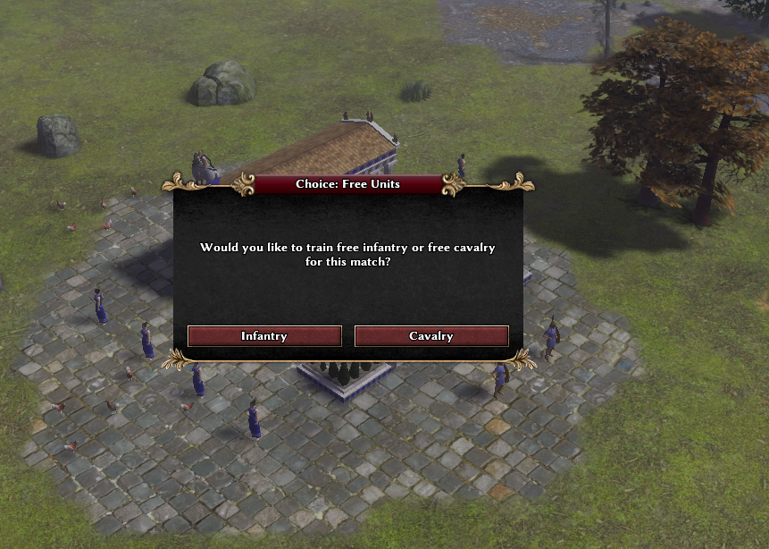
Github repo: https://github.com/Mare-Nostrum-0AD/popup_choices Zipfile: popup_choices.1.zip Hey everyone! Here's a new feature I've been planning to create for a while. It allows Scenario designers to include "popup choice" menus in their trigger scripts. These popup choice menus can have up to three buttons, with each button (optionally) triggering a function when it is clicked. This allows you to create scenarios with storylines and more interesting scripted events, and also to display information to the player during gameplay (i.e. a "Historical Background" blurb at the beginning of the scenario). The instructions for how to use this are contained in the README.md of the github repo and zipfile I linked to above. I included an example script at maps/scenarios/demo_popup_choices_triggers.js. To try out the scenario, go to the Scenario selection menu, filter by Demo maps, and look for DEMO: Popup Choices. You'll have to know at least a little JavaScript to use this feature, of course. I know a lot of you here aren't coders, so I'll try to build a "template" scenario script and a library of functions for simple use cases to make this as accessible as possible to everyone. I'm also willing to help people build their scenarios, as long as it's just a small or medium sized project. I'm also including this feature in my other mod, Mare Nostrum, from now on. I hope y'all can make some interesting scenarios with this!
-
Can we make it possible to dictate where techs can go in the UI? It would be very helpful (and logical) to be able to place techs beneath the units that they primarily affect. For instance, Rank Promotion techs and "Tradition" techs ("Archery Tradition", "Hoplite Tradition" etc.) can go directly beneath the unit. Example: It could go in the building's template in the productionqueue/technologies component, perhaps productionque/technologies/row. <ProductionQueue> <BatchTimeModifier>0.8</BatchTimeModifier> <Entities datatype="tokens"> units/{civ}/infantry_javelineer_b units/{civ}/infantry_slinger_b units/{civ}/infantry_archer_b units/{civ}/infantry_crossbowman_b </Entities> <Technologies> <Row2 datatype="tokens"> upgrade_rank_advanced_infantry_jav upgrade_rank_elite_infantry_jav upgrade_rank_advanced_infantry_slinger upgrade_rank_elite_infantry_slinger upgrade_rank_advanced_infantry_archer upgrade_rank_elite_infantry_archer </Row2> <Row3 datatype="tokens"> <br/> <br/> special_archery_tradition </Row3> <Row4 datatype="tokens"> training_levy_infantry_ranged </Row4> </Technologies> </ProductionQueue>
- 7 replies
-
- 3
-

-
- javascript
- xml
-
(and 1 more)
Tagged with:
-
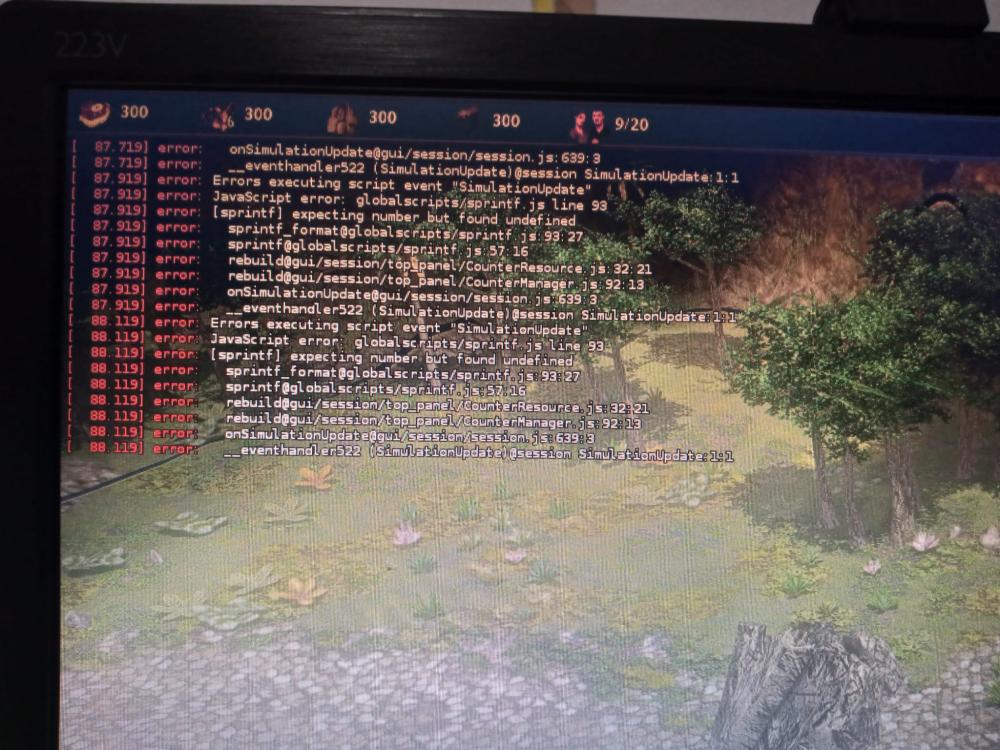
First game of Alpha XXIV, rev 24932 I order to chop some wood at the beggining of the match, it shows this errors. The GUI have problems to update on resources and population, when training units, etc...
-
I know this may be controversial, but I think the current SpecificName scheme adds a minor amount of confusion, or at least a better scheme may add some more clarity where currently there is little. So, for example: <GenericName>Gallic Champion</GenericName> <SpecificName>Soliduros</SpecificName> This is actually a Swordsman, along with whatever that means to the game, but you don't know that from the name of the unit. What I would suggest is something like this: <GenericName>Champion Swordsman</GenericName> <SpecificName>Gallic Champion</SpecificName> <EthnicName>Soliduros</EthnicName> In the UI, it would show: Gallic Champion (Champion Swordsman) Likewise: Spartiate Hoplite (Champion Spearman) This now gives you a much better idea what "kind" of unit it is. The <EthnicName> "Spartiátēs" and "Soldurios" would show up elsewhere, likely in the Information viewer. Extended, we could give the player the option of what they want to see in the UI and tooltips.
-
- 1
-

-
- javascript
- xml
-
(and 3 more)
Tagged with:
-
In the 0 A.D. code there are some unit parameters that control the time that passes between two consecutive attacks of a unit. There is a technology that reduces this value by 20%. That means there is 20% less time between attacks, which means 25% higher attack speed (1/0.8=1.25). How should we cover this and similar scenarios in user-visible tooltips? −20% attack repeat time −20% attack time −20% time between attacks +25% attack speed [something else] For background, see the change proposal that triggered this topic. CC: @elexis @Freagarach @Nescio @otero @Palaxin @fatherbushido @mimo @Itms
-
Currently 0 A.D.'s tooltips display both the armour level x (the internal value defined in templates and modified by technologies and auras) and the effective armour percentage (1-0.9^x). The question is whether maintaining the current situation is desirable: one could argue that the purpose of tooltips is to convey information at a glance, and the more data are displayed, the less visible each number becomes, so perhaps a simpler format for the armour values makes sense, hence this poll. [EDIT]: Also, in which order do you prefer the health, attack, and armour tooltips to be displayed? If you have opinions or suggestions for other options, please post here. Related: https://code.wildfiregames.com/D2247
-
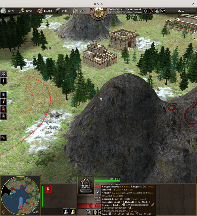
As you can see the numbers under “Resource Trickle:” are quite ugly; they ought to be 0.59, −0.34, and −0.31. Is there a way to hide those trailing zeroes and nines? Also, the line-break ought to occur before the minus, not after.
-
I need create new background but with renders instead that photo, but need be similar. and as inspiration of Aoe I.
-
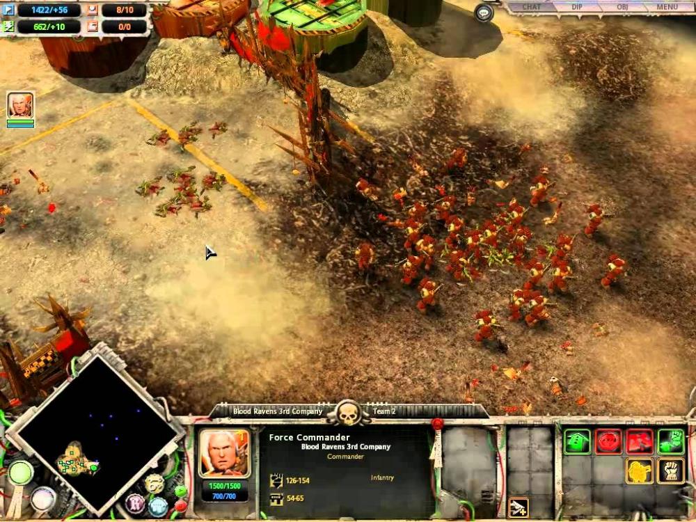
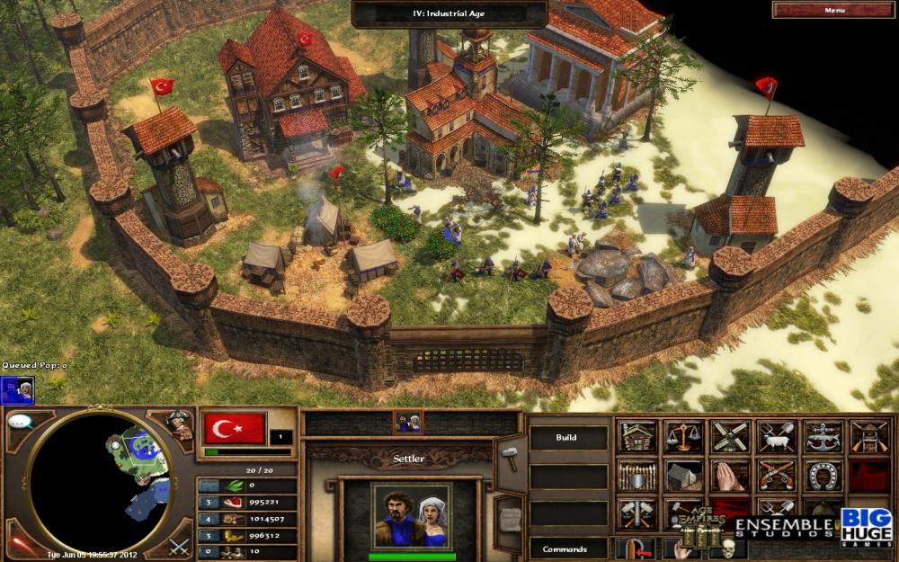
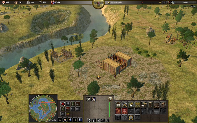
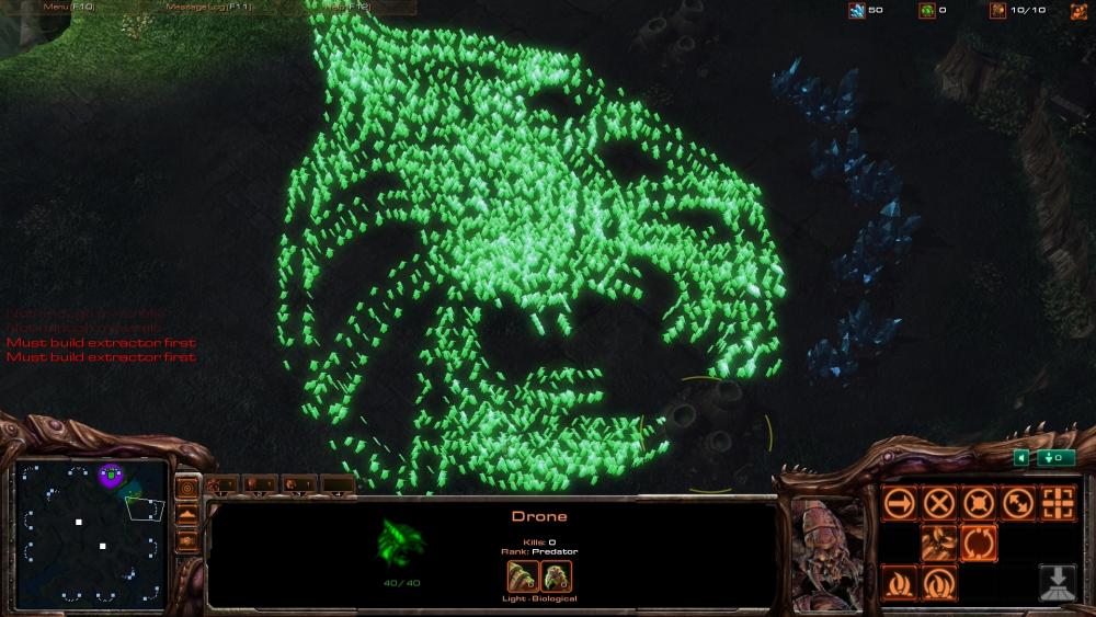
Hey guys, I bring some screenshots of other games to show different approaches of GUIs ·Dawn of War 1 ·Age of Empires III ·Starcraft II ·0 ad That are a little bit old RTS (haven't take a look into new ones like Grey Goo Right know the GUI doesn't fill all the screen. (Just pointing). I would suggest to move all buildings into a submenu like Starcraft or Age of Empires 1/2, and then, move all the actions that under the unit/s icon in the center, to the right panel. I Just feel the GUI a little bit crowded. What do you thing?
-
As artist I found a issue in the messages and GUI with some player color. some player color are dark so the contrast with the own outline is bad. example Dark red, blue, and Dark Gray aren't work/contrasting with Black outline, but work with Yellow(the actual yellow is a light color). and even its worse when are over the default stone black texture

