Search the Community
Showing results for tags 'ui'.
Found 8 results
-
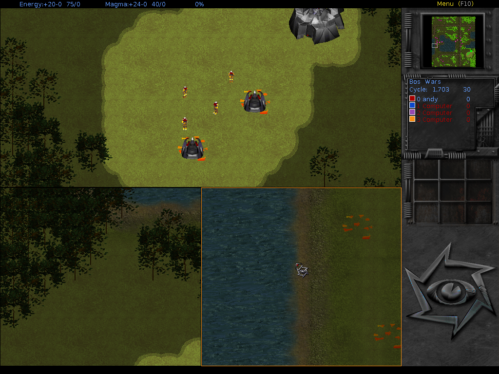
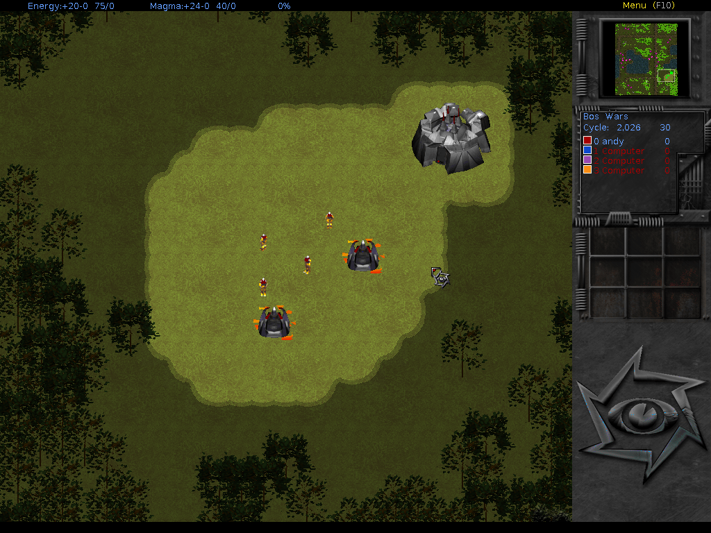
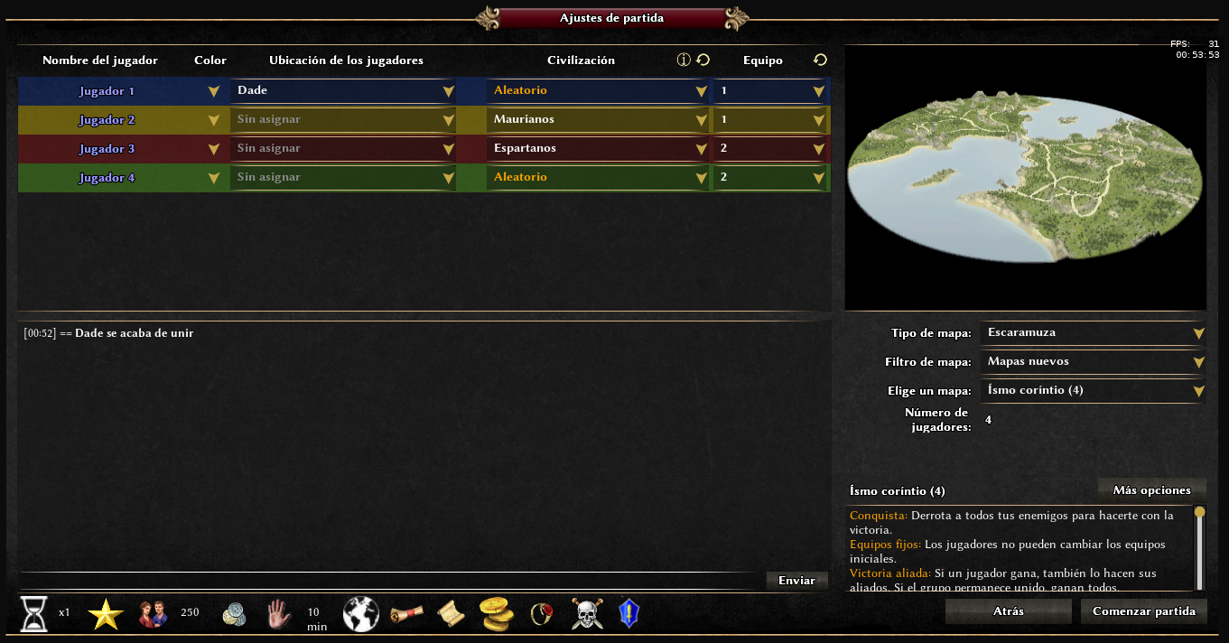
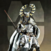
Bos Wars has a feature for enabling multiple viewports. You can select a viewport and scroll through it (The first screenshot is with no viewports). Does 0ad have anything like that and do you think it would be a good feature to implement?

-
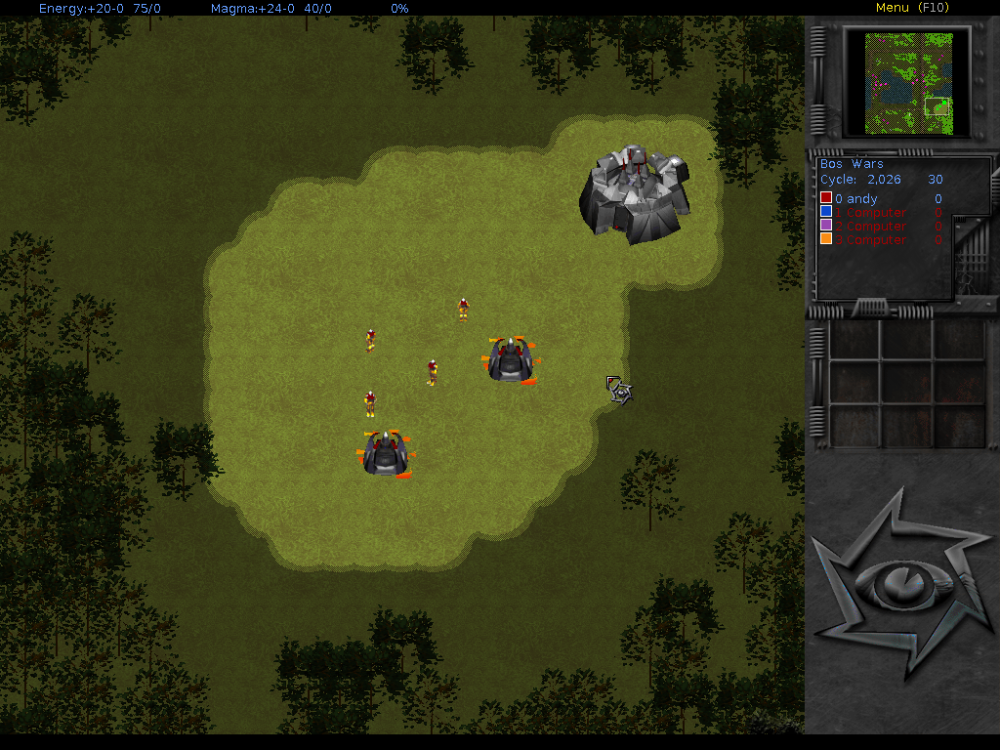
First game of Alpha XXIV, rev 24932 I order to chop some wood at the beggining of the match, it shows this errors. The GUI have problems to update on resources and population, when training units, etc...
-
I know this may be controversial, but I think the current SpecificName scheme adds a minor amount of confusion, or at least a better scheme may add some more clarity where currently there is little. So, for example: <GenericName>Gallic Champion</GenericName> <SpecificName>Soliduros</SpecificName> This is actually a Swordsman, along with whatever that means to the game, but you don't know that from the name of the unit. What I would suggest is something like this: <GenericName>Champion Swordsman</GenericName> <SpecificName>Gallic Champion</SpecificName> <EthnicName>Soliduros</EthnicName> In the UI, it would show: Gallic Champion (Champion Swordsman) Likewise: Spartiate Hoplite (Champion Spearman) This now gives you a much better idea what "kind" of unit it is. The <EthnicName> "Spartiátēs" and "Soldurios" would show up elsewhere, likely in the Information viewer. Extended, we could give the player the option of what they want to see in the UI and tooltips.
-
- 1
-

-
- javascript
- xml
- (and 3 more)
-
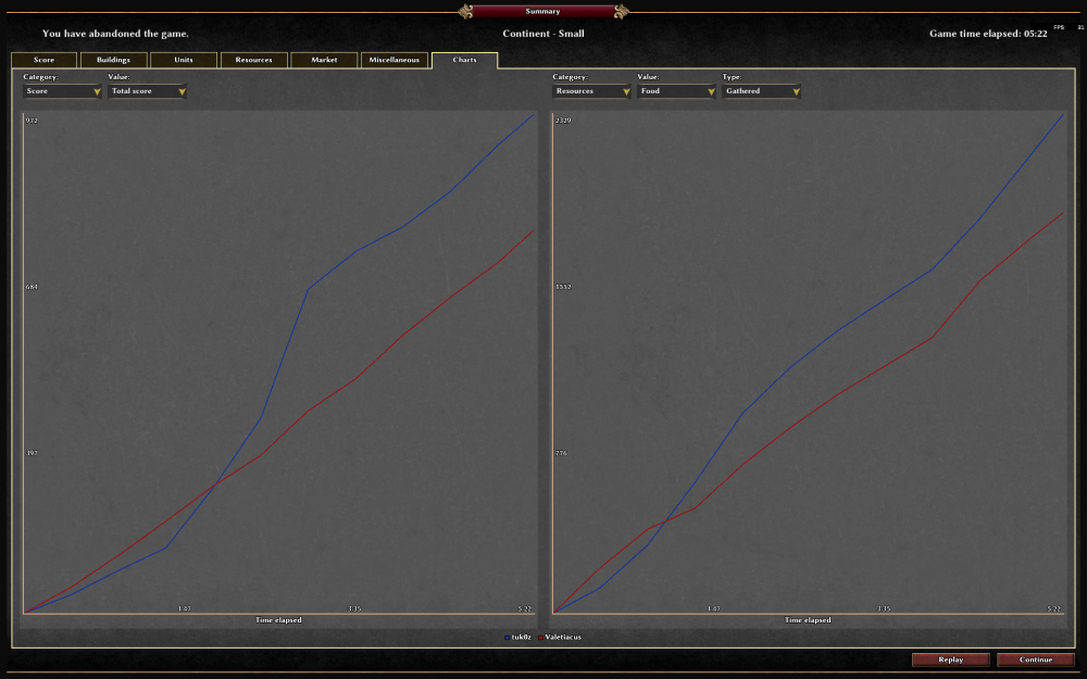
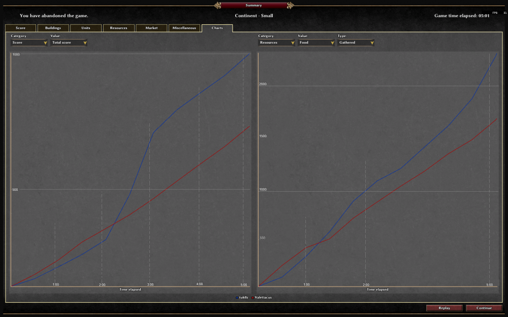
Happy New Year and sleep tonight all Haven't found a related thread in two search result pages so maybe everyone else is happy with the graphs' layout as of a23: /me (wish, dream) there was a way to compare between both players and games, that would be visually easier as well as more relieable than trying to compare between always changing numbers without a single visual helper. Even by only adding a few visual marks e.g. (watch out, /me really not the best at graphics he he): Here one could, for example, see until when he scored less than opponent X, how much he gathered at 1'00 or at 5'00, and so on in a second.
-
Hi, I see that some mods have added/changed some screens for the UI of the game (for example fgod mod). Is it possible to add, via modding, a new screen? Let's say it would be accessible from the currently disabled button "campaign" in the main menu > Single Player. Then, this screen could have an image where some parts are clickable and lead to a scenario game? (More or less like the campaign screen in AoE2.) If these things are possible, then it seems that campaigns are mostly implementable already as mods, or am I missing something? I am asking because I have seen that the trigger mechanics seem quite powerful already, so maybe I would try to experiment on that. Thanks!
-
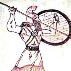
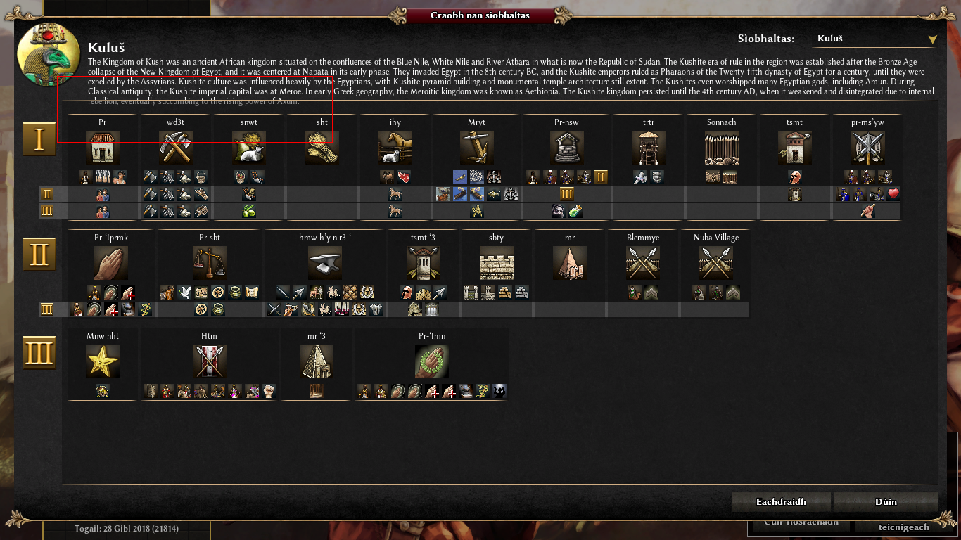
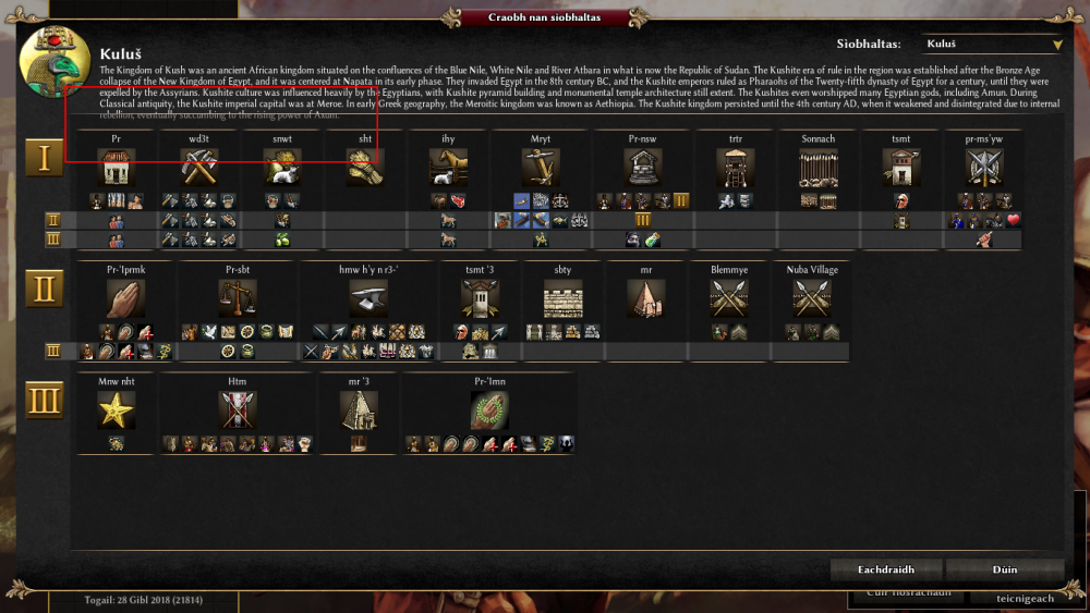
I am getting some text/image overflow in the civilization help. My screen resolution is 1366 x 768. The text overflow happens only with Kush, because the text is the longest. Keep in mind that the text will be even longer with translations. Also, the units don't fit for all civilizations - see Persians in the screenshot. Maybe we could have a bottom scrollbar here?

-
Hi all, having the opportunity to play A22 after so much time really delighted me and by all means I wish to try help the project form my little knowledge. So here I am! It's something I have been thinking a lot on other releases but my extreme laziness prevent me to try out (well I have to confess I played on A20 trying to make an alternative ingame UI, but I lost those files ). CONCEPT I always felt the "More Options" button was ok to admin the room, but the info inside it should be much more visible to all players without the need of any "More Options" button. Why not bring that information directly to players in the room? This is my proposal to achieve it. The icons used in this early patch/mod are from within the game, but my idea is to use more specific icons if they idea fits. Last but not least, this is just a proof-of-concept, I see still a lot of margin to improve this. Enough background! Lets get to the options. BOTTOM MORE OPTIONS ICONS This was my first attempt to achieve my objectives. The bottom side of the game room has plenty of space to accommodate some icons, so why not there? I reviewed some of the documentation, started to play on my own et voilá there we have some new graphics on game room bringing some life and personality. Items are organized as they appear on the "More Options" window, but I'd prefer to place the ones with text earlier and then the rest. MIDDLE MORE OPTIONS ICONS You know that sensations when you finish a job thinking you could have done better? That brought me to this second option, giving much more relevance to the game information and providing a much clearer separation from players list and chat window. IMO this is a much better implementation, as we also save time from finding another place for certain buttons tooltips (on a side note, some are hardly visible already when using "More Options" window). ICONS CONCEPT Even with this messy icons being used right now, the concept is much simpler: Icons accompanied by strings should be colored by default as those are active options on the game Boolean options icons should have two version: colored (enabled) and grey (disabled). Victory Condition and Initial Resources icons could change depending of the option selected. BONUS TRACK Think that was all?!?!? Right side of the Games Room could receive a fresh rework: "More Options" button can be moved (or even removed, using the icons as option toggles for room admins) to bottom or inline with icons. Text from within the right-bottom corner could be used as tooltips (Bootstrap like) over the icons. Having more space in this section we can add some extra folklore with a nice looking ancient-papyrus-style description of the map which is going to be played. Questions? Suggestions? Gallows and torches from the horizon? Thanks for your time reading this!


-
In this topic I want to discuss the altering of the existing UI, that is not only the UI in-game but the menu's too. As the current UI is being altered I suggest starting with backgrounds. I already saw some good ideas for the main menu background (Lion, Rodmar, where did you post these land maps? I couldn't find them quickly) In which we could alter the right text box to our logo. (Romulus, could you continue your work on the logo, please? I've got no idea on what's happening with NoMolester and Arishia)