-
Posts
300 -
Joined
-
Last visited
-
Days Won
16
Everything posted by nifa
-
Roman buildings --village phase reference---
nifa replied to Lion.Kanzen's topic in Tutorials, references and art help
Maybe this could be something for the Republican Romans in DE to differ from the Imperial Romans? @wowgetoffyourcellphone -

Civ: Germans (Cimbri, Suebians, Goths)
nifa replied to wowgetoffyourcellphone's topic in Delenda Est
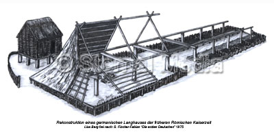
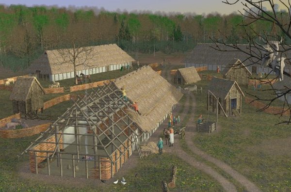
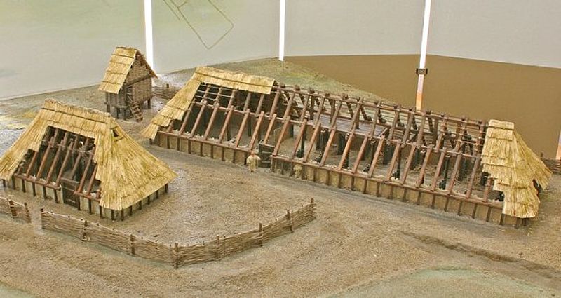
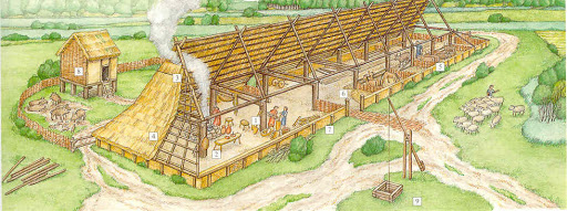
Wie_die_Germanen_gewohnt_haben_(CC_BY-SA_4.0).webm The farm houses in lower saxony are still very similar until today: https://en.wikipedia.org/wiki/Low_German_house Long story short, historically corrals didn't exist, they lived together with their animals. I didn't find this kind of living in any other culture, except maybe the vikings (who are also considered to be germans in the broadly sense). I think the Gauls didn't have these? Maybe someone has a better insight in other cultures? It could somehow distinguish the gauls from the germanic tribes, otherwise they'd be too similar -

Civ: Germans (Cimbri, Suebians, Goths)
nifa replied to wowgetoffyourcellphone's topic in Delenda Est
The Longhouse/byre-dwelling (https://en.wikipedia.org/wiki/Byre-dwelling) is something unique to the germanic tribes. Other cultures didn't have animals and people literally under one roof. Maybe it could be available in the city phase. And for the village phase there could be the chicken coop. So you would start with the coop and chickens in village phase, and then build the longhouse in city phase (or town phase) to produce cows, pigs etc and get an extra population bonus. btw. what's the "great hall" building above? I don't get it Also a nice idea! the coop could also be a feature in the farm building, only visual -

Civ: Germans (Cimbri, Suebians, Goths)
nifa replied to wowgetoffyourcellphone's topic in Delenda Est
https://commons.wikimedia.org/wiki/Category:Arch%C3%A4ologisches_Freilichtmuseum_Funkenburg?uselang=de some pictures from an open air museum (seems more like a storage than a coop) -

Civ: Germans (Cimbri, Suebians, Goths)
nifa replied to wowgetoffyourcellphone's topic in Delenda Est
There is also a chicken coop in Opfermoor Vogtei, on stilts and with wicker instead of a wall -

Civ: Germans (Cimbri, Suebians, Goths)
nifa replied to wowgetoffyourcellphone's topic in Delenda Est
those buildings look really nice! germanic longhouses had the entrance on the side and were split into two halfes with people living on the one side and animals on the other. They were long and big in size and with the roof nearly until the ground. I think this could be a nice special building (like the appartment buildings of the romans or carthagians), with a bigger population bonus and animal corral combined. Also I noticed the chicken coop/ henhouse on stilts (like in the background on those pictures). Would be a nice addition too. It would give individuality to the germanics but I understand if it breaks the balance/ scale.. -

[POLL] Corpse Removal Option
nifa replied to Stan`'s topic in Game Development & Technical Discussion
or only show the helmets? Less gpu intensive, less violent, easy to count.. Or maybe other props like sword/shield? I just don't know what to do with the units without those things -
could be useful to prevent misclicks
-
Saturday it's 10 years that you joined the forum, enjoy your well deserved rest
-

A "psychic" shader mod; development begins...
nifa replied to DanW58's topic in Applications and Contributions
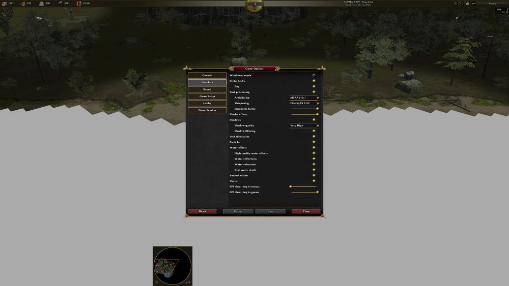
Thank you for your fast reply, the water is back:) but there now is quite a different between with and without GLSL, is that how it should be? Yes, I think so too, especially in combination with high quality shadows -

A "psychic" shader mod; development begins...
nifa replied to DanW58's topic in Applications and Contributions
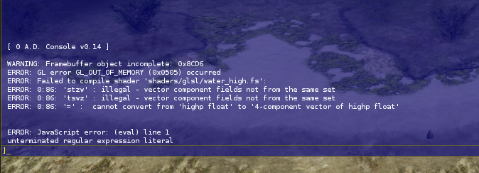
Nice, just found out that it's working with my other graphic card, but not with the onboard graphic, idk if that's helpful but then I get this with my the other with my external gpu: -

A "psychic" shader mod; development begins...
nifa replied to DanW58's topic in Applications and Contributions
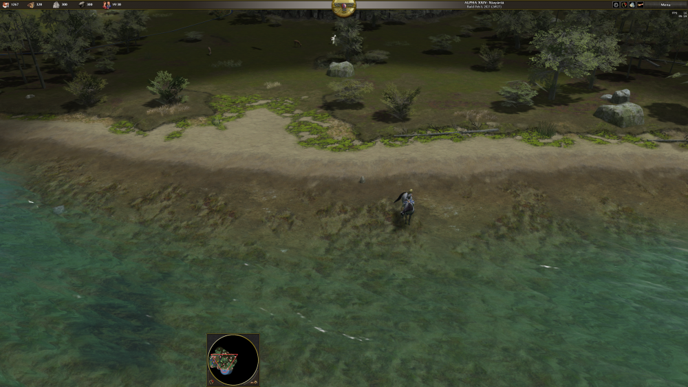
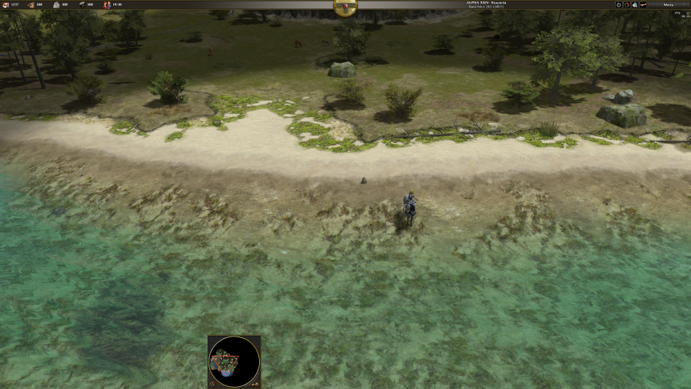
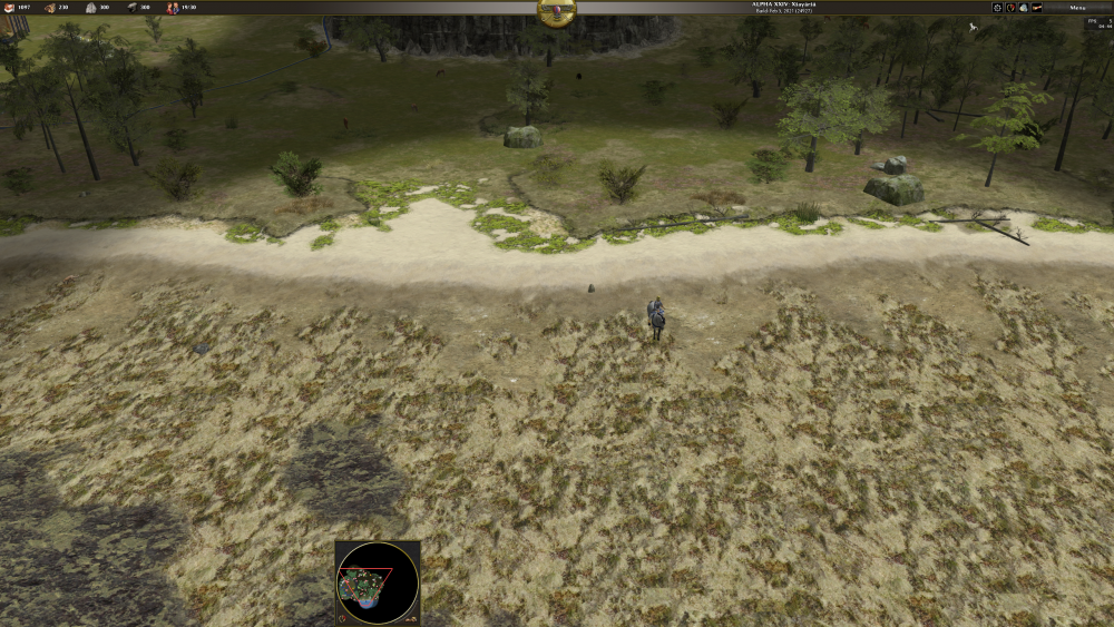
I get this error on the map "oceanside": This is with GLSL disabled: Did I do something wrong? Apart from that, thanks, everything else is looking really nice:) -
I think "unknown" should be a new diplomatic status. Not only hide the civ, also make all other interactions impossible, like no tribute, no spies, maybe hide their borders etc..
-
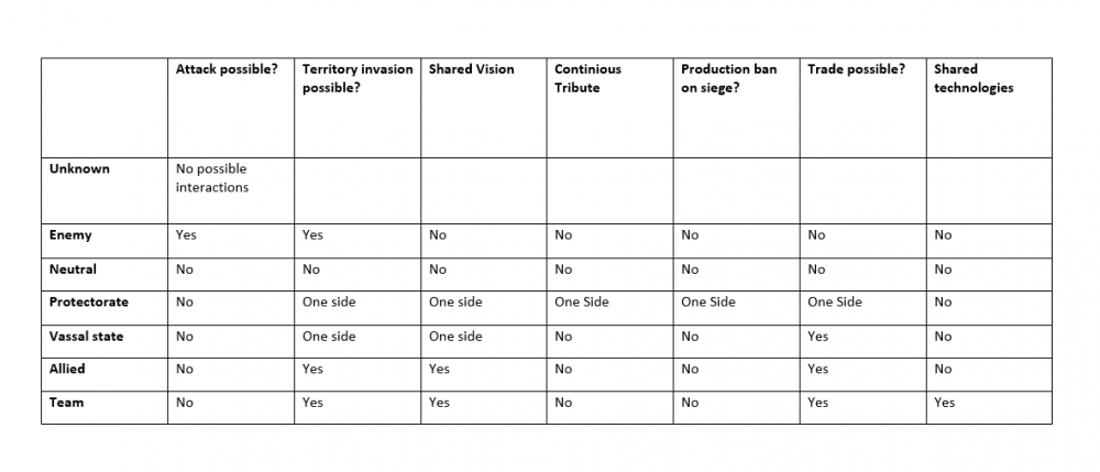
I had some ideas, it's not a complete suggestion but maybe i can get the discussion running:) Right now there are only 3 kind of diplomatic relations, which are Neutral, Enemy and Ally. I think it might be nice to add "unknown", as I've seen people many people requesting here on the forum. Further, right now all three diplomatic relations are balanced. Adding uneven relations, like Vassal state / Hegemonic state could add some dynamics to the gameplay. The idea is, that when you have heavily damaged an opponent, you can make him your vassal and focus on other opponents, while still being able to have some control over him. On the other hand the vassal has the opportunity to come back to power in later game. As far as i see in alpha 24 there are three variables to be controlled, which are whether attack is possible, shared vision and shared dropsites. More possible variables could be: Territory invasion: Make it unpossible to move units into another players territory (unless support units). This could also prevent some sneaky moves Continious tribute: Paying a percentage of all gathered resources (not at once, but like out of 10 wood gathered 1 goes to the hegemonic power) Production ban on siege: Make it impossible to produce rams, catapults etc In the end this could look like this: This is only a basic idea, other ideas are welcome:) Allied and team might be one too much, out of Protectorate and vassal state one might be enough too. Historical correctness might be improved. So far all relations only have effects between the two parties, maybe an effect on the relation with others is desired, like abolishing trade with a third party and so on
-
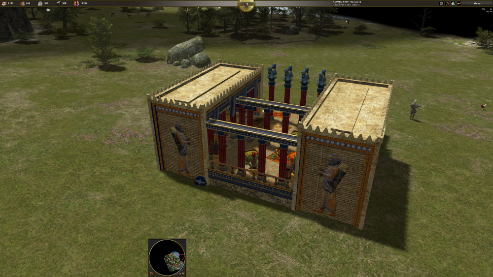
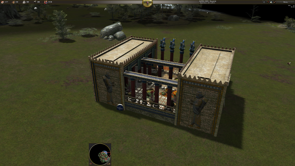
nice work I think the windmill, the forge and the saw mill are my favourites. I wonder why the fortress towers have glass doors to the outside, that seems a little unpractical
-
I agree with Sundiata also I don't see why it should make an opinion more important how good you are in playing or what rank you have
-
Hi and welcome
-
Something different I noticed (sorry ): Rams are able to attack ships, is that how it should be?
-
That's definitly better, Speerkämpfer sounds like a melee unit, while Speerwerfer (literally Spearthrower) makes it clear that it's a ranged unit
-
Thanks for the answers and sorry for triggering Anyway, since we are off-topic now: actually, correct me if I'm wrong, many fortifications (at least in Europe) started with only moats, earth walls or palisades, which later were replaced by stone walls. And in cases of palisades, the towers were not build directly in the palisades, but behind it. So technically I think (kind-of) standalone towers might still be historically accurate at least in some cases. But behind stone walls it looks odd, that's true Regarding the ranges, I understand both sides, I think it's ok for now. Emphasizing scouting sounds good. If there is one perfect building order applicable for all occasions then something is wrong. That would make it boring. That basically all buildings are abstractions is kinda true. I doubt that cultures without a professional army even had barracks. I think the less developed cultures didn't have a clear distinction between living, working and military. Germanics (and celtic?) tribes e.g. had byre-dwelling longhouses where people and animals lived together, so that would be corral + house, and I think there are many more examples like these
-
Thanks! Yes, I think it would look nice. I like this approach to "force" the players not to build randomly but also to make it look good. I'm looking forward to your mod in a24
-
I noticed that there are 13 practice ranges (the structure) in atlas, but it seems that I can't build any of them ingame, so I was wondering why they have been left out?
-
di lo que esta escrito ahí
-


