-
Posts
324 -
Joined
-
Last visited
-
Days Won
18
Everything posted by nifa
-
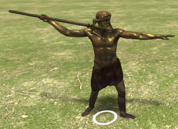
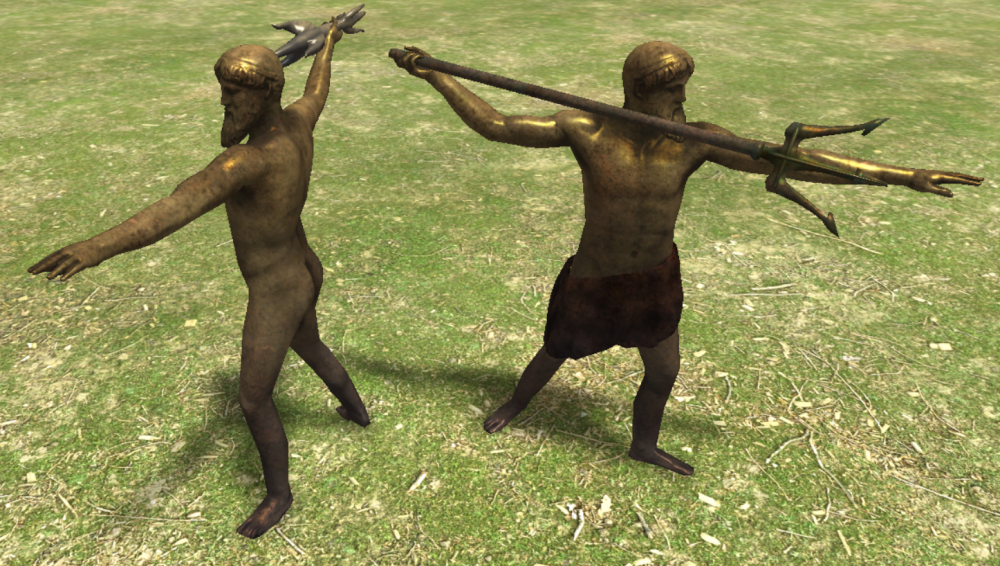
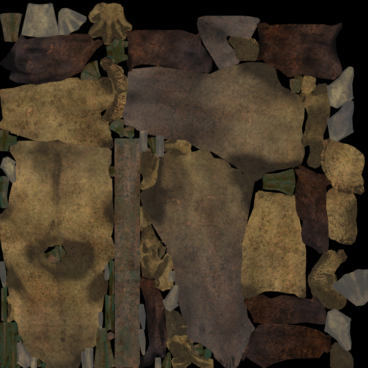
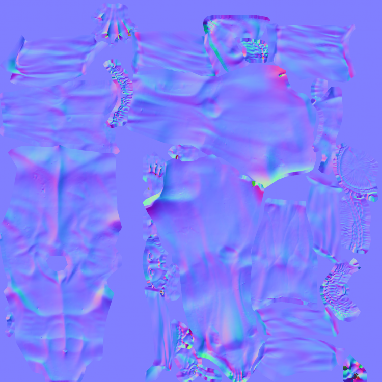
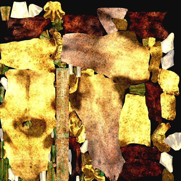
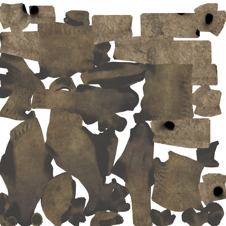
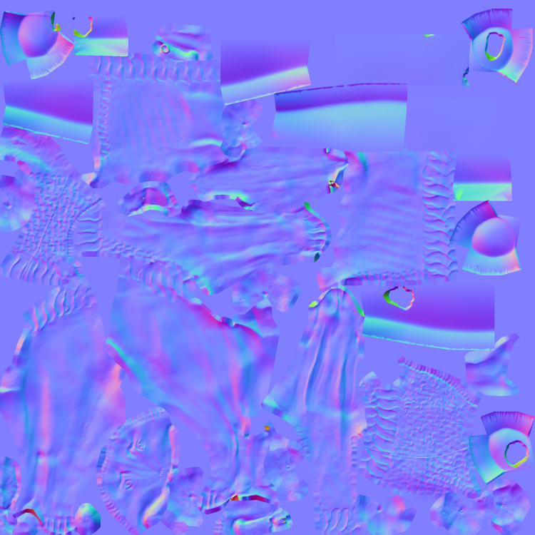
looks better with more contrast on the uv map again. Is that the right position for the trident? I will see what I can do about the wrinkles statue_poseidon.dae
-
Artemision Bronze https://en.wikipedia.org/wiki/Artemision_Bronze https://sketchfab.com/3d-models/zeus-or-poseidon-from-the-artemision-d4876aa609304682945145debedfc77e https://open.smk.dk/en/artwork/iiif/KAS2100?q=Poseidon eller Zeus fra Artemision&page=0&filters=has_3d_file%3Atrue That statue showed either zeus or poseidon depending on the weapon in the hand, so I just made both. It was kind of difficult to find a representation for how the ancient greek imagined a thunderbolt, but I certainly didn't want some harry-potter-kind zigzag thunderbolt. I made two separate meshes, but we could also add the weapon as a prop if that's better. Both models can use the cover prop. I'm not sure about the colours though. I added eyeballs, so when we have the final colours I'd like to add this (with gimp?): @wowgetoffyourcellphone maybe you could have a look and tweak it a little? Also I just used a brightened diffuse as spec map for now, but I could bake something if needed. poseidon_cover.dae statue_poseidon.dae
-
Hi @Kiselena, welcome to the forums! Sure it might need some patience but it's definately possible to contribute, especially since you already have some knowledge. You're free to take on any task you like. Just need to know what your interest are in terms of history, like what civilizations you like and what field of 3D modelling you are familiar with. Since you're from Kazakhstan, if you're interested in central asian civs, maybe these are for you: https://wildfiregames.com/forum/topic/22832-faction-nomads-xiongnu/#comment-337459 https://wildfiregames.com/forum/topic/20550-civ-scythians/#comment-314106 https://wildfiregames.com/forum/topic/108392-art-needed-remaining-nomadic-structures/#comment-557439 I've only worked with blender, don't know about maya. Most of the time the process is building a basic mesh, UV unwrapping, texturing, maybe with gimp e.g. I don't have that much experience with the last especially. In case of organic assets (statues, sculptures, animals etc) I had to do some highpoly building, sculpting, LP Retopology, Normal Map Baking, Procedural Materials and Diffuse Baking. How familiar are you with these? I could try to find a task that fits you then. No worries, I had zero experience when I started not that long time ago
-
Thanks, really nice! Yep sure, looks better now. Podium would look good too. When you scale the second mesh down for a smaller structure prop, you might try out the decimate modifier, it might be possible to reduce the polycount a bit without having too bad visual effects.
-
They are at my drive, i used 2048^2. I think they were scaled down to a different max size when I uploaded them.
-
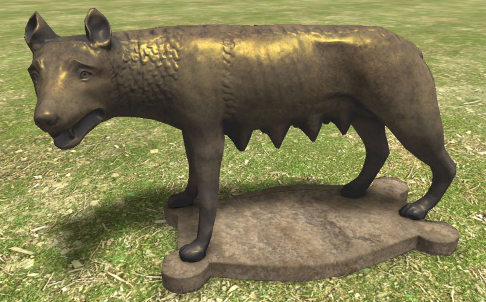
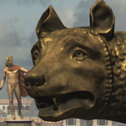
Capitoline Wolf https://en.wikipedia.org/wiki/Capitoline_Wolf https://open.smk.dk/en/artwork/image/KAS837?q=*&filters=has_3d_file%3Atrue&page=7 Ready to be committed I guess? @wowgetoffyourcellphone capitoline_wolf.dae
-
sure, I'll see what I can do
-
okay, but how is it in the screenshot? I didn't find it in DE either. Is there at least some kind of high poly mesh i could take a look at?
-
Where could I find the statue of Athena Parthenos in the game? Is it what Sebastian Gomez started here?
-
Civ: Germans (Cimbri, Suebians, Goths)
nifa replied to wowgetoffyourcellphone's topic in Delenda Est
I'd really like to help but I've some other projects I'd want to finish first and unfortunately don't have much time at the moment, but I will keep it in mind for later -
nice, maybe @Ultimate Aurelian @Genava55 have some ideas?
-
Make i two sentences. <ColoredPlayerName>'s Hero <HeroName> has fallen. He crossed River Styx to meet Hades.
-
Unfortunately it will take more time but it's not forgotten:)
-
Maybe civ specific with a reference to their mythology? e.g. greek: <ColoredPlayerName>'s Hero <HeroName> has crossed River Styx to meet Hades. e.g. britons The valkyries led <ColoredPlayerName>'s Hero <HeroName> to valhalla. Neither is english my mother tongue nor am I a historian but I hope you get the Idea:)
-
haha, I should be aware of this Sure, I will do that as soon as possible. This week I'm quite busy though, maybe towards the weekend.
-
I am the copyright holder of original works I post in the Wildfire Games 0 A.D. Art Development forum. I hereby release all original works I uploaded to this forum in the past, and those I will upload in the future, under the Creative Commons Attribution-Share Alike 3.0 Unported license.
-
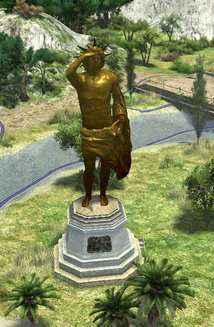
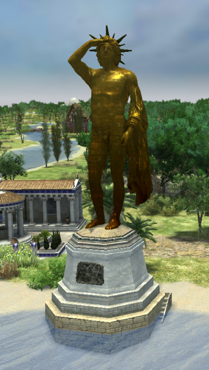
wow nice, makes a huge difference, good catch @Stan` ! thanks a lot the idea was that I needed to add details that distinguish it from a small statue that was just scaled up. It would look out of place then. That's also why I added the door and the stairs (and wanted to add the fence at first), so that the viewer can get an impression of the scale in comparison, and how huge that thing was. I let the banding fade out to the top so it doesn't disturb the face. For the pedestal you can go for whatever you think fits. Just shouldn't get too busy though, so that it drags attention from the statue itself. I read something about Rhodes blue marble somewhere, not sure though (edit: somewhere in here: https://www.athensjournals.gr/humanities/2019-6-4-1-Kebric.pdf) Somewhere in the thread there was also the idea of having it collapse, like it did during an earthquake Would be fun as an easter egg. I could try to make a "death" animation, don't know if it's easy to implement though. Capture the wonder would be cool, maybe not so different from capture the relics, hopefully easy to implement? I might finish the pantheon later when I find the time
-
thanks sure, that's what the cloth prop is there for
-
statue was the hardest part, so I'm glad you like it. Feel free to remap, you can also use another texture if you find one that fits nicely
-
I found my motivation to pick it up again and now I think it's ready for commit. I made two versions, one naked and one covered. The pedestal uses a karthago texture. Could someone experienced commit it if you think it's good enough? @wowgetoffyourcellphone @Stan` I added a mod for everyone to test. colossus.zip
-
Great work! That's exactly how I imagined it, thanks for your effort:) It looks really nice. cherry on top would be the possibility to use the keyboard for navigation:D
-
I would prefer to open the next page alphabetically, like they are shown when going one step up to the category. So e.g. if you'd like to find a specific animal out of the 50 animals in the game, you could just pick the first one (African Elephant starting with "A") and then just turn page by page through all of the fifty animals until you finish at Zebu (Z). Makes it easier than going back and forth fifty times. Icon could be something like these, in ancient style of course: turn page backwards: turn page forward: the same but mirrored. If the design is made to resemble a papyrus roll I know turning pages is kind of strange though
-
great work! Not necessary but a another nice feature would be buttons to "turn pages", so you can read it like a book. E.g. after reading about the first Athenian hero I would like to go straight to the second one on the next page instead of going one level up to the category above and down again.
-
Thanks! yes I will definately add some green for grass or moss, maybe small stones etc. Just want to make sure the UV layout is final before I do the colours. Btw., would it be useful to have summer/winter/autumn/spring textures? Is the game using it appropiatly? Having a green mound in winter might seem odd.
-
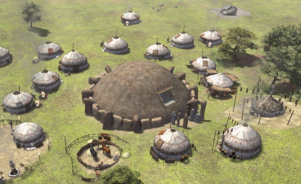
What do you guys think about this setup? Seems to me round is better than square. Also not sure where to place the steles. Could put one or more on top as well. Since most of these is organic stuff I don't see much possibilities for repetitive texture usage in the uv (despite reusing the stones), or am I missing something?


