
niektb
-
Posts
2.843 -
Joined
-
Last visited
-
Days Won
67
Everything posted by niektb
-

process Buildings portrait process and little theory
niektb replied to Lion.Kanzen's topic in Eyecandy, custom projects and misc.
The glow is too subtle, I can barely see it -
process Buildings portrait process and little theory
niektb replied to Lion.Kanzen's topic in Eyecandy, custom projects and misc.
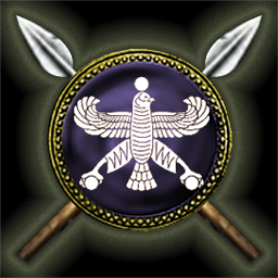
Was mentioned in my tutorial 7e8862 is the hex value I use. But actually, I think the persian hall icon can be considered finished when you've changed the color. (the noise isn't too much and the shape does fit the shield quite well even though it would've been nice if it the glow was slightly stronger in the corners). -
process Buildings portrait process and little theory
niektb replied to Lion.Kanzen's topic in Eyecandy, custom projects and misc.
Your glow color is much more yellowish, also your glow is quite a bit noisier. -
process Buildings portrait process and little theory
niektb replied to Lion.Kanzen's topic in Eyecandy, custom projects and misc.
When I apply my values for the glow and drop shadow in Gimp, I get this. How does it look?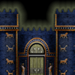
-
process Buildings portrait process and little theory
niektb replied to Lion.Kanzen's topic in Eyecandy, custom projects and misc.
Oh, I didn't notice the edit in this topic: I'll look at it later today! -
Watch Tower?
-
Not imgur, that site throws it away too after some time (and when the amount of daily views or something dropped below a certain value). Best is to download the images and upload them as attachments into the post
-
Updated - Icons Photoshop effects: Values
niektb replied to Lion.Kanzen's topic in Tutorials, references and art help
@Lion.Kanzen: but on what image size do you apply the effects? -
Updated - Icons Photoshop effects: Values
niektb replied to Lion.Kanzen's topic in Tutorials, references and art help
You use quite different values and colors than I did when I wrote this tutorial. My values can't be applied in Photoshop? -
process Buildings portrait process and little theory
niektb replied to Lion.Kanzen's topic in Eyecandy, custom projects and misc.
@Lion.Kanzen: with the 'final effect' you mean the glow and the drop shadow? -
process Buildings portrait process and little theory
niektb replied to Lion.Kanzen's topic in Eyecandy, custom projects and misc.
The shadow is really thick (and with a sharp edge) now and the glow doesn't seem to be different? Edit: now that I look better,there is more glow around the spearheads -
process Buildings portrait process and little theory
niektb replied to Lion.Kanzen's topic in Eyecandy, custom projects and misc.
I think the blue color in the Ishtar Gate is too saturated and uniform. When I search on the internet most reconstructions have a darker and more natural. Also it should ofc be 256x256 The latest version of the Persian Hall looks quite good but I prefer the glow effect as seen in v1.1.1 (since the new one is somewhat 'squarish' (which is slightly weird considering the round shape of the shield). Also the drop shadow seems to be somewhat gone. The symbol itself is really good though! -
process Buildings portrait process and little theory
niektb replied to Lion.Kanzen's topic in Eyecandy, custom projects and misc.
Nice shield rim -
process Buildings portrait process and little theory
niektb replied to Lion.Kanzen's topic in Eyecandy, custom projects and misc.
I hoped that maybe the spears could be rotated a little in order to make it work... (but it's not a big issue so if it's not doable to get it centered in a nice way then we use the current final one) -
process Buildings portrait process and little theory
niektb replied to Lion.Kanzen's topic in Eyecandy, custom projects and misc.
No, that's also not it. I should've provided an image. I was hoping you could do something about (the difference in) these spacings: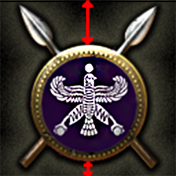
-
process Buildings portrait process and little theory
niektb replied to Lion.Kanzen's topic in Eyecandy, custom projects and misc.
I actually meant vertically, not horizontally (if that's doable) -
process Buildings portrait process and little theory
niektb replied to Lion.Kanzen's topic in Eyecandy, custom projects and misc.
@elexis: sure @Lion.Kanzen: would it be possible to alter the icon a bit so that the shield can be centered? Other than that the icon looks very nice! -
But it could be that there is some issue with the model (that differs depending on the graphics settings) so it could introduce a bug
-
25th is the feature freeze date. The actual release is a few weeks later
-
@wowgetoffyourcellphone: possibly, but I would suggest to add some more grass variation on top of the cliffs
-
@imperium: Rogue Republic has nothing to do with this mod idea
-
What do you mean? It has a subforum inside the Council of Modders subforum...?
-
I assume that if the song is part of the mod it would be legal to have the music volume turned on...
-
@UI_Start_Battle: The idea is good. The crash sound is a bit harsh (a bit of de-essing / eq'ing should do the trick). Also the drums can be a bit fuller. A good idea would be to try to listen to how it plays together with the main menu theme song. @Gaia_Attack_alert: Still not sure about the added value... @Regicide_alert: sounds very nice!
-
By the time these icons were committed the farms were still green... It already has a black shadow around
