Enrique
WFG Retired-
Posts
2.338 -
Joined
-
Last visited
-
Days Won
96
Enrique last won the day on June 29 2019
Enrique had the most liked content!
About Enrique

Contact Methods
-
MSN
kikeylaura@hotmail.com
Profile Information
-
Gender
Male
-
Location
Zaragoza, Spain
Recent Profile Visitors
7.037 profile views
Enrique's Achievements
-
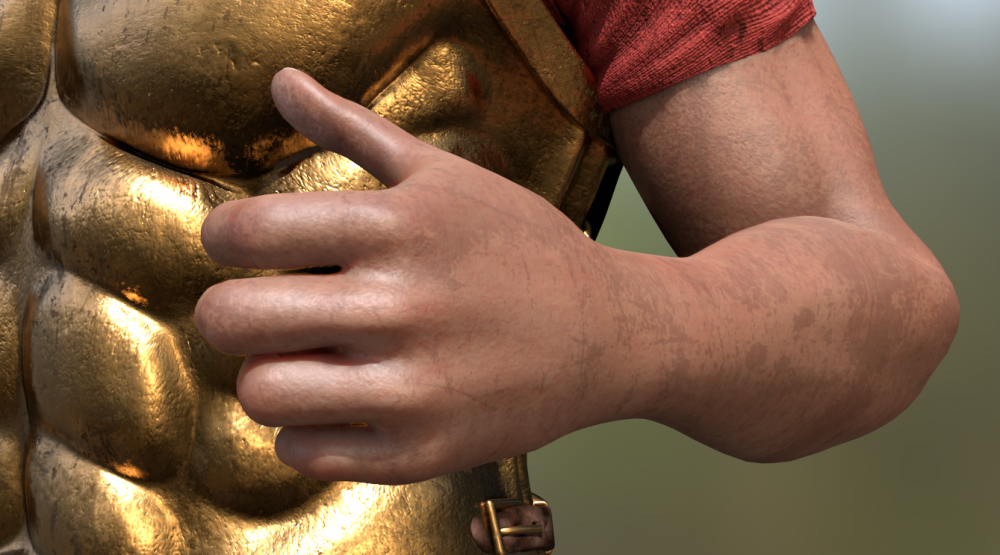
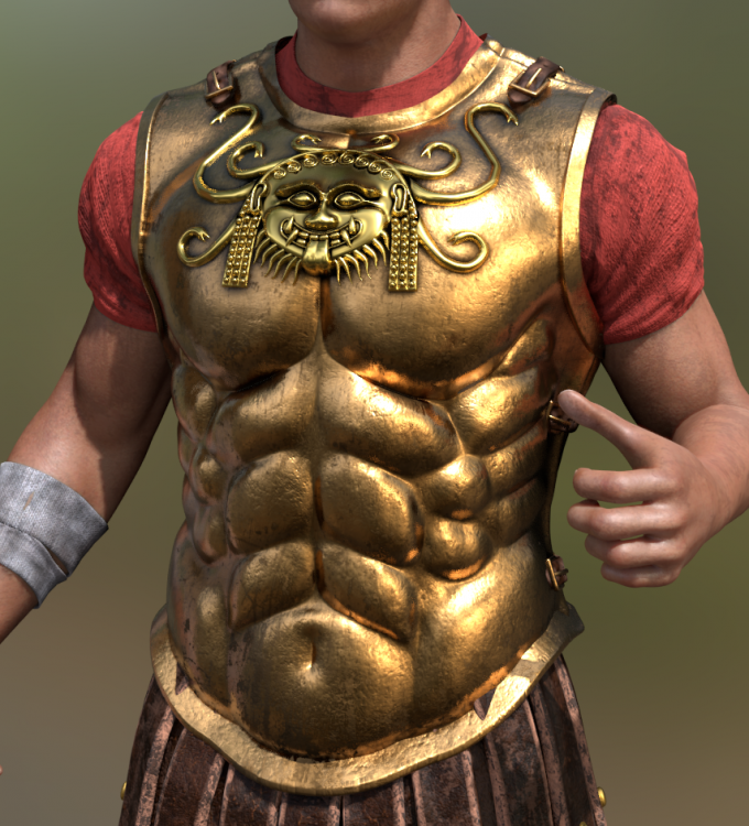
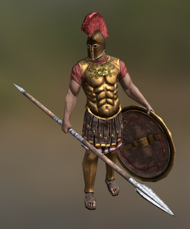
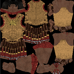
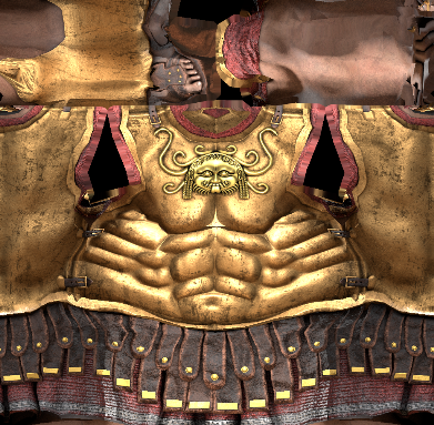
The skin is taken from a makehuman model. I just multiplied dirt in top and used a tiling small skin texture to make the pores detail: The metal is a simple color, multiplied with vertex colors, and then the dirt on top. It is pretty simple, but in a PBR engine, the reflections and fresnel makes all the heavy lifting in the shader: Apart from that, I just used a sunlamp in the front, and another without shadows in the back. I just baked it without much more setup to get the result from above. On a more serious test I made a few months ago, the result on a PBR engine with a similar unit mesh as 0AD (1.2k triangles) looks like this (this is with 2k textures though): But the heavy-lifting is done by the engine and PBR visuals. This is the diffuse: So as you can see... the biggest impact in visuals will always reside on the engine and the shaders that is able to pull-off.... not the amount of detail in the texture. If I remember correctly I left somewhere in the forums a high-res version of a guy with this armor? or similar? it is just a matter of creating a setup for baking all the details into a 0AD unit. Both normals, AO, diffuse... Then you can just create hi-poly versions of the units you want to it and bake with the setup.
-
Here's a quick dirty bake from a personal project as an example of detail-is-not-everything. You can test this texture set out hidetail textures.rar on an m_armor_tunic_long and compare in-game (downscaling to 256 first) with the regular zoom option with any other unit that looks similar, and you'll see how little benefit for gameplay visuals these do. Even with much less details than this, some fancy shader effects allowing to see reflections moving when the unit moves is much more impactful than any super-duper-detailed textures you create. Small preview:
-
Yes, but not limited to those. You can also play for recoginition with pose(s) and animations, color scheme, playercolor placement scheme, silhouette, props... The thing is that I always see that historic autenticity always wins in these forums against the gameplay/readability. May work on some cases, but can hurt gameplay / game experience for sure. That's why unit visual design is a very complex and important area in zoomed out / isometric RTS that usually have behind several concept art studies and tend to sacrifice historic accuracy in benefit of clarity and readability. There are other solutions that can alleviate the hard choices that have to be made on unit visual design... a good example are the banners with specific and easy to read unit types of the batallions on Total War series which allow them to make units that you have to zoom in to see differences between them, but it is clear when you zoom out and see the banners.
-
It would be so much easier for artists to create quality content, since with just a simple diffuse and a strong-ish normalmap would take care completely of metallic surfaces. If you can have a mask or simply the AO map to take care of where reflections should be stronger and where they shouldn't, even better. Furthermore, this feature was already tested and is written already since a lot of time and it was used in a mod! https://wildfiregames.com/forum/index.php?showtopic=19650&p=304957 Imagine if this was already implemented, with all the updates to units and textures you guys did recently, if you would be able to take advantage of reflections while doing them.... Specially since you guys are aiming for such fidelity when zooming in... Seems that people on the forum forgets about this being a rts meant to be played with zoomed-out camera, but always the screenshots and designs of the units are focused on zoomed-in perspective, which can lead to harder unit recognition from afar. In any case, with the amount of art content already in the game, the biggest improvements in art resides in shaders/engine, instead of manually having to redo and keep up-to-date units textures with the passing of the years... SSAO, cubemaps, detailmaps, tiling... Then it would be really worth it to redo things taking advantage of new features. (Great to see the recent additions of soft shadows for example) This is still relevant I think:
-
Awesome job @Alexandermb If you want to keep pushing it forward, try bothering a dev to implement fake reflections (cubemaps) as an "add" layer to the metal shader and a slider or a way to set up its strength. Metals will look 200% better.
-
===[TASK]=== WONDER: Persians: Apadana of Darius
Enrique replied to Mythos_Ruler's topic in Official tasks
Oh man... I can't believe after 6 years this isn't in the game even as a editor building. -
Age of Empires 2 Definitive Edition
Enrique replied to Lion.Kanzen's topic in Introductions & Off-Topic Discussion
Age2 DE showmatches starting in a minute here: https://www.twitch.tv/escapeaoe Not sure if they'll be uploaded to yt after stream is finished. Enjoy! -
You'll see many empty vertex groups for bones that don't deform because the engine will complain about those bones not being recognized when getting the armature ingame. And probably why the duplucated vertex groups originated. Regarding poses... I'd agree with @wowgetoffyourcellphone, I think a cleaner and easier to read pose is more beneficial than a 100% acurrate one, specially if it impacts the shilouette and intention of the pose negatively Specially when you aren't even able to zoom ingame enough to see if the shield floats, or if it actually have the correct hand-grips etc
-
1- bake the physics animation 2- Scroll through the timeline with the bones you want to keyframe selected 3- Insert keyframes for all bones selected using "visual loc-rot" each frame or each 2 frames (depending how much fidelity you want) 4- Save the animation in the dopesheet and append it from a blendfile without the physics setup and see the result. 5- Profit
-
Speaking from the lack of knowledge from the latest animation additions, wouldn't be higher priority to make more death variations for infantry units? Afaik, I just made one on the original animation set and I don't really know if any other death variations were added later on. On the same train of thought, it could be interesting to apply the same changes done lately to the armature in the blendfile with the ragdoll setup to make such animations based on physics (bake the animation and keyframe required bones by inserting "visual loc-rot" keyframe. (I would make a test first keyframing all bones and if the animation look weird, leave out the root bone from the keyframing bone set)
-
The original idea behind the different walk/jog/run was to having the game decide which animation play based on the current unit speed (also thought that in the future with batallions unit may have the need of acceleration/exhausted mechanic and this would help with the different speeds transitions) And the purpose of relax/ready animation variants was in the case that the units could became aware of enemies being close and change their animations to the "ready" variants dinamically, so they would behave more realistically
-
Oh wow, 30 mins without an admin logged into the forums to delete 3 spam threads. Let's start a thread about it instead of reporting the content so the admins have a notification to delete them. Sigh. Good job ethanray94
-
Looking amazing! Great work! Do you mind sharing some wireframes of the shield mesh?
-
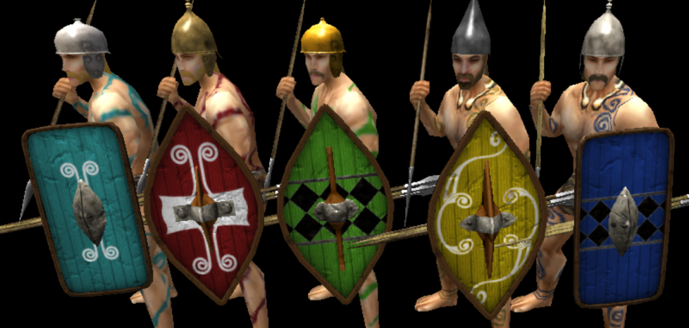
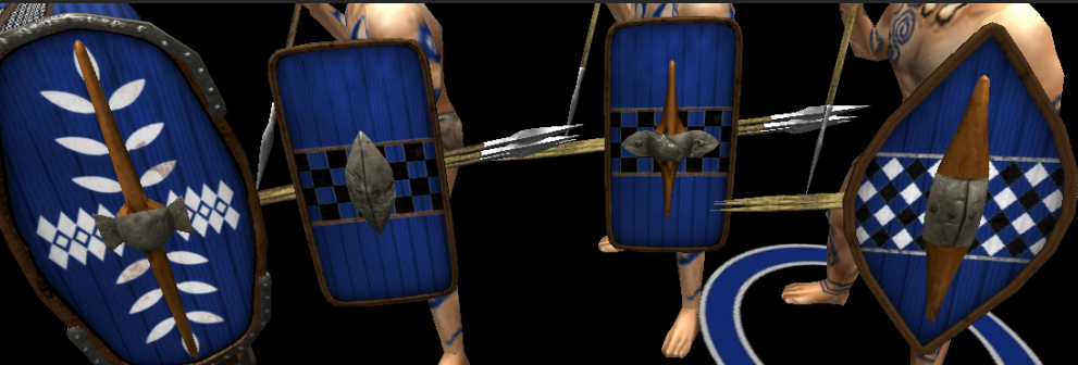
I don't know the ranges you're working on in terms of polycount numbers now, but ~350 tris for a shield prop seems to high imo. (unit body mesh has ~750) Either way, programmers are who should know better to put contraints on art assets. The texturing work on these new props is good, so you don't have to rely so much on polygons to make it look good. This also relates with the texel density (texture resolution based on area covered by the texture) of the new shield/props you guys are making compared with the body unit textures. Here's an example of how crisp and detailed the new shields look compared with the skin/tatoos/heads of the unit textures: If you want to alleviate the disparity between texel density without decreasing resolution of new props, you may try scaling up unit textures accordingly using software that uses AI when scaling up images to enhace details that is getting so popular to remaster old games textures and such. Here's an article with examples: https://petapixel.com/2017/10/31/website-uses-ai-enhance-photo-csi-style/ I think it is worth if you don't want to manually enhace all unit textures ingame. At least doing some tests to compare. Cheers!
-
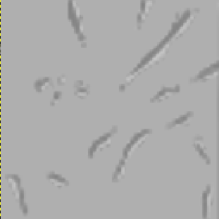
Perhaps an overlay layer for the new shields you guys are making should have some hack damge. Something like this (which was used to make other shields in the game): These shields you make look awesome, but the wood parts are in pristine condition (and the middle part has damage):

.thumb.png.ce58cea22940c255f5b0a735d5abee36.png)
