-
Posts
1.411 -
Joined
-
Last visited
-
Days Won
24
Everything posted by vladislavbelov
-
Not only, there is a case with <cstdint> (which we also include in some places), which might not define ::*_t, only std::*_t ones. To avoid the question what to include we might use own types. But I don't mind to use std::*_t. It defines the *_t types by itself. Your issues might mean that it doesn't define all required types. For sure there is a lot of things to improve with includes and dependencies. Like CStr/CStrW definition. IIRC the biggest and most annoying part for me was building libraries (which I didn't finish), the code itself was pretty easy to build with mingw.
-
So these path are correct, and no need to change something in the code. Maybe there is a problem somewhere in premake which doesn't catch these paths properly.
-
Hi! Have you installed libsdl2-dev? And what's a value of an SDL2_CONFIG env?
-
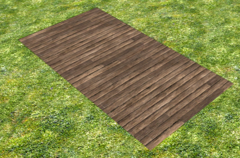
Decals are supposed to be rendered only in bounds you set in xml. And outside of those bounds shouldn't be rendered. To avoid rendering it uses alpha channel of the texture on its borders (and all current decal textures are transparent on their borders). So to fix the issue you need to add a transparent border to your texture.
-
What's the material? Could you attach a sample decal?
-

A25 svn-version 25810 not playable
vladislavbelov replied to Mr.lie's topic in Game Development & Technical Discussion
Sounds like an out of memory. Nothing to fix in the game except optimize the memory usage. But it's a very complex task to complete for A25 (and even for A26). -

Graphics of the Evening #2
vladislavbelov replied to vladislavbelov's topic in Game Development & Technical Discussion
Yeah, I was experimenting with it: Yes, square for each R5G5B5. It's possible but more slow, as on each frame you need to do a lot more work for rendering. Just generated by a script. We don't have a blog, so I just post some of my local stuff on the forum. It's impossible without performance loss at the moment. Cleaning up the cache should help, because there should be no other relation between mods. -
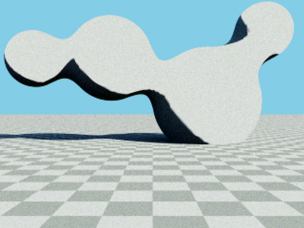
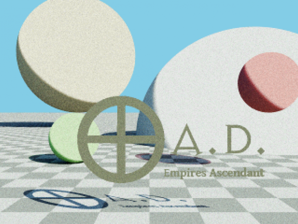
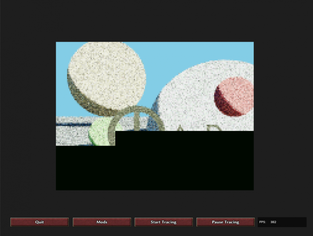
If it's cold in your room, then there is the following mod. Another useless application of our engine: just ray trace a simple scene written completely on JavaScript. The mod is attached, feel free to play with it. 0ad-js-rt-demo.pyromod 0ad-js-rt-demo.zip
-
Usually it means a not good map design.
-

Updating loading screen pictures and tips
vladislavbelov replied to maroder's topic in Eyecandy, custom projects and misc.
Agree. -

Updating loading screen pictures and tips
vladislavbelov replied to maroder's topic in Eyecandy, custom projects and misc.
If someone could repaint the paper background I'd be happy. It doesn't look good currently. Also the vignette border on a picture is a bit strong I think. -

0 A.D. 0.0.24b-alpha crashes under Windows 10
vladislavbelov replied to Ceres's topic in Bug reports
For Windows it's a complete game installer made for the current development version. -

0 A.D. 0.0.24b-alpha crashes under Windows 10
vladislavbelov replied to Ceres's topic in Bug reports
I mean not the A24b release, but a release build for the SVN version. Yeah, you need to go step-by-step and build. But the good thing is that you can use binary search: if you have a range [A, B], when on the revision A the game is broken and B is fixed you need to check the revision (A + B ) / 2. And then depending on results you need to go to [A, ( A + B ) / 2] or [( A + B ) / 2, B]. That feature is built-in in git, but maybe there is something similar for svn. -

0 A.D. 0.0.24b-alpha crashes under Windows 10
vladislavbelov replied to Ceres's topic in Bug reports
Ideally I'd like to have answers for the two following questions: Is it really fixed or is it still reproducible for a release build of the game? If it's indeed fixed which commit is the reason? -

0 A.D. 0.0.24b-alpha crashes under Windows 10
vladislavbelov replied to Ceres's topic in Bug reports
Not necessary, just select all projects with Shift and then open properties once.


