wowgetoffyourcellphone
-
Posts
11.375 -
Joined
-
Last visited
-
Days Won
588
.thumb.png.ce58cea22940c255f5b0a735d5abee36.png)


(1).thumb.gif.b5909d3df98a8ec15dc452423f219bc5.gif)
About wowgetoffyourcellphone

- Currently Viewing Topic: AI bot spam on the forum


.thumb.jpg.b21ca1d0c15fb56b42c39b25a0a40815.jpg)
wowgetoffyourcellphone's Achievements
")
-
AI bot spam on the forum
wowgetoffyourcellphone replied to Deicide4u's topic in Introductions & Off-Topic Discussion
I delete a hundred spam posts per month probably. -
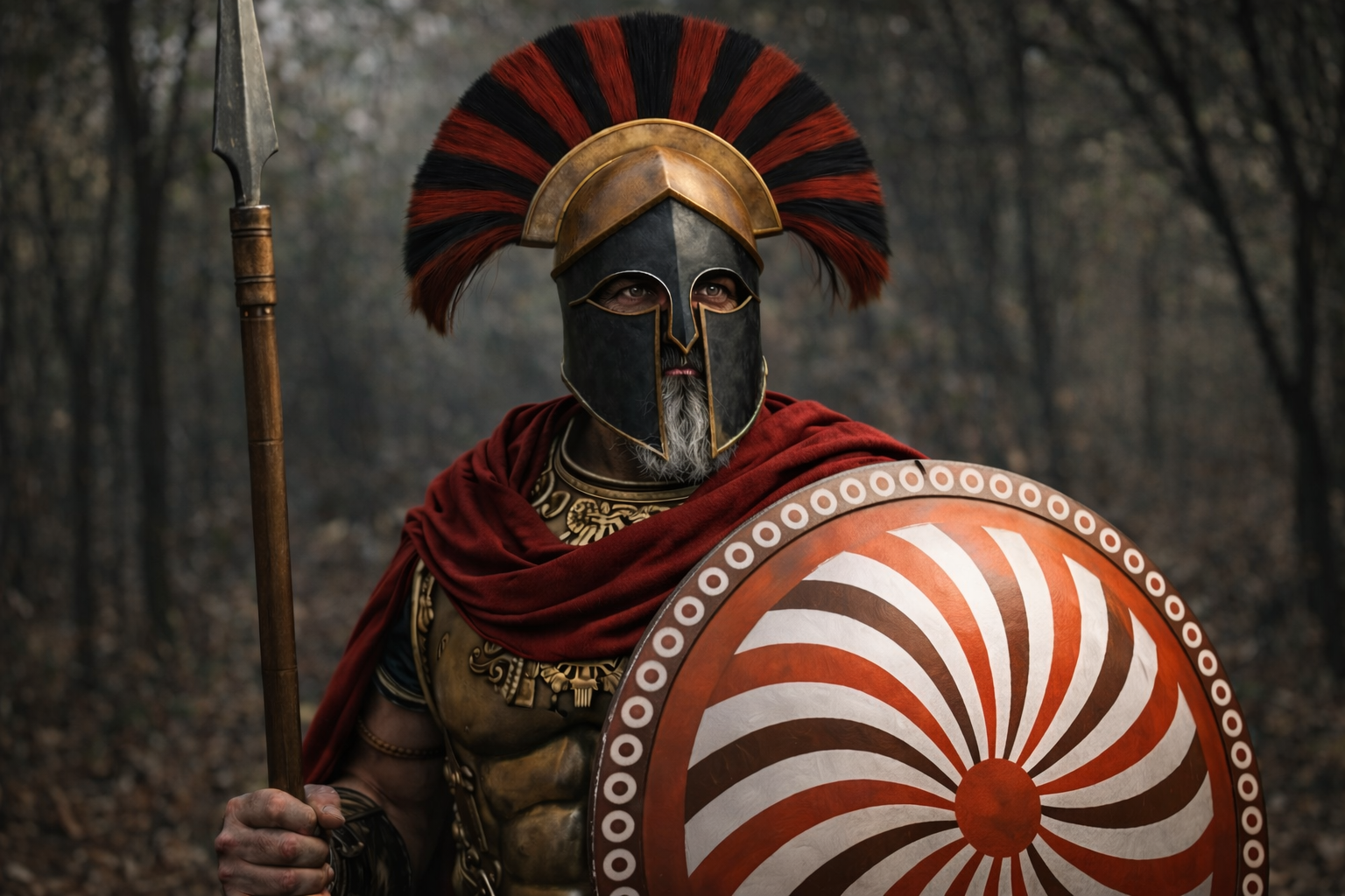
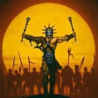
Gupta Cavalry Archer
-
Five Gupta heroes
-
Nice! Can you make a female Kushite one like this with a leather eye patch over one eye? For Amanirenas.
-
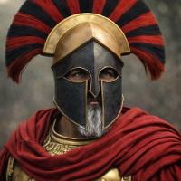
Chandragupta II
-
Key Gupta Rulers (319–550 CE): Chandragupta I (c. 319–335 CE): Recognized as the real founder of the empire, he took the title Maharajadhiraja (King of Kings) and consolidated power in the Ganges Valley through his marriage to the Lichchhavi princess Kumaradevi. Samudragupta (c. 335–375 CE): Often considered the greatest ruler, he is known as the "Napoleon of India" for his extensive military campaigns in northern and southern India. He was also a patron of arts and a poet, earning the title Kaviraja. Chandragupta II (c. 375–415 CE): Known as Vikramaditya, he expanded the empire further, particularly against the Sakas in western India, and moved the capital to Ujjain. His reign is recognized as the height of the Golden Age, with his court famed for the scholar Kalidasa. Kumaragupta I (c. 415–455 CE): Son of Chandragupta II, he maintained the vast empire and founded the famous Nalanda University. Skandagupta (c. 455–467 CE): Renowned for successfully defending the empire against the invasions of the Huns, preserving the cultural achievements of the previous eras, though the cost of the wars brought financial strain. Probably a good list to pull from.
-
I mean, I'd be paying to host the site regardless?
-
"Mounted..." to me, indicates they dismount to fight.
-
That's a really good improvement. Thanks for taking my critique to heart. Is the normal map correct for the women's faces? Something odd happening with their cheekbones.
-
Just easier for modder readability if horizontal, is all.
-
Newbie Questions - I can't beat Easy AI as Romans
wowgetoffyourcellphone replied to Satevis's topic in Gameplay Discussion
Methinks it would be interesting if the AI mixed it up a bit and tried different mixes of units in its attacks more than it currently does. Perhaps we can add more personalities to the mix beyond Aggressive, Defensive, Balanced, which try specific types of units for different strategies or tactics. -
What do you guys think is the best platform on which to build a mod's website? This is for a guy (me) with little website coding knowledge. I used to be big into making websites 20+ years ago, but none of those skills have been expanded since then (style sheets were the height of innovation, lol). So, maybe Squarespace? Wix? Anyone with any experience with hosts such as these? I'm looking to build a website for Delenda Est. A few years ago I started one on fandom.com, but deleted it after experiencing severe frustration with the platform's ads and limitations. So, something like Wix or Squarespace where I pay a small fee per month is fine. Even free is fine as long as they don't plaster ads everywhere.
-
Very nice idea for a website for the mod. You may have just inspired me to make one for Delenda Est. I originally was making one on fandom.com, but I got angry with the massive ads everywhere and frustrated with the limitations.
-
256x128 you mean?
-
The Suebian knot here looks much better than the current one.

