Leaderboard
Popular Content
Showing content with the highest reputation on 2017-10-23 in all areas
-
3 points
-
3 points
-
2 points
-
2 points
-
2 points
-
sentry tower give lightest, most spread out protection, defense towers are stronger defensive points for greater cost, easier to avoid due to the resource drain but harder to go up against when you're forced to. Fortresses are the next logical step, giving a lot more intense defensive capability in one area for a very high limiting cost. If towers were perfectly balanced we wouldn't need the minimum distance and build restrictions, and we'd see the same thing manifest in tower density. I'd personally make them territory roots, you can control a lot of land with a fortress, and generally speaking that's what they've always been for. In the countryside to extend your reach, or in a city to serve as a citadel so the whole city doesn't fall with the CC2 points
-
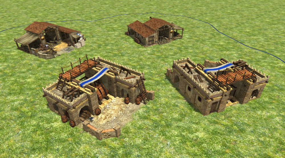
Well all the Goron buildings are done and everything: Their defensive buildings such as the fortress, walls, and towers will be able to customize themselves with various upgrades such as reinforced stone (more HP), Lava Moats (melee attackers take consistent damage), and giant bunkers (can garrison with twice as many defenders) Unfortunately I can't get the BFME style base building to work for this faction. My scripting knowledge is just not good enough. I'd very much love to give this faction a very distinct build style different from the other races with large interconnected mountain bases: Unfortunately I just can't script well enough, so for now I guess their bases are all built normally.2 points
-
2 points
-
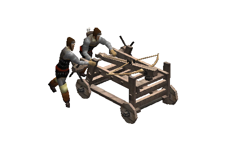
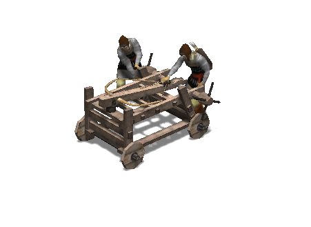
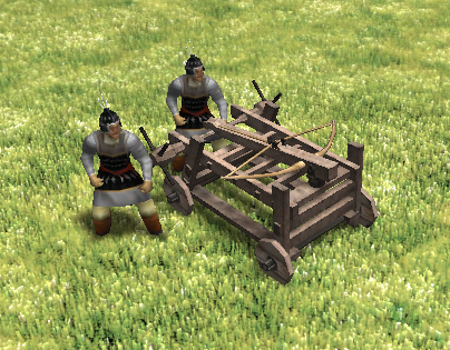
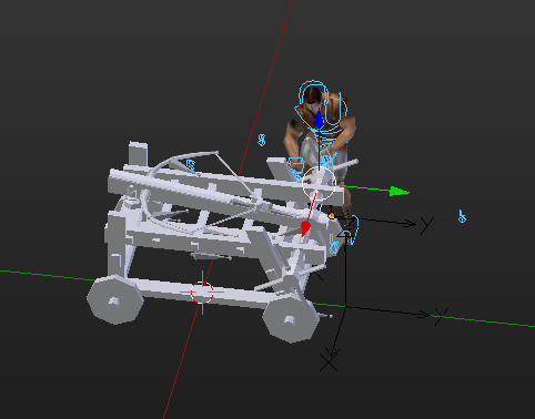
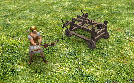
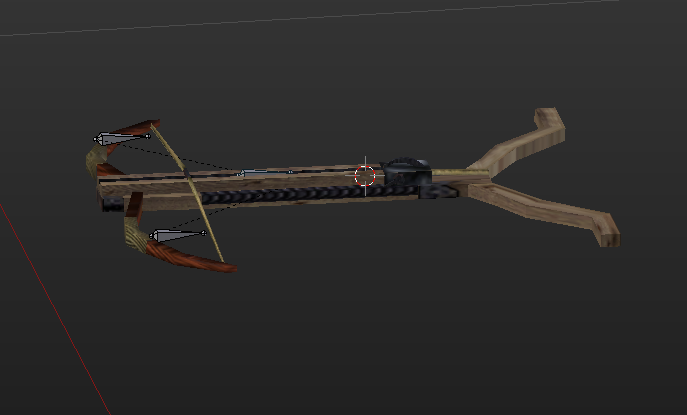
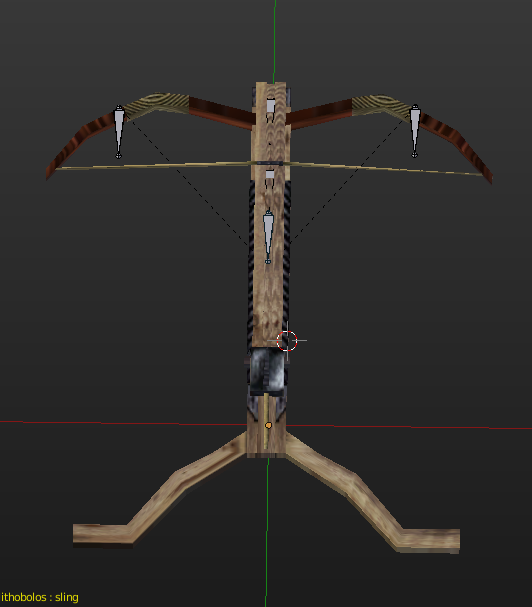
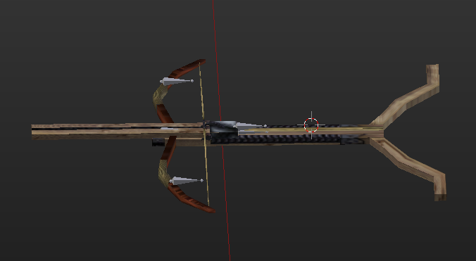
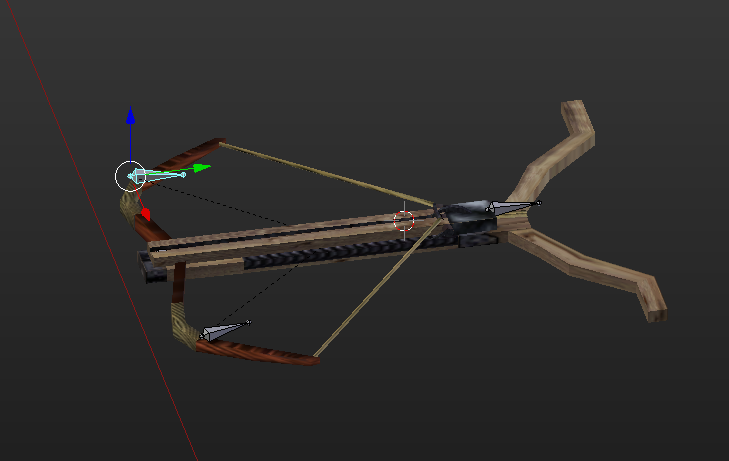
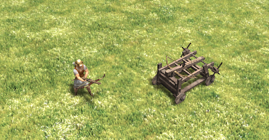
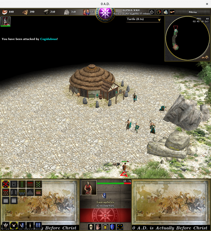
@Nescio Use this file instead the first one, i fixed a bug with the skeleton, using an existing one for preventing crashes on other siege engines gastraphetes.7z2 points
-
20 Design Rules You Should Never Break Just like with any profession or discipline, design comes with some rules. While breaking design rules is allowed and even (in some circumstances) encouraged, it’s important to at least be aware of the rules you are breaking so you can break them the right way. From typography to layout, right through to colour and special effects, this list runs through a few basic rules, tips, tricks and guides to some common errors and how to banish them from your design. 01. Don’t Forget To Kern <img width="320" height="160" src="https://designschool.canva.com/wp-content/uploads/sites/2/2015/04/1_Kerning1-320x160.jpg" class="attachment-resp-mobile-portrait size-resp-mobile-portrait" alt="" /> Somebody once said that if you truly hate someone, teach them how to recognise bad kerning. A shoddy kerning job is one of the cardinal sins in the world of design, so it’s an important skill to nail down early on. Kerning is the adjustment of space between characters. It doesn’t sound like much, but a good kerning job can make a world of difference. The ultimate goal of kerning is to ensure that the space between each letter is visually even to make for a neat and orderly piece of text. While we’ll run over a few typographical mistakes in this list, be sure to also check out these 20 other typographic mistakes that you should avoid at all costs. 02. Don’t Disregard Readability/Legibility For Aesthetic Reasons <img width="320" height="160" src="https://designschool.canva.com/wp-content/uploads/sites/2/2015/04/2_Legibility1-320x160.jpg" class="attachment-resp-mobile-portrait size-resp-mobile-portrait" alt="" /> I’m sure I’ve said this a million times, but the primary purpose of design is communication, so it makes sense that the readability and legibility of your type is a top priority. So, what hinders readability and legibility? Well, a number of things can affect how much effort your reader has to put in. A common example is too low of a contrast between the text and background, keep contrast high to prevent this issue. Another common mistake is the overuse of capital letters. Not only do capital letters make the reader feel like they are being YELLED AT, they also hinder the eye’s ability to distinguish letterforms. This is because when executed in caps, each letter has the same x-height and block-like shape, whereas in lowercase, the letterforms are more uniquely shaped, allowing for the eye to more easily identify each letter and word. One other mistake is type size, the usual offender being type that is too small. Consider your audience, would they have a difficult time reading this type? If you’re unsure do test prints and ask for others’ opinions, while your eyes may read it perfectly fine, others may not. The takeaway is predominantly this: just because it looks good, doesn’t always mean it communicates well. Treat your type with care! 03. Keep Your Line Lengths Short <img width="320" height="160" src="https://designschool.canva.com/wp-content/uploads/sites/2/2015/04/3_LineLength1-320x160.jpg" class="attachment-resp-mobile-portrait size-resp-mobile-portrait" alt="" /> Have you ever struggled to get through an otherwise interesting magazine article? Or perhaps lost your place each time you tried to go to a new line? This may be the fault of badly structured line lengths. The golden number for body copy line lengths is a minimum of six words per line and an average of about 30-40 characters (including spaces) on each line. Any less and your sentences will be too choppy, any more and you risk your sentences becoming tedious and difficult for the eye to get through. 04. Have Purposeful Hierarchy Just like within a lot of natural orders, a strong and purposeful hierarchy is a pretty powerful tool. Within the realm of design, hierarchy concerns the arrangement of visual elements in order to signify importance. So, the more important elements are made to hold the most attention through scale, colour, type etc. and the least important elements are made to hold less attention. An element that hierarchy is most evidently used in is typography, so let’s look at an example of hierarchy using some type. In the included example, have a look at the way the first invitation is laid out, all the type is given the same size and weight, making all the information hard to gather in a quick skim. The example to the right, however, has had a little bit of hierarchy introduced to the type. Even with just the smallest adjustments to the colour, weight and size of certain elements, the information becomes way easier to digest and make sense of. 05. Practise Appropriate Word Spacing <img width="320" height="160" src="https://designschool.canva.com/wp-content/uploads/sites/2/2015/04/5_WordSpacing1-320x160.jpg" class="attachment-resp-mobile-portrait size-resp-mobile-portrait" alt="" /> As a designer, dealing with a body of type is almost an inevitability, and it’s not always easy. There are lots of rules and elements to take into consideration, and here’s a pretty important one: word and letter spacing. There are two main points of spacing we’ll run over: tracking and leading. Leading is the adjustment of space between vertical lines of type. There are a lot of things that determine what leading you should use – from your choice of typeface, how much text you have to work with etc. But, a good rule of thumb is this: longer line lengths often require a bit more leading than shorter line lengths. While kerning is often done manually, when you have a large body of text and a tight deadline, there often isn’t time to manually adjust each space, which is where tracking comes in handy. The tracking tool adjusts the space between characters and words in a more general way than kerning. Tracking is a great way of getting rid of rivers or awkward line lengths in type. In body text, like with leading, a good rule to stick by is to keep longer line lengths tracked ‘loosely’ and shorter line lengths tracked a bit ‘tighter’ for maximum readability. Another handy rule of thumb for word spacing is, for smaller bodies that are more reasonable to manually alter, a common practise is to imagine a lowercase ‘i’ in between each word and adjust your space accordingly, but of course this all depends on the typeface and the situation etc. 06. Use The Correct Alignment <img width="320" height="160" src="https://designschool.canva.com/wp-content/uploads/sites/2/2015/04/6_Alignment1-320x160.jpg" class="attachment-resp-mobile-portrait size-resp-mobile-portrait" alt="" /> You have almost definitely encountered the basic alignment tools before, whether you have been in the game for years or are yet to step anywhere near the game. There are four different kinds of alignment: left aligned, right aligned, centered and justified. Let’s quickly run through when and where we can use these. Left aligned type is the most common form (note how even this text is aligned to the left) and for a good reason. It’s the most easily legible and gives a nice, neat left edge to the text. When in doubt, left align. Right aligned type does what it says on the tin, it aligns the type to the right. This is mostly used for decorative purposes within branding or small pieces of type in certain publications. Right alignment isn’t recommended for large chunks of text, though as it can get hard for the eye to follow, the ragged left edge makes it slightly more difficult to find a new line. Centered text definitely has a wide variety of uses. Posters, invitations, branding etc. Centered text makes it easy to balance out a bit of type and make for an aesthetically pleasing type arrangement. However, again, it’s not recommended for larger bodies of type as the lack of a neatly aligned edge makes it tricky for the eye to move from one line to the next. And finally we have justified type. Justified type can be deceptive, it seems like the perfect alignment module – a neat left and right edge, what more could you ask for? In some cases justified type is fantastic, novels are a common example. Justified text has its issues though, mainly in terms of spacing. As you can see in the graphic, towards the end of paragraphs where there are fewer words on each line, the justify tool will often spread the type awkwardly from left to right, leaving awkward word and letter spacings. 07. Always Use A Grid Developing some basic grid skills is probably one of the first steps any fledgling designer should undertake. A well-implemented grid is a bit like a fairy godmother, it can transform your design from something average to something clean, clear and effective. Grids come in many shapes and sizes and you can build them to be flexible, adaptable and to suit your design. Grids help designers align elements on the page in relation to each other which often produces a neater, more logical design. Check out the sample grids in the included graphic, a two, three and four column grid can be used to help arrange type and imagery in various ways. The fewer columns your grid has, the more uniform your design will be. Your elements may have a strong sense of alignment, but you won’t have as much flexibility as you would with a grid with a few more columns. Again, in the graphic, check out the 4 column grid to the right, some elements stretch over a few columns and others remain within the set columns, allowing for a few different size text boxes and images without abandoning the alignment. Play around with a few different grids and find what works for you and your design. 08. Always Design For Your Audience <img width="320" height="160" src="https://designschool.canva.com/wp-content/uploads/sites/2/2015/04/8_Audience1-320x160.jpg" class="attachment-resp-mobile-portrait size-resp-mobile-portrait" alt="" /> Most designs start out with a brief, even if it is a personal project, a designer will often (consciously or subconsciously) brief themselves with the basic information. One of the more important elements of a brief is the question “who am I designing for?” Every design has an intended audience, the people that will be viewing the design and receiving the communication, so it makes sense to keep them in mind. Take a look at the examples of design for specific audiences. The example on the left doesn’t quite fit the mark for this brief and audience. The target market for a children’s concert poster is children and their parents, so a sophisticated, black and white design probably won’t attract the right attention or send the right message. The example on the right, though, suits the content and audience much better. A bright and colourful design with recognisable graphics is more eye-catching and keeping in tone with the demographic and event. Remember that while your design may look good, it might not be the best possible communication for your audience. When in doubt, always refer back to the brief. 09. Avoid Widows And Orphans <img width="320" height="171" src="https://designschool.canva.com/wp-content/uploads/sites/2/2015/04/9_WidowsOrphans1-320x171.jpg" class="attachment-resp-mobile-portrait size-resp-mobile-portrait" alt="" /> An easy way to take your design from amateurish to polished and professional is to recognise and eliminate typographical widows and orphans. The odd few widows and orphans are bound to pop up in any type-based design you undertake, it’s almost inevitable, but recognising them and dealing with them is the important step. For those of you who aren’t familiar with the concept of widows and orphans, let me quote Drew de Soto’s explanation from ‘Know Your Onions: Graphic Design’, “A widow is a term for a line of text that belongs to a paragraph and has moved over to the next column. An orphan is similar, but a single word on its own on a line, poor little thing.” There are a few ways you can deal with widows and orphans. First of all, if you have been given the okay, you can manually edit the text to adjust the line length to remove the problem altogether. Another tip, as is demonstrated in the graphic, is to place a soft return (press shift + return) on the word in front of your orphan, to bring it down a line. Another technique as demonstrated in the graphic is to adjust your textbox or column sizes to allow for type to move around enough to get rid of the orphans and widows. 10. Have A Logical Colour Palette Colour is a powerful tool for designers, so it makes sense that a carefully arranged and consistent palette would be an important step in all design endeavours. When compiling a colour palette, it might be worth looking into colour theory and past uses of colour. Colour theory dictates that certain hues can certain effects on consumers, i.e. orange is thought to stimulate an appetite, which is why orange is a commonly used in fast food designs. While switching things up sometimes can pay off, be sure to make educated moves when experimenting with colour. For a very simple example, have a look at the two generic logo types in this graphic, one for a florist that specialises in romantic bouquets, and one for a paintballing centre that promises a messy and exciting time. On the left, each logotype has been given a colour scheme that quite obviously doesn’t work, and on the right, a more appropriate one. There are certain codes and conventions when it comes to colour, and while experimenting and thwarting expectations can make for a punchy design, be sure that your use of colour isn’t too distracting or confuses your message. 11. Have A Consistent Font Palette <img width="320" height="160" src="https://designschool.canva.com/wp-content/uploads/sites/2/2015/04/11_FontPalette1-320x160.jpg" class="attachment-resp-mobile-portrait size-resp-mobile-portrait" alt="" /> Just as you have a palette of colours, so should you have a carefully selected palette of fonts. Also like colours, certain fonts have certain ‘moods’ or ‘emotions’ associated with them – you probably wouldn’t use Curlz MT for a law firm branding. A lot of designers recommend that 2-3 fonts should be a maximum in most cases to avoid overcomplicating the design. Try to choose fonts that complement each other and your communication to make for a logical and effective design. For a handy guide to pairing fonts, be sure to check out these 10 golden rules. 12. Never Use Display Fonts For Body Copy <img width="320" height="160" src="https://designschool.canva.com/wp-content/uploads/sites/2/2015/04/12_Display-Type1-320x160.jpg" class="attachment-resp-mobile-portrait size-resp-mobile-portrait" alt="" /> Using a display font for body copy is a bit like wearing a ballgown to the supermarket – it’s not the right time or place, it can be confusing for others and it just isn’t a very smart move. Display fonts are fonts that are better suited to smaller areas of text, rather than body copy. They are usually a bit flashier than typefaces designed for body copy purposes, and thanks to this flashiness, they often better suit a short title, sometimes a subheading, but never a bulk piece of text. Check out the example graphic that uses the decorative display font ‘Yellowtail’ for body copy. Since the typeface was designed with aesthetic value in mind, rather than legibility or readability, it gets tiring and tricky to read after a while. It is far better to balance it out with a typeface that is designed for body copy purposes, like ‘Georgia’. There’s a time and a place for display type, and body copy is not that place. 13. Never Stretch Type <img width="320" height="160" src="https://designschool.canva.com/wp-content/uploads/sites/2/2015/04/13_Stretch-Type1-320x160.jpg" class="attachment-resp-mobile-portrait size-resp-mobile-portrait" alt="" /> This is a very simple rule, it’s easy to understand, easy to remember and easy to execute: do not stretch your type. In any case. Fonts are (most of the time) built with careful care and attention to the shapes and proportions of each letterform, so to distort this by stretching it can just take away from the effectiveness of the font. A lot of the reason people often stretch their type is they need it to be slightly taller or wider than it currently is. There is a solution to this that doesn’t involve distorting your type. There is an endless supply of just about any kind of font you could ever want, there are tall fonts (I recommend Bebas Neue), wide fonts (have a look at Silverfake) and everything in between, all at your disposal. Some may cost you, but finding that perfect typeface can just be priceless. 14. Avoid Colour Discord <img width="320" height="160" src="https://designschool.canva.com/wp-content/uploads/sites/2/2015/04/14_ColourDiscord1-320x160.jpg" class="attachment-resp-mobile-portrait size-resp-mobile-portrait" alt="" /> More commonly referred to as ‘colour clashing’, colour discord commonly occurs when two colours that are widely separated on the colour wheel are paired together. Discordant colours create a muddy or ‘vibrating’ effect that makes it a struggle for the eye to find the line between each colour. A pretty simple way to avoid colour discord is to use hues that have a fairly high degree of contrast, check out the graphic for an example of contrasting colours. The eye can easily pick up on the line between each colour, and there is little to no ‘vibration’ or muddiness as there is in the discordant colours to the left. Some designers, particularly advertisers, lean into the effects of colour discord, as they feel it creates an eye-catching design. So, while avoiding colour discord for your more aesthetically-pleasing designs is generally recommended, this is not to say that it is entirely impossible to bend the rules of colour discordition in your favour. 15. Don’t Think Of White Space As Empty Space <img width="320" height="160" src="https://designschool.canva.com/wp-content/uploads/sites/2/2015/04/15_White-Space1-320x160.jpg" class="attachment-resp-mobile-portrait size-resp-mobile-portrait" alt="" /> White space is one of those diverse and effective tools that can add something special to your design. Well used white space can have many beneficial effects for your design. It can help put more focus on a specific aspect of your composition, it can let your design ‘breathe’, it can help balance out your elements or it can add some sophistication to your design. Another thing that white space can do is add meaning to your design without adding in another physical element. Have a look at this sample graphic, a fake poster for some noise cancelling headphones. The ad on the left uses little white space, it fills up all the space with graphics and type. The second ad, however, uses white space strategically. By making the headphones the focus amongst a sea of white space, the “100% noise cancellation” is made more visual and the product is put in focus without compromising any of the information. In this case and many others, it’s important to recognise that the white space is not empty space, it does not need to be filled with a graphic or a texture or some type, it’s doing its job just like every other element. Don’t disregard the idea of white space, experiment with incorporating it into your design and see if it can work for you. 16. Don’t Follow Design Trends <img width="320" height="160" src="https://designschool.canva.com/wp-content/uploads/sites/2/2015/04/16_Trends1-320x160.jpg" class="attachment-resp-mobile-portrait size-resp-mobile-portrait" alt="" /> Sometimes design can be a bit like fashion, experimental trends come by, are insanely popular for a while, then slowly fade out. Once those trends have passed, all the outfits and items of clothing you curated around that trend suddenly become dated and no longer effective. Design works in a similar way, new styles or methods become popular for a while and everybody jumps on the bandwagon because its new and exciting and easy to replicate. But as quickly as trends come, trends also leave, so that logo you designed that was meant to last for years, suddenly becomes dated. This is not to say that you should turn a blind eye to trends, though. Keep an eye on what’s popular when and try to figure out why it’s popular. A pretty prolific trend only recently was the X-shaped logos. You might know what I’m talking about: those crest-like logos that placed illustrative symbols or letters around an X. These were pretty popular for a while because they were simple and (when done right) looked good. But, because they became more widely used, the trend ended up passing just as quickly as it came. Something to take away from trends is an act of analysis – why was it popular, what could I take from these logos to enhance my designs? In the case of the X-shaped logos, maybe you could take away the idea of geometric lines to shape your type, as can be seen in the graphic. By all means, learn from trends and try to set them, but don’t jump blindly aboard just any bandwagon. 17. Use The Right Tools <img width="320" height="160" src="https://designschool.canva.com/wp-content/uploads/sites/2/2015/04/17_RightTools-011-320x160.jpg" class="attachment-resp-mobile-portrait size-resp-mobile-portrait" alt="" /> Just like a handyman wouldn’t use a hammer to screw in a screw, a designer should know what tools are correct to use in certain situations, and more importantly, what tools are not. A very common mistake that could be easily avoided with a proper tool selection is rasterized logos. For those of you who aren’t entirely familiar, let me break it down quickly. There are two types of digital graphic files, rasters and vectors. A raster graphic is made up of a grid of many pixels, whereas a vector graphic is instead made up on many lines or “paths”. One of the biggest difference between a vector and raster is the ability to scale the graphic. Since a raster is made up of a certain amount of pixels, at a certain point of scaling, the image will become pixelated (as you can see to the left of the graphic), but a vector (to the right) does not have this problem. Since a vector can be scaled to just about any size without losing the sharp edge of its shapes, it’s generally the more favourable option for logos, which often have a large range of sized applications, from the side of a pencil to the side of a building. So, to create a logo using a raster graphic limits your brand’s applications, making raster logos a very common but easily avoided mistake. Going back to the main point, a good designer should not only know the difference between these formats, but also what tools to use when. Raster graphics are commonly created in tools such as Adobe Photoshop and vectors are often born in Adobe Illustrator, so be sure to familiarise yourself with the software, what it can do and what it can create before you launch into a design. 18. Consider Your Medium Where is your design going? On a poster, a website, bound within a magazine? Knowing the exact specs of your design’s application is such a crucial aspect of your design because it is how your design will most commonly be viewed. If you don’t account for all the details of the medium you are designing for, you risk your design being compromised in some way.A common mistake is not counting for gutters when designing for publications. A gutter is the space between two facing pages that is left both for readability reasons and also to accommodate for the binding process. In instances where a certain size of gutter is needed for binding, a designer must account for this during their process, and often this means ensuring they don’t place any graphics or type over the gutter. If they do, during the binding process, the design that is spread across the two pages and gutter will run into the seam, distorting the image or type. Check out the graphic for an example of the effects of running type across a gutter that is later used for binding. Try to instead work around the gutter, like the example to the right does to avoid the dreaded pull. So how do we avoid this? Good old fashioned communication. If you’re unsure, speak to your printer, client or briefer and figure out how much gutter space you need to work around and move from there. 19. Learn The Rules Of Grammar Grammar can be a tricky thing, there are a lot of hidden rules that you don’t always know you’re breaking until they’re pointed out. Taking the time to learn some of the design-oriented rules of grammar can keep your designs professional and make you feel delightfully smug when you start to notice others’ errors out in the wild. Let’s run through a quick few now.First of all, ampersands. Ampersands do not belong in body copy, avoid substituting an ‘and’ for a ‘&’. Instead, ampersands are most commonly used for organisation titles (e.g. “Johnson & Johnson”) or stylistically within logo/identity design.Another common error that is easily fixed is double spaces after punctuation. The simple solution? Don’t. One space is more than enough. If you find that your type still looks a little too squashed, perhaps try adjust your tracking or just switch to a new font.One more point is hyphens and dashes, something you’re bound to come accross eventually, even within this article there have been a small handful. Basically there are three types of hyphens/lines: the hyphen (-), the en dash (–) and the em dash (—). The hyphen is used to join two words (e.g. “custom-built”); an en dash is used to connect numerical values (e.g. “1984–1998”); and an em dash is the length of an ‘M’ and is occasionally used within sentences to stand in for a comma (e.g. “Grammar is hard — or so I once thought”) There are plenty of rules to grammar, and while it can seem like a relatively unimportant thing to know, a lot of designers would argue otherwise. It is a subtle but powerful tool that can take your designs to a whole new level of professionality and attention to detail. 20. Don’t Use Too Many Effects https://www.upwork.com/hiring/design/10-common-graphic-design-mistakes-avoid/ 10) Missing the Overall Point While there’s no guaranteed way to impress every customer 100% of the time, epic mistakes can be minimized by doing your homework and seeing what types of design projects have previously worked in your industry. By gauging the customer feedback to those campaigns and understanding why ideas succeeded or failed, it makes it a lot easier to become relevant to your customers. Also, pay close attention to not allow your personal tastes to get in the way of what’s best for your brand. Great design should be a natural extension of the messaging, and the implications should be plainly obvious. So be very careful with being a little too clever with your delivery2 points
-
2 points
-
Pretty much everyone has been saying this for months, if not years.2 points
-
2 points
-
2 points
-
1 point
-
1 point
-
Allow me to emphasize I do know next to nothing about Kush. And if the faction is complete and qualitively at least as good as the existing factions, I wouldn't object to including it into “0 A.D.” as well. However, that decision is not mine to make. To clarify, I was not really suggesting reducing the number of factions from twelve to three. “Acceptably”, “Ideally”, “Realistically”, “Theoretically”, etc. are all quite different terms; “a lot easier” does not mean “better” nor “should be”. Of course the choice of the current dozen could be debated. (Why Athenians and Spartans, but not Boeotians or Syracusans? Or a generic Greek civilization? Don't the Britons belong in part two? And why merge completely different peoples into an amalgam called Iberians? It's like grouping Carthaginians, Greeks, and Romans into a single faction, just because they happen to have lived in the same area.) Nevertheless, we now have them, therefore let's focus on improving them (and more importantly: on improving the underlying code, the performance of the engine, flexibility of the AI, etc.) That doesn't mean we should cease discussing unimportant but interesting and potentially nice to have ideas; but let's always be critical on whatever is suggested, of course1 point
-
1 point
-
Yes, I agree; something similar I've implemented in my 0abc mod: Village phase: outposts and palisades Town phase: sentry towers and turf walls City phase: stone towers and city walls Outposts can be upgraded individually into sentry towers, sentry towers to stone towers; walls can not be upgraded. Fortresses do not train anything, they are just defensive structures. And the AI actually builds more fortresses than I do, protecting its borders with them, as is historically accurate. Unfortunately the AI does not construct walls nor wonders (neither in “0 A.D. Empires Ascendant” nor in 0abc); if it were capable of handling those, it would certainly be a more formidable opponent. PS Let's be careful not to get involved into another off-topic discussion1 point
-
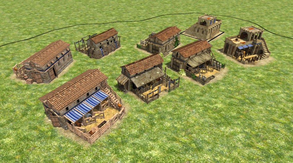
Sweet Jesus... I think from a gameplay point of view, unit recruitment gets assigned to specific and much more logical structures that become pre-requisites for training those units. This forces the player to make more thought-through decisions about how they're going to spend resources, and build-times, and for which units at what time. It also allows enemies to target specific unit production infrastructure, crippling specific area's of the enemies military ability. They also help delay unnatural rushing in the opening 5min of a game. New strategies and tactics open up, leading the way to more logical and diverse ways of playing the game. + there's so much eye-candy in the form of new buildings I can barely contain my excitement1 point
-
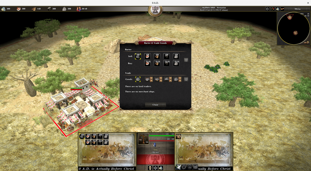
45. So I've added silver, however, somehow there is now a problem with buying resources: The only clue I have is a single warning from the interesting log: WARNING: JavaScript warning: simulation/components/Barter.js line 45 reference to undefined property multiplier.buy[resource] which I fail to understand. I did not touch the Barter.js file, nor do I understand why line 45 (buy) is problematic but line 46 (sell) not. By the way, which file do I need to change the cost of bribing (espionage) from 500 metal into 250 silver? placeableFilter file? Which, where, and how? 48. What is the syntax for internal AND and OR operators in technology json file modifications? {"value": "Loot/silver", "add": 1, "affects": "Healer"} E.g. I want it to affect champion infantry instead of healer.1 point
-
1 point
-
can't go cutting clauses out of sentences and expect them to retain their original meaning, silly I don't like how quickly cities fall once the administrative center (which is generally hard to fortify without planning for it at the start of the game) falls. "rush the CC" is mindless and effective in that it cripples the whole city. Better to make an attacking army fight the strongest points in the city before it falls1 point
-
1 point
-
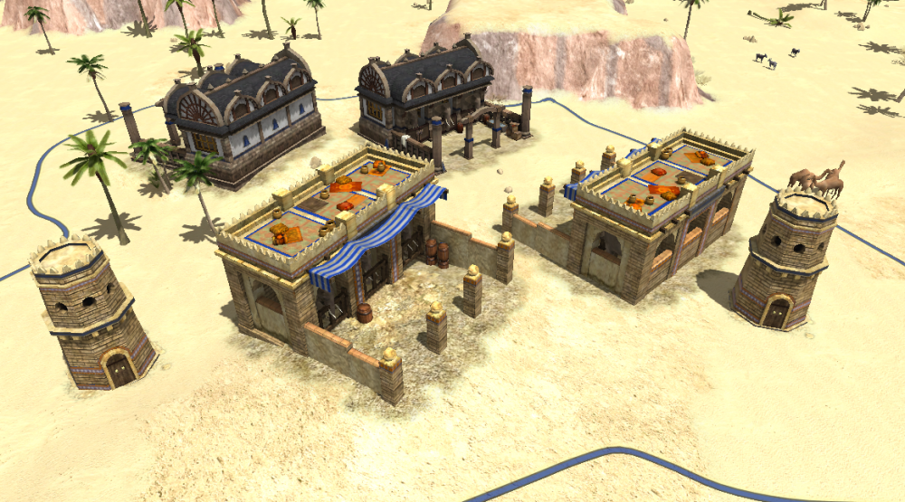
Nice elephant stables, LordGood! What's the role of towers? They don't train units either, but they can shoot arrows and are garrisonable; likewise I think fortresses are still worth having even if they do not train anything at all. (Just because castles train units in AoK doesn't mean 0 A.D. has to slavishly copy that). However, it was not decided that all champions are to be removed from fortresses, at least not as far as I know.1 point
-
In https://www.ancient.eu/Magadha_Kingdom/ Though I have no clue (I didn't read the page) if we are in pure history or in myst and litteracy (I found some stuff about lightning bolts weapons :p) There is a player called hunt from India in the lobby, perhaps can we ask more about: mahashilakantaka1 point
-
I'm hoping to have it so certain buildings spawn "nodes" or "plots" in pre-set arrangements around themselves that workers can then build new buildings on. Imarok suggested having a building construction class limited to the node or plot. The problem is I don't know how to have a building spawn other entities in pre-set arrangements around itself, and have those disappear if the building is destroyed. I'm also not sure how to limit a build class to another entity in pathfinder.xml, only land or sea.1 point
-
https://webdesign.tutsplus.com/articles/understanding-the-z-layout-in-web-design--webdesign-28 This applies other kind of dewing focus inbred or information The premise of the Z-Layout is actually pretty simple: super-impose the letter Z on the page. Place the items that you want the reader to see first along the top of the Z. The eye will naturally follow the path of the Z, so the goal is to place your "call to action" at the end. All along the path you can include bits of information that build up to the call-to-action. Let's take a look at the diagram: This post marks the first in a series where we’ll be examining the wide variety of layout paradigms that exist in the world of web design. The goal: to better understand why you might choose one layout concept over another. In this series, we'll also be looking at the "F" shaped pattern, the open layout, and some out of the box layouts that are sure to give you some great ideas. Attaining a better grasp of how different layouts can change user behavior is one of the central principles of the creating an effective user experience. : Notice that we've numbered the key points along the path - these represent the order in which a reader is likely to view the page content. Let's see how this translates to an actual layout: Now let's overlay the Z-Diagram on top of the layout: Simple, right? There's certainly nothing complicated about this layout - but it quickly and effectively moves the eye from Point 1 to Point 4 in a logical order - concluding with a powerful call to action. There's still a few things that we can do to spice this layout up though... so let's add a few things to the design: Background separation to focus the eye movement inside the framework of our design. A styled logo to grab the user's attention at point #1. A colorful "sign up" button at point #2: this will reinforce the desired eye movement. A Featured Image Slider in the center of the page: this will separate the top section of the design from the bottom, and facilitate eye movement downward. Icons at point #3 and along the bottom axis: this will encourage "title scanning" as the eye moves to the call to action. A big "call to action" at point #4 - thanks to the new background separation, this feature should stand out more. Here you can see that the new "sign up" button in the navigation stands out more; The "slider" that we've added to the leaderboard area helps keep the user's attention within the center of the frame; The 2 icons next to the blocks of content in Point 3 also help to make them a bit more visually interesting. Again - this stuff is simple as it can be, but simple can be good when it comes to website design! You can layers in complexity as you please, but don't overlook the power of a simple, effective layout. Why it Works The Z-Layout certainly doesn't need to be the final concrete solution for all sites, but as I mentioned before, it's often a great jumping off point for any design project because it tackles the 4 of the big principles of an effective design: Branding Hierarchy Structure A Call to Action It works because most Western readers will scan a site the same way that they would scan a book - top to bottom, left to right. From this simple foundation you can pretty much go anywhere: Add multiple calls to action, shrink the height of the Z, extend it, do whatever you'd like that makes sense to the goal of the site. Let's take a look at a few great site designs that use the Z-Layout as the basic structure. One thing you'll want to note in these examples is how the z-layout is able to adapt. The Call to Action may not always be the same (some sites may want to drive you to their portfolio more than they want to you "Sign Up"); the content along the path may look markedly different than our example. The thing to notice is how the storytelling aspect is carried across: 1, 2, 3, Action! By moving the eye along the Z-Path, the chances that a viewer will end up doing what you want them to do is increased. While you view these examples, try to find the Z-path that the designer wants you to follow. Examples of the Z-Layout in Action Evernote looks complex at first glance, but a closer inspection reveals a z-path ending with the "download" button. Much simpler, the Daina Reed site delivers a couple quick bits of information, then prompts a "Get in Touch" action. The path on CodeMonkey starts at the logo and ends on "Get Started". It's a bit harder to see here because of the duo-chrome palette, but the z-layout creates the general framework. This example ends with a bright, bold price tag. Probably one of the clearest uses of the Z-Layout, the Blue Acorn design hits each point along the path. Campaign Monitor's design mixes up the layout, but the 1, 2, 3, 4 steps are all intact. Caveats Worth Mentioning It's important to note that the Z-Layout isn't the only layout paradigm that's out there. Heck, there are about as many layouts as there are letters in the alphabet. The Z-Layout is one of the principle layouts because it's so simple to use as a foundation, but you'll always want to trust your instincts when it's time to make a final layout decision. ...Regardless of any specific layout design, viewers are more likely to first look at the biggest, brightest, and most highly contrasted elements on a page. There have been a bunch of interesting studies done on eye-tracking that suggest trying to predict eye-movement across a website is about as erratic as sending 1,000 kids into a candy store. Several studies have also shown that the "F" shaped layout (which we'll be reviewing next in this series) is more effective at controlling a viewer's eye movement across a page. The simple truth is that, regardless of any specific layout design, viewers are more likely to first look at the biggest, brightest, and most highly contrasted elements on a page. Keep this in mind; if your goal is to guide a viewer through the Z-Layout, don't give them any more opportunity to be distracted along the way than they already have. Where the Z-Layout truly shines is in design projects where simplicity and a call-to-action are the most important principles. Trying to force a Z-Layout on a complicated content structure probably won't work well, but allowing the Z-pattern to form a framework for a very basic site can bring a sense of order that can help increase your conversion rate. Check out the "F" shaped pattern post!1 point
-
Color Contrast Simply put, contrast is the difference between two colors. On a web page, the amount of contrast required varies with different parts of the page. You usually want a high contrast between text and its background color. But too high contrast between design elements might give an unsettled and messy impression. Black and white create the highest contrast possible. Please visit our Color Contrast Analyzer page to see if the colors you want to use have enough contrast. Colors can contrast in hue, value and saturation, but there are many different types of contrasts that have been defined by color theorists throughout the years. Some of them are perhaps not directly applicable to web design, but let's look at a few of the most important. Contrast of Hue High Contrast Low Contrast Contrast of hue is what relates most directly to the color wheel combinations described above. The further away from each other two colors are, the higher the contrast. This means that the complementary color combination has the highest contrast, while the analogous combination has the lowest. For text, a contrast of hue alone is usually not enough to make the text as legible as wanted. In that case, you might want to combine contrast of hue with some other form of contrast. A special case of contrast of hue is contrast of warm and cold colors. The way the human eye works, cold colors appear to be more distant, while warmer colors appear to be closer. This means that it is a good idea to use a warm color for a symbol or menu, and to use the cold colors for backgrounds. Contrast of Tint and Shade High Contrast Low Contrast Contrast of value is very efficient in creating large contrasts. The biggest contrast of them all-- black and white-- can be said to be a contrast of value. In general, large differences in lightness are considered to be pleasant for the eye, but low contrasts of value can also be useful for more subtle differences-- for instance, in a background. Contrast of Saturation High Contrast Low Contrast Contrast of saturation is often best for design aspects that do not require a lot of emphasis. A set of colors with different saturation set against a grey background can be interpreted as transparency. This is something that can be used to interesting effect. Combination of Contrasts Not Good This is some text Better This is some text Good for background Bad for Text This is some text Against natural values With natural values While the contrasts above can be efficiently used one at the time, is is most common to use a combination of them-- especially for text where you need a high contrast. The top picture to the left shows blue and its split complementary color, orange. This is a combination that has a high contrast of hue. This gives a rather vibrant combination that can be tiring to the eyes. By changing the value and saturation as in the next picture you will get a combination which is much more pleasing to the eye, and more readable. Working against the natural values of the colors can often have bad effects. For instance, yellow is naturally a lighter color than its complement, blue. A combination in which yellow is darker than blue would feel strange. Colors and Text Green on red is hard to read And so is red on blue Black on white is easy to read And so is yellow on dark blue As mentioned above, using the right contrast is especially important for text. Using the wrong colors can decrease the readability drastically, and it will quickly tire the reader's eyes. Black text on a white background has the highest readability. Black and yellow is another combination which usually has a high readability, as do blue and white. Green text on red and red text on green are particularly hard for many people to read. A combination of red and blue creates a vibrating effect that can also make reading very difficult. Color Blindness Another thing that can be good to keep in mind when making color selections is color blindness. Some 8% of the population has some form of color blindness, and by choosing the wrong colors, you can make your page virtually unreadable for them. There are some colors which are worse than others-- for instance, red and green. Blues and yellows are usually better to use for this reason, and you should make sure that there is a strong contrast between a text and its background. Also, make your design so that color is not the only visual cue.1 point
-
How does vox get the animals to run away like that? Give them a small vision range?1 point
-
I semi-agree. The UI is already overwhelming with buttons and info. The background is bringing more eye-strain. However, I like the minimap in the corner. In fact, I'd take any corner as long as it's in the corner... not alongside the Unit/Building control buttons.1 point
-
1 point
-
1 point
-
1 point
-
Indeed, it would be best to have mines a bit further out But that's beyond me here1 point


.thumb.png.ce58cea22940c255f5b0a735d5abee36.png)


