-
Posts
298 -
Joined
-
Last visited
-
Days Won
16
Everything posted by nifa
-
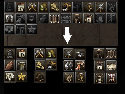
well, it's basically the template/ classes order. I think it will mostly be an improvement for beginners It's the same number of portraits in the same space. You can check, no change of the size. It would be 8 or 9 portraits per line instead of 10; but the columns are better filled up with 3 portraits, while in the original 7 out of 10 columns contain only 2 portraits.
-
what about sorting in columns by function and in lines by phase like this: 1. column is civic 2. economic 3. military 4. fortification
-
Alpha 26 Pre-release/Release Candidate Build Testing
nifa replied to Stan`'s topic in Game Development & Technical Discussion
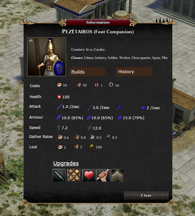
maybe like in the following? I think it would be nice to use "tabs" like in a browser: -"stats" tab -"history" tab -"builds" tab -"equipment" tab; I don't know if this is possible, but for some units it would be nice to have some information about the props, like the roman pilum, scutum or gladius; or the iberian falcata Also nice to have would be if you could press the upgrade buttons in the menu and you would instantly see how they effect the unit stats. -

Alpha 26 Pre-release/Release Candidate Build Testing
nifa replied to Stan`'s topic in Game Development & Technical Discussion
idlebug.mp4 I hope it's possible to see, the number of 4 idle workers below the minimap is blinking as soon as they get into a formation @Stan` @Langbart -

Alpha 26 Pre-release/Release Candidate Build Testing
nifa replied to Stan`'s topic in Game Development & Technical Discussion
When a formation is idle, the number of idles workers shown in the right down corner of the minimap seems to be buggy. It switches between including the formation and excluding it few times per second. Tested with svn version, most recent commit 27006. I think it's easy to reproduce in every game. Is that bug known? -

Error = "failed requirement: Mesh is made of triangles"
nifa replied to LordStark's topic in Art Development
You can also use the following: Mesh ‣ Clean up ‣ Delete Loose Select ‣ Select All by Trait ‣ Loose Geometry https://trac.wildfiregames.com/wiki/ExportingErrors It says you can't use quads and that you'd have to triangulate your mesh, isn't that outdated? -

Walls - Tips for perfectly aligned walls
nifa replied to LordStark's topic in Scenario Design/Map making
You can use copy/paste (ctrl + c/ ctrl + v) in Atlas to get at least a little bit of symmetry. -
I tried out several biomes and they all look very nice! The random topography makes it so real and unique. Sometimes it produces a little mess though, with mines appearing on top of the mountains. Treasures sometimes don't fit the biome they are placed in, e.g. I had ship wrecks on the mountains xD Some waterlilys and reed at the lakes would look nice:) Would love to have this map in the main game!
-
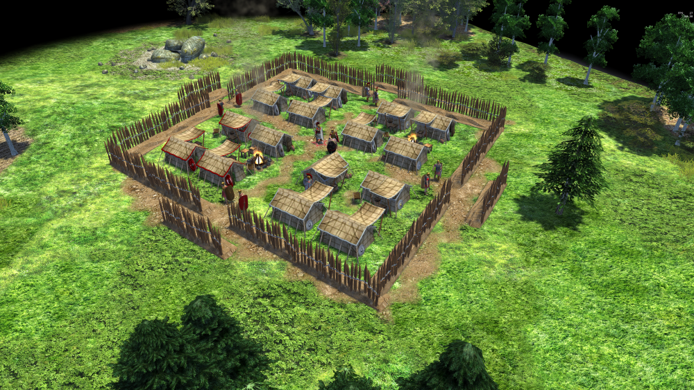
here they are:) i'm not yet convinced of the textures though the smallest size could be like the recent camp but with the option to draw the camp to a bigger square rome_pilum_murale.dae pila_murale.blend
-
Common structure of a military camp during the imperial period: Valli is a different term for pila muralia
-
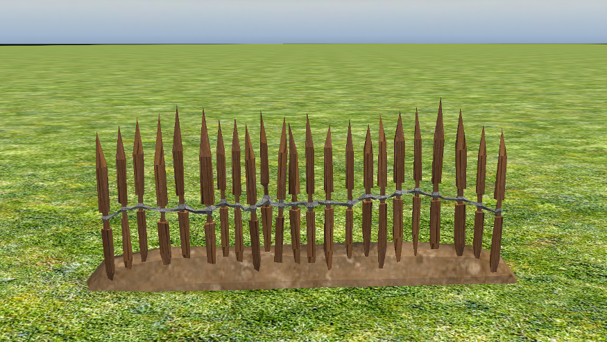
hi all, I took my first few steps in blender and tried to recreate a wall of pila muralia (or pilum murale), which are wooden sticks made out of oak. The Roman legions used to carry them with them to quickly build up military camps without having to cut down trees first. They piled up an earth wall, stuck the pila muralia in it and tied it together in the middle. Now I was wondering if that would be something to use for a replacement of the recent army camp model, which is a bit too small and outdated imo. I also found some nice reference for new tents (e.g. for the centurio): http://www.castrum-novaesium.de/Seitenraster.12.html The camps always had a very similar structure, mostly square or rectangle with 1 entrance on each site and round corners. Some of them were build for a night, others were upgraded with stone walls and barracks, e.g. to protect a border. I was wondering if it's possible to build the wall with drag&drop in a rectangular shape and then automatically fill it up with tents? The point were you click the mousebutton would define one corner, and the point where you release it would define the corner on the diagonal side. That would let the player decide about the size and the shape of the camp, while it's still only one button in the building menu of the units. Would that be easy to realize or is a lot of coding required?
-

Feedbacks from A26 SVN tests
nifa replied to Yekaterina's topic in Game Development & Technical Discussion
Thanks, works. -

Feedbacks from A26 SVN tests
nifa replied to Yekaterina's topic in Game Development & Technical Discussion
With the latest svn (At revision: 26462) I get errors when trying to save a game or load one. It appears to be some problem with the GUI of the saving/loading window (page_loadgame.xml). Does anyone else have this problem? -
I'm interested, please keep on spamming
-
I think some symbols could spice things up and consume the empty space between the buttons. e.g. a sword for single player, crossed swords for multiplayer, two gears for options, a door for exit, a book for learn to play etc.
-
I tried to represent a roman castrum, so I think the fortress makes more sense there, also the civic center looks too big in there. But if it works better in another way I'm also fine with it I don't have much freetime and I won't be active so much, so feel free to improve the map however you want (I won't be able add the new terrains as well). I'm kinda proud that it get's some recognition anyway Thanks a lot!
-

===[TASK]=== Terrain and Map Overhaul (Milestone: Alpha 27)
nifa replied to wowgetoffyourcellphone's topic in Official tasks
Why only at the borders of the forest, not inside? This way it looks strange once you cut the wood. Is it because of performance? I think it would also look better if there wasn't such a hard line of border-marking bushes, but rather some kind of fluid transition -

===[TASK]=== Terrain and Map Overhaul (Milestone: Alpha 27)
nifa replied to wowgetoffyourcellphone's topic in Official tasks
I think that dead wood could be a nice addition to make forests more realistic. Something like tree stumps, fallen trees, burnt trees from lightning, dead trees. At least for European forests, they have never been so "clean" as they are today and that's because of forest industry. I know it's partly included in other trees but I think it could have its own category. I tried to use a lot of that for my limes map: https://wildfiregames.com/forum/topic/36065-new-scenario-map-the-limes/?do=findComment&comment=415734 -
Thanks, I'm happy you liked it! Sure let me know what you have in mind. That one looks like I forgot a texture behind the stones:D @wowgetoffyourcellphone I didn't know people are interested, but in this case I'll try to update it. Do I have to do that in altas or are you using a script or how is it done?
-

Should I release DELENDA EST ALPHA 25 incomplete?
nifa replied to wowgetoffyourcellphone's topic in Delenda Est
If it's possible to add the new suebian buildings, that'd be nice, but apart from that I'm looking forward to a soon release! -
Sounds good to me. A shooting angle of maybe 45 degrees for artillery on ships without turning might be okay as well. Less turning means more realistic battles (also slower turning but that's a different story). A catapult shooting both in the direction of the front and the back is unrealistic, might be hitting the own sails, so there would be a need to turn. We would need to check for historical accuracy, what the exact positions would be for each unique ship. Whether they were fighting to the front, to the side.. maybe both, or to the back... and with how many on each side
-
if there is a plan to distinguish between arrow-attacks (archers) and bolt-attacks (catapult), then the ships shouldn't turn for attacking with arrows. Let's say soldiers, citizens, elephants, heros, and fishing boats are attacked with arrows, while buildings, siege and bigger boats are attacked with bolts. Seems weird if the whole ship is turned to attack a single soldier standing on the beach. They should be able to shoot in any direction then.
-

Roman buildings --village phase reference---
nifa replied to Lion.Kanzen's topic in Tutorials, references and art help
Maybe this could be something for the Republican Romans in DE to differ from the Imperial Romans? @wowgetoffyourcellphone


