-
Posts
2.333 -
Joined
-
Last visited
-
Days Won
60
Everything posted by Sundiata
-
Game Setup Rooms aka games creation room UI "overhaul"
Sundiata replied to Dade's topic in General Discussion
@wowgetoffyourcellphone YEAAAHS!!! Did you just make that???? It looks amazing! And it finally puts to good use those emblems! I love... -
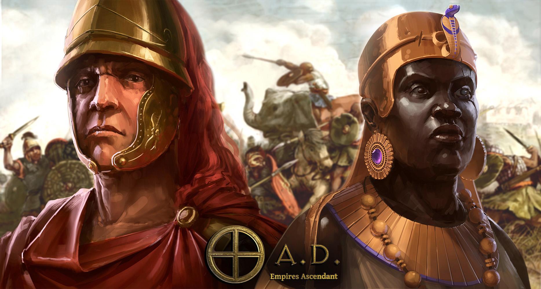
Yes please! When selecting a group, the entire group should move at the speed of the slowest unit in that group! This seems like a basic feature that's perhaps overlooked? It would help a lot with keeping armies together when marching a long distance, and would make the AI less vulnerable when attacking. When you're moving with siege-engines, infantry and horses in the same group, the group will move at the speed of the siege. You can easily select a subgroup of specific units from the original group, and when given a new move-order, would start moving at the normal movement speed for that unit. So horses would start moving at their original speed (a lot faster) when a move order is giving only to the horses, while siege and infantry keep moving at the speed of the siege-engines. I think it's a tactical must-have... By the way, a Han Chinese faction has been created and is fully playable. It juts needs some more vocal support to get in the vanilla game... A nomadic Xiognu faction is also in development and seems like it will be ready before the next alpha. It also needs support to be implemented in vanilla. Same story for the African Kushite faction...
-

Desired gameplay(planned) features for A23
Sundiata replied to Lion.Kanzen's topic in Gameplay Discussion
I completely agree, I'd love to see the AI become a lot more challenging, reactive, responsive, strategic/tactical, building walls etc.. There should just be three "versions" of the AI: Passive: One that doesn't attack (unless maybe in late-game), focusses on defence/econ, peaceful diplomacy (more likely to request/accept ally status). Reactive: One that attacks, in response to attacks (reactionary). A balanced AI, that responds proportionally to threats. Attacks when strong, defends when weak. Aggressive: One that just attacks: Attack, attack, attack! Basically the current AI The newbies need something other than ceasefire to get used to the AI, and a lot of long-time players have a very laid-back/relaxed play-style, which isn't fun when the AI attacks every 5min. Sometimes you just want to live in peace, co-exist for a while, whilst building the town of your dreams. But that doesn't mean you don't want a worthy adversary when you're finally "ready" to fight. Ceasefire doesn't feel organic enough to satisfy. I want to feel different dispositions from different AI's... Seems, simple enough... What you do is, you just type the thing, next to that other thing, with the funny symbol and then some more stuff kind of like that, and voila! Seriously though, code is scary -

Desired gameplay(planned) features for A23
Sundiata replied to Lion.Kanzen's topic in Gameplay Discussion
I really think this is a must have. It would really help newbies ease in to the game, and offer (a combination of) different play-styles according to personal taste. The first few matches for every single person I've ever enticed in to playing 0AD have been pretty traumatic. I see the same for every first-timer on youtube. Different aggression levels from the AI would help A LOT. The AI waltzing into your town with at minute 10 with a "massive" army when you've just figured out how to build a farm is really disheartening for a lot of first timers. At least give them a heads-up that the AI is a total douche... This shouldn't be that difficult to do, is it? I honestly don't know... -

Game Setup Rooms aka games creation room UI "overhaul"
Sundiata replied to Dade's topic in General Discussion
On a side-note, wouldn't it be nice to show the civ-emblem next to the name of the civ, so you have a secondary visual association with each civ? -

The Kingdom of Kush: A proper introduction [Illustrated]
Sundiata replied to Sundiata's topic in General Discussion
A beautiful feel-good video about modern day Sudan, in the words of the Sudanese. Beautiful scenery and diversity of it's peoples and cultures. From Napata to Meroë The early glory of Kush, when Kerma Kingdom conquered Egypt (this is waaaay before the 25th dynasty): Meroitic insult to Rome: The Royal Baths The Amun temple in Naqa Meroë was settled by 950 BC! Meroitic geometric black and white mosaic floor: Musawwarat es Sufra 3D- 1.042 replies
-
- civ profile
- history
- (and 5 more)
-
That's what I think... Because it "didn't" work the first time doesn't mean it won't work the second try around... The secret is a really slick promotional video, of top quality, to showcase the true potential of 0AD, and the direction we want to go. This is a pivotal point...
-

The Kingdom of Kush: A proper introduction [Illustrated]
Sundiata replied to Sundiata's topic in General Discussion
@wowgetoffyourcellphone thank you so much for that video, it made me smile. My research is partially motivated by the same reasons Muhammed is talking about this history and organising tours. I'm happy to see young people interested, and that's one of the things I want to achieve here, with 0AD as well. We deserve to know our history... A history that has been hidden from us, and the world, for far too long. The lack of exposure to actual and credible African history completely distorts the narrative on Black history in general, as well as our own understanding of our ancestors. It's shameful, really...- 1.042 replies
-
- 4
-

-
- civ profile
- history
- (and 5 more)
-
Just some thoughts: That's what I'm passionately hoping for... Not just Kushites, but also Han Chinese need to be included in vanilla, and it would be awesome if you could finish the Thracian faction as well, before the next alpha release. 15 factions is better than 12, no question about that. It's also one of the easiest ways to attract new people and bring back old fans, generate interest and add diversity. The next release needs to make a splash! New civ's are some of the most visible and visually appealing addition an RTS of this type can add! I also think the next release shouldn't be rushed (at all), and all the projects currently being worked on need to be implemented, even if it takes a few more months. We have viable competition now, so I believe the next release needs to be as comprehensive as possible, to keep 0AD "competitive". This means very noticeable changes, upgrades and additions need to be embraced to make the next release more convincing and appealing. also, - All of the old unit meshes need to be replaced (every single one), though I don't know the status of that project, I admit. - Somebody needs to contact Enrique ASAP (there must be someone who has a personal contact/social media link to him). I loved his work on the horses and units, but it pains me to see it go to waste... I think he should either take a week off and finish up some of his projects, or release the necessary files for someone else to work on it. Off course we can respect his absence, but we shouldn't stall development on important aspects of an open source project because of it either. - Formal implementation of minicivs: The Xiognu (helps link China to the greater game). There is another miniciv already implemented as gaia on some maps: The Celts. Thracians could also have a miniciv-derivative. - I'll be the guy to say things other people are shy to say: the GUI needs a serious revamp. LordGood's paintings looks really nice. That really old painting with the hoplites at an acropolis is really not so nice. Although the main menu is just a vertical panel, it looks like it's from 2003... Why those square, dark grey tiles?? Why not a single slab of marble or something?
-
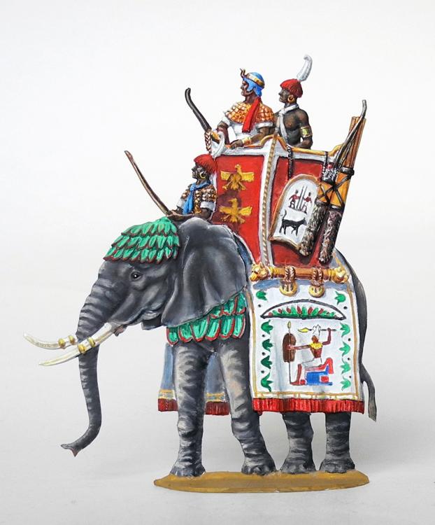
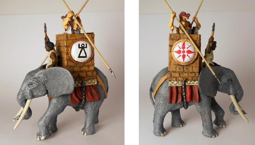
@Alexandermb, seen as you're having a go at the elephants, maybe you and @wackyserious could work on the Kushite Hero Elephant (ridden by King Arakamani): I found this sumptuous illustration of a Kushite King on his war-elephant. Kushites probably wouldn't have made (much) use of towers on their small forest elephants, but we can easily imagine a king riding a larger bull, with a lightweight tower (call it Ptolemaic influence). I think the image is an excellent imagination of what a towered royal Kushite war elephant could have looked like. My only suggestion is to replace the green fabric with padded cotton. I'll understand if you don't have time for this, you're both quite busy people, it would just be nice to replace the current placeholder.
-
@Alexandermb Nice...!
-
@Alexandermb I love everything with horses, so I definitely like this Could we perhaps see some quick video's or a collage of video's of your new animations?
-

The Kingdom of Kush: A proper introduction [Illustrated]
Sundiata replied to Sundiata's topic in General Discussion
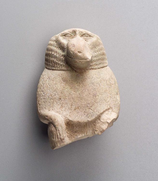
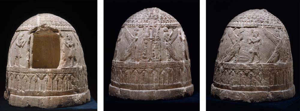
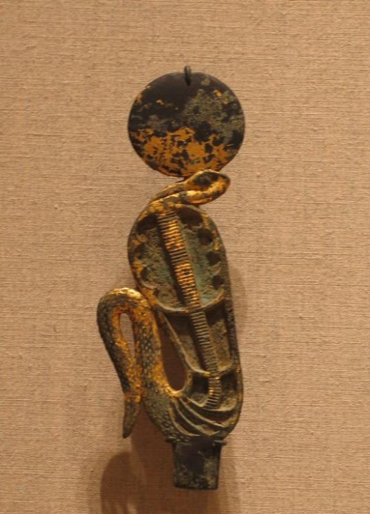
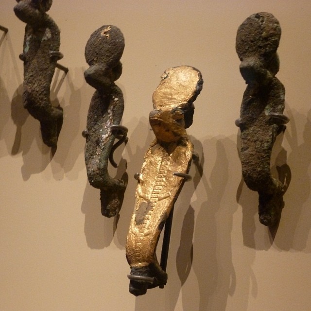
Nope All I can say is that they're cylindrical, and it's the original shape (it's not broken of or anything)... I don't think anyone really knows. In some alternative medicine circles it's referred to as "The Wands of Horus", but that seems like a load of BS at a first glance... Here's 13 pages of academic ramblings specifically on the subject, but doesn't really say anything conclusive, only conjecture: Personally, I suspect they might be symbolic cylindrical seals, representing royal authority. Who knows, another one of those Nile Valley mysteries... @stanislas69, good video!- 1.042 replies
-
- 2
-

-

-
- civ profile
- history
- (and 5 more)
-

The Kingdom of Kush: A proper introduction [Illustrated]
Sundiata replied to Sundiata's topic in General Discussion
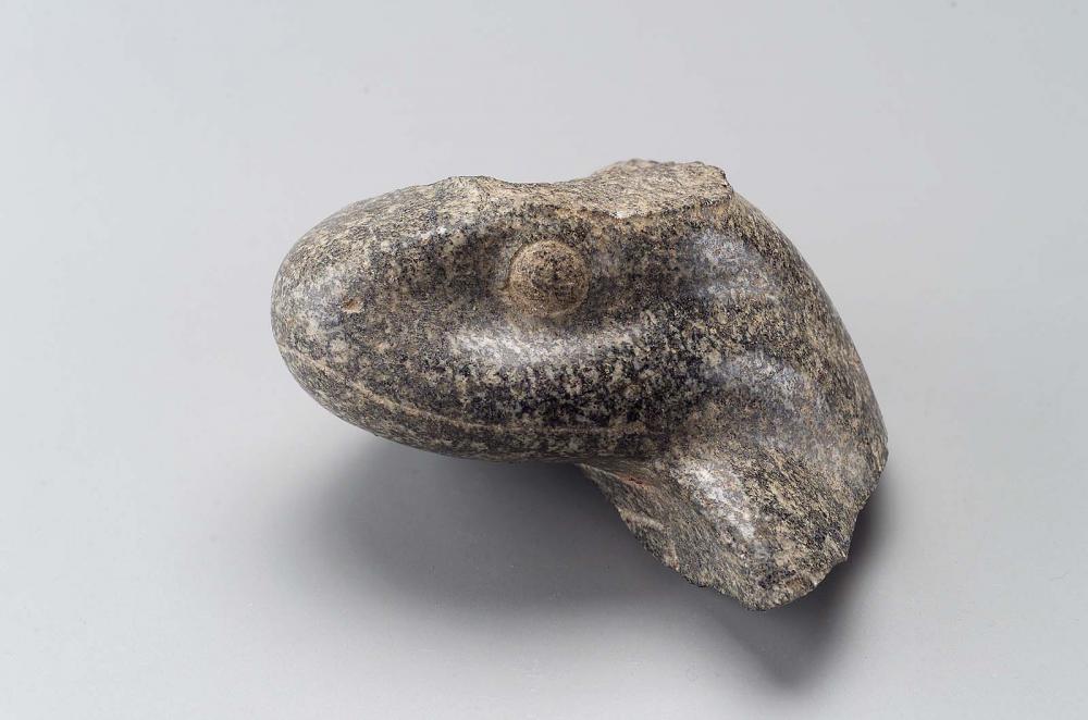
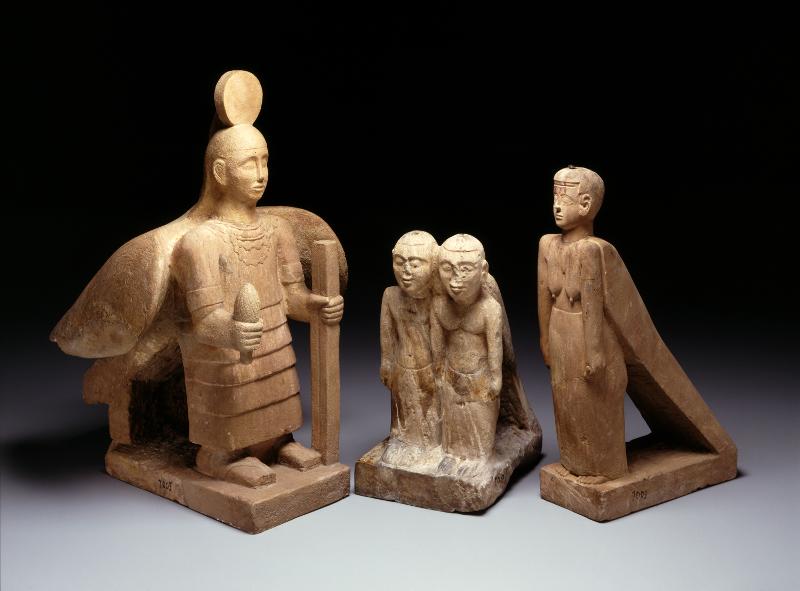
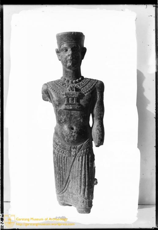
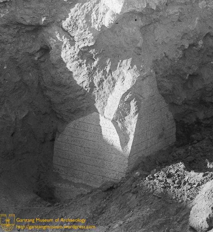
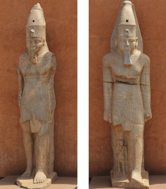
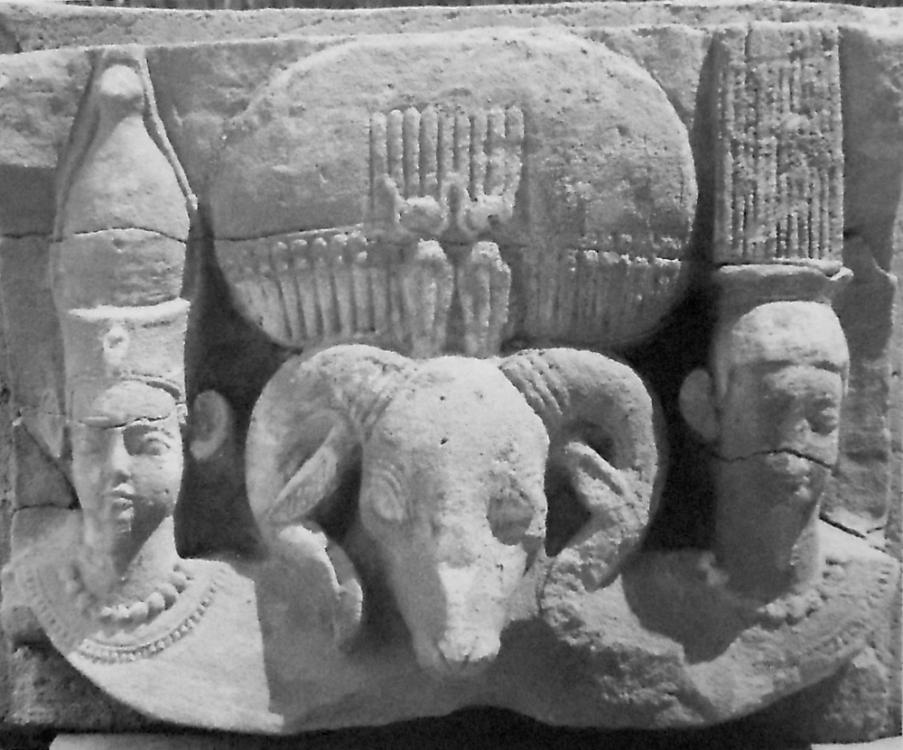
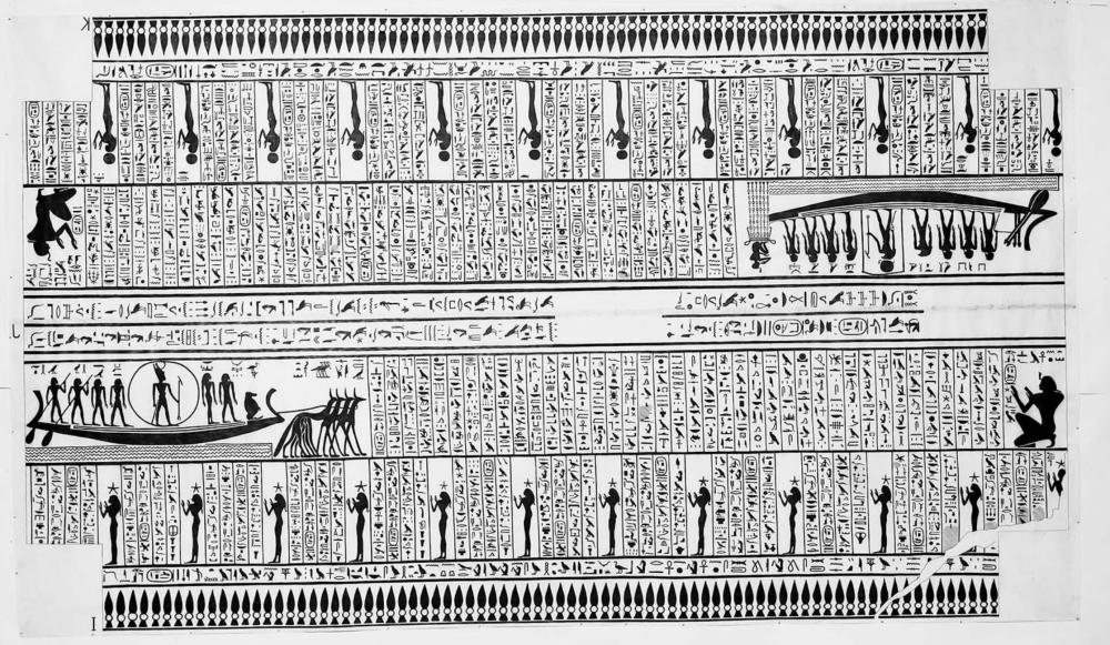
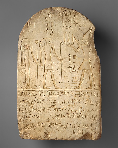
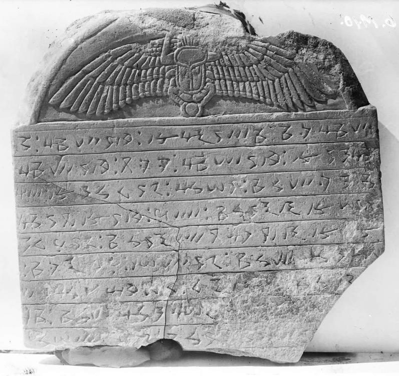
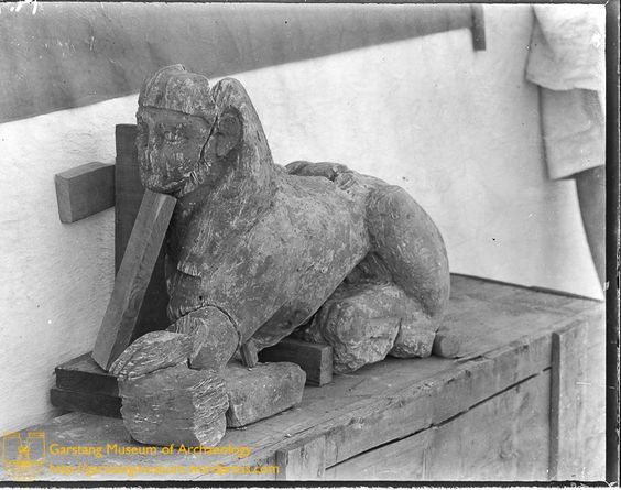
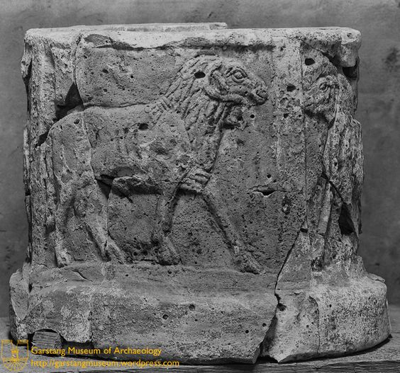
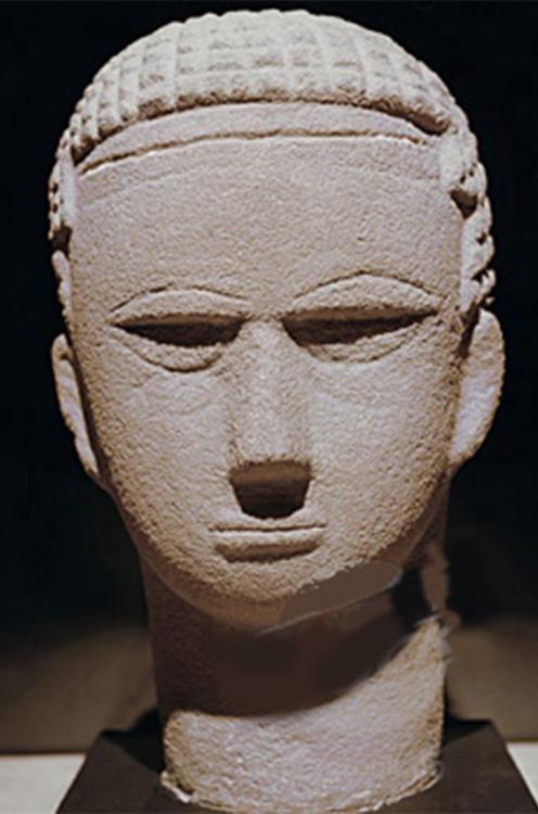
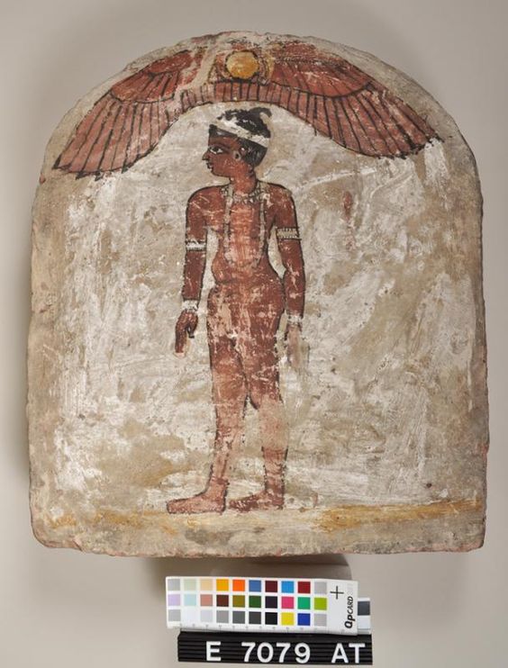
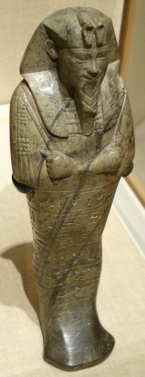
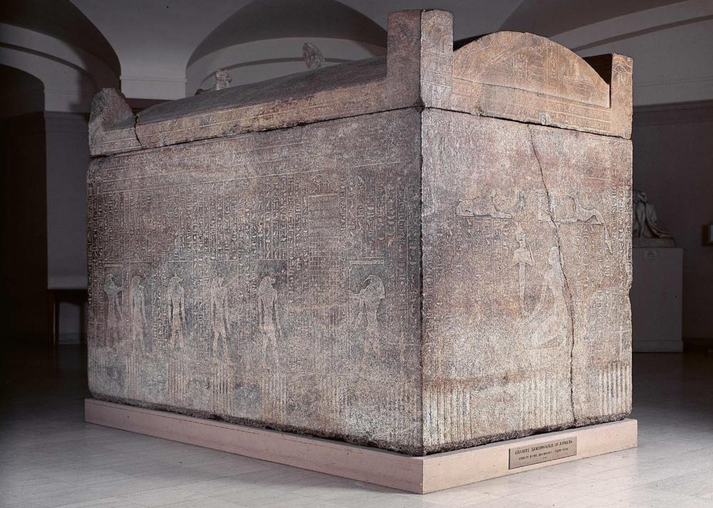
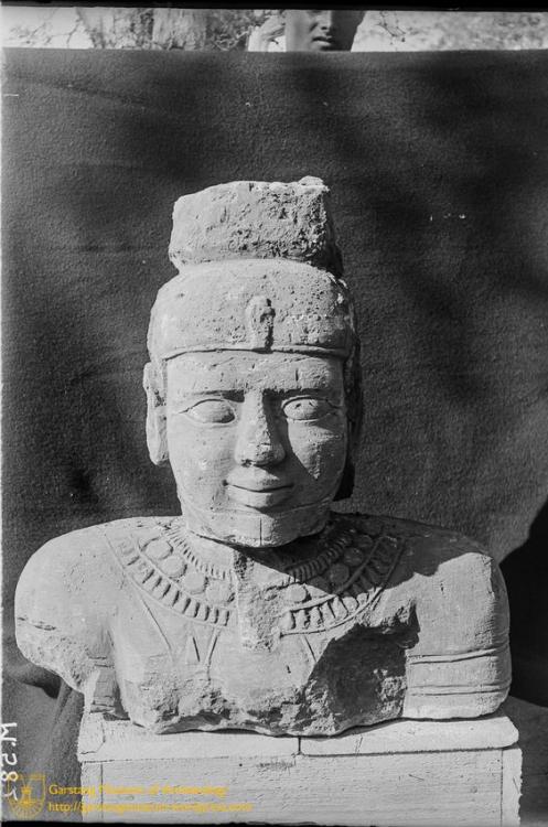
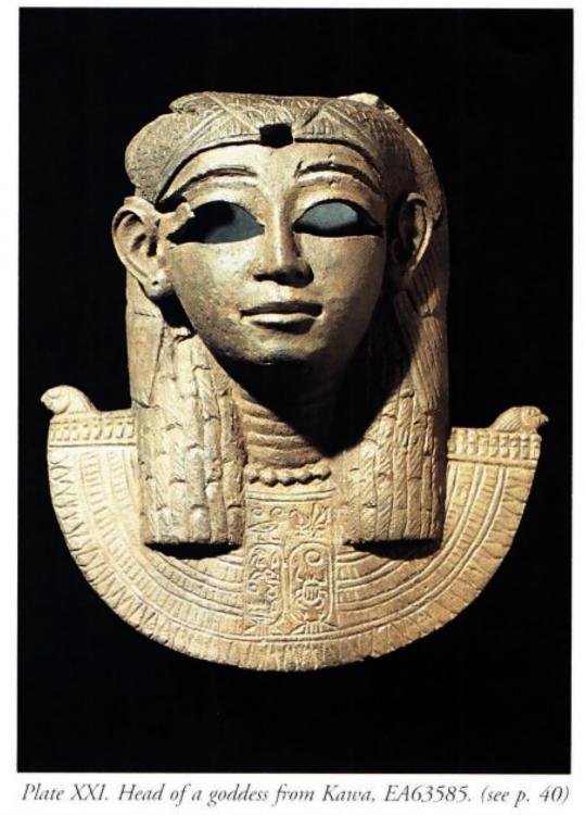
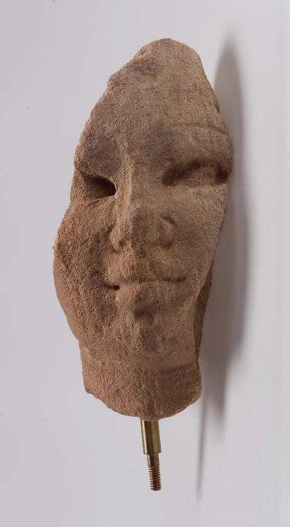
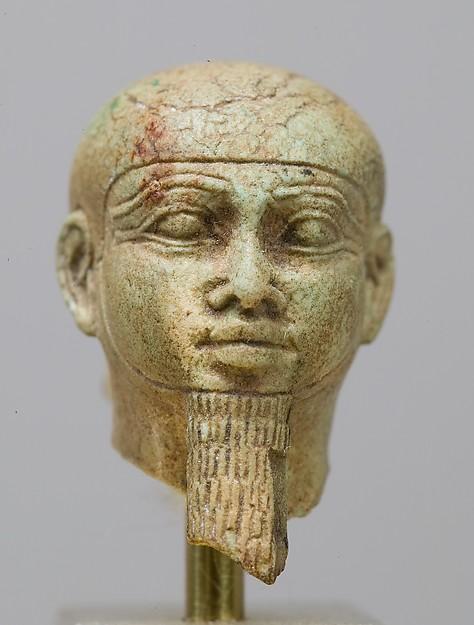
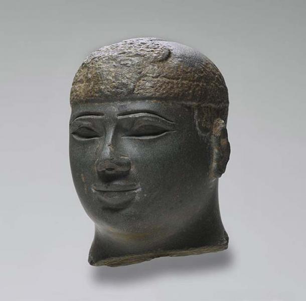
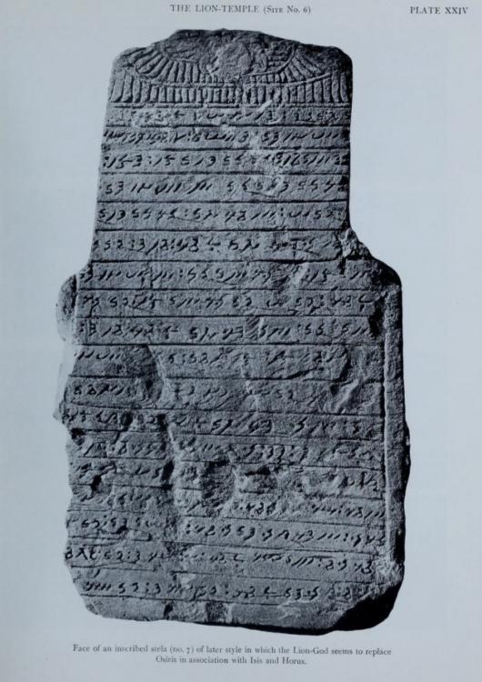
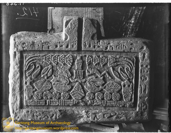
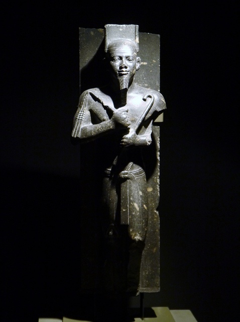
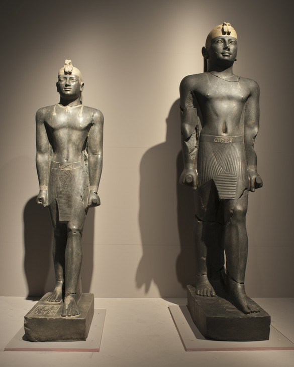
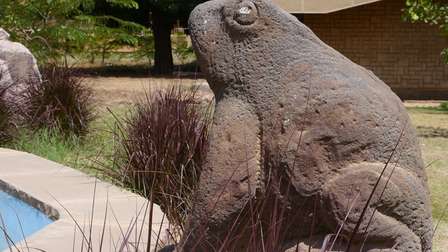
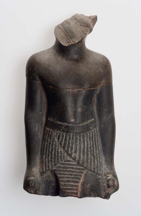
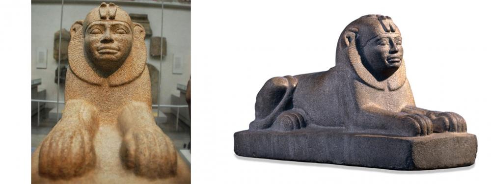
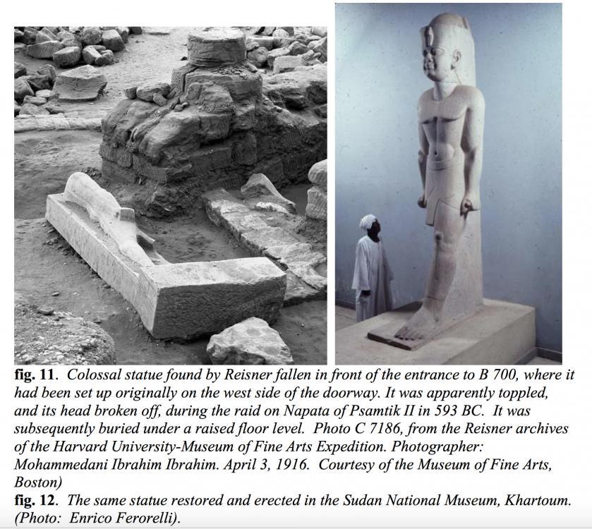
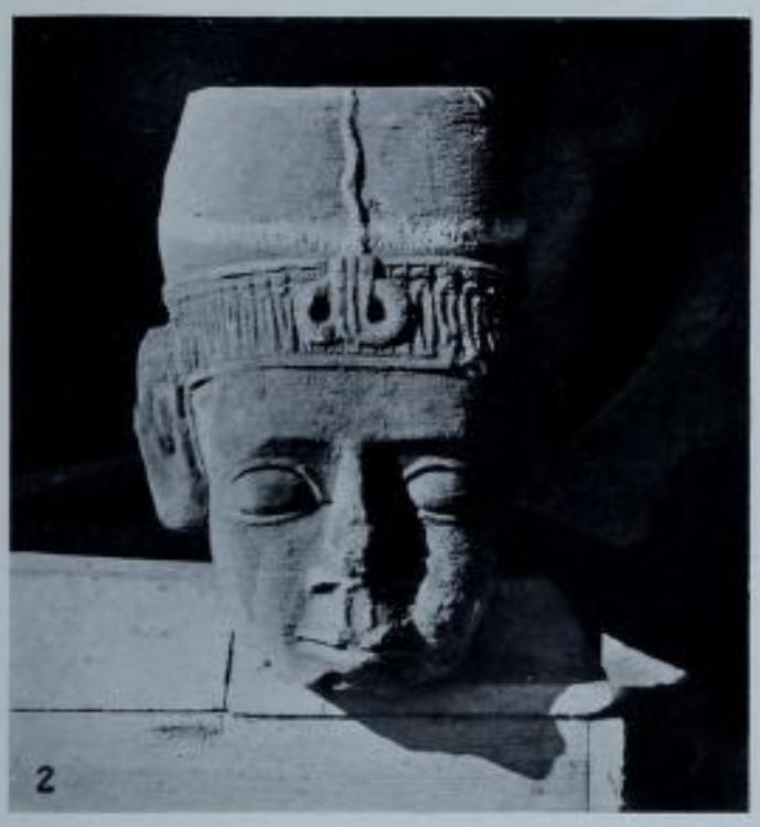
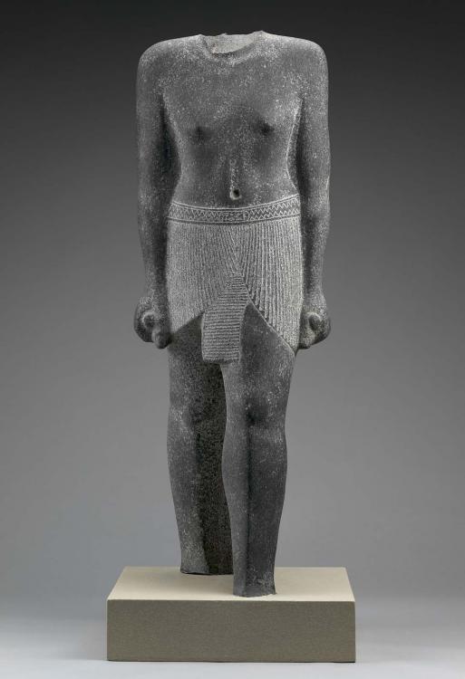
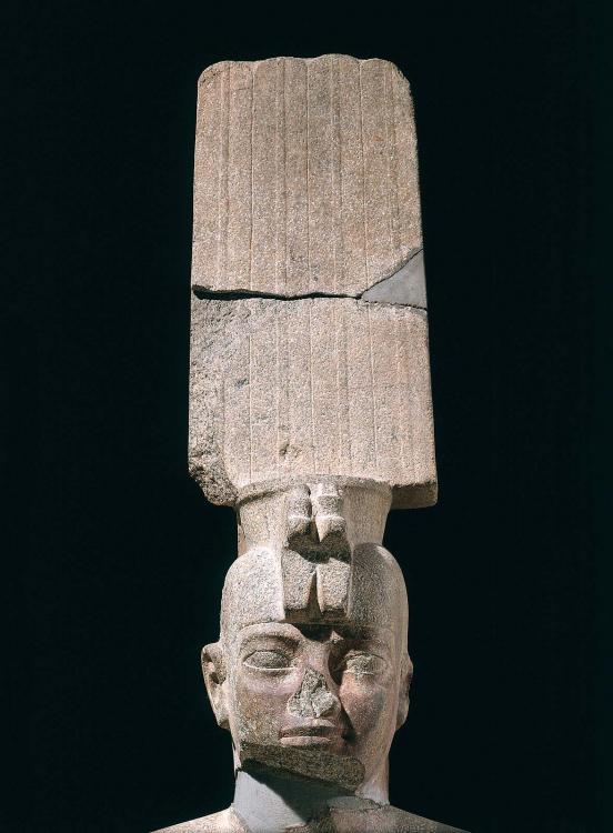
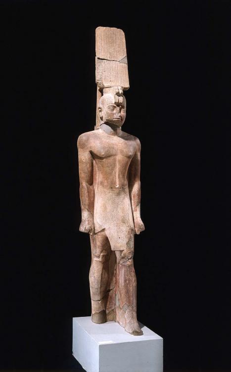
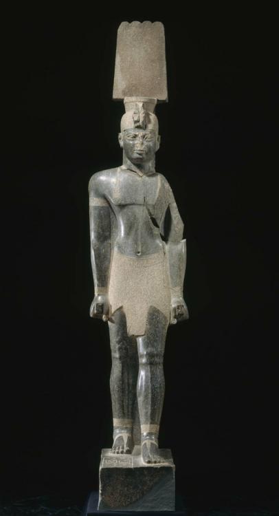
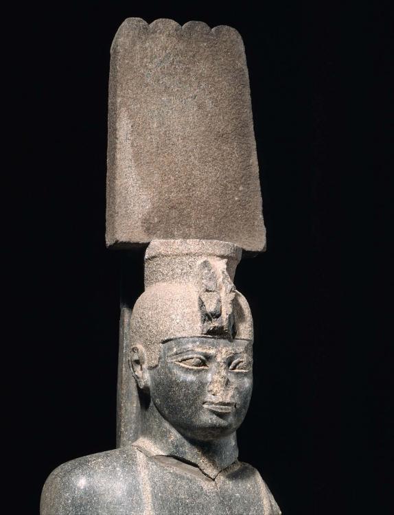
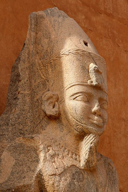
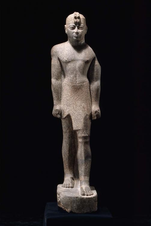
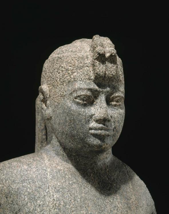
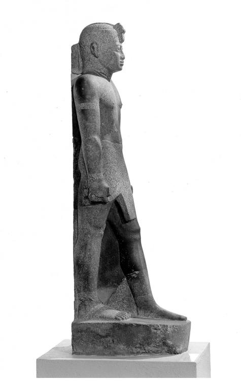
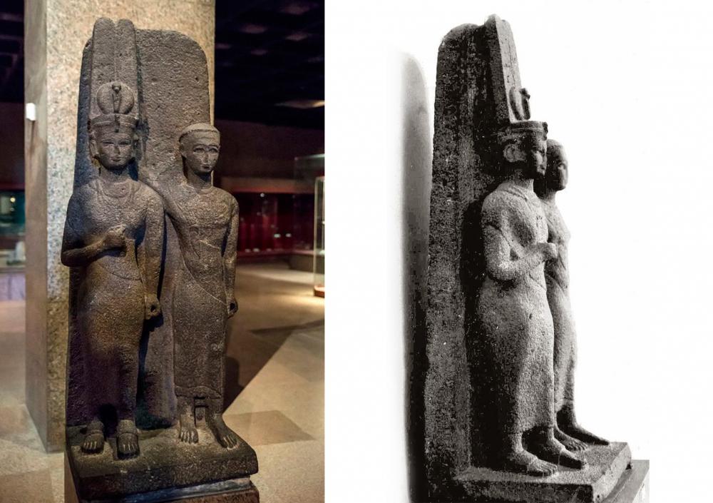
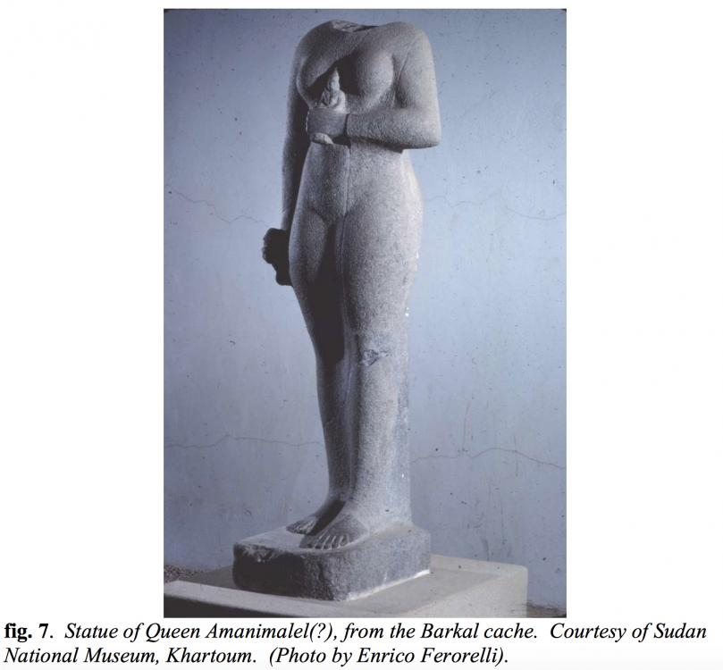
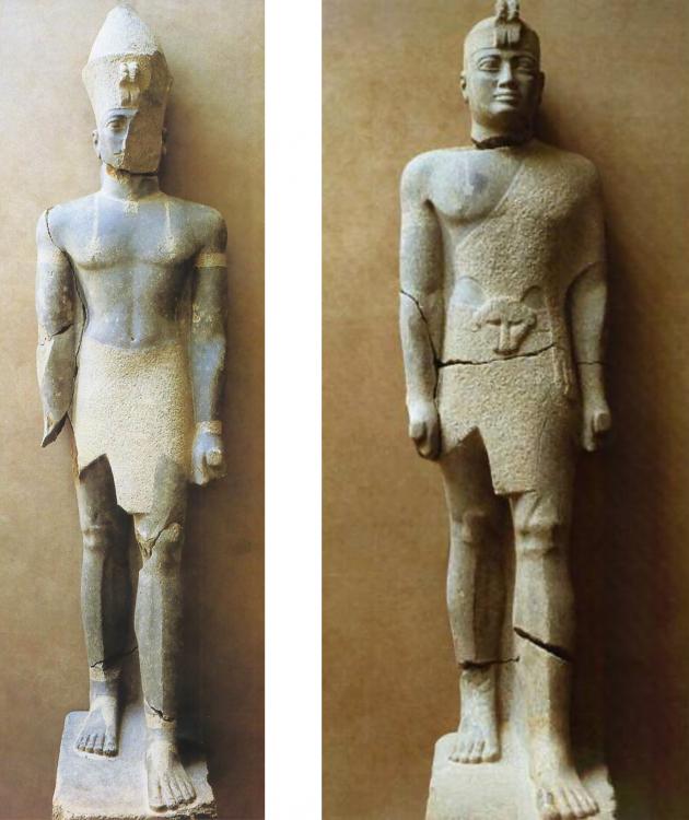
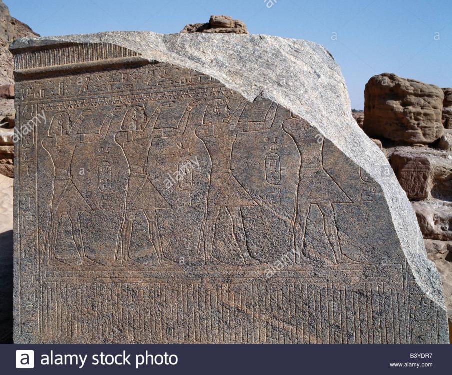
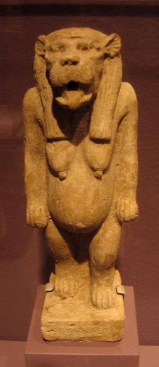
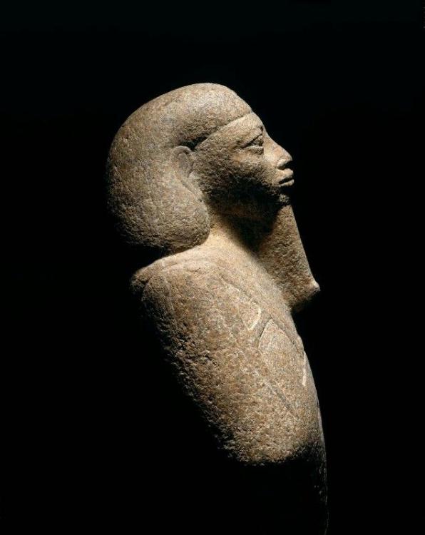
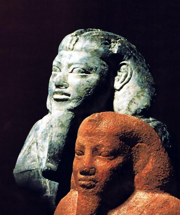
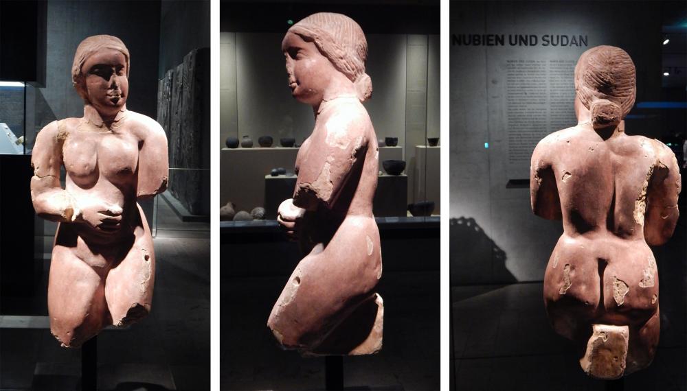
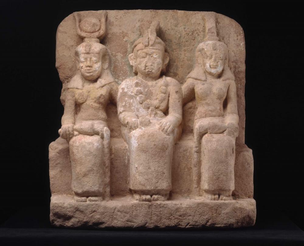
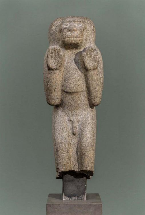
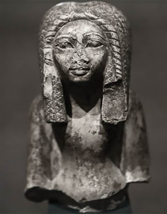
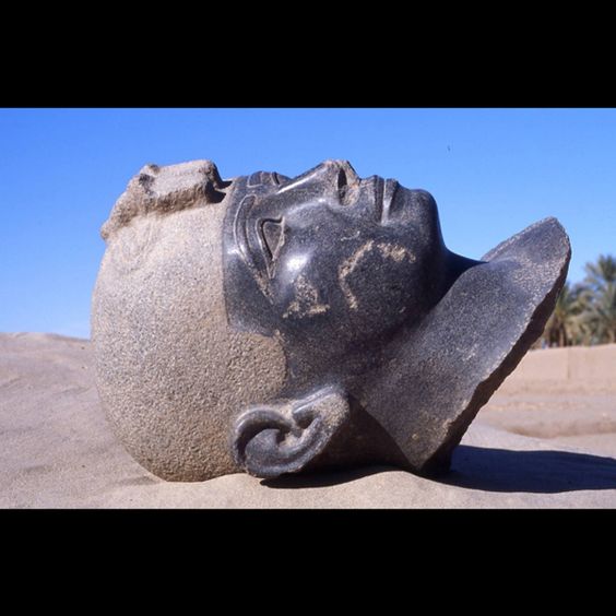
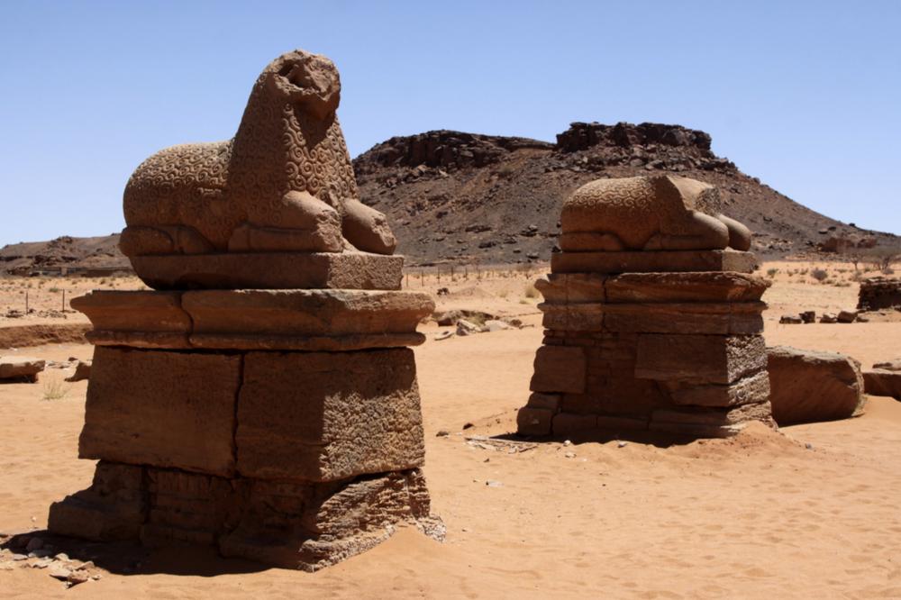
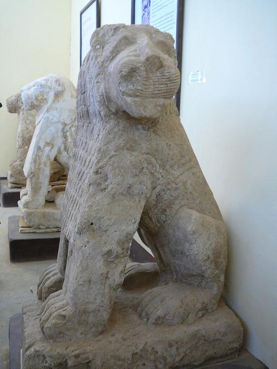
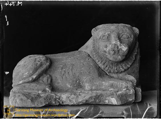
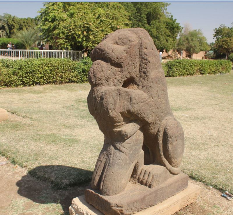
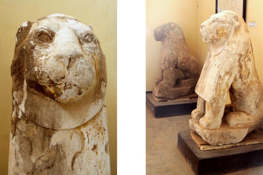
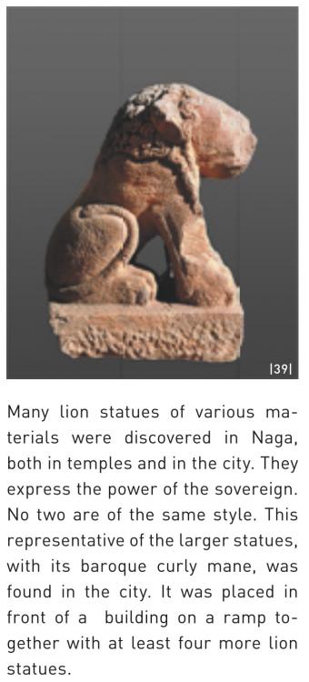
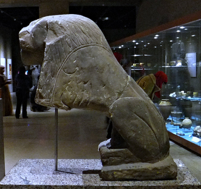
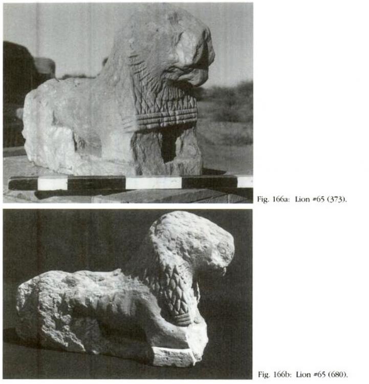
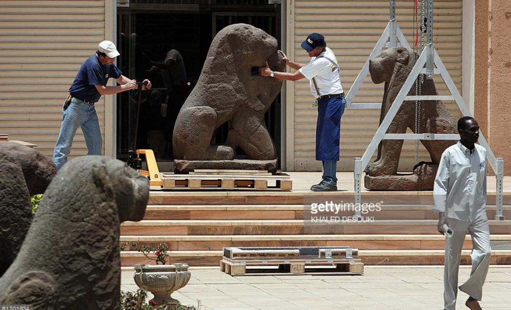
The Statuary of Kush, and other artefacts of cut stone This post focuses on the rich legacy of statues of cut stone in the Kingdom of Kush. Kushites loved statues, and produced a large corpus of monolithic carvings of many of their favourite subjects, particularly of royalty, but also deities and animals like lions, rams and even frogs. Other interesting stone objects include the many inscribed stelae, offering tables and the carved boat stands and altars in the temples. The most common medium is sandstone, which was the primary type of stone richly available in their territories, but granite and a number of other types of stone were also used. These statuary and carvings were produced during every period of Kush, since at least the Egyptian period. Statues and other cut stone artefacts from Kush:- 1.042 replies
-
- 2
-

-

-
- civ profile
- history
- (and 5 more)
-

===[COMMITTED]=== Carthaginian Unit Textures
Sundiata replied to wackyserious's topic in Completed Art Tasks
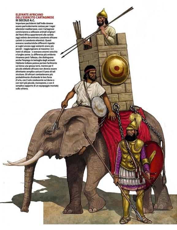
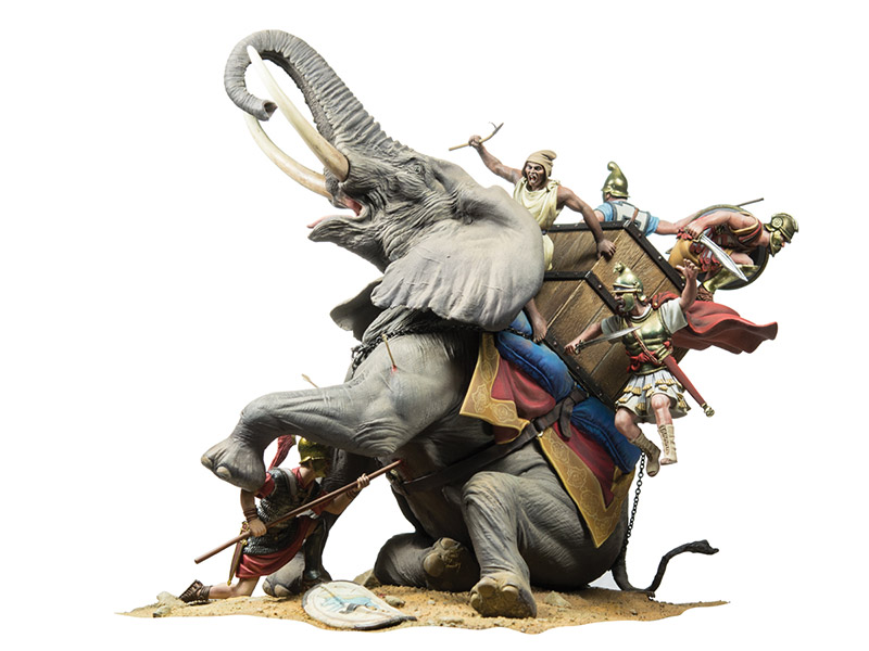
@wackyseriousFirst of, let me tell you, I'm a big fan of the work you're doing! Keep it up! About the elephants: if the tower is used, it does need to be noticeably scaled down. I think towers are actually ok, as long as they are really lightweight. -

Gauls modern references and link.
Sundiata replied to Lion.Kanzen's topic in Tutorials, references and art help
-

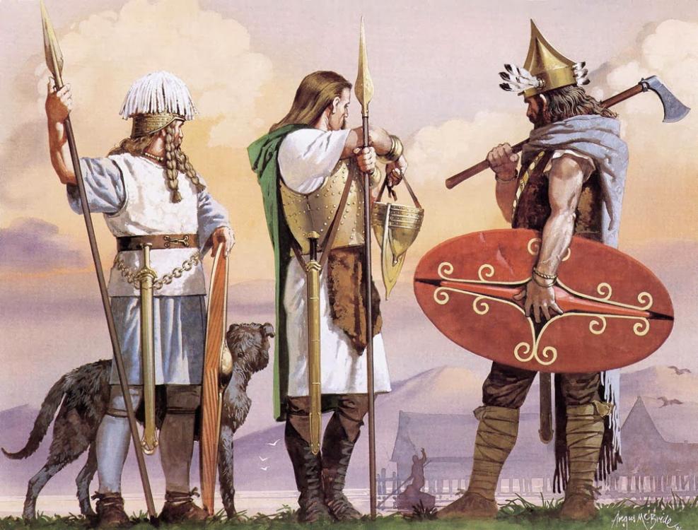
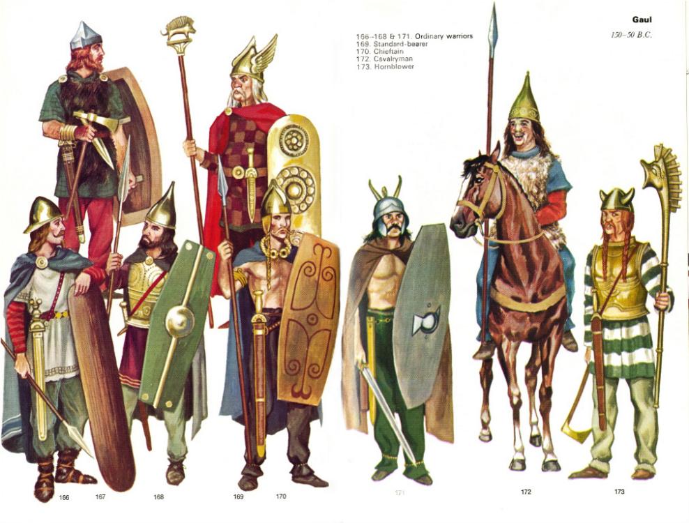
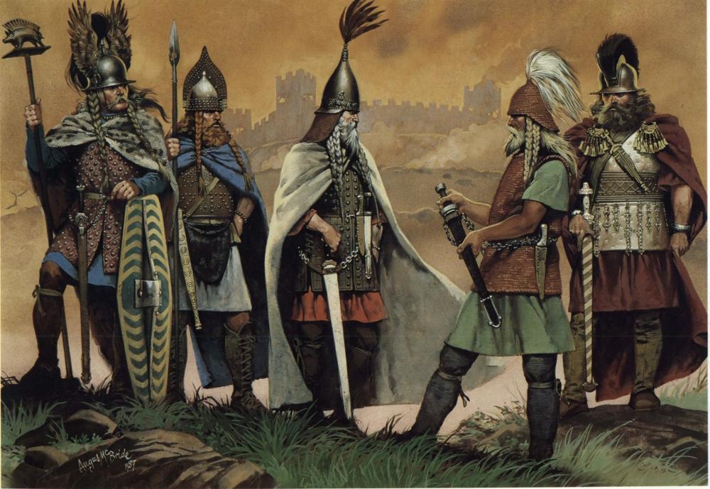
Gauls modern references and link.
Sundiata replied to Lion.Kanzen's topic in Tutorials, references and art help
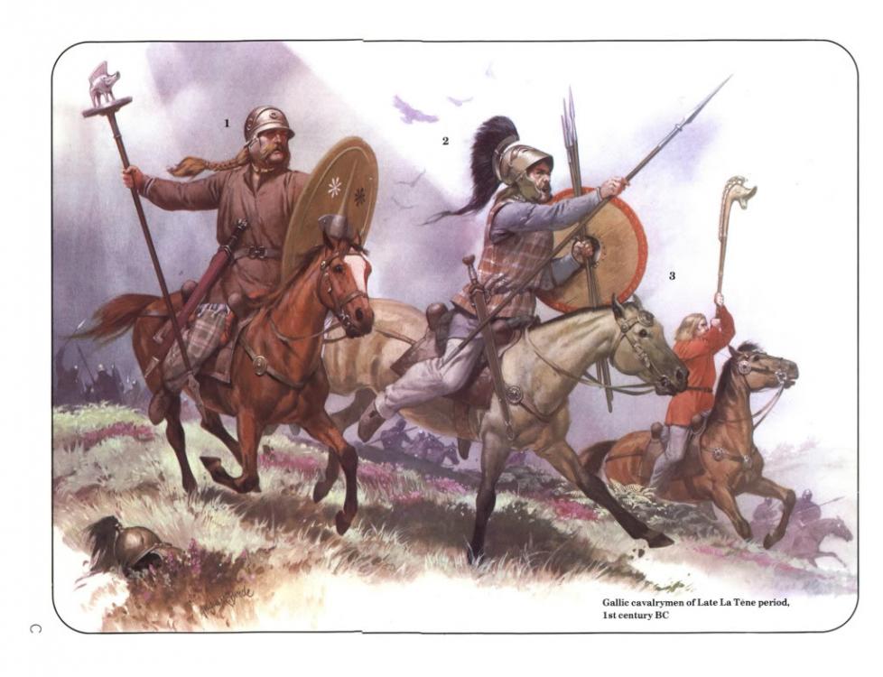
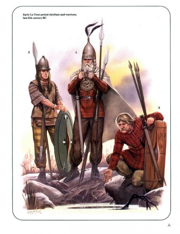
Good references @Lion.Kanzen! Some of these re-enactors take reenacting very seriously.. PS: overweight people were ridiculed and shunned in Celtic society -
I really have no conception of the complexity of the issue, but perhaps it's possible to generate a huge image of a static, low poly, unplayable "map" (a fake map) surrounding the playable-map, giving the illusion of infinity. Then the skybox can be extended far below the horizon without an issue. If you approach the edge of the map (demarcated somehow), it would feel like you could almost continue, and if you look up, you'd see a perfectly believable horizon with a generated image of a believable continuation of the map. Or is that way too complex?
-

Lowering Default Population Limit
Sundiata replied to WhiteTreePaladin's topic in Game Development & Technical Discussion
Maybe resources are being spent faster because of buildings, units and techs that are being used more often than in previous alphas? Resource amounts might not have changed, but I also get the feeling that the map is emptied of recourses faster than before. -
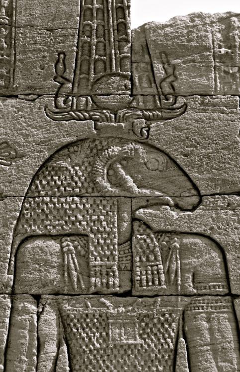
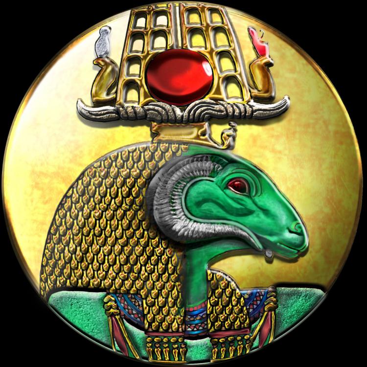
The White crown is for Upper Egypt (and Nubia), and the red crown is for Lower Egypt. Interestingly the earliest depictions of the white crown come from Nubia, during the pre-dynastic/early dynastic A-group, like the Qustul incense burner dated to c. 3200 -3000 BC, and continue to be used all the way through to the Late Meroitic period. Well, the crown is a typically Meroitic Kushite mash up of elements. The crown seems to be some kind of an elaborate variation on the double feathered crown of Amun (falcon feathers), with horizontal ram's horns, a central solar disk, flanked by uraei wearing the white crown (left) and the red crown (right). It bears similarities to elaborate versions of the double feathered Atef crown and/or Anedjiti crown with horizontal ram's horns, which can both feature double uraei (no vulture), with solar disks. The feathers in those crowns are double ostrich feathers (curving outward on the top), instead of falcon feathers (straight). The emblem is entirely referenced from a Meroitic period carving of Amun on the Lion Temple of Apedemak in Naqa and coloured according to other approximate parallels. @wowgetoffyourcellphone #3458 if I'm not mistaken. The problem is discussed there. @elexis Perhaps the skybox can somehow be triggered once the camera reaches the angle that the horizon becomes visible? No need for a skybox above that angle (i think?), and the ground will remain black where the map ends when seen from above?
-
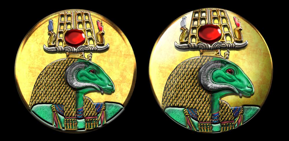
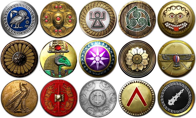
@Nescio You know what, I think I see what you mean... I think it's because the other emblems have a greater sense of depth, and at least 9 of them are spherical... I made some adjustments. Is it better like this? Old vs New. How the new one looks next to the others The human form of Amun is usually depicted blue. The Ram headed Amun is usually green (with red eyes), black or an odd type of brown. Eh.. Your right about Osiris usually being depicted as green but red skin for males and yellow for females, although common, is by no means universal. It depends strongly on the period and place where the depiction is made. Iconography isn't as static as it's sometimes insinuated (over thousands of years of history things change/evolve/adapt). A variety of colours can be used, and in Southern Egypt female deities can be depicted as dark as their male counterparts.
-
The Uraeus wouldn't be a bad choice in itself. The thing is that it's just as closely associated with ancient Egypt as it is with Kush. Anybody that is familiar with Kushites will immediately recognise the ram-headed form of Amun, which is much more specifically associated with Kush: - Human headed Amun = Amun of Thebes or Amun of Karnak - Ram-headed Amun = Amun of Napata Second issue with the Uraeus is that it's vertically orientated, and the important parts, like it's head surmounted by the solar disk, would either be cut off on top, or the entire thing needs to be scaled down to fit in the visible part of the circle, which would make it awkwardly small. There'd be no filling to the left and right of the cobra either.
-
Hmmm, I'm probably biased, but I like it: Amun looking down on his subjects... It's different, but Kushites are different from the existing civilizations anyway... I don't see any real stylistic continuity in the other emblems either, apart from them being round, so I decided on one of the most commonly mentioned and depicted symbols of power: their state-god, the ram-headed Amun of Napata. It fits well with the obsessively theocratic nature of Kushite society. I'm always open for suggstions, but please nothing generic... Factions, including their emblems should be historical and unique, not hammered in to uniformity to fit with the other civs (that's how you get a bland game). Anyway, any ideas on this more important issue: The issue creates a very distracting and ugly black band along the horizon.... Extending the box far below the horizon, would make the horizon look like an actual horizon, and not a black hole resembling the end of the world. It's necessary to fix this in order to make marketable screenshots without having to "hide" the horizon behind structures...
-
So am I! They look amazing from all angles. Zooming around my little town on a low angle allowed me to catch some glimpses of those areas of your models which you wouldn't see in a standard game, and they look great, inside and out! Thanks, but they could be a lot better. The Skybox isn't working properly. At low angles, you can see the lower rim of the box above the horizon?? Very displeasing, from an aesthetic point of view. The Skybox should extend far below the horizon to avoid such weirdness.. Maybe you should, lol. Anyway, spending your time making so many pretty models instead of playing really isn't wasted...

