wowgetoffyourcellphone
-
Posts
10.887 -
Joined
-
Last visited
-
Days Won
536
Everything posted by wowgetoffyourcellphone
-
-
Already in-game, for a few years now.
- 202 replies
-
- 1
-

-
- a24
- new features
- (and 1 more)
-
Have fun. I'd reserve Justinian and Belisarius for a Dominate Romans faction (or Late Romans, Early Byzantines, whatever you want to call them) for the core game.
-
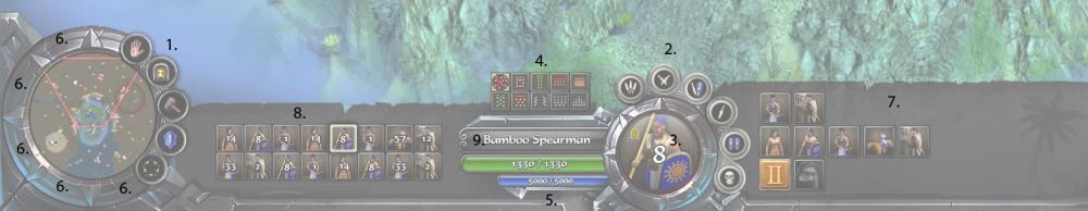
Comments/Notes Overall style looks great to me. The "paper" sections could be different colors/textures/have different edge detail for each culture, while the metallic elements can change to match as well, such as silver, iron, stone, wood, bronze, gold, etc. Keeping the same shapes and overall look. 1. These buttons are unit actions, so should go with the buttons [2] around the unit portrait [3]. 2. I think these should be centered over the top arrowhead. If [9] can be extended a few pixels leftward, then the additional buttons at 1 can be placed radially around the portrait. Initially there would be too many, but if WFG adopted my suggestion to simplify stances to 3 selectable stances only [Aggressive, Defensive, Stand Ground], then there is enough room for all of the buttons, a total of 9. 3. The portrait needs a spot for the Rank insignia. I like the "gloss" overlay. Nice touch. I also agree that if the selection is multiple units but just 1 type, then the large portrait should remain, with a large number overlain. 4. This is nice, I like this. Makes the formations prominent. Would look even nicer if, again, number of formations were reduced. Box, Skirmish, and Flank formations are useless. 5. Need a yellow bar for resource count. 6. Minimap buttons can go radially here, all the way around. Total of 8 possible minimap buttons. Plenty. Or just go with the 5 buttons you have there, bunched together. That works too. I don't think we really want more than about 5 different minimap features anyway. 7. I like how this gives room for 1 more additional icon [9 wide instead of the current 8 wide]. This panel here is where this UI can adapt to different screen widths. On narrower widths, there can be an arrow-over to scroll this over to show any hidden icons. 8. I like the negative space around the icons here. Gives "breathing room." 9. May I suggest a nifty little feature here? Perhaps clicking here toggles between GenericName and SpecificName. Does a quick little rollover animation. The "Drakkar" detail you have there on the right side can further customize for each culture. On lower resolutions the feature wouldn't even show up, but it would on 1600+px widths. I'd like to see the above, but using the real 0 A.D. logo. I like the style and the buttons at the bottom.
-
28mm Ancient Miniatures
wowgetoffyourcellphone replied to Gyrion's topic in Introductions & Off-Topic Discussion
Yeah, at least. -
Instead of reinventing the wheel with the Egyptians, why not reuse the Ptolemies set of buildings, but adjust the color of the textures a bit [reduce the yellow color]. Then make some modifications to make them more unique to Aristeia later.
-
28mm Ancient Miniatures
wowgetoffyourcellphone replied to Gyrion's topic in Introductions & Off-Topic Discussion
I'd try a phalanx of Spartan hoplites. -
Panel on the right needs to accommodate 3 rows high. You also need to show mockups for various things like formations, garrison, bartering at Market, etc. Otherwise this is awesome.
-
28mm Ancient Miniatures
wowgetoffyourcellphone replied to Gyrion's topic in Introductions & Off-Topic Discussion
I am not sure. Depends on how they end up looking, the cost, etc. I personally wouldn't mind acquiring a bunch of them. -
28mm Ancient Miniatures
wowgetoffyourcellphone replied to Gyrion's topic in Introductions & Off-Topic Discussion
Also, keep in mind that at the scale of a table-top miniature the model detail doesn't need to be very high. -
28mm Ancient Miniatures
wowgetoffyourcellphone replied to Gyrion's topic in Introductions & Off-Topic Discussion
For 0 A.D.'s units? No. -
28mm Ancient Miniatures
wowgetoffyourcellphone replied to Gyrion's topic in Introductions & Off-Topic Discussion
Still would be kind of cool. -
Too many IMHO. They never used Thureophoroi and Thracian Swordsmen, either. The 'Royal Stoa' was a mistake.
-
Having a problem intermittently where the Windows Taskbar won't go behind the gameplay window. Might not be 0 A.D.'s fault per se. Any idea how to get rid of this problem? Taskbar is not set to 'Lock' either.
-
Possible Game Optimisation for Next Update?
wowgetoffyourcellphone replied to Gyrion's topic in Help & Feedback
darnit! I saw this from you and thought it was his. My bad @Gyrion -
Possible Game Optimisation for Next Update?
wowgetoffyourcellphone replied to Gyrion's topic in Help & Feedback
Perhaps, but I only have one shown to "choose" from.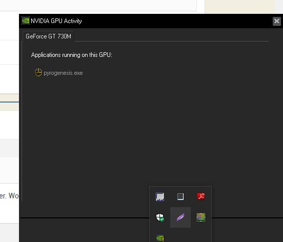
-
Possible Game Optimisation for Next Update?
wowgetoffyourcellphone replied to Gyrion's topic in Help & Feedback
This makes me think you don't have the latest NVIDIA driver and software. -
[Map] The Aerie & Tordheim
wowgetoffyourcellphone replied to Shiyn's topic in Scenario Design/Map making
Man alive, a lot of those screenshots would look incredible with some SSAO. -
Possible Game Optimisation for Next Update?
wowgetoffyourcellphone replied to Gyrion's topic in Help & Feedback
If you click that icon while running 0 A.D. it should tell you.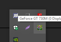
-
Possible Game Optimisation for Next Update?
wowgetoffyourcellphone replied to Gyrion's topic in Help & Feedback
Are you sure you're using your graphics card and not your onboard graphics? -
28mm Ancient Miniatures
wowgetoffyourcellphone replied to Gyrion's topic in Introductions & Off-Topic Discussion
It wouldn't take much editing to add shoulder flaps, straps, etc, to the models before printing. -
Possible Game Optimisation for Next Update?
wowgetoffyourcellphone replied to Gyrion's topic in Help & Feedback
Smoke I understand. Particles are a performance hit, but distance fog shouldn't hurt that much. -
hmm, lol, then perhaps it's your positioning of them. Looks kind of random, also too many planes. Check out the Carob trees in-game to get a better view of how the geometry in a tree canopy should be structured. The Baobabs are good examples too. Basically, you want a kind of "layered" look to the canopy planes to give some good internal self-shadowing. When you have a lot of randomized planes like you have now you create these weird shadows and odd intersections, which don't look as good as they should since all of your other artwork is top notch.
-
I encourage you to use short range for LOS/Vision for now until there's some kind of "Engagement range" coded into the game. Lower vision range will help you/the player control the units better and they won't run off and attack whatever wanders into vision range. Also, a suggestion/tip for your videos. If you really want to show off some detail with your units, you can unlock the camera by Ctrl-D. That way you can zoom in further than the hardcoded minimum for your videos. Art tip: Use auto-smooth on the branch/leaf faces in the canopies of your trees. This will help alleviate that "planey" look to the treetops.
-
No, it's not confusing. I currently have a workaround for this for the Romans (the completion sound of the required temples is the phase sound), but it's not a good workaround for the Han and Kushites (since their requirements are multiple items of a class, not just 1 like the Romans). It's essential, IMHO, if you're going to have auto-research phase techs to audibly notify the player when the phase has been auto-researched. Yeah, I knew it was somewhere.

