-
Posts
2.762 -
Joined
-
Last visited
-
Days Won
207
Everything posted by LordGood
-

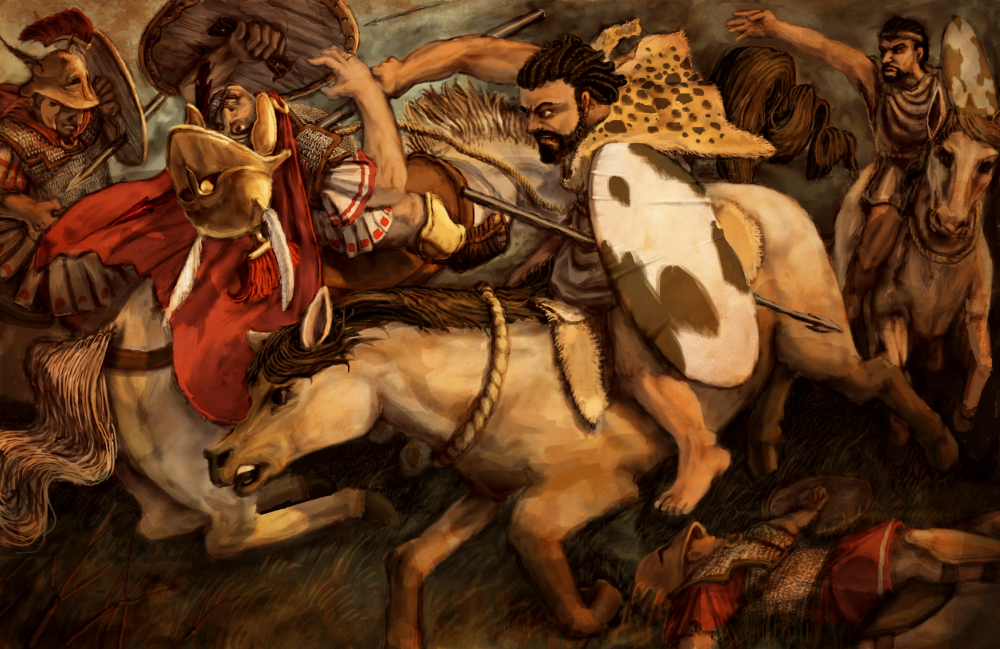
===[COMMITTED]=== Seleucid champion chariot
LordGood replied to Enrique's topic in Completed Art Tasks
@wowgetoffyourcellphone no its not, its been beveled out. The texture is what 'looks' low poly -
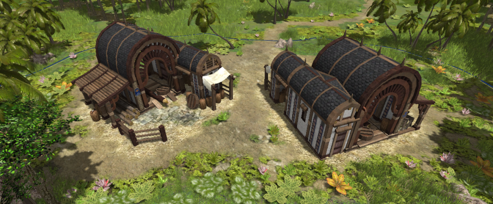
Beef up that dormer thatch and I think you're good to go, should be as thick as the rest of it imo
-
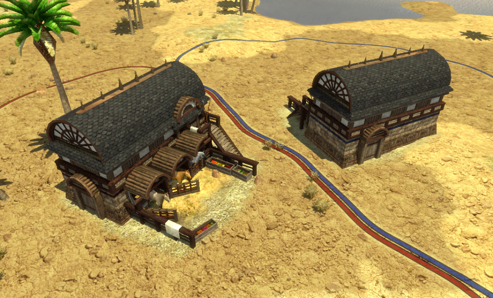
I'm a little worried about the size, how does it stack up with the rest of the stables? Also the thatch on the dormer windows is looking really thin
-
Walking animations look fine. Seems Enrique has approved as well. Have gifs of the updated animations?
-
-
-

===[COMMITTED]=== The next big thing : Helmets
LordGood replied to lucas92's topic in Completed Art Tasks
I like the boeotian, phrygian, pilos, and corinthian helmets, and the colored thracian (?) ones. I'm not particularly good at categorizing these helmets lol @wowgetoffyourcellphone We were thinking you could give us a point or two assigning distinct helmet types to different units, keeping helmet types homogenized within a troop class will help with recognition. I was thinking boeotian helmets for cavalry and cheekless pilos for archers, but apart from that we don't want to slap the wrong helmet on the wrong dudes, especially if we're homogenizing helmet/troop types. -

===[COMMITTED]=== The next big thing : Helmets
LordGood replied to lucas92's topic in Completed Art Tasks
I'll say a few of those helmets look a little too close-fitting, maybe those longer horsehair plumes should fall flat on the helmet. I also think the phyrgian beard should sweep out a bit -
Aaa that shouldn't hurt performance too bad should it? The axe is fine, but I think a pickadze/ double pick would better fit the animation than a pick
-
eh, I'm not in tune with the mauryans as much as I used to be. Sketchup is way better at poking holes in things
-
mauryan textures can handle horizontal, that one stretched plank looks to be a minor oversight
-
Normals work for body meshes, it's the AO maps that don't
-
Yeah my issue on this most recent one is that the geometry seems to be the defining edge of the armor and it seems a bit flat as a result. I would recommend you find some way to make normal maps for these, they would make a world of difference
-

===[COMMITTED]=== Siege Weapons Infantry Animations
LordGood replied to Alexandermb's topic in Completed Art Tasks
Yes yes, I think there is room for improvement, but this is a huge step up from the ghost weapons we had lol. Keep an eye on the actors to make sure we don't have freaky vertex groups flying all willy-nilly. That goes for the gastraphetes as well, I don't know if there is a mesh issue with that one though. all in all, well done @Alexandermb ! -
256px, its good to have a higher res source on hand for edits and derivatives when necessary. All the unit textures are currently in 256 though
-
go for it, I'll finish up the Mauryans in the meantime, reaaally dont like the greek texture sets
-
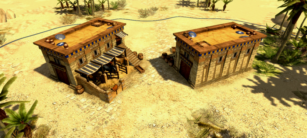
yes a-very nais. Would be interesting to have workshops and stables as a prereq for charioteers, on an offhand note
-
Nice, maybe open up the back of the garage a bit to make it recognizable from both directions?
-
lol same image thrice posted. GG guys also these horses eat particularly well
-

===[TASK]=== Differentiating Britons and Gauls
LordGood replied to Mythos_Ruler's topic in Official tasks
Oh! I thought I had already committed that one with the gaul one. so yes -
Pretty sure he wont anytime soon, he's last known to have been working on the horses though. had a pretty amusing way of making death animations lol. That said I'm more than a little wary of touching the mesh or skeletons themselves, just in case he comes back with some work for us. Lord knows that unit upgrade was given to us all at once I'm assuming the skeletons and vertex groups are still intact or things would already be acting weird. Sounds compatible but without thorough testing I can't be sure
-
-

===[COMMITTED]=== Brittonic Shooting Range.
LordGood replied to Stan`'s topic in Completed Art Tasks
Go on ahead, looks good! -

===[COMMITTED]=== Brittonic Shooting Range.
LordGood replied to Stan`'s topic in Completed Art Tasks
I'm worrying about the plaster being on the ground and exposed to rain but that's just the pseudo-engineer in my head speaking. I do think those stall walls need to be thicker if they're going to stay plaster or stone. At current thickness i would more easily believe wicker wattle, but that's also my pseudo engineery tick, and I'm willing to entertain the idea that's just bothering me lol The overall shape follows the standard, its good I'd use the celt barracks decal on top of the dirt ground decal to give the ground a bit more varied texture like how i did with the spartan range as well -

===[COMMITTED]=== Brittonic Shooting Range.
LordGood replied to Stan`'s topic in Completed Art Tasks
You have some weird normal smoothing going on around that tower's plaster, I see it a lot on old asset's columns where the top and bottom faces arent seperated but the whole thing is smoothed. I might just make a topic on it. makes things look plastic-y and unnaturally bright. I think it still exists in the old carthaginian temple too

