Stan`
-
Posts
18.555 -
Joined
-
Last visited
-
Days Won
606
Everything posted by Stan`
-

Automatic Build for buildings
Stan` replied to Stan`'s topic in Game Development & Technical Discussion
Magic -
Differential: https://code.wildfiregames.com/D2492 This patch allows building to build by themselves. Coupled with a special Grove Component creating foundations, one could imagine a forest regenerating itself. 3D Printing house:
-
Yeah sure. Thanks for all the work you put in the game so far. Merry Christmas?
-
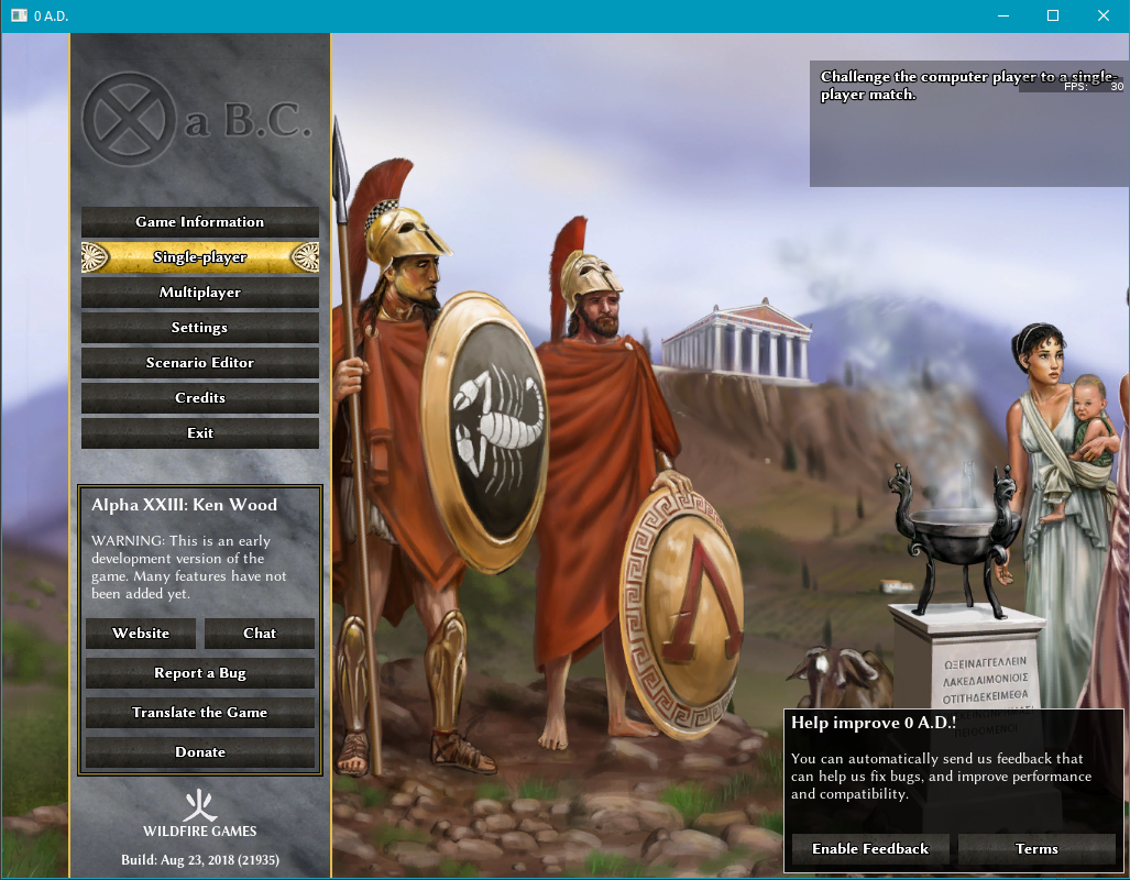
0abc_logo_02.xcf

-
Can you try to disable GLSL in the game options? See:
-
Linux Biolinium, but yes
-
Updated debian sid building dependencies
Stan` replied to uovobw's topic in Game Development & Technical Discussion
Hello @uovobw Thanks for updating the wiki. I noticed there are some issues with your edit. Would you be willing to fix them? First note that libwxgtk3.0-dev is already in the sudo apt install command. So if you don't want it installed before your policy command you need to remove that from the list. libboost-filesystem-dev is also there, as well as libvorbis-dev, libopenal-dev, libcurl4-gnutls-dev, libsdl2-dev, libgloox-dev, libminiupnpc-dev, libboost-dev libsodium-dev shouldn't be in the list because it's asked to install it manually on other versions -
To put in art/textures/ui/pregame/shell/logo/0ad_logo.png 0abc_logo.xcf

-
-
Nah I meant @Nescio's
-
I made it Do you like it? Also btw your mod crashes atlas for me... not sure why.
-
What changed? @Alexandermb

-
Well actually those it takes to remove the stretching And for the rest I'm open to ideas
-
@Nescio yep sounds good to me too We should use most of them, those we don't won't get in for now
-
First try - Caribbean Island
Stan` replied to Marcus Brutus Bombastus's topic in Scenario Design/Map making
Please do so -
Age of Empires 2 Definitive Edition
Stan` replied to Lion.Kanzen's topic in Introductions & Off-Topic Discussion
Well apparently the vanilla one is also nice so Enjoy the choice? -
@chrisf It runs badly on the 3 but the four should have enough ram... as depicted in the video above.
-
You need to edit templates to fix this (which might make you out of sync) or find a dae file with a projectile prop point.
-
I was more thinking of a volcanic one but that works too.
-
Updated the mod started adding buildings for terrans (just the templates with placeholder art) but it's slooooow.
-
The problem is their obstruction. A ram can't pass if there units on top of the wall... I knew it was possible it was actually done in the han faction I'm not sure. @borg- what do you think? Stay tuned.
-
So definitely the buildings with no backgrounds as they look nicer! If it's possible to make the white background transparent so it looks good on dark mode as well that'd be perfect. As for the description I'd say on the right
-
If I understand correctly the person is wondering why there is no visible garrisoning on gates. If that's the case, it's because the engine does not support it yet. See D1418. This something I've been asking for, for a long time. To be able to have both visible garrisoning and specific spots for artillery we need someone to review D2308. But remains the size issue.
-
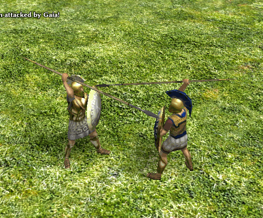
===[COMMITTED]=== Roman Infantry (New texture)
Stan` replied to wackyserious's topic in Completed Art Tasks
As long as it looks good and it is historically correct -
===[COMMITTED]=== Roman Infantry (New texture)
Stan` replied to wackyserious's topic in Completed Art Tasks
What is used currently?