-
Posts
2.762 -
Joined
-
Last visited
-
Days Won
207
Everything posted by LordGood
-
It's the railing isn't it?
-
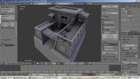
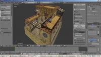
Thanks Ludo Left view is the baked-in Ambient Occlusion maps on the building, right is just the normal UV mapping. It does take me a lot longer than sketchup does, and speed will come with time (and everyone's tips), but I'm glad I managed to get a handle on things! I'm having a tough time peeling myself away from Blender now that I can use it xP oooh i have a paper due in the morning... dang, that floor texture's really stretched isn't it? :/
-
Right, so I'm not wasting time stuffing it into the engine because that takes waaay too long because I'm stupid when it comes to that sort of thing. Also, not pivotal. Can't enable whizbang graphics so there's really no point either :/
-
Whazaaah! Incredibly irresponsible of me but I did it! ptol_barracks.zip
-
I think we can agree that we can give a good critique without being quite so flagrant. "frankly pretty embarrassing to look at" was not necessary. Does Lion have a bit of room to improve? Yes of course he does. Sharper edges, higher value contrast and clearer features would definitely help him out, but he is practicing, and he's showing us all on the forums so we can give him feedback. I made the same mistakes in my early Carthaginian icons. Still do sometimes. He does have the right to be at least a little ticked off at this statement. Next time please try being a little more technical in your critique. Nolan, I admire your sticking up for Lion but it's also unnecessary. I'm noticing it's spreading to other forums so let's take the hostility back down to zero alright?
-
Very, very nice! The composition seems a little divided along the center IMO The dog helps, but what about a few figures on the left side?
-
Aw come on man, I had a lot of room to improve when I started posting on the forums. Community feedback is invaluable to us artists.
-

Capitoline wolf, Boiling Oil tech and Colossus of Rhodes
LordGood replied to Iskandar's topic in General Discussion
this is amazing, learning things is fun. -
I'm not quite sure what you mean. If you mark all of your seams on the model so they unwrap without stretching and then unwrap the model, you can go into the UV editing panel and place the surfaces on the corresponding textures Video is low res and sped up x8 so I doubt that would show as a tutorial very well xP
-

Capitoline wolf, Boiling Oil tech and Colossus of Rhodes
LordGood replied to Iskandar's topic in General Discussion
I made a mirror tower in SU a while back, it'd definitely be a fun thing to have in atlas -
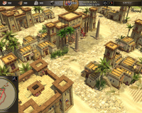
I would hope so, just so that it looks like local stone was used for both buildings. I feel like this is a contributing factor as to why there are so few hellenized ptolemaic buildings modeled thus far I feel like the library and military settlement will particularly be a breeze if that's implemented. Marble library stands out a little much amongst these yellow buildings
-
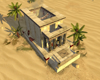
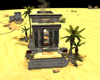
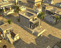
Thanks Enrique! That should help me out a lot I'm not sure I can (or should) change video capture resolution or compression rate. These long videos take up a lot of room as is. I just don't have adequate storage for a high quality capture at such a length. Enrique, I played the ptolemies on SVN and I think one of the issues with the temple that is present in many others is the lack of a nice thick foundation. That might just help it make more sense structurally without having to revamp it, it does look a little odd to see an open, heavy structure like this without something raising it out of the sand when the other temples (Rome, Cart, Pers, Maur) do But that's just a suggestion, that could have made no sense whatsoever Taking a closer look at those columns, the way you mapped them is just top notch Also! I was wondering if we should have an edited Hellenistic/Roman texture set to use with the Ptolemies. The color scheme of the Egyptian buildings doesn't seem to like the Peloponnese textures. Maybe warmer colors and filters and all that stuff i don't understand yet
-
lol that UV stretching gets me every time i make complex Ngons xP Thanks! I have another video! wee!
-
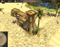
What are these tall structures?! pew pew... pew pew pfff who needs props anyways? Ptolemy skinny arrow shooty building! I totally see what you mean now Enrique, that yellow can be tough to break down should have put that border thing around the corners, maybe. I dunno, I'm tired been modelling all day xP Time flies in blender eh? Ptol_tower.zip
-
Sweet! Looks awesome Enrique! Those temple textures look extremely busy though, and I'm not sure I buy having the top side bricks be a lighter color than those on the side. ( I would assume the tops of structures would be bleached from the sun more so than the sides) this could just be me being nitpicky though probably is Still looks awesome
-
Oooh texturing that should be fun! ahaha Nice work so far!

