Enrique
WFG Retired-
Posts
2.338 -
Joined
-
Last visited
-
Days Won
96
Everything posted by Enrique
-
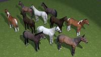
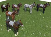
Ok.. you asked for it... Please keep in mind that these are early WIPs and the textures are much bigger than their final size, there will be a lot of detail loss (we can't afford such big textures in a RTS game) Screenshots show Shieldbearer's horse mesh with little tweaks and 1024 color map and normal map and a texture test for where the props will be placed. This task is low priority at the moment, so it will take a while until they get into the game.
-
Let's spice it up, keep the bricks part as geometry like in your last screenshot, make the fenced part on the front instead, make a small rounded window near the top of the higher point of the front, make a little window in both sides and poke out some beams out of the side walls following the slope direction and make them irregular. Then it's a matter of adding some props for the animals to have some place to eat or if you want to make some kind of little wood structure where they're going to have the props to eat to have some shadow, i don't know I'm sure it's not finished and you planned more things, just speeding things up suggesting things
-
We've decided to get a different approach to the iberian barracks and we'll provide a new concept that reflects better the defensive nature of the Iberian civilization and will follow the layout of the persian and mauryan barracks. I'm sorry you worked hard on this one, but this things happens on the development. The concept will be posted soon.
-
Horses meshes, textures and animations will be redone in the future.
-
Model looks good. However, I think it's very large compared with the rest of the corrals. I'd follow wraiiti's suggestion making a double central door, and using the space at both sides of the front to put some troughs for the animals and make the whole structure shorter from the front to the back (hope I explained correctly ) Also, please remove the rooftiles texture from the front, it doesn't look good to me. keep it up!
-
Awesome models, both look very nice, we can use both as variations. (For some reason I can't see the images from work, don't know where they're hosted but It didn't pass my workplace filter ) Just nitpicking here, the roof hatch texture looks a bit stretched near the top. The round objects look very round (posts, barrel, , I don't know how many faces they have (maybe it's the shader). Final notes is to make sure that the structure extends under the ground like posts and walls. When you're happy with the model, export it as .dae or .obj, zip it and post it here in the forums and I'll commit it into the game Nice work on this one.
-
There are some wonder placeholders since the "wonder winning condition" has been implemented. Each faction will have its own wonder... keep in mind it still in developement. @LordGood That temple looks awesome man! Be careful when baking AO for buildings with flora... it tends to get really dark on leaves and intersecting geometry. I usually add an approximation of the plants like spheres when baking AO to have some shadowing where the plants are, but leave them out of the AO map when the structure is put in-game, otherwise they look quite dark.
-
I'd vote for adding the simple graphics options menu. IIRC there is already some ground work done. No idea how difficult is to implement it.
-
Shape looks good and textures too, but it looks too boring right now, there are like three or four walls that there's nothing there except a window. I'd suggest to make some openings in one or two walls to show something in the inside of the structure to make it more interesting. Look at the current iberian barracks now. I'd prefer also to make some (if not all) corners a little bit rounded, like the rest of the iberian buildings. And for the textures, could you try to show some bricks at the bottom? If I remember correctly there are some bricks under the texture you used that could give the overal colors of the structure some contrast. This is used in a lot of the current buildings. Or maybe try to use the roof tile texture in the middle roof... (not sure if it will look good) Overall, there's nothing wrong in your model, but since the player is able to place the structures in any angle, we need something interesting for the player to look at from every angle. And since we don't have concept artists in our pipeline, the modeler is the one in charge of the concept of the building which makes it harder than working from a concept in paper. That's why I am suggesting "add more detail" on every step (artistic freedom you could say ).
-
Nice!, looking better. Try to get rid of the texture stretching in the roof borders. You should make something in the entrance to make it more interesting, maybe an open door showing the interior or something. Falcata model is here http://svn.wildfiregames.com/public/ps/trunk/binaries/data/mods/public/art/meshes/props/weap_falcata_a.dae Keep it up!
-
Here's a normal map and a spec map I made from an high poly sculpt of the croc, a lot of detail will be lost on the shrink of the image but hopefully there's still some detail to show. Normal map is 0AD-ready, to make it work in blender (to test or whatever) you should invert the green channel color of the normalmap (blender weirdeness ) BTW those teeth are too big now (looking at your second image), usually crocs do not show the whole line of teeth in the upper part of the jaw or the lower croc_normal_spec.zip
-
Here. I played with the tones and saturation and wasn't sure which one, so here are 4 variations or so... crocodie textures.zip
-
need help with the size ingame and into blender.
Enrique replied to ProvencalLeGaullois's topic in Game Modification
Yes. Use the "very small" size reference that the imported.models have, but before exporting something into the game, use ctrl+a and select apply scale -
Hey Stan, You should add more details, thicken up the roofs and make the walls a little bit taller overall, if you notice how tall the doors are and you compare with the walls on the sides you can see that the roof is very low on there. You might also keep in mind that the structure has to "extend" under the ground plane, so when the building is placed in uneven terrain, there are no parts floating. Another suggestion would be if you can round some hard edges a little bit (not too rounded), that would make the structure look more interesting. And definitely needs more props: some weapons in holders or tables, more shields, some small windows in the front side (the first image)
-
Is part of the developement process LordGood, you cant imagine how many models and sketches I have discarded even after working quite some time in them.
-
Yep, having it per the amount of units fighting (if possible) is the best solution here. I don't really like the idea of replacing the current "per hit" sounds... if they're going to have the same level of audio intensity, they will be "mimetized" with the ambient battle loop. About the siege engines.. you're right, but if we keep the current sounds, they may be excluded from the count of units to trigger the ambient fight sounds. Alpha 15 will be out soon... so these new sounds will not make it until alpha16, but they will be available in SVN version as soon as they're finished.
-
I agree with some parts of the texture are too saturated and will be toned down, but I think it's not right to base your decision on actual photos of older houses in egypt to say that they weren't colorful, in fact I think this civilization may be the most decorated and colour varied of the ones included in the game. (Houses also only have a playercolor border and some border decorations in top of it, not really colorful IMO) @Lion: I don't see the point of the video. @Lordgood I think that in the dock in particular, the stalls are helping to get the sense of cartoony because they do not help to understand its proportions. Some of them occupy more space than the "tower" with the door for example and there are a lot of them. Since we cannot make buildings following the same scale as the units, I think it's better to emphasize the "solid" structure size rather than the props (except the "open" markets). The dock is quite big, but I think this civ is going to have one of the best naval units roster in the game so that may stay as is IMO, And as a suggestion, maybe an ancient crane instead of a stall in the left side would look better crane refs: http://www.timetrips.co.uk/parth-crane.gif http://upload.wikimedia.org/wikipedia/commons/a/a9/Pentaspastos_scheme.svg http://www.museuprehistoriavalencia.es/resources/image/s_14_Artifex_02_Grua%20con%20rueda_1.jpg
-
I think it's a nice start! This will make battles more visceral I hope it can be played very low from zoomed-out position, and more loud when zoomed in the battle zone. Right now in my opinion it's "filling" too much, considering that the current fight sounds will be played too during the battle, but it sounds nice (I know it's a mix of loop sounds and they will be separated). I only found out of place some squash sounds which sounded more cartoony IMO. Since the "battle music" is triggered by calculating the amount of damage that is being dealt in that moment, we may have different level of "busy" or "violent" levels adding more loops to the mix depending on how much damage is being dealt too. I don't really know if this is possible to achive but it might be good to know how these can be implemented. Keep it up LAVS! On a side note, my opinion about the sounds priority would be chat messages, "not enough resources" sound, and in resume, all the notifications that requires players' awareness (but battle sounds are so cool! )
-
It looks great! I mentioned the "normal stone" roofs because the fabric ones makes me think how easy they may catch fire with the chimney close to them. It looks nice though.
-
It looks good to me lordgood! I'd like to see it.using beams showing in the roof like the houses :-) @idanwin take a look to the farms vegetation adapting to the terrain to see the prop floating feature (it is not implemented on everything yet) edit: sanderd was quicker :-P
-
looking good! You can check i.e. the greek blacksmith to see how the "floating props" are added. In this case you should create a separate actor for each tent and then add it as a prop point to the main structure. This would also allow to use single tents as actors in altas as eyecandy, which is a plus. I don't have internet access at home right now but I will adapt it when I have some time if you prefer. Also I'd like to do the same with the rest of the "open markets" because the ground platform looks much worse than the floating prop solution. Regarding the stretching problems, I can not see them in the shots. If you are referring to the fabric on top of the stalls, it may be because they need some more geometry or because the mesh is not triangulated before mapping. Also remember to use ctrl+a to apply scale always before unwrapping, this will maintain the correct shape of the uv and reduce stetching. Good job overall
-
Texture Artist Application - Anna Kusnierz
Enrique replied to AnnieQ's topic in Applications and Contributions
Hi AnnieQ! welcome. Nice work examples. For 2D artwork we're looking for unit portraits and technology icons. If I remember correctly they're 128*128 in-game size. We're also going to need a whole struct texture for the next civilization - Seleucids - but we usually work with photos as textures to simplify the texture creation and achieve somewhat a realistic look quickly (also for prototyping colors and overall look of the civilization buildings) but you can give it a try if you prefer. I'll not be around in the following days but someone from the team will answer any questions you have and guide you in whatever you need -
Yep! looking better. Keep detailing The second shot is where the entrance will be, also in that place you can put some dummies where the soldiers "train" take a look at other barracks in the game. Which program are you using to model and texture? If you're able, you should import an existing barracks building into your 3D modelling software to get something as a scale reference (also doors, windows and such to be more or less adequate to the units size) Keep it up!
-
Hello, That's the basic layout we're looking for, but it needs to use the iberian struct texture: http://svn.wildfiregames.com/public/ps/trunk/binaries/data/mods/public/art/textures/skins/structural/iber_struct.png You'll need to add details and props like shields and weapons too. You should take a look to the iberian buildings in-game to get an Idea of the artistic direction. Also next time post front and back angles to judge better the model
-
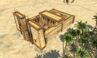
===[COMMITTED]=== Edfu Temple (Wonder)
Enrique replied to DukeDiamond's topic in Completed Art Tasks
lol I didn't know that... I'm rather new to recording videos. The ones I made with camstudio were recorded as a timelapse directly (which helps with the disk space a lot) BTW the temple is already on SVN, here's an in-game shot: You can also take a look at two closeups in 0AD's moddb page http://www.moddb.com/games/0-ad


