Enrique
WFG Retired-
Posts
2.338 -
Joined
-
Last visited
-
Days Won
96
Everything posted by Enrique
-
Not yet, but I'll try it on the final composition. It's the best way to avoid clipping with the ground. I will also need to reduce the number of props of the big tent or polycount will be too high.
-
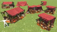
Market stalls for a revamped ptolemaic market. Standalone stalls will be also available as eyecandy props in atlas. Cloth texture is missing. Pic without AO:
-
Aren't walls made like that? Either way, props of the foundations need to extend a little under the ground, they have bigger area than a normal prop, and they can still be seen "floating" if placed on uneven terrain.
-
Actually I toned it a little less bright. It looked like radioactive wheat when the sun was very low lol
-
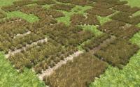
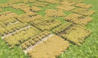
Made a different material for the weeds, now they look better when the camera is turned where the shadows are showing. Before and after pics:
-
Extend it more...
-
That's not enough... It has to extend further into the ground.... Especially big buildings, which have more possibilities to be constructed on uneven terrain.
-
Ptolemaic mercenary camp. Realtime capture with baked normalized AO. (it will be less dark ingame). White cloth is playercolor. Sightly bigger than a barracks, but smaller than a fortress/roman army camp.
-
Wow! very nice looking indeed!. Awesome attention to detail! <-- My face when I saw how small the "camera view cone" is in the minimap.
-
===[COMMITTED]=== Ptolemaic/Seleucid Helmet Props
Enrique replied to Sighvatr's topic in Completed Art Tasks
Yep, better. The edge detail you removed can be added as texture detail to fake it. Regarding the textures, you can check how are the current ones made. Example: http://svn.wildfiregames.com/public/ps/trunk/binaries/data/mods/public/art/textures/skins/props/helmet/mace_c.dds You can use 128x128 if you are going to add nice looking details. (or even use existing ones and map your helmets to existing textures) Also the thracian ones seem to not be using the whole texture space? -
===[COMMITTED]=== Ptolemaic/Seleucid Helmet Props
Enrique replied to Sighvatr's topic in Completed Art Tasks
Seleucid Roman helmets doesn't look bad, they just need some work on the texture (scratches, some contrast, worn dirt) and reduce the polys on the haired crest, Thracian helmets are too highpoly, considering that one helmet alone has the more triangles that the current unit meshes we use. (sketchfab says all three helmets have 1.4k triangles divided by 3 they're something around 466 tris each) -
===[COMMITTED]=== Ptolemaic/Seleucid Helmet Props
Enrique replied to Sighvatr's topic in Completed Art Tasks
From "How to import/export assets..." tutorial: -
===[COMMITTED]=== Ptolemaic/Seleucid Helmet Props
Enrique replied to Sighvatr's topic in Completed Art Tasks
That's not the dude mesh used in the game. You can import a head from props/head (or something similar, can't check it now) -
===[COMMITTED]=== Ptolemaic/Seleucid Helmet Props
Enrique replied to Sighvatr's topic in Completed Art Tasks
General reminder: Please import a "head" from the game to make sure the helmet modeled fits, otherwise they will need to be manually tweaked. It also helps to make screenshots of the helmet on the head to see how it fits. Stan, about the texture keep in mind that the vast majority of the helmets in the game use a 64x64 texture, the latest ones are 128x128. Keep that in mind when making the texture, a lot of the details you added on your last screenshot will probably not be seen at all. -
Cool reference along the video. The best one imo is 1:10 - 1:19 If you want a very cool tip.... if you're able to download the video as .flv and extract the portion that you want, you can use it as background "image", and blender will cycle between the video frames when you move the timeline. You can pull off very realistic animations that way
-
===[COMMITTED]=== Ptolemaic Elephant Tower
Enrique replied to Sighvatr's topic in Completed Art Tasks
I will when I finish what I have on my hands right now, thanks for the reminder. However, I'll make a new texture for it. That brown one just doesn't look ok. -
===[COMMITTED]=== Iberian Tower Crenelation + Foundations
Enrique replied to Stan`'s topic in Completed Art Tasks
Looks good enough. Will judge better when I am in a pc though. -
Wraitii, importing and re-exporting seems that it doesn't work if it wasn't exported with 2.69 or newer. This makes reusing existing biped and animal animations impossible if not done with the source files
- 20 replies
-
I guess it's time for a new boar mesh/texture/animations
- 20 replies
-
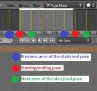
It looks better indeed. I don't know if you animate using poses in the action editor, or using IPO curves, but using the later you can remove the "ease in/ease out" that blender makes between poses. Removing them helps you to make the cycle seamless in terms of acceleration of movements. If you use poses in the action editor, you can remove the "ease in/out" motion using the previous pose of the "starting/end pose" before the start, and the next pose after the ending pose. This image should explain it better: (white line and light grey represents the length of the actual animation)
-
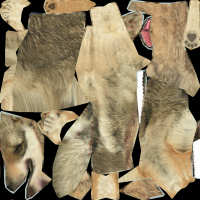
Wolf texture needed to be redone from scratch. Here's a quick one (it needs to be downscaled to maybe 256x256 or so... if anyone wants to improve it, feel free to do so.
-
You don't have to apologize we're all here to learn!! I posted the mistakes not to make you feel bad, but to learn for them I never did lowpoly models before working for 0 A.D. and I learnt a lot from the models already in-game and while working on new ones. The design is good, and since I cannot give you tips while modelling in Max, I can only tell you where the mistakes are once the model is posted. =/
-
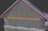
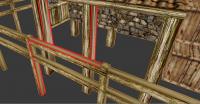
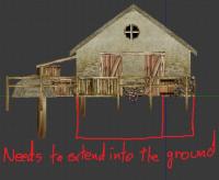
Some remarks for future models: There are some parts with a lot of unnecessary polygons. You can see in the following picture that the surface surrounded by red is totally plain, but its conformed by several triangles that aren't needed at all. The vertical edges in particular aren't needed since there's no variation along the surface. On the lower part of the walls (the bricks part) mesh there are several holes and unconnected geometry that just look unfinished. Not sure if you forget about them or it was just laziness, but it's not right: The wooden fence and the wood in general have at least two visible faces with overly stretched texture: And finally, we need that all the buildings extend further into the ground, so when they're constructed in uneven terrain, there are no parts that look like they're floating: The scale is off, but that's an easy fix and you already reported some problems getting it right, no problem about that. However, these other errors require a lot of cleaning work and should not be present in completed models.
-
I've already spoken with Stan and I will take care of this model.
-
I think removing castshadow helps, but if you turn the camera it would still look messy on the parts that are not lighted. We should try making them not being affected by the lighting at all. This is done with the self-illumination feature. I know that it doesn't work with animated textures but it should work with static transparency ones (based on my tests with aura's visualization)

