Enrique
WFG Retired-
Posts
2.338 -
Joined
-
Last visited
-
Days Won
96
Everything posted by Enrique
-
Very very nice! looks very organic and natural. I think this cycle plus the ones you posted on the 12th post makes all the animations for the wolf.
-
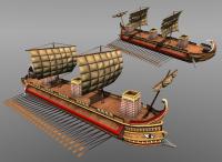
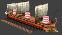
Almost there... got distracted making new sail textures, but I'm not happy with them, no playercolor ptolemaic bird in them yet. Textures are very high-res, expect less quality in-game. Realtime screenshot, AO added in the texture.
-
===[COMMITTED]=== The next big thing : Helmets
Enrique replied to lucas92's topic in Completed Art Tasks
I used this one for bronze and the same one 100% desaturated for the iron variation, you can use whatever texture you want as long as it is licensed under CC-BY-SA 3.0 or CC0. This one is taken from another helmet texture already ingame and modified to get rid of the helmet-specific details it had. -
===[COMMITTED]=== The next big thing : Helmets
Enrique replied to lucas92's topic in Completed Art Tasks
Right now it's too saturated in my opinion. I went for bronze/iron variations because you can make details pop up switching between them. Keep in mind that we can use playercolor in helmets too, which means the color will vary depending on the player that owns the unit. (iron texture = greyscale texture, which can be used as alpha mask to make the playercolor happen) -
===[COMMITTED]=== The next big thing : Helmets
Enrique replied to lucas92's topic in Completed Art Tasks
Looking nice, have you imported a head model from the game to make sure the helmet has the right size/proportions? -
https://lh3.googleusercontent.com/-B2654-2gfAQ/UmUwn_ZWFBI/AAAAAAAABZw/BKz-UiYOBqY/w1920-h1200-no/2013-10-21_00171.jpg
-
It's not final... Posted the WIP to get feedback from the hull, main colors, playercolor and shape.
-
Nope, all from scratch
-
-
Ehhm.. both. You can actually do the lotus flower of the tail geometry, it's just a bunch of polys. It's simple, make it look as good as possible. I guess GIMP textures are compliant but.. c'mon they're ultra tiny... I've posted these a bunch of times already in the forums and tutorials... these are GOLD for 3D artists as they have CC0 license... you should save the links... http://agf81.deviantart.com/gallery/ www.texturemate.com http://opengameart.org/users/yughues
-
I see you used parts of the reference image to texture it... sadly, we can't use it unless it's licensed by cc-by-sa 3.0. I can't find under which license this image was released, we can't take the risk to use it. This is important, always check the source/license of the texture you are using. Some more detail on the tail and head wood would be good too. For the hull, you can try using the texture attached. Also it'd be good to see the final texture and some more angles. The sail cloth are normally added as props so we can add some variations and it'll leave you more space for the rest of the textures.
-
Crowd-Sourced Civ: Ptolemaic Egyptians (Ptolemies)
Enrique replied to Mythos_Ruler's topic in Official tasks
Found this, thought it's interesting: http://deadliestblogpage.wordpress.com/2013/12/06/armies-of-the-macedonian-successor-states-the-ptolemies/ -
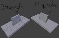
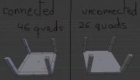
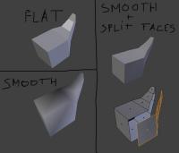
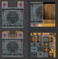
GENERAL LOWPOLY TIPS These are general tips when working with lowpoly assets, they're no software-specific. -Use unconnected geometry! This is the first and one of the most important tips. I’ve seen in a lot of models that people try to make the asset (smaller or big) all made from one mesh. This approach generates unnecessary geometry and makes the mesh more difficult to handle if you want to make changes. Here’s an example: Here we can see how many faces we’ve saved, and makes the mesh much more simple, which is good for make changes easier if required. -Split faces for hard-edge creases. Sometimes we want to create assets that contains both smooth curves and hard creases. Some 3D software lets you choose specifically which faces you want to set smooth shading and which ones set flat shading. However, in every single 3D software, you can “detach” the faces that you want to create the hard crease, this procedure will make the unconnected faces as hard creases. Left side are totally flat and totally smooth connected faces. Right side is the same smooth object, but with the faces where we want hard creases unconnected (the faces are split) -Double sided faces. 0AD’s engine does not render double-sided faces, if you want them to be shown in the game, you have to duplicate the face, and invert the normal. It is also good to move it a tiny bit, so they do not overlap for easier selection/modification or when baking AO. -Try to avoid Ngons use quads as much as possible. This one is not as important as other tips, but using always quads have more advantages than using Ngons and triangles. The main reason is that Ngons have sometimes unpredictable behaviors when triangulated (needed to export into any game engine) and not all 3D editing software supports them. Ngons, like triangles, doesn’t let you create clean loopcuts between loopfaces, which makes the mesh topology harder to modify/manipulate. -Animation loopcuts. When you are modelling meshes that are going to be animated, you must have in mind where the mesh is going to bend. To be able to maintain volume in the mesh on the points when is going to be deformed, you need to have some minimal geometry. This gif explains it visually: http://wiki.polycount.com/LimbTopology?action=AttachFile&do=get&target=BenMathis_limb_deformations.gif -Fake details with decals/textures Try to avoid geometry using textures to add detail. This can be further enhanced by the use of normalmaps. You can also use single faces, or simple geometry mapped to another part of the texture to use it as “fake” detail: several windows in 0AD’s buildings use a simple quad as a “decal” which removes the need of subdividing the geometry in the wall to make a “connected face” to map it to the window texture. (You can also make windows “insets” in the wall for more detailed windows, if the polycount permits) -Use as much texture space as possible, reuse as much texture space as possible too. This is a common mistake, and it’s one of the most important concepts of lowpoly texturing (wasting texture space). The best example to understand “reuse texture” expression is found in symmetric objects. Using only half of the mesh texture lets you make that texture portion bigger, which means more detail, at the expenses of having the exact same texture in both sides of the mesh. This is used in several things like helmets and… mainly symmetric objects. This is especially important when you are restricted to use fairly small resolution textures (like 0AD). Here are some examples of how to save texture space, increasing texture detail. Using a mirror modifier in your 3D software will make this process easier and automatic. In this example you can see the same asset mapped to different textures but both of them are 256x256. In the top example, there's heavy use of "reusing texture space" since the object is symmetrical in the Y and X axis. The bottom example is the same asset to another texture of 256x256, but each UV island has its unique space in the texture. You can clearly see the loss of detail, but in this case, you can make every face of the asset different/unique. You have to choose which assets/part of the asset are important enough to have its own texture space for unique details. -Add margin to your textures – texture bleeding Try to avoid seams showing up by texture bleeding (surrounding pixels close to the edge of the UV island gets “inside” of the UV and are displayed). You can avoid seams by texture bleeding simply giving some margin colour to your textures, and using a background of similar colour as your textures, which will minimize the seams effect. Here’s an example of texture bleeding making seams noticeable: http://www.ftc-creative.de/uploads/projects/FROG_Shading_01.jpg -Playercolor in textures. Playercolor is the term used to determine the unique colors of each player in a 0AD match. These colours help to differentiate the owner of the units/buildings even if there is other player in the match playing with the same civilization. Playercolor is shown in the parts of the texture that has not full opacity in them. Here’s a good explanation by team member quantumstate of how playercolor works in 0AD. (it’s an extract from this post: http://www.wildfiregames.com/forum/index.php?showtopic=18035) GIMP will work fine for textures as long as you understand what is happening. The issue is that the game does the player colour in an unusual way. What I think you are expecting to happen is to have a background of the player colour with the texture over the top so the player colour shows through in the alpha sections. It works slightly differently though. First with images you need to understand that each pixel in the image has 4 channels. 3 colours (red, green, blue) and the alpha or transparency channel. When you make part of the image transparent you only change the alpha channel, the colour components stay exactly the same. To see this in gimp you can use the layer mask as Enrique mentioned to show the alpha channel as a black and white image. You can disable the layer mask (from the right click menu of the layer) to see what the image looks like without the alpha channel. Now what 0 A.D. does with the player colour to create the final texture: 1. Multiply the texture by the player colour and discard the alpha channel. So if the player colour is white then the image will be left as it was (multiplying by 1 leaves things unchanged). If the player colour is black the whole image will become black, if it is blue then the image will become blueish. You can test the multiply in gimp using layer modes, just create a layer with the player colour and set the mode to multiply. 2. Take the original texture with the alpha channel and place it on top of the new multiplied image. Then the multiplied image will show through in the transparent regions giving the final texture. You can replicate this in gimp to preview what your texture will look like. 1. Open the texture, there should be a single layer. 2. Duplicate the layer. 3. Remove the alpha channel from the bottom layer. (Now you can see the colours "underneath" the transparent sections). 4. Create a new layer and put it in between the two existing layers. 5. Fill the new layer with the player colour (e.g. #0000FF for blue players). 6. Set the mode of the new layer to multiply. Now you should see an image which will look like the final texture in game. So it is important that you are aware of what the image is like "underneath" the transparent areas because it will affect what the texture looks like. This is why layer masks are useful so you can easily disable the transparency and see the colours in the transparent areas. (create the layer mask using the "Transfer layers alpha channel" option).
-
I'd make it go a bit deeper into the water, it looks to me that it would have problems floating, but I'm no expert in boats. Maybe someone with more knowledge in that area could share his/her thoughts?
-
It feels like the hull needs to be further into the water for the ship to actually float, otherwise I think it's looking better
-
Proportions look a bit off. it's too narrow for a merchant ship. As I always say.... Try to import another building/ship/unit from the game to get a reference for the scale. Also I think the head and tail should have more width from the center to the ends. Also in the reference, the fact that the space between the bars of the hand-rails at both sides of the ship gets smaller, it suggests that they're rounded (semicircle shape), not squared with weird spacing. EDIT: Of course, you can use whatever texture that is already in the game. -- Could you please add -merchant ship- to the topic title, so it is more clear what is this task about?
-
Thanks, updated. The only ptolemaic boat finished is the fishing boat.
-
===[COMMITTED]=== Ptolemaic/Seleucid Helmet Props
Enrique replied to Sighvatr's topic in Completed Art Tasks
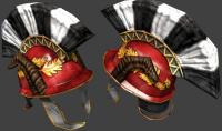
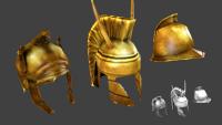
Modified and textured: Sadly, those textures are 256*256, which is double the resolution it will be in the in-game version, so details will be lost. (they won't be noticed in the game anyway ) @Stan: Please, use the mirror/symmetry modifier when modeling helmets or whatever other symmetric prop. It makes things much easier. -
===[COMMITTED]=== Ptolemaic/Seleucid Helmet Props
Enrique replied to Sighvatr's topic in Completed Art Tasks
No I do not want. LoL. Just post it, don't wait for approval for posting models for contribute to 0AD lol Part4. Just the baking of the different maps and some sculpting for the crest fibers: -
===[COMMITTED]=== Ptolemaic/Seleucid Helmet Props
Enrique replied to Sighvatr's topic in Completed Art Tasks
Part 4 being uploaded... Here's the final result but textures need some tweaking (contrast/saturation/cleaning edges) and make the crest playercolor. (these textures are 128*128 - final res) -
Fix for our skeletons in the upcoming Blender?
Enrique replied to wraitii's topic in Art Development
Thanks xrg. I will try that FBX import addon. I was confused when I read that .FBX supports armatures/bones and animation but discover that "default" blender .fbx importer doesn't import them. My try will consist in export the "original" 3DsMax dude armature to .FBX format and import it into blender with that addon. Let's see what it does. BTW. wow such idea, very comment, much suggestion. wow xDD (couldn't resist) -
Fix for our skeletons in the upcoming Blender?
Enrique replied to wraitii's topic in Art Development
It seems that bone data is lost when exported from max => Imported back to blender. That or just each program exporter handles the bone/armature data differently when exporting/importing. There has been already attempts to recreate the armature in blender from scratch. I've tried myself three times and Jason tried once that I can remember, but I think that things like bone roll/orientation is what makes the armature do crazy things. I'll try to recreate it one last time, but I have to admit that after putting so much time in this task and trying every single thing I could, I've lost hope that we can get an armature compatible with the current units in blender. That reduces new unit animations to animators using max, or recreate every single animation we already have with a new armature in blender. -
Fix for our skeletons in the upcoming Blender?
Enrique replied to wraitii's topic in Art Development
After a whole day attempting to rescue the original max files and make countless attempts changing things and different options, we still haven't a working unit armature in blender -
===[COMMITTED]=== Ptolemaic/Seleucid Helmet Props
Enrique replied to Sighvatr's topic in Completed Art Tasks
Part 3 is here. In this part I finished the highpoly meshes, the next part (hopefully the last one) I'll be baking all the maps needed for the textures and combine them. -
===[COMMITTED]=== Ptolemaic/Seleucid Helmet Props
Enrique replied to Sighvatr's topic in Completed Art Tasks
Someone asked me to record the process of the helmet production (lowpoly, hipoly, bake, texture) I'm posting it here in case someone else is also interested. Note: this is NOT a timelapse, it's long and boring, but it covers the whole creation of the last 3 helmets that Stan posted:

