Enrique
WFG Retired-
Posts
2.338 -
Joined
-
Last visited
-
Days Won
96
Everything posted by Enrique
-
===[TASK]=== WONDER: Britons: Stonehenge and White Horse
Enrique replied to Mythos_Ruler's topic in Official tasks
You should make the rocks the limit of the structure. I commented this to Ludo when he was working on it. Now looks okay, but place it in a different ground texture that is not grass. It'll look out of place and the transition will be very harsh and will not look as a wonder at all IMO. You have quite some room for artistic freedom here for using gaia assets, rocky formations, natural stairs, vegetation... make it interesting... -
===[TASK]=== WONDER: Persians: Apadana of Darius
Enrique replied to Mythos_Ruler's topic in Official tasks
gate all nations.zip -
===[TASK]=== WONDER: Persians: Apadana of Darius
Enrique replied to Mythos_Ruler's topic in Official tasks
Then yes, you'll need to make new textures -
===[TASK]=== WONDER: Persians: Apadana of Darius
Enrique replied to Mythos_Ruler's topic in Official tasks
Depends, what do you want to add? -
===[TASK]=== WONDER: Persians: Apadana of Darius
Enrique replied to Mythos_Ruler's topic in Official tasks
I don't think so. Banners, goods, statues, cool stuff... -
===[TASK]=== WONDER: Persians: Apadana of Darius
Enrique replied to Mythos_Ruler's topic in Official tasks
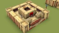
Oh, I started working on this one back when this thread came up, but I didn't finish it because I started working on higher priority things. I reused several assets from Pureon's awesome persian buildings. It needs the human-headed-winged-bulls in the back gate and eyecandy everywhere. I'll upload the blendfile if someone wants to finish it. -
This will probably be the texture that will be used
-
Thanks. Post updated. Check thread for feedback.
-
IMHO those huts need details everywhere. They're also quite similar to the britons huts, so a new texture is needed. The orangish lighting doesn't help to understand the colors used in the texture. (I guess it's just celts texture reused?) Also the angle is too low to have a good understanding of how they will look in-game. The doors angles are so perfect it doesn't look like it was made by hand. Visible empty interiors. References: http://i.imgur.com/3V94Jqc.jpg http://fast.swide.com/wp-content/uploads/natural-air-conditioning-how-ancient-cultures-kept-cool-mud-hut.jpg http://4.bp.blogspot.com/-1R5zdCimmA8/UGuxwNVR2iI/AAAAAAAAEfA/PWQ4_iQGtC4/s640/Namibia+074.jpg http://www.johntyman.com/africa/a123.jpg http://www.worldatlas.com/webimage/countrys/africa/zambia/zmpics/aaaphotos/villagehouse.jpg http://gradcontent.com/lib/300x225/african_hut.jpg http://2.bp.blogspot.com/-LKC7ywB59RQ/Ukxk5pf7nXI/AAAAAAAACfA/QLqM-tJssq8/s1600/The-african-tribe-Hadza1.png http://gisby.files.wordpress.com/2008/08/sudhuts.gif http://gisby.files.wordpress.com/2008/08/huta.gif http://smalllivingjournal.com/wp-content/uploads/2009/07/world-housing.jpg
-
Nice. It fits well. From the thumbnail from my phone it looked like a 3D model lol. Good job with the lighting. Can I ask you to experiment a little more? Two or three more proposals with similar colors or colors you think they may fit. It's always better to see other proposals to make a final decision
-
Totally agree. This one should be considered too: http://www.wildfiregames.com/forum/index.php?showtopic=17180&p=277610 and if it's not possible because it doesn't met the wide screen requirements for the main menu background (which I think he fixed to be able to add it) we could use it for loading screen like http://www.wildfiregames.com/forum/index.php?showtopic=17180&p=277668 Let's not forget about http://www.wildfiregames.com/forum/index.php?showtopic=17708&p=282386 and http://www.wildfiregames.com/forum/index.php?showtopic=17708&p=276405 but his thread seems to be abandoned for a while.
-
YES:
-
Whoa. Beautiful work LordGood. We need your illustrations to be in the load screen for multiplayer maps following Mythos' concept showing also the players and map. Keep it up man. I made the roman structs, mauryan structs (With Pureon's help) and ptolemaic structs. What do you mean how they were done? Find compatible textures, modify them following existing references, testing main colours and upgrading them constantly until the art direction is set.
-
Docks size, and the main reason the buildings are not 100% real scale compared with the units, is gameplay. Sometimes I've been struggling to find room for some buildings when playing narrow/closed maps already, therefore my suggestion about the size on this dock. This do not mean that if the faction had historically a clear advantage in naval warfare it could be reflected in the dock size for example. However, you just only have to imagine a unit next to a barrel in the screenshot of the first post to see how big that docks would be compared with the standard size used ingame. It's just a suggestion that I thought it may be worth to point out
-
Judging by the size of the props, the houses' doors and the houses size in relation with the planks surface/overall surface, the structure in-game will look huge if you're going for units-props-house correct scale, or the houses are going to look tiny if you go for standard size dock structure. Unless the huge dock structure is intended of course.
-
It doesn't need to be "on" the wall, just resting on it. The idea here is adding something interesting to look at in that spot that is related with the blacksmith. That's all.
-
Only those two things are the parts that I think don't fit. Adding things in that corner is just for eye-candy pleasure. Think of things that would be related to the blacksmith... swords in a barrel, armors, helmets, an open crate with things inside... whatever you think it would look cool.
-
The shield in the chimney is not working there IMO. And the scaled down shield looks weird. You should try adding something cool on that corner now that is visible. An open barrel with weapons, or a bunch of helmets (some could hang on the wall) or something. the rest is quite good.
-
Persian and greek, you can find more info in seleucid reference thread: http://www.wildfiregames.com/forum/index.php?showtopic=17651
-
Looking good! Does the reload thing have to stick out so far? it's... weird, I also noticed it in the ballista and scorpion.
-
Y u no commit!!!
-
===[COMMITTED]=== Ptolemaic/Seleucid Helmet Props
Enrique replied to Sighvatr's topic in Completed Art Tasks
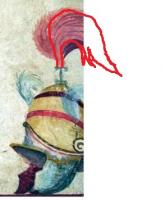
The helmet texture looks ok now. But the top thing looks very unnatural, don't you think?? Try something like this (maybe not so tall): -
===[COMMITTED]=== Ptolemaic/Seleucid Helmet Props
Enrique replied to Sighvatr's topic in Completed Art Tasks
It's not mandatory, but yeah, generating dirty vertex is relatively fast. Anyway, I think tweaking the black&white levels should be enough... I did it in the last tutorial to get a nice contrast. but if you prefer to start from scratch, it's your choice -
===[COMMITTED]=== Ptolemaic/Seleucid Helmet Props
Enrique replied to Sighvatr's topic in Completed Art Tasks
Just tweak the contrast and/or black&white levels on GIMP in the dirtyvertex map... -
===[COMMITTED]=== Ptolemaic/Seleucid Helmet Props
Enrique replied to Sighvatr's topic in Completed Art Tasks
Now it doesn't have enough contrast in the crevases. Try to achieve the same contrast levels as the last helmet you made. I'm not happy with the feather. checking the reference, it comes directly up, it does not bend backwards and then it's like a ponytail, similar to the cataphract helmet: http://www.wildfiregames.com/~art/history/macedonians/antiochus-the-great.jpg Another thing... The colors you're adding are painted directly in the texture, right? I think the feathers and maybe some of the colors you added should be playercolor, so it needs transparency on some of the colored areas. Having hard-painted colours in the helmet may lead to confusing player owner.


