Enrique
-
Posts
2.338 -
Joined
-
Last visited
-
Days Won
96
Everything posted by Enrique
-
While I don't fully agree with the "surprise" commit (it could have a forum post with a little explanation, major changes list, etc) I don't see the issue either for the same reasons as Brian.
-
lol Stan. I made the same mistake some time ago. I think I might have the files in case you want them for the RotE mod:
-
Texture is good, but animations need more work except Idle02. Attack is okay, but could have some tweaks. The walk and run don't loop correctly and the animations make "jumps" when looped. The death animation the boar starts its position lower than the ground. The texture could have been of only half boar, so you could have had twice the texture space, but it could work like it is. Maximize always your texture space, specially if the object is symmetric. I'll try to not lose too much details shrinking the texture. And a question, did you changed something in the armature? or you used the current one?
-
Looking good. You could use also a piece of playercolored cloth covering part of the wood piles, in case you don't want to use shields or only vases for playercolor. It's a welcome update. Keep it up!
-
I'm the only one who thinks that the proportions are waay off? I mean, it's a gate, it looks like a overly complex gate. Big gates like the mauryan one makes sense because the walls were higher than the standard because of their roofing, but here that the walls are standard size.... it looks disproportionate to me
-
I'm almost 100% sure that what I'm seeing is texture stretching. You can also see it in the barracks that the back is facing the camera
-
Shape looks good, but I think I'm seeing quite a lot of stretching in the brownish brick textureof the outer wall.
-
You forget to mention the incovenients of using this approach (which is why it isn't used in the game) Smaller uv islands means less texels per polygon (less texture definition). That means much blurrier textures unless you use very big textures and one for each object, which the game will need to load in memory. This approach is good for smaller entities that need to be animated or other cases where there are more benefits than the incovenients mentioned above
-
Lordgood, no I haven't started in this yet. Feel free to take it
-
Which files are you trying to import into blender?
-
Did you edit the .dae file in any way with a text editor? What mesh are you trying to import? It seems that there's a missing "<" sign on a label in the .dae code.
-
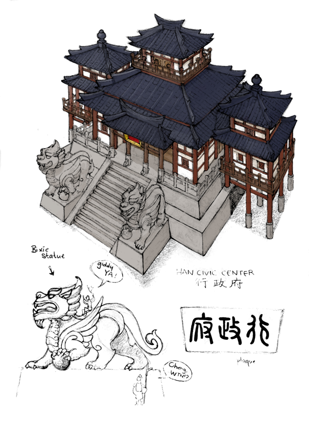
Buildings having roughly the same footprint between civs is also related with balance. You need free space in your territory to build them. Free space in your territory is not a main resource, but it's also an important "resource" to have. A civ with bigger buildings would have more trouble to build up fortresses, barracks etc in a narrow map than other civ with smaller buildings. I agree with Ayakashi here, it looks rather small not only compared with other temples of other civs, but it also can be seen when the units are nearby: see http://www.wildfiregames.com/forum/index.php?showtopic=18922&p=296093 An overall scale-up (10-20%) and increasing the size of its roof a tiny bit would do the trick imo.
-
The door... make a loop cut in the middle and mirror it so the door texture is not stretched, it will look much better.
-
No. I search in wikimedia commons, open the image page and scroll down to see its license. Here are some good ones you can use: http://commons.wikimedia.org/wiki/File:Wild_boar_animal.jpg http://commons.wikimedia.org/wiki/File:Wild_boar_(1).jpg http://commons.wikimedia.org/wiki/File:Wild_boar_skin,_Germany.jpg http://commons.wikimedia.org/wiki/File:Wild_boar.jpg
-
Yes... like every other texture for the game, it needs to be compatible with the game license...
-
Look for projection painting tuts...
-
All you need to make it look better. However I don't think you'll need much more geometry than it already has, it just need a better shape. Check boars references and you'll see.
-
Animation looks great, but mesh and textures do not. I think it can be improved.
-
Based on the awesome concept of Ayakashi. This was ultra fun to make Bixie statues closeup: From Ayakashi's concept:
-
Originally, It was going to be used as ptolemaic mercenary camp, thats why it has greek and eastern tents, however Mythos thought it fit better as seleucid settlement which is used as their expanding system, so in resume, yes a new ptol merc.camp design and building is needed
-
RotE list of missing things to the next release
Enrique replied to Lion.Kanzen's topic in Rise of the East
Yes, you only need to select the edge of the roof (the part of the roof that is facing front, outside of the building) and hit "Y" to disconnect the geometry, this will make the edge sharp and you can still maintain the smooth shading of the detached part if that's what you mean. -
RotE list of missing things to the next release
Enrique replied to Lion.Kanzen's topic in Rise of the East
You don't need to modify any angle, you just have to make the end corner sharp so the smoothing don't try to average the lighting at the end of the roof and you get rid of the weird shading. -
RotE list of missing things to the next release
Enrique replied to Lion.Kanzen's topic in Rise of the East
(stretching) All the roofs and ramps of the CC, and you can see it clearly in the floor of the bridge, and a little in the corral roof. This is what is causing the weird shading of the roofs: Notice how the roof gets darker towards the edge in the right example? this is even more visible when using normal mapping. I think a sharp corner at the end of the roof make them look better: http://www.wildfiregames.com/forum/uploads//monthly_07_2014/msg-13528-0-51833300-1405613717.jpg You can also bevel that edge corner, but that creates more gometry, so it's up to you.
-
RotE list of missing things to the next release
Enrique replied to Lion.Kanzen's topic in Rise of the East
You should work on the texture mapping in some areas, there is noticeable stretching even at that zoom level. Also you should do something with the roofs, they have weird shading due to the smooth groups. You should disconect the geometry or make flat where there are big angles in the roof geometry, otherwise you'll keep getting that weird shading. -
===[TASK]=== WONDER: Britons: Stonehenge and White Horse
Enrique replied to Mythos_Ruler's topic in Official tasks
You have the answer in the first page of this thread...