Enrique
WFG Retired-
Posts
2.338 -
Joined
-
Last visited
-
Days Won
96
Everything posted by Enrique
-
I'm certain he used it as a background when modelling, so expect a 100% match. It's true that the long neck is a characteristic of this breed, maybe I'm seeing it longer than it should because of the stiff pose or the particular dog in the reference. Searching "wolfhound" in google images you can see that they indeed have long neck, some longer and others shorter.
-
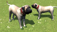
While I think the mastiff and the rest of animals are really spot-on in shape and proportions, I can't stop thinking that in the wolfhound the neck is too large and the head too small. Not very way-off, but enough to not be comfortable with it. Here's a comparison shot of what I think feels more natural: Opinions?
-
Yep, don't worry about it. While I think the collar is a must in both dog breeds to easily identify player owner, I'm not sure about showing the rank through the collar. I mean, is a good idea, but I'm not sure if the collar would be enough to differentiate ranks without zooming in to check which kind of collar is. We can try to see how it works though
-
-
-
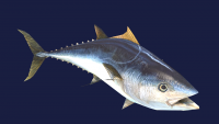
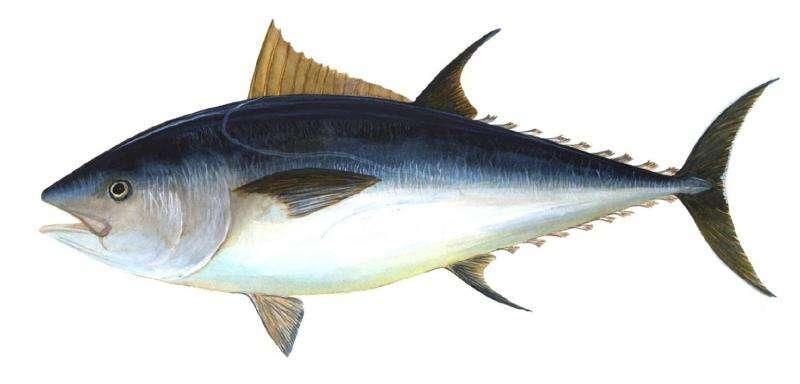
WIP. Still needs to fix the fins from the sides part of the texture. Its a public domain image, will it be enough? EDIT: Added the tuna image used for the above model. Source: https://phys.org/news/2019-01-bluefin-tuna-uk.html
-
The triangle count is not much higher (around 250 -350 additional triangles only), these meshes still pretty lowpoly for today's standards. AFAIK the biggest performance problems are mainly caused by pathfinding and simulation calculations. So I don't think they would cause much bigger problems. There has been some improvements lately in graphical performance like better shadow culling and better alpha transparency handling too. Regarding unit detail, while it is true that the game is not meant to be played at max zoom all the time, people like sometimes to zoom into the battleground and enjoy observing how the battle unfolds (myself included), take good looking screenshots or use these models in other mods that the camera angle could be different than the standard RTS. Also my mission in this project is to make the game look as good as possible
-
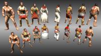
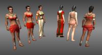
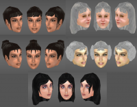
Wildfiregames presents: 0AD's unit upgrade. -Why do you work on this upgrade when you should be working on pathfinder and performance improvements? -Please note that this upgrade has been done by an artist who hasn't any knowledge in programming. This upgrade has not taken away any precious work time to 0AD programming developers who continue to work on the needed pathfinder and performance improvements. -Why do you make this upgrade? For a number or reasons: Unit models are very old, around 6-7 years old. These new models are closer to today's industry standards. UV mapping and model proportions aren't ideal on the current models. The new ones have realistic human proportions and much better UV mapping. Old animations cannot be modified, only created from scratch. With the new models we can maintain the blender source files of the animations and modify them at will. Since we share the blender source files, the team and the community can make variations for their own model variations and still use the new armature. Old model's armature (skeleton) is very basic and limited. With the new model's armature we can achieve more detailed animations and are capable of basic prop animation -Are these new models already implemented? Do they work with the old animations? -No. The models are finished and ready to start animation production. We will remake all the unit animations and implement them when there are almost all of the required animations completed. However, the models are commited to the SVN version of the game with some test examples that you can check in the map editor. These examples and the models will be released in the next Alpha release (Alpha18) if you don't wan't to set up a SVN version. To check some unit examples in SVN, go to the map editor and in the object tab, search for all actors and filter by "newunit". Once selected click on "Switch to action viewer" to isolate the unit and zoom in. (please note these are just examples and they aren't final unit setups) -Do you have increased the number of unit variations of the game? -Yes, now there are non-armored unit variations, and armored unit variations with some differences. There are plans to add some more in the near future if time permits. -Can I make my own animations for my mod and use these new models? -Yes you can! Check at the bottom of this post to download the blender source file(s) of the armature and check the SVN newunit xmls example for setting up your own units. Don't forget to check the presentation video where there's a short explanation of how the armature works. -What is left to be done before I can play with these new models? -Since the unit heads have different size than the old ones, all the helmets in the game must be resized to fit them. Also as pointed a few lines above, we're going to upgrade all the animations to fit these new models. When these two tasks are complete or close to completion, we'll implement them and you'll be able to play 0AD with them. -Is there something I can make to help with this task? -Yes! If you are a skilled animator with experience in human models' animations you can open a thread in "Applications and contributions" subforum, tell us about yourself and show us some of your animation works! Male unit variations (Old Work in progress): (Click following images to enlarge) Female unit variations (Old work in progress): Download the blend file and start animating! Enjoy! New unit upgrade animation template.zip
- 157 replies
-
- 30
-

-
Military strategy: the art of planning a campaign or large military operation Planning is the key word here. By having to take a decision you have to "plan" what your actions will be in the match. That involves thinking what you think the other player is up to, via scouting, judging by the opponent's civilization or intel gather in battles, also knowing your civ pros and cons and even the map attributes should be taken into account. This do not mean it should be a "best combination" of techs to research, and definitely not "losing directly" a match for a bad decision, but to gain an strategic advantage over your opponent if you made the right decision or planning. Why do you think it reduces strategy depth?
-
Really? I can understand that they were removed for the sake of easier rebalance to set the new gameplay direction, but I hope they come back. IMHO the tech pairing system added another layer of strategy, also it was a nice personality touch to the game, and in top of that increased the replay value of the matches.
-
Jason is spot on with the suggestions imo. The tail needs also a bunch of edgeloops for animation deformation, right now the tail couldn't bend. About the seams, quadruped animals are normally seamed this way: - Separating the legs. Seams around the legs where they connect to the torso and each leg cut by a vertical seam in the inner part for unwrapping them. You made horizontal seam cuts on the legs which are not necessary, also the vertical seam is better to be in the inner part, since it will be less visible than in the front where it is now. - Separating the tail. As it is now. - Separating the head. Choose near the skull, or the base of the neck. You made both, one of them is unnecessary. -The last part after separating all of them is the body. It's better to have it in one solid piece. The current central body seam is not necessary. This is not set in stone, but it's "the standard". You can definitely cut in other places depending on the topology of the creature, like around the ears or parts where you notice stretching or the textures look stressed. The number of polys and shape looks good to me, except the mentioned tail issue.
-
I'm giving this advice for various reasons, the first is that with several unconnected parts and excess of seams and 0 pixels of bleed margins in the islands with black surrounding the texture, it is assured that there will be several black seams visible from the normal camera distance in the game. (Even if it is not visible in the screenshots because the distance of the camera when the shot was taken) Another reason is for teaching good practices in 3D graphics, mirroring UVs in symmetric assets for increased texture space, minimal seam unwrapping and clever seam placing are the core subjects for a good 3D artist. I didn't mean to nitpick on this task with no basis.
-
Looking gorgeous!. Well done!
-
That's why the rest of the texture around the UV islands should be painted with the average color of the texture or use the bleed option when texture painting (called margin when baking) to paint outside the UV islands of the unwrap and prevent texture bleeding or the "black seam" that usually happen when not painted with the margins
-
There are a bunch of automatic UV unwrapping options in blender, generally for cube-ish and for small props that don't require much attention to where seams are placed. Also "smart UV project" is very useful for mappings when stretching is not so important, like AO maps or light/shadow maps. Basically, it creates a seam where there's an angle of X degrees between faces and there are some more options that let you customize a little further the automatic unwrap. However it is unpractical for more detailed assets or assets where you want to control the seams by yourself.
-
As pointed a few times before in other threads, It's better if you just texture half of the animal, and let the mirror modifier map the other half, since it's a symmetrical creature. This way you can make the UV islands much bigger (more texture detail) because you only have to unwrap half of it.
-
===[COMMITTED]===Temple of Capitoline Jupiter (wonder)
Enrique replied to Tobi95's topic in Completed Art Tasks
Wow! That's looking epic! Keep it up! -
Don't use lightmap pack. It is assured texture bleed will make seams noticeable, and since is unwrapped there will be seams everywhere. It's called lightmap packing because it is used to bake the light shadows of big scenes into one texture since the shadows don't need to be as crisp as texture details. Manual unwrapping is the way to go on every single organic model. Creatures, characters and any other organic form. Use the "bleed" option in the texture paint shelf to be able to paint past the UV islands, so no black texture is seen on the seams.
-
Hey Micket, could you please share the link to your references to get an specific idea of where you was aiming?
-
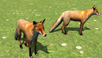
Unlike the wardogs, I think that an animal that is going to be almost 100% of the time underwater is not worth the effort to make such subtle distinctions. Is up to you though
-
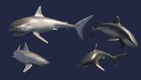
Whitetip and blacknose. For a great white shark it needs a new texture with sharper contrast line between the dark grey and the white bottom and the black eyes as you mention. I'll try to get it done.
-
Two versions I made using a pair of public domain images. They just need a bit of tweaking in the bottom part and the mouth interior. Now we need Strannik to animate it and this would be a great production chain
-
Great!! You're a beast in organic modelling Don't hesitate to use a little bit more geometry if necessary, these ones will be more important than huntable animals. Use three loops in the joints that are going to bent, we can afford it and animation deformations will look much better on skinny legs like dogs Keep it up!
-
You can bake the current texture that is mapped into a new UV coordinates with an assigned new black texture. That will generate the new texture with the UV layout desired and you can tweak from there.
-
You don't need to do any texture paint, just scale the texture you made to 256x256


