Enrique
WFG Retired-
Posts
2.338 -
Joined
-
Last visited
-
Days Won
96
Everything posted by Enrique
-
Hello Vincent! Any progress with the rest of the animations?
-
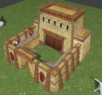
Actually I was about to keep this task assigned to you. The barracks I made is not finished and the design is not ideal. IIRC you draw two more concepts that looked nice and more symmetrical, so if you're willing to, I'll leave the barracks to you. You're very good at drawing, so you can post some concepts to decide which one to go to avoid losing work. About the barracks decoration, I want to keep the hieroglyphs/decoration to a minimum, it's a warfare building after all.
-
Despite of which one is used or if a new one is modeled, I think that a symmetrical building is the way to go, which seems to be more historical accurate. Looking for references, every important building I found is totally or almost-totally symmetric.
-
-
I'm not talking about the design, the slopes are ok, it's characteristic of the egyptian architecture. It's just the impression the building gave gave me. I.e. you can see the "curved thing of the roof that has the stripes texture" on the first images that it has more than the half of the height of the second floor. The second floor looks squashed out in comparision with it's roof thing, which I think that makes it feel so cartoony to me. It's just my opinion.
-
The design isn't bad but I feel like the proportions are cartoonish... it remembers me AOE Online style...
-
It has sightly bigger footprint than the persian temple. Here are some references: http://upload.wikimedia.org/wikipedia/commons/e/ed/Philae,_Trajan's_Kiosk,_Aswan,_Egypt,_Oct_2004.jpg http://cdn2.vtourist.com/4/5090784-Trajans_Kiosk_Philae.jpg http://farm5.staticflickr.com/4025/4677163356_d84422f60f_o.jpg Cool vid Lordgood! Some tips for UV mapping: - Always use Ctrl+A - Apply Scale before unwrapping. - For squared objects (almost every building) is better to choose the "conformal" method to unwrap instead of "angle based" (on the tool shelf on the left of the viewport at the bottom after unwrapping) - Try to scale the UV islands in the X and Y at the same time. The less scaled in only one axis (stretched), the better. - Use the mirror modifier whenever possible (specially on symmetric structures). It's a huge time saver (less time modelling, less time unwrapping) - I try to avoid Ngons as much as possible, they tend to distort the textures, but this is more a personal preference
-
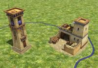
Two new added! I just fixed some UV stretching here and there. I really like the tower design. Good work!
-
No way. It's a wonder, it'll be only one in the whole map... you can crank it up! make it pretty!
-
Great!, that design is good. I'll add it as well as the temple when I get home ^^
-
Thanks. Egyptian ceremonial buildings were extremely decorated. Example The brownish texture color was choosen to break the overall yellow tone. The buildings are supposed to be recently constructed, we should avoid depicting the buildings looking erosioned/bleached as they might look nowadays.
-
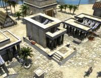
Looking awesome Micket. Here's Giovanni's Paolo painting of it if you want inspiration about how it may have looked (use the enlarge & zoom tool to see the statue better) http://www.christies.com/lotfinder/paintings/giovanni-paolo-panini-a-capriccio-of-roman-5426683-details.aspx
-
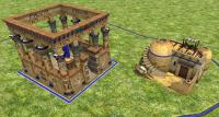
Temple and farmstead based on Lordgood's concept commited. Buildings now have normal and specular maps.
-
Hey Shadosk, That's an awesome design! I like it I'd say to add it as is to the game as a decorative building, and maybe we can make use of it in the future. You can zip the file and post it here and I'll add it to the game or, if you prefer, wait until I finish some changes I'm making to the texture to add some column variations. (adding two new capitels and a painted column variation for the temple). Please, be my guest to start working on the blacksmith. My guidelines will be that it must be a functional-looking structure (almost no decoration, like the houses), and following the "L" shape that the blacksmiths currenlty have. We use blender empties (We call them prop-points) to add things like fire, smoke... etc Good work so far! keep it up!
-
There's nobody working on it as far as I know. Go for it! Ptolemaic big struct texture here: http://svn.wildfiregames.com/public/ps/trunk/binaries/data/mods/public/art/textures/skins/structural/ptol_struct.png (transparent parts on the texture are meant to show playercolor on the mesh once in-game, it's the color used for each player to know who owns each entity at a glance) EDIT: btw, I made a library building some time ago for macedonians, it's already in-game, you can check it out for inspiration if you want, however you have freedom for the design. (Until we ask you to change things muhahaha )
-
A blender user introduction
Enrique replied to Shadosk's topic in Introductions & Off-Topic Discussion
As Erik said, you can access to the SVN online version (or downloading it), but you also have them in the game's folder: The game's buildings are usually divided in different .dae files (one per diffuse texture used) Usually, they consist in one main ".dae" file located in the game's folder "binaries/data/mods/public/art/meshes/structural" and one or more ".dae" children (props) that are attached to the main file, this "prop" daes are located in "meshes/props". (this is not always the case) You can find the textures in "binaries/data/mods/public/art/textures/skins/structural/" and ".../skins/props/". We normally use two 1024 textures for each civilization structures called "struct_civname" and the props textures are for any other kind of textures for props and such that we want to use. -
-
A blender user introduction
Enrique replied to Shadosk's topic in Introductions & Off-Topic Discussion
Hello Shadosk! Welcome to the forums! Impressive portfolio! I love your characters design and models! Which is your primary interest in modelling? organic/nature assets? hard-surface buildings? We've actually paused work on renewing our unit meshes due to some problems on blender's collada exporter with bones, but we'll need new meshes and animations eventually, so if you have animation experience will be very useful in the near future. We're currently developing the Ptolemaic kingdom faction. We need buildings models and unit textures. I've started some of them already, but there's a lot of them left to do if you are interested. There are a bunch of sources and references in this thread: http://www.wildfireg...showtopic=16960 Here is the thread of the buildings I started, so you can see the direction we're aiming: http://www.wildfireg...showtopic=17296 Here's a list of the buildings that nobody is working on yet: -blacksmith -docks -corral -library -market -lighthouse -military settlement I recommend you to download the game and check it out to get the feel of the general art direction (if you haven't done that yet ). You can use the map editor (called Atlas) to see all the buildings and units currently in-game. We're looking to have similar building layouts for each building type, but different style for each faction. If you want more info, here's the (outdated) Art design document: http://trac.wildfire...tDesignDocument (things like polycount are really outdated) Some tips/requirements of the engine: - The engine does not render double-faced polys, so if you want a polygon with both faces rendered, you need to duplicate it and flip the normals. - The engine do not tile the textures like blender does, so when UV mapping, keep the UV islands within the texture space - We use two UV coordinates, one with overlapping UVs for diffuse, normal/parallax and specularity and another non-overlapping for AO maps - Building models need to extend below the ground (-Z axis) because it can be visible when the building is constructed in uneven terrain - Triangle count for big buildings should not be higher than 8k-9k, and around 5k-7k for smaller ones - To get the correct scale is very useful to import a building from the game into blender as a reference. I think that's all for now. Once you know what you want to do, you can open a thread in the Art forum starting with "===[TASK]===" There you can post any questions, WIPs for critique/review, etc. Looking forward to see your work! -
-
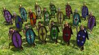
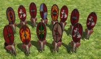
Ingame examples (not final designs). Still have to discard or change colors to some of them. All with red playercolor. (forget about the elephant, is a quick hack to show them )
-
Lion, not sure if you noticed, but your previous eagle emblem design is already on the template (which I think it looks better IMO). Also keep in mind that emblems would be easier to see with white/lighter colors than black/darker colors in general. Some notes: - The shields you posted do not have playercolor. You won't be able to recognize which player owns the units with those shields. Playercolor is achieved by leaving one of the two playercolor variation layers visible (not both), and the last one called "fill" unaltered (you changed the color and opacity) - The template was designed to use only one layer of each group. If you use more than one "mid" or more than one "rim" some subtle shadows and grunge will overlap and it will look almost black in-game if there's playercolor. - Be careful if you want to add more transparent layers or grunge textures, make sure you test the result in-game, because from my experience, the playercolors are very sensitive to alpha opacities.


