Enrique
WFG Retired-
Posts
2.338 -
Joined
-
Last visited
-
Days Won
96
Everything posted by Enrique
-
I'll definitely model and texture them. Specially if you keep making such awesome concepts that fire up my modelling instincts lol. EDIT: BTW, if you are interested, I invite you to try your hand with ptolemaic and seleucid concepts currently under development, you'll be more than welcome to do so
-
From my brief research and links in this thread it looks like there had more greek than persian influence. Links from BloodSpiller and images I found from Apamea depict it looking closer to greek style: http://2.bp.blogspot.com/_GTlmuE_yF5Q/TLIWCcI3BxI/AAAAAAAABHU/1a0fUpE97WU/s1600/Apamea+etc+131+_01.JPG http://4.bp.blogspot.com/_GTlmuE_yF5Q/TLIWKThGSLI/AAAAAAAABHY/gzmeE8XPvC4/s1600/Apamea+etc+082+_01.JPG http://4.bp.blogspot.com/_GTlmuE_yF5Q/TLIWSqZZU-I/AAAAAAAABHc/cFJFMDzi0lk/s1600/Apamea+etc+103+_01.JPG http://upload.wikimedia.org/wikipedia/commons/6/61/Syria_Apamea.jpg
-
Those blocky wall reinforcements don't look good to me, IIRC the iberian defense tower an the fortress had nice ones. Also the wooden planks texel number is too low and they are too perfectly lined. I'd like all the building corners to be sightly rounded, even on the window frames
-
I'd prefer a new whole texture, not just desaturating existing ones. We want the civs to feel unique. Desaturating and minimal editing would work for the three greek factions to diferentiate them even more, and it might be done in the future. Designing the main colors and look of a new civ is not an easy task and it envolves a lot of tries and iterations on the texture, and it's preferible not having a lot of finished structures due to the changing nature of the texture which would surely lead to UV remapping all the structures for that civ until the texture design is mature.
-
Wow! 10/10 would die in an ambush from this men in the woods
-
Texture looks good enough. For the next time here's a trick: since the animal is symmetric, you can just texture one half while keeping a "mirror" modifier. This way you have two big advantages: you only have to texture half of the model, and you can make the UVs much bigger, resulting in a gain in final texture resolution. La textura se ve bien. Para la proxima vez puedes texturizar solo mitad del animal, ya que son simétricos. Usando un modificador "mirror". De esta forma trabajas solo la mitad en la textura y tienes mas espacio para hacer mas grandes las islas de UV, con lo q se consigue mas resolucion en la textura final.
-
Nice, Looking better already, but I still think the stone mill should be moved more to the exterior. It still looks like is in the center of the building and will be hardly visible from the camera point of view. It would be better to post screenshots from an isometric-ish view, like it will be viewed ingame. Keep it up.
-
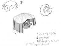
I think the structure is too similar to the current rotary mill. It needs to be bigger overall, with a wider entrance and wooden beams framing the entrance. What I'd like to have is the mill not in the center of the round structure, more towards the outside, so even if the roof is closed the mill is quite visible and when the donkeys are walking around the mill, they actually get totally outside and they are easy to view. You can see in my sketch top view that the mill is partially outside (top right of the sketch). Keep in mind that the normal point of view of the building in-game will be from an angled top view and with your layout the mill and donkeys are not going to be seen. Donkeys will be eventually animated along with the mill turning 360 with them.
-
Totally agreed. It would be nice to update several parts of it. I'll write something in the near future
-
I modeled them from scratch. Can't tell how to reduce polys in max since Im no expert and the last time I used was long time ag
-
Lion that info is way out of date (several years) I've repeated everywhere that its outdated and poly limit is much higher than that.
-
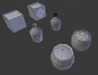
Almost done fixing the farmstead. It needed some re-scaling because it was bigger than the roman farmstead (in-game pic soon...) . Also fixed some UV stretching in the roof and minor things, specially the props which had too much triangles for just props (see attached image). We should use less geometry in props (specially if we want add multiple props around the structure). The two rounded props were reduced to one third of their total triangle count (from ~150 quads to ~ 50)
-
Quick draw concept (not final in any way, we must build over this one if we decide to go with this) 1.- Cart prop 2.- Hay props 3.- Possibility to keep wood beam supports from the current model entering the roof It needs ton of detailing and this would be just the starting point where the modeler needs to add improvements and such. As I said before, modelers in 0AD must take care also of the conceptual part of the models.
-
Sorry if it looks a bit crappy??? That looks uber-awesome man! Maybe a little big for the game, but really pleasant to look at! Really makes me want to model it...
-
Alpha 16 Wishlist/General discussion
Enrique replied to Lion.Kanzen's topic in Game Development & Technical Discussion
Hello Hephaestion! welcome to the forums and thanks for your feedback. To address some of your points: - You will be able to capture women (IIRC the only possible unit to capture along with buildings) But capturing is not yet implemented - AI enemies/allies is being improve over time and will have more diplomacy options/decisions in the future - "Auto guard" could be a possibility, but is up to discussion if that should be managed with micro-management or not. Regarding soldiers guarding women, there's a "alarm" bell in the dev. version that makes women automatically garrison in the nearest building. (haven't tested it myself though) - IIRC, growing trees is no longer planned. Only food will be an infinite resource to gather in the map. We want to make trading more important (as it was in those times too) in the late game, which will provide you the resource you need as long as you have traders traveling between markets/docks. There is some development on upgrading how trading works that will make things easier to choose which resource to gain through trading. Also keep in mind how many years take a tree to grow up, and in 0AD we don't have "ages" but rather city phases which don't take so long to develop. - Animal herding functionality still being discussed how it will work. But we plan making corrals useful and reflect that and probably add animal reproduction and extinction in the map areas (not decided yet I think) - Weather/season changes and daynight cycle plus torch/fire spotlights seems to be out of scope. We had a skillful developer who was working on add deferred lighting to 0AD (groundwork for this features to happen) but sadly he disappeared - Your tech system sounds cool to me and something that could even suit the game, but I think the tech system is already tightly implemented and would be hard to change such a big gameplay feature in the current state of the game. - Cavalry and infantry run/walk means run/charging. Units will have stamina and will be able to run/charge to the enemy with double right-click. Cavalry, chariots and elephants will have a big bonus damage impact when charging (apart of the speed bonus of course) - Nomad mode I think is not working on buildings yet, and I don't think is planned. That suggestion seems to fall under the "mods" section - Your commanders suggestion seems way too difficult and sounds something that micro-management should take care of. Maybe I'm not right in all my points but I think is an approximation of how things are at the moment (of course not all of them will be on A16 ) -
Which gimp version are you using? Are you exporting correctly? What format are you using?
-
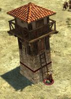
This is the image, you can see the bricks on the corners I mentioned. About the beams, the reasoning is to make it look bigger without scaling it up. Or maybe the thing that make me think the structure isn't big enough are the doors and shield size, also the balcony space is minimal. Anyway, just nitpicking there And here's a screenshot of the tower with max settings: EDIT: Fixed the image
-
Great! nice to hear Woldn't that be too much? Usually you'll have very limited amount of units/buildings with an active aura, but imagine how many weapon range lines could be drawn when selecting several units :/
-
Yep, actually it is done with prop-points conforming into the terrain, we tested some ideas even with moving textures to make it look good, but the props made the selection box of the unit/building as big as the radius itself because of the props so we decided to remove them before the release. Decals is the other option, but there was some discussion on IRC that big decals could make a performance hit, and there was a brief talk about making "hollow" decals to reduce the performance hit not rendering the interior pixels of the decals. (I hope I get it right and explained it correctly) Philip was the one who suggested it, but of course, someone have to code it.
-
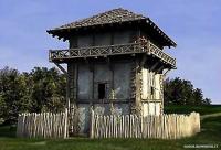
Looks good, but I can't find any references with sloped walls, all of them look totally straight and fat (wider in general). I'd like to see some bricks sticking out on the corners to spice it up, something similar to the greek houses or the bricks sticking out of the roman market. Something on these lines: http://www.historyfiles.co.uk/images/Europe/Romans/Limes_Tower_LowerRhine01_full.jpg I'd also make the beams that support the balcony smaller but higher in number. What do you think?
-
Romulous, the iberian faction is one of the most historically correct factions designed in our game from architectural to texture design based in a lot of references like the last ones Lion posted. We also need some consistency between structure layouts for the player to recognize each structure function without the need of selecting it to see what is it. If you don't like the fact that it looks similar to aoe, sincerely you're not going to like 0AD at all... And saying that it should look more unique without giving any reference, post or valid suggestion doesn't help at all. Regarding the current WIP model... It's not looking right to me at the moment. It doesn't have the organic feel that I get from LordGood's concept. Take a look at the iberian fortress to get a hint.
-
Updated. The rotatory mill model is really old, and that structure is not ideal, the only reason that it has no roof is to show the animals I think. Something similar but looking better would do the trick.
-
Awesome, looking really good. Zip it up when you're satisfied with the model
-
I see you're using GIMP. I had also a lot of trouble with alphas before in GIMP. It's kind of weird how GIMP handles transparencies. The correct way to show the playercolor without the weird borderline is using masks layers. Just rightclick your texture layer, add mask (white, full opacity) and paint there in black where you want the playercolor to show. Try exporting that as .png and see if is fixed. Your other problem about erasing and the texture still partially showing is weird. I have no Idea why is doing that. Are you sure your eraser opacity was at 100%?


