Enrique
WFG Retired-
Posts
2.338 -
Joined
-
Last visited
-
Days Won
96
Everything posted by Enrique
-
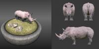
Correct. Nice work projecting it though. Stan you should try to improve the texture once projected through GIMP or Blender's texture painting. I finished texturing this fine model. I think I scaled the model though, not sure if it was already set to in-game scale. Good job everyone. white_rhino_final.zip
-
Nice to see you back modelling and animating wraitii! Very nice overall My input would be on marking a little some characteristic look of the hyenas: the fact that they normally walk with the head quite low, and the fact that their back legs are much shorter than the front ones compared with other quadrupeds (thus making a slope on their spines seen in auron's reference http://media.web.britannica.com/eb-media/34/82634-050-865C2055.jpg). waiting to see the animations
-
Hey nice job Stan! I like all of them except the one with the hole, it looks too fake. The rest are looking pretty good! You should try also going for some lowpoly flower groups. keep it up! On a side note, be carefull with the saturation of the mushrooms, too bright/saturated colors may make the player think they're collectable/food. Otherwise, nice work.
-
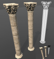
We'll discuss this further soon. I've made some better columns for seleucids. Overall the texture you made is quite good, I'm going to touch some values and probably make it 2048*1024 to have some more room for more stuff
-
Art Lead Application - 3D Artist/Texture Artist
Enrique replied to Kicking_Bird's topic in Applications and Contributions
Will do Ben. I'll not take into account what I think it could be made into the game or not, so it will be an extensive read... -
Very interesting indeed wraitii! nice experiment I wonder if the intensity of it could be driven by the specular map
-
Art Lead Application - 3D Artist/Texture Artist
Enrique replied to Kicking_Bird's topic in Applications and Contributions
Hello Kicking_Bird, Regarding terrain textures: As already noted by a lot people in the thread, several terrain textures have quite some age already (as you already know the project has been going on for several years). Normal/Parallax, Specularity and AO maps were introduced in 2012 after the roman set was done. These features weren’t planned, and an awesome contributor took it and implemented them by his own (which is one of the many benefits of open source development). Before that, several artists had just a basic lighting render model where they did the best they could to make things look nice, which involved textures with shadows and highlights in them and contrast noise to counter the plain lighting. With this background, you can see that nobody made these textures like they are “on purpose” or “by mistake”, but it was a workaround of the possibilities of the engine at that time. Surely they can be improved, you’re more than welcome to start working on it and show us what you can achieve. Regarding LOD: It isn’t implemented. The contributor who made the sweet graphic improvements had it planned after he implemented deferred lighting, but sadly he disappeared from the forums and project before that (one of the inconveniences of open source). That’s the main reason artists have to work with more-limited-than-standards polycount and make use of hard edges and smoothing groups to deal with shapes and can’t go chamfering every edge. Another thing we have to deal working for 0AD is the fact that the diffuse and normal maps are shared between all the strutures sets, which doesn’t give you all the freedom you want when using them and it pushes the improvisation and creativity of the artist to make use of them in the best way possible. The only non-shared maps between same civs structures are AO maps, which are just greyscale images and doesn’t eat so much memory space than having one normalmap and one diffuse texture for each one. (And since there’s no LOD system, we can’t make use of lower res textures dynamically either) This shared textures also generates the problem of the different pixel density ratios, where even if you make your best effort designing the texture and trying to make each piece the closest to its final size on the model, there will always be situations where pixel density will vary in the model since the texture wasn’t specifically designed for that particular model. Regarding the Persian wonder: The current one in the game seems to not be as accurate as it could be, so the last decision about it was to use the Gate of all Nations. I started it some time ago but didn’t finish it yet. You can check the direction I took here: http://wildfiregames.com/forum/index.php?showtopic=17552 I have an updated version with more detailed/accurate columns I can upload if you would like to take it from there, unless you want to start from scratch. Last thing, I’d like to take a look at your work examples and/or older projects. Sadly the link you provided in the first post is not working for me (not found) And welcome to the forums by the way! -
===[COMMITTED]=== New Animation (Work in progress)
Enrique replied to Jos3BV's topic in Completed Art Tasks
I'll drop quickly my input in some of the anims, I'll elaborate more later at home: Mining: I think the arch of swinging the axe should be exaggerated a little bit. The pickaxe don't get momentum, it goes from almost stopped to full speed blow too quick IMHO. Also could use a step forward when giving the blow and move it back to original pose when drawing back the pickaxe?? just thinking loud, you have freedom to see what fits Carrying ore: I like that we're going to have different carrying animations (yay!). I think that when carrying ores, their back should lean backwards (to counter the material weight). Right now they bend forward, which I think looks unnatural. (Imagine yourself carrying something very heavy in your hands walking forward and you'll see how you lean backwards to keep balance) Chopping wood: I know that you used Lion's reference to make the animation (around 1:50 I think) however, that woman is chopping wood as fast as she can for a competition. If you're going to make a hard task like chopping, you want a more relaxed back stance. Right now they're bending too much forward, they'll have a big back ache from that pose if they're going to keep chopping for a long time. Also the legs may be too "crouched" but I think it's because I'm seeing them leaning forward too much. The arms timing and the swing flow is perfect though, I really like it and looks very natural. Carrying wood: Perfect Walking: Looking pretty good Keep up that good work man! really digging your work! -
===[COMMITTED]=== New Animation (Work in progress)
Enrique replied to Jos3BV's topic in Completed Art Tasks
This is very very good news! -
===[COMMITTED]=== New Animation (Work in progress)
Enrique replied to Jos3BV's topic in Completed Art Tasks
I like the gathering fruit loop nice work. The building loop seems harder notice she's hammering. Maybe exaggerate it some more making the arm rise higher? closer to the actual animation (aoe style) About the problem exporting... seems the problem is the bone's orientation, which may differ when exported from c4d. Do you have any options when exporting? -
===[COMMITTED]=== New Animation (Work in progress)
Enrique replied to Jos3BV's topic in Completed Art Tasks
Let's show you some modding so you can make your own tests in the game: This is a look at the newunit_fem.xml actor: (open the .xml file in notepad or notepad++ is better) This file is located in \0AD\binaries\data\mods\public\art\actors\units\hellenes\ <?xml version="1.0" encoding="utf-8"?><actor version="1"> <castshadow/> <group> <variant frequency="1" name="Base"> <animations> <animation file="biped/new/fem_idle_long.dae" name="Idle" speed="100"/> <animation file="biped/new/fem_idle_short.dae" name="Idle" speed="100"/> </animations> <mesh>skeletal/new/f_dress.dae</mesh> <props> <prop actor="props/units/heads/new/head_female_test.xml" attachpoint="head"/> </props> <textures> <texture file="skeletal/hele_fem_d.dds" name="baseTex"/> </textures> </variant> </group> <material>player_trans.xml</material></actor>In this example, you can see the animations that are going to play when "idle" (no attacking/not moving) are the following: <variant frequency="1" name="Base"> <animations> <animation file="biped/new/fem_idle_long.dae" name="Idle" speed="100"/> <animation file="biped/new/fem_idle_short.dae" name="Idle" speed="100"/> </animations>The speed is obviously the speed to play the animation, and the file is the path where the ".dae" of the animation is located. Just overwrite the path with your animation's path (better place your animation in the same folder as the "biped/new/" folder) and the unit will play it when spawned in atlas. These .xml are just for test, so don't worry to change them as you please to test your animations In resume this is how "visual actors" work in the engine, it's a ".xml" that tells the engine where are the mesh in the <mesh> labels, the <textures>, the props, animations... -
===[COMMITTED]=== New Animation (Work in progress)
Enrique replied to Jos3BV's topic in Completed Art Tasks
Hi Jos3BV, amazing work as usual. I'll drop my input: First some explanations on my list: -The difference between relaxed/ready: This is because we want the units to look more aware of their surroundings, so we want to have a relax pose when no enemies are nearby, and one "ready" when enemies are close. An example would be units with shield: if no enemies are nearby, they will have their shield down, at a side relaxed. And when they have enemies nearby, they should bring the shield up and get "ready" in a pose closer to the attack loop, but still "idle". For ranged units, relaxed would be the javelin or arch down, at a side and when they're "ready" with the javelin up ready to shoot, and their arch loaded too. This is an example I made about static poses to give an idea of what I had in mind: Same for walking and running, if they're walking/running towards the enemy it makes sense that the units raise their shield according to the incoming danger. Right now units walk around the battlefield like if they're walking in the park *(NOTE: units being aware of units nearby to change their idle/walk/running animation is not yet implemented, but will be. So we need these animations) This difference makes that females do not need a "ready" stance for idle/walking/running since they do not attack. Sorry I didn't make clear that before. -Female walking looks too manly, let's try to make it a little more feminine (more hips-heavy, less shoulder heavy). The flow of the loop is great though . We want walk/run/idle for females to be different from males. -Mining... I think the previous iteration was better. Something close to what we have now would be nice. Good reference: http://youtu.be/sPwXhtg94-M?t=2m33s You're doing an amazing job man! keep it up! And forget at the moment about horses and fishing animations, core unit's animations are high priority now -
Your animations and transitions look incredible man. I really like them even if they're not finished yet. The big problem is that the engine doesn't support transitions between animation states (states = loops) yet. I still have to make some minor tweaks to the armature that I posted, like adding one or two prop-bones, but I think it shouldn't create incompatibility with the work you already did. I'll do them asap if you're willing to keep making this awesome stuff. Here's a list draft of the animations I could think of. Ask any question/doubt you may have about them or how the engine manages the animations. (Even in spanish if it easier for you lol )
-
Wow Jos3BV Impressive stuff!!! I'll elaborate later since I have no time now, but I must say you really got some animation skills!! Keep it up!
-
An Archer Animation Proposal
Enrique replied to Stan`'s topic in Game Development & Technical Discussion
Very robotic and harsh movements. Stan please, try your best with the animation until you can't see where it can be improved and then ask for feedback. I'm sure you can see how harsh the movements are. There are plenty of tutorials about animating with curves and how to smooth between keyframes, start from there. -
An Archer Animation Proposal
Enrique replied to Stan`'s topic in Game Development & Technical Discussion
Check the last step he makes to return to original position. It's just too quick. If you manage to stop the video where he starts to make the step forward is less than 1/3rd of the timeline. Don't try to work on a fast loop. Just try to balance the number of frames from start to the shooting, to resting again. start - shoot - back to start. The speed of the animation can be tweak later. -
How to export animations from Blender3D to 0AD
Enrique replied to Enrique's topic in Tutorials, references and art help
Bienvenido entonces! Y sigue así, nos vendría muy bien un buen animador para las nuevas unidades! But better to keep english in the forums for everyone -
How to export animations from Blender3D to 0AD
Enrique replied to Enrique's topic in Tutorials, references and art help
Hey it's looking great!! very nice loop! Did you use the armature from the blend file? or you created a new one in C4D? -
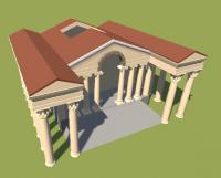
I'd rather go to the Hatra structure directly, the one that you made the front blueprint LordGood. Nice work on the structures by the way. I like the overall color scheme and the columns. The temple looks very nice, my favorite so far. I'm not sure if I like the defense tower though, having the wall-columns in a military building doesn't look like it fits (unless I'm missing a reference that shows accuracy) If you let me, I'll make the texture following the color scheme that you set, and will go for a 1024*2048 texture as I did with ptolemies. This is what I want for the Seleucid CC:
-
How to export animations from Blender3D to 0AD
Enrique replied to Enrique's topic in Tutorials, references and art help
It's not obligatory, but it's the team standard. For unit animations we provide the mesh and armature in .blend format (blender standard) I guess you can try to export it as .fbx or .dae for cinema, but you'll probably lose some functionality. -
An Archer Animation Proposal
Enrique replied to Stan`'s topic in Game Development & Technical Discussion
For the standard archer animation, I made an idle where the archer would have his arrow already drawn and resting on the bow ready to shoot (archer_ready). The firing animation would be just aiming and shooting, then picking a new arrow and rest it again in the bow to begin the loop again. I think this could look pretty good in the game and lower the starting animation frames so the arrow would be shot earlier in the animation loop. The problem I see with Stan's animation is that now it is playing slow, and remember that we want the animation to loop and it will play much faster, which will make the non-smooth movements even less smooth. This is a very nice example of a good draw-shoot animation: http://www.wildfiregames.com/forum/index.php?showtopic=19490&p=301834 It's short, loops nice and the pose is very natural. -
Could the black be replaced by a color based in the fog color? Or is it posible to set a blend of the sky texture with a color set in atlas? (Dont really know how the sky works)
- 5 replies
-
- map editor
- screenshots
-
(and 1 more)
Tagged with:
-
From the first post
-
I agree. I just though that tweaking the neck a bit would fit more on the "average" proportions of the breed. I've been checking it hiding the "hairy lose" faces. I'll use them for alpha-transparency hair still. I think I'll leave the head size as the original and shorten the neck just a tiny bit (not as much as the comparison screenshot I posted earlier)
-
I think the best solution is to treat dog units as champion units, without ranks, since they do not gather/build like champion units. This doesn't mean that they can't have different collars and fur variations.


