-
Posts
25.684 -
Joined
-
Days Won
302
Everything posted by Lion.Kanzen
-
.thumb.png.ce58cea22940c255f5b0a735d5abee36.png)
The Role of Women in 0 A.D.
Lion.Kanzen replied to Thorfinn the Shallow Minded's topic in General Discussion
said that to Praetorians game (now in GOG in HD), any economic feature.... I waste. think more SC2 or... more complex game like Stronghold. -
.thumb.png.ce58cea22940c255f5b0a735d5abee36.png)
The Role of Women in 0 A.D.
Lion.Kanzen replied to Thorfinn the Shallow Minded's topic in General Discussion
CAESAR II - warning! Don't use headphones. -
si es que en opciones tiene varias formas y una es atacar en modo boom / rush a los 13-14 minutos. debes cambiarla a defensivo y ver nustros tutoriales en video y los consejos de @borg- para hacer una economia fuerte.
-
the ai is way to hard. in 15 minutes they rush him. is not a rage or complaint , is a quite faster. by the way kind regards he said.
-
-
again the answer is ... make all clones , nobody have time to read, Christmas eve is near, Happy 2020. baibai
-
deja que los desarrolladores respondan, a veces se pasan los post si no los tageas, Stn sabe quien trabaja en qu area del juego. el otro que puedes consultar es @elexis
-
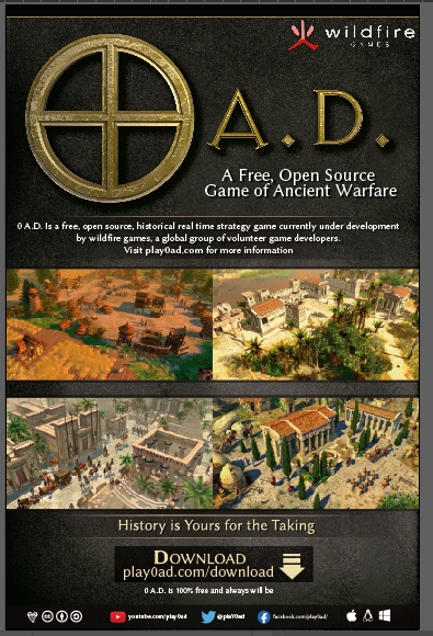
you must be save that one in the art repo can be useful for press and media screenshots. like fyers, posters, FB post etc.
-
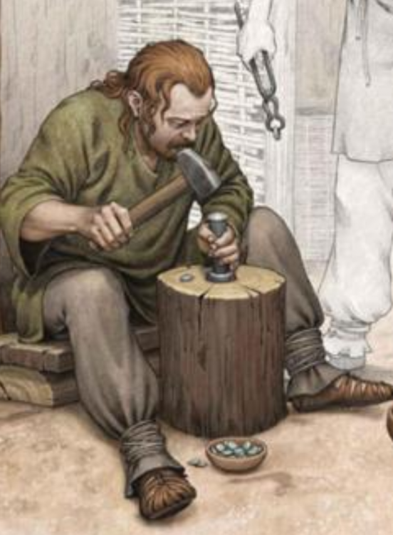
Some ideas... Some blavksmith basic technique I know is XIV century but... Some things doesnt change, forging melt and iron cast change but hammering...
-
.thumb.png.ce58cea22940c255f5b0a735d5abee36.png)
===[COMMITTED]=== Gallic Tunic Textures
Lion.Kanzen replied to wackyserious's topic in Completed Art Tasks
Wonderful art. -
he can connect or verify with the server. The rest is clear. @Stan`
-
En el 94 teníamos eso, aqui fue por q hubo un desaste connlos cables de telefono luz e internet en mi colonia.
-
.thumb.png.ce58cea22940c255f5b0a735d5abee36.png)
===[COMMITTED]=== Civ: Rome Scutum
Lion.Kanzen replied to Alexandermb's topic in Completed Art Tasks
I have a book with legions shields. @Alexandermb https://www.pinterest.com/pin/310044755578925848/?lp=true -
question @Genava55 why celtic teams use this pattern?
-
current champion is discarded... Genava said isn't accurate unit.
-
sorry ... I wasnt time this week. to much work, social life (girlfriend), even one day I was without power (energy) and Internet. poster copia.pdf
-
.thumb.png.ce58cea22940c255f5b0a735d5abee36.png)
Age of Empires 2 Definitive Edition
Lion.Kanzen replied to Lion.Kanzen's topic in Introductions & Off-Topic Discussion
Few days for the release. -
I dont use psd this time, I use Adobe Illustrator. And save as pdf.
-
PDF you mean.
-
there are optimization at this A24 25% more i guess.
-
what we must do at the end?
-
Why Jimienez?
-
.thumb.png.ce58cea22940c255f5b0a735d5abee36.png)
===[COMMITTED]=== Civ: Rome Scutum
Lion.Kanzen replied to Alexandermb's topic in Completed Art Tasks
Se ve raras esas alas como separadas las plumas. El del segundo. -
.thumb.png.ce58cea22940c255f5b0a735d5abee36.png)
===[COMMITTED]=== Civ: Rome Scutum
Lion.Kanzen replied to Alexandermb's topic in Completed Art Tasks
Not for republican Romans. -
.thumb.png.ce58cea22940c255f5b0a735d5abee36.png)
Age of Empires 2 Definitive Edition
Lion.Kanzen replied to Lion.Kanzen's topic in Introductions & Off-Topic Discussion


