Leaderboard

Popular Content
Showing content with the highest reputation on 2018-03-02 in all areas
-
Position: Gameplay Developer Do you understand that Wildfire Games is a non-commercial project, work for 0 A.D. is volunteer, and work is done for free? Yes, and while I wouldn't mind any interesting professional occupation paying my expenses, I value non-monetary interactions as superior towards creativity and honesty. Do you agree to distribute all your work for Wildfire Games under Creative Commons Attribution Share-Alike license? I'll shoe ya all if you steal MY work (Actually, no I won't throw sues at you and yes, I agree) Are you sure you are not wanting to work on something programming related? (Then you don't need to send in an application form.) Yes, but I could occasionally do some simple tasks like in the past. Name: Nikos (or Nick), from Nikolaos. Full name currently classified (I'm getting funny). Email: I'd rather not post it in a thread. Location: Athens, Greece. Availability: I generally could offer several hours a week, often many hours a day and would also usually be reachable during my work hours. But as my schedule and priorities aren't always stable, I might have small periods of inactivity. The motivation of working on something I really like, from a position I consider meaningful, would probably mean I won't quit unless something really serious happens. Age: Soon to be thirty-two. Occupation: I'm now eating dried nuts with honey (I'm getting funnier). But I'm an optician/salesman/bored/whatever... Motivation: Love of history, strategy games and their design. Creative/healing brain activity. Working in a team instead of alone. Personality: Ignorant human being, skeptic, anti-authoritarian, a weird mix of a romantic and a cynic, rather shy, wannabe philoshoper, trying to be a decent/just person. Skills and Experience: See just bellow. Short Essay: I've been a strategy game player since about the year 2000, starting with Age of Empires, Age Of Kings, Myth I & II at friends' places, without owning a computer. It started for good though 2-3 years later when I bought Age Of Mythology and soon Warcraft III, which are probably my most played games, along with Rome Total War and World Of Warcraft. The first thing I did when I first run AOM was to create a scenario with the editor. I found about 0 A.D. online, sometime in the mid 00s, while searching for new strategy games. I've been a minor contributor to the game as well as a modder for it and RTW, WC3, Civ V. Also a map maker/scenario designer for AOE, AOK, AOM, AOE 3, Rise Of Nations, Stronghold Crusader and Civ III-V among other games. Besides playing, modding and designing strategy (and rpg) video games , I've designed tabletop/card games since a young age and been a history nerd since my pre-school years, with the ancient era (and it's military part) being my favorite. I'm intrigued by strategy game design from creative, balancing and realism/historical perspectives. While trying to find what works best under any given circumstances, besides a lot of trial and error, I've read on game design and self-studied on how various games work and try to achieve their goals. Interests and Hobbies: Music listening/composing (with a focus on lyrics), reading, writing, the occasional mountain-walking, socio-political/scientific/philosophical discussions. I'll soon try to sing my songs in a band for the first time instead of playing guitar. May the higher beings of the universe help me. Staff: I don't know any team member personally. Community: Currently none besides this one, but I have participated in several game forums (thehiveworkshop and twcenter among others) and still check some of them at varied frequencies. Favorite Game: Impossible to single one or a couple. Lately I play Crusader Kings II more than anything else. I wish 0 A.D. becomes my favorite. Work Examples: You could check the mod Ancient Empires, though at the moment it's broken by game updates, stagnated and much of the information on the forum is outdated. If need be I could also dig for and provide my work for other games, in various states of playability. I fear all of this might not be tempting enough and I'm also not sure that the team wants a gameplay designer, but I strongly believe one or more are needed. So I thought, why not apply instead of keeping to spam the forum with suggestions as I've done occasionally for years now. To be honest I've thought about it in the past as well but this is the first time I took it seriously. I'd love to make my dream strategy game or mod a reality, but at this point I'm so full of ideas it's hard to choose on which to work and working alone is a serious drain on my motivation. If I were to be accepted in the team I'd prefer to focus on a practical approach. I'd like to know what is planned, how the team works internally and to what degree changes are debatable as of now, because what I get from reading the forums is rather confusing. I guess it's most realistic not to have extreme expectations about possible changes, so I'll provide some short proposals bellow based on that assumption ( = don't shoe me for making no mention of battalions). Mind that my observations are based on playing up to A21, and then on, only on impressions from forum comments, so please excuse any neglect on my part. Anyway, to the proposals: Phases & Tech-Tree Layout Capturing, Rank And Looting Mechanics Citizen Soldier Concept Unit Roles, From Historical And Gameplay Perspectives. Counters And Their Function Game Pace And Scale Territories Visual Cohession Civ Differentiation Heroes Maps I can take the time to provide a more unified and personal gameplay proposal with additional details if that's desired, but I thought this rather generic approach describing possibilities is best since I have almost no clue on what is planned (and to what degree things are planned) behind the scenes and even if accepted I don't expect full control on the design anyway. What I would find ideal is working with a small number of sensible and friendly people that have a clue on gameplay design, while taking in account other team and community opinions as well. This was my first application on anything ever, I hope it's not terrible and that my english are fully understandable. Thanks for taking the time to read, Prod/Nikos5 points
-
Although Erik and I are in favor, I will still tag @MishFTW one more time. --- In the mean time, I am attaching a link to SPI's reimbursement request form: http://www.spi-inc.org/treasurer/SPI_reimbursement_request.pdf Unfortunately there is a USD 22 charge for outgoing wire transfers charged by SPI's international payment system, so it is best to minimize the number of transfers. I suggest we reimburse one participant for the FOSDEM expenses and that person would then transmit the money to the other participants with their respective shares.5 points
-
Yes, the AI is more or less able to cope with them, although some final tweaks will be needed when these structures are really in. But more globally concerning this thread, we agreed in the team some time ago to wait until a23 is out before enabling these structures, and i don't see any good reason to change that decision and delay more the release. My motivations to support this decision were: - only enabling the existing structures is not enough, we should take this opportunity of new available structures to give more diversity (based on history) between civs, and not just adding what is available. And that will take time. - that will inevitably require some balance, which will also take time to have it right (even if some people here seems to think it is useless for an alpha, i don't see how it can help the fame of 0ad to release something unbalanced). - A23 is already quite late compared to what we wanted (we were aiming at beginning of february) and staying in a pre-release state for too long does not help development as it prevents the important changes that people don't dare to do before a release. - A23 has already a huge highlight, the kush, and most of the other changes may go unnoticed in comparison. I'd much prefer to have a short A24 in a few months highlighting these new structures with possible improved diversity between civs.3 points
-
using the background wallpaper cataphract as reference, did 2 colour variants of the sele blanket:
 3 points
 -
Got it. Try it now.3 points
-
Mace Gauls Persian Athen
 3 points
 -
3D tats hell yeah2 points
-
I haven't started them yet so go ahead. You could also do the mace workshop or commit the existing ones or the Kushites Don't forget to remove the ao suffix from the ao textures as it's implicit by the folder name Oh and if you can try the new actor editor2 points
-
why not just use justus' formula for hero portraits for the time being?2 points
-
@Prodigal Son your application makes me write my first post after 8 months... One of the best things I've read on this forums so far, giving me new hope for the future of this game... I wish you and the team the best (may they accept your offer!)... Hopefully gameplay will no longer limit the true potential of 0 A.D.!1 point
-
Well, all of those maps are war maps. Silk Road will be a trade map, but even that will be at war1 point
-
Actually it's the other way around. The war season was typically in the summer (when there was less work in agriculture); afterwards, armies were disbanded, and the warriors would return to their farms. These warriors were typically citizens who were rich enough to afford their own weapons. Only in times of real emergency the rich provided funds to arm the lower classes of society (the poor, serfs, slaves, etc.). Military power meant political power, at least in city-states and tribal societies. Warriors were usually untrained amateurs. Even Spartans were only professional in comparison: state-serfs worked the land, enabling the Spartan citizens (the elite) to form a leisure class. Their “rigorous training” consisted of dancing, some athletics, chasing hares into traps, and subsequently clubbing those to death. Mercenaries came typically from areas with a lack of good farmland and thus a population surplus; younger sons would typically leave home to have a chance to make a living as fighters elsewhere (they were the actual “professionals”). However, the priorities of a mercenary were obviously different from those of a citizen: the latter fought to defend their land and family, the former to be able to buy enough food to eat and to avoid getting killed in combat. Macedon and the late Roman Republic had standing armies; they were the only ones who actually had real soldiers (i.e. men who received a salary in return for military service). Their military training consisted mostly of one thing: marching. The ability to move around armies quicker than their opponents expected enabled the expansive conquests of Macedon and Rome. After some years of active duty, veterans were given emough farmland to support a family and settled down in military colonies. Summary: citizen-warriors were actually the de facto standard in Antiquity.1 point
-
On our machines the hotkey event is sent less often than on your machines, so we didn't notice it being a problem. If the GUI updates it less often than the hotkey event frequency, the lag should be gone independent of the hotkey event frequency.1 point
-
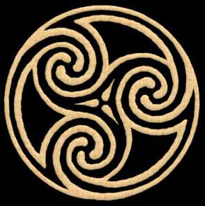
Another celtic symbol for blankets, remember in case someone need the symbols this are 3D models so can be adapted to most things (shields, clothes, banners, buildings)
 1 point
 -
Just to respond to some of the criticisms of the system I proposed, I would say that it is as sensible as other alternatives. If it were to be realistic, citizens swapping to the soldier role should go back to their home and rally at a given location. To compare to other options, the idea of using the gatherer>ulfsark mechanic is no better. Weapons and armour appear out of nowhere for that. Also, there is no way of switching back. For that matter, villagers magically summon axes, mining picks, etc. In the case of the timed ability from Warcraft 3, weapons and armour again appear out of nowhere. In the system I proposed, it is not that different. The big change is mainly in that it takes time to switch between roles. If this idea still sounds frustratingly exploitable, I think that it is within reason to have some malus applied to citizen soldiers when they are outside of friendly territory (Technology could possibly change that in the mid-game.). To summarise, 'packing' seems to me to be a sensible marriage between realism and gameplay and should be considered since in many cases for civilisations of 0 A.D., they had no standing army, and it took time to mobilise their forces. There might be some ways it could be improved, yet it is a legitimate option in my opinion.1 point
-
@Sundiata tried to make it similar to the texture it already have but also followed this one wich was also posted some where in the forums.
 1 point
 -
Thanks for the feedback! Removed one hero on Thebes (black in skirmish, dark brown in editor, why's that?) player. Overlapping temples in Thebes: There are so many overlapping temples, so I guess you are referring to the two apdemak temples. Correct me please, if I'm wrong. I changed those two facing to the south the to be an actor and placed fences beneath them as blockers. Balancing Persians: You are right in that the Persian player has the most free space within its starting area in the beginning. This becomes especially true, when you compare it to Alexandria, who must (!) expand in order to even have enough space for farms. This is why the natural expansion in the delta exists, which of course will be harrassed by the Persian player. On the other hand, the Persian player lacks starting buildings, has no wonder, libeary or theatron and has the hardest time expanding into new territory. Condensed ... I am not happy with that too. It was more of a working title than personal preference. I chose that supplementary word in order to addesse that everything-compressed-into-a-single-spot nature of the map. But the primary reason for having such an addition was simply that I didn't feel It was appropriate to occupy the title “egypt“ all for myself. Didn't you ever plan to create a genuine Egypt map for your portfolio? (Especially since this map starts with full citties and thus does not offer a usual gameplay. A map subversion devoid of any city buildings is planned, but would either need an indestructible atlas-visible-only blocker entity in the stock game or some modding efforts.) I am open to all suggestions. AND: I uploaded maps with the recent changes (=v 0.20.4) in the first post. Greetings mimesot1 point
-
@Lion.Kanzen So you still need references?


 1 point
 -
In case you decide to enable the new structures, you can use: https://code.wildfiregames.com/differential/diff/5994/1 point
-
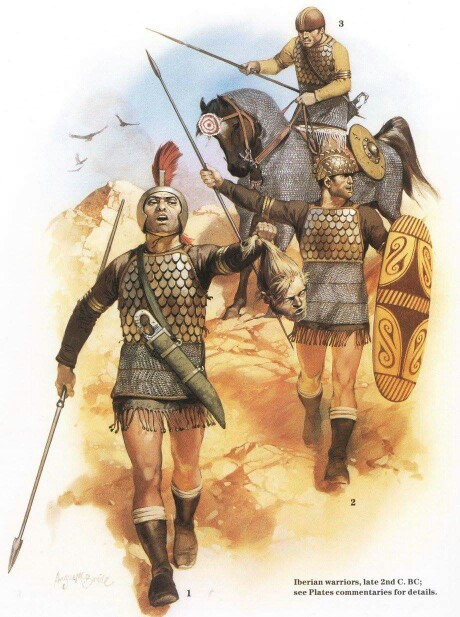
Update: Iberian: athenian Carthaginian Fur: Persian basic rank:
 1 point
 -
I gonna try several sketches.1 point
-
Here's one in english: They've been selling this mediocre (and that after many improvements) warscape engine for over 10 years and about the same number of games. At least this time it's free(mium)1 point
-
Indeed the game pace could/should be slower. I'll blame mostly the crazy movement speeds though and not the resource settings (which are something to consider, as of which should be the standard setting, but a minor and easy fix). Something like almost half movement speeds (as well as vision/unit range) would be great, talking about a classic RTS setting like current 0 A.D. and not within an advanced combat system. I haven't tried RON multiplayer, but the single player, though interesting in many fields hasn't impressed me as a whole. If the game goes more towards the advanced combat/grand strategy genre it might have things to take from RON. Rare/strategic resources similar to RON would be a nice addition (ruins no, "treasures" in 0 A.D. are also a bad idea for multiplayer). How resource gathering works would fit rather well with a semi-advanced combat system. The way techs are acquired is also rather interesting (Civilisation does them in a similar but even better concept). AOE 2 might be aged visually (but not so much considering it's 20yo), have some annoyingly oldschool mechanics (no so much if you like a variety of micro tasks) and is not very historical, but for the most part is awesome. I'd rank it as the best RTS game along with the first Starcraft. AOM without the Titans expansion being close to them.1 point
-
I starting to sketching... in this. state can be nice major props.1 point
-
best thing to do here instead of arguing misconceptions is to actually ping @mimo for a status update lol @stanislas69 do you have either of the Gaul buildings IP, or can i go ahead and push forward with them next?1 point
-
I agree with @Sundiata wouldn't harm hold a month or two if it can be done, at least stables will fit extremely good with the horses/camels/elephants units update, and siege workshops with the siege infantry animations.1 point
-
Gameplay-wise we could easily differentiate by role: can gather, can not build (females, available at houses) can gather and build (citizen soldiers, available from village phase) can not gather, can build (mercenaries, available from town phase) can neither gather nor build (champions, available from city phase) Basically all factions should have at least one citizen-soldier, but some can have more than others.1 point
-
Sorry I missed this. I suspect this was fixed, there was at least one gamesetup-biomes fix and other non-gamesetup biome fixes.1 point
-
20 Design Rules You Should Never Break Just like with any profession or discipline, design comes with some rules. While breaking design rules is allowed and even (in some circumstances) encouraged, it’s important to at least be aware of the rules you are breaking so you can break them the right way. From typography to layout, right through to colour and special effects, this list runs through a few basic rules, tips, tricks and guides to some common errors and how to banish them from your design. 01. Don’t Forget To Kern <img width="320" height="160" src="https://designschool.canva.com/wp-content/uploads/sites/2/2015/04/1_Kerning1-320x160.jpg" class="attachment-resp-mobile-portrait size-resp-mobile-portrait" alt="" /> Somebody once said that if you truly hate someone, teach them how to recognise bad kerning. A shoddy kerning job is one of the cardinal sins in the world of design, so it’s an important skill to nail down early on. Kerning is the adjustment of space between characters. It doesn’t sound like much, but a good kerning job can make a world of difference. The ultimate goal of kerning is to ensure that the space between each letter is visually even to make for a neat and orderly piece of text. While we’ll run over a few typographical mistakes in this list, be sure to also check out these 20 other typographic mistakes that you should avoid at all costs. 02. Don’t Disregard Readability/Legibility For Aesthetic Reasons <img width="320" height="160" src="https://designschool.canva.com/wp-content/uploads/sites/2/2015/04/2_Legibility1-320x160.jpg" class="attachment-resp-mobile-portrait size-resp-mobile-portrait" alt="" /> I’m sure I’ve said this a million times, but the primary purpose of design is communication, so it makes sense that the readability and legibility of your type is a top priority. So, what hinders readability and legibility? Well, a number of things can affect how much effort your reader has to put in. A common example is too low of a contrast between the text and background, keep contrast high to prevent this issue. Another common mistake is the overuse of capital letters. Not only do capital letters make the reader feel like they are being YELLED AT, they also hinder the eye’s ability to distinguish letterforms. This is because when executed in caps, each letter has the same x-height and block-like shape, whereas in lowercase, the letterforms are more uniquely shaped, allowing for the eye to more easily identify each letter and word. One other mistake is type size, the usual offender being type that is too small. Consider your audience, would they have a difficult time reading this type? If you’re unsure do test prints and ask for others’ opinions, while your eyes may read it perfectly fine, others may not. The takeaway is predominantly this: just because it looks good, doesn’t always mean it communicates well. Treat your type with care! 03. Keep Your Line Lengths Short <img width="320" height="160" src="https://designschool.canva.com/wp-content/uploads/sites/2/2015/04/3_LineLength1-320x160.jpg" class="attachment-resp-mobile-portrait size-resp-mobile-portrait" alt="" /> Have you ever struggled to get through an otherwise interesting magazine article? Or perhaps lost your place each time you tried to go to a new line? This may be the fault of badly structured line lengths. The golden number for body copy line lengths is a minimum of six words per line and an average of about 30-40 characters (including spaces) on each line. Any less and your sentences will be too choppy, any more and you risk your sentences becoming tedious and difficult for the eye to get through. 04. Have Purposeful Hierarchy Just like within a lot of natural orders, a strong and purposeful hierarchy is a pretty powerful tool. Within the realm of design, hierarchy concerns the arrangement of visual elements in order to signify importance. So, the more important elements are made to hold the most attention through scale, colour, type etc. and the least important elements are made to hold less attention. An element that hierarchy is most evidently used in is typography, so let’s look at an example of hierarchy using some type. In the included example, have a look at the way the first invitation is laid out, all the type is given the same size and weight, making all the information hard to gather in a quick skim. The example to the right, however, has had a little bit of hierarchy introduced to the type. Even with just the smallest adjustments to the colour, weight and size of certain elements, the information becomes way easier to digest and make sense of. 05. Practise Appropriate Word Spacing <img width="320" height="160" src="https://designschool.canva.com/wp-content/uploads/sites/2/2015/04/5_WordSpacing1-320x160.jpg" class="attachment-resp-mobile-portrait size-resp-mobile-portrait" alt="" /> As a designer, dealing with a body of type is almost an inevitability, and it’s not always easy. There are lots of rules and elements to take into consideration, and here’s a pretty important one: word and letter spacing. There are two main points of spacing we’ll run over: tracking and leading. Leading is the adjustment of space between vertical lines of type. There are a lot of things that determine what leading you should use – from your choice of typeface, how much text you have to work with etc. But, a good rule of thumb is this: longer line lengths often require a bit more leading than shorter line lengths. While kerning is often done manually, when you have a large body of text and a tight deadline, there often isn’t time to manually adjust each space, which is where tracking comes in handy. The tracking tool adjusts the space between characters and words in a more general way than kerning. Tracking is a great way of getting rid of rivers or awkward line lengths in type. In body text, like with leading, a good rule to stick by is to keep longer line lengths tracked ‘loosely’ and shorter line lengths tracked a bit ‘tighter’ for maximum readability. Another handy rule of thumb for word spacing is, for smaller bodies that are more reasonable to manually alter, a common practise is to imagine a lowercase ‘i’ in between each word and adjust your space accordingly, but of course this all depends on the typeface and the situation etc. 06. Use The Correct Alignment <img width="320" height="160" src="https://designschool.canva.com/wp-content/uploads/sites/2/2015/04/6_Alignment1-320x160.jpg" class="attachment-resp-mobile-portrait size-resp-mobile-portrait" alt="" /> You have almost definitely encountered the basic alignment tools before, whether you have been in the game for years or are yet to step anywhere near the game. There are four different kinds of alignment: left aligned, right aligned, centered and justified. Let’s quickly run through when and where we can use these. Left aligned type is the most common form (note how even this text is aligned to the left) and for a good reason. It’s the most easily legible and gives a nice, neat left edge to the text. When in doubt, left align. Right aligned type does what it says on the tin, it aligns the type to the right. This is mostly used for decorative purposes within branding or small pieces of type in certain publications. Right alignment isn’t recommended for large chunks of text, though as it can get hard for the eye to follow, the ragged left edge makes it slightly more difficult to find a new line. Centered text definitely has a wide variety of uses. Posters, invitations, branding etc. Centered text makes it easy to balance out a bit of type and make for an aesthetically pleasing type arrangement. However, again, it’s not recommended for larger bodies of type as the lack of a neatly aligned edge makes it tricky for the eye to move from one line to the next. And finally we have justified type. Justified type can be deceptive, it seems like the perfect alignment module – a neat left and right edge, what more could you ask for? In some cases justified type is fantastic, novels are a common example. Justified text has its issues though, mainly in terms of spacing. As you can see in the graphic, towards the end of paragraphs where there are fewer words on each line, the justify tool will often spread the type awkwardly from left to right, leaving awkward word and letter spacings. 07. Always Use A Grid Developing some basic grid skills is probably one of the first steps any fledgling designer should undertake. A well-implemented grid is a bit like a fairy godmother, it can transform your design from something average to something clean, clear and effective. Grids come in many shapes and sizes and you can build them to be flexible, adaptable and to suit your design. Grids help designers align elements on the page in relation to each other which often produces a neater, more logical design. Check out the sample grids in the included graphic, a two, three and four column grid can be used to help arrange type and imagery in various ways. The fewer columns your grid has, the more uniform your design will be. Your elements may have a strong sense of alignment, but you won’t have as much flexibility as you would with a grid with a few more columns. Again, in the graphic, check out the 4 column grid to the right, some elements stretch over a few columns and others remain within the set columns, allowing for a few different size text boxes and images without abandoning the alignment. Play around with a few different grids and find what works for you and your design. 08. Always Design For Your Audience <img width="320" height="160" src="https://designschool.canva.com/wp-content/uploads/sites/2/2015/04/8_Audience1-320x160.jpg" class="attachment-resp-mobile-portrait size-resp-mobile-portrait" alt="" /> Most designs start out with a brief, even if it is a personal project, a designer will often (consciously or subconsciously) brief themselves with the basic information. One of the more important elements of a brief is the question “who am I designing for?” Every design has an intended audience, the people that will be viewing the design and receiving the communication, so it makes sense to keep them in mind. Take a look at the examples of design for specific audiences. The example on the left doesn’t quite fit the mark for this brief and audience. The target market for a children’s concert poster is children and their parents, so a sophisticated, black and white design probably won’t attract the right attention or send the right message. The example on the right, though, suits the content and audience much better. A bright and colourful design with recognisable graphics is more eye-catching and keeping in tone with the demographic and event. Remember that while your design may look good, it might not be the best possible communication for your audience. When in doubt, always refer back to the brief. 09. Avoid Widows And Orphans <img width="320" height="171" src="https://designschool.canva.com/wp-content/uploads/sites/2/2015/04/9_WidowsOrphans1-320x171.jpg" class="attachment-resp-mobile-portrait size-resp-mobile-portrait" alt="" /> An easy way to take your design from amateurish to polished and professional is to recognise and eliminate typographical widows and orphans. The odd few widows and orphans are bound to pop up in any type-based design you undertake, it’s almost inevitable, but recognising them and dealing with them is the important step. For those of you who aren’t familiar with the concept of widows and orphans, let me quote Drew de Soto’s explanation from ‘Know Your Onions: Graphic Design’, “A widow is a term for a line of text that belongs to a paragraph and has moved over to the next column. An orphan is similar, but a single word on its own on a line, poor little thing.” There are a few ways you can deal with widows and orphans. First of all, if you have been given the okay, you can manually edit the text to adjust the line length to remove the problem altogether. Another tip, as is demonstrated in the graphic, is to place a soft return (press shift + return) on the word in front of your orphan, to bring it down a line. Another technique as demonstrated in the graphic is to adjust your textbox or column sizes to allow for type to move around enough to get rid of the orphans and widows. 10. Have A Logical Colour Palette Colour is a powerful tool for designers, so it makes sense that a carefully arranged and consistent palette would be an important step in all design endeavours. When compiling a colour palette, it might be worth looking into colour theory and past uses of colour. Colour theory dictates that certain hues can certain effects on consumers, i.e. orange is thought to stimulate an appetite, which is why orange is a commonly used in fast food designs. While switching things up sometimes can pay off, be sure to make educated moves when experimenting with colour. For a very simple example, have a look at the two generic logo types in this graphic, one for a florist that specialises in romantic bouquets, and one for a paintballing centre that promises a messy and exciting time. On the left, each logotype has been given a colour scheme that quite obviously doesn’t work, and on the right, a more appropriate one. There are certain codes and conventions when it comes to colour, and while experimenting and thwarting expectations can make for a punchy design, be sure that your use of colour isn’t too distracting or confuses your message. 11. Have A Consistent Font Palette <img width="320" height="160" src="https://designschool.canva.com/wp-content/uploads/sites/2/2015/04/11_FontPalette1-320x160.jpg" class="attachment-resp-mobile-portrait size-resp-mobile-portrait" alt="" /> Just as you have a palette of colours, so should you have a carefully selected palette of fonts. Also like colours, certain fonts have certain ‘moods’ or ‘emotions’ associated with them – you probably wouldn’t use Curlz MT for a law firm branding. A lot of designers recommend that 2-3 fonts should be a maximum in most cases to avoid overcomplicating the design. Try to choose fonts that complement each other and your communication to make for a logical and effective design. For a handy guide to pairing fonts, be sure to check out these 10 golden rules. 12. Never Use Display Fonts For Body Copy <img width="320" height="160" src="https://designschool.canva.com/wp-content/uploads/sites/2/2015/04/12_Display-Type1-320x160.jpg" class="attachment-resp-mobile-portrait size-resp-mobile-portrait" alt="" /> Using a display font for body copy is a bit like wearing a ballgown to the supermarket – it’s not the right time or place, it can be confusing for others and it just isn’t a very smart move. Display fonts are fonts that are better suited to smaller areas of text, rather than body copy. They are usually a bit flashier than typefaces designed for body copy purposes, and thanks to this flashiness, they often better suit a short title, sometimes a subheading, but never a bulk piece of text. Check out the example graphic that uses the decorative display font ‘Yellowtail’ for body copy. Since the typeface was designed with aesthetic value in mind, rather than legibility or readability, it gets tiring and tricky to read after a while. It is far better to balance it out with a typeface that is designed for body copy purposes, like ‘Georgia’. There’s a time and a place for display type, and body copy is not that place. 13. Never Stretch Type <img width="320" height="160" src="https://designschool.canva.com/wp-content/uploads/sites/2/2015/04/13_Stretch-Type1-320x160.jpg" class="attachment-resp-mobile-portrait size-resp-mobile-portrait" alt="" /> This is a very simple rule, it’s easy to understand, easy to remember and easy to execute: do not stretch your type. In any case. Fonts are (most of the time) built with careful care and attention to the shapes and proportions of each letterform, so to distort this by stretching it can just take away from the effectiveness of the font. A lot of the reason people often stretch their type is they need it to be slightly taller or wider than it currently is. There is a solution to this that doesn’t involve distorting your type. There is an endless supply of just about any kind of font you could ever want, there are tall fonts (I recommend Bebas Neue), wide fonts (have a look at Silverfake) and everything in between, all at your disposal. Some may cost you, but finding that perfect typeface can just be priceless. 14. Avoid Colour Discord <img width="320" height="160" src="https://designschool.canva.com/wp-content/uploads/sites/2/2015/04/14_ColourDiscord1-320x160.jpg" class="attachment-resp-mobile-portrait size-resp-mobile-portrait" alt="" /> More commonly referred to as ‘colour clashing’, colour discord commonly occurs when two colours that are widely separated on the colour wheel are paired together. Discordant colours create a muddy or ‘vibrating’ effect that makes it a struggle for the eye to find the line between each colour. A pretty simple way to avoid colour discord is to use hues that have a fairly high degree of contrast, check out the graphic for an example of contrasting colours. The eye can easily pick up on the line between each colour, and there is little to no ‘vibration’ or muddiness as there is in the discordant colours to the left. Some designers, particularly advertisers, lean into the effects of colour discord, as they feel it creates an eye-catching design. So, while avoiding colour discord for your more aesthetically-pleasing designs is generally recommended, this is not to say that it is entirely impossible to bend the rules of colour discordition in your favour. 15. Don’t Think Of White Space As Empty Space <img width="320" height="160" src="https://designschool.canva.com/wp-content/uploads/sites/2/2015/04/15_White-Space1-320x160.jpg" class="attachment-resp-mobile-portrait size-resp-mobile-portrait" alt="" /> White space is one of those diverse and effective tools that can add something special to your design. Well used white space can have many beneficial effects for your design. It can help put more focus on a specific aspect of your composition, it can let your design ‘breathe’, it can help balance out your elements or it can add some sophistication to your design. Another thing that white space can do is add meaning to your design without adding in another physical element. Have a look at this sample graphic, a fake poster for some noise cancelling headphones. The ad on the left uses little white space, it fills up all the space with graphics and type. The second ad, however, uses white space strategically. By making the headphones the focus amongst a sea of white space, the “100% noise cancellation” is made more visual and the product is put in focus without compromising any of the information. In this case and many others, it’s important to recognise that the white space is not empty space, it does not need to be filled with a graphic or a texture or some type, it’s doing its job just like every other element. Don’t disregard the idea of white space, experiment with incorporating it into your design and see if it can work for you. 16. Don’t Follow Design Trends <img width="320" height="160" src="https://designschool.canva.com/wp-content/uploads/sites/2/2015/04/16_Trends1-320x160.jpg" class="attachment-resp-mobile-portrait size-resp-mobile-portrait" alt="" /> Sometimes design can be a bit like fashion, experimental trends come by, are insanely popular for a while, then slowly fade out. Once those trends have passed, all the outfits and items of clothing you curated around that trend suddenly become dated and no longer effective. Design works in a similar way, new styles or methods become popular for a while and everybody jumps on the bandwagon because its new and exciting and easy to replicate. But as quickly as trends come, trends also leave, so that logo you designed that was meant to last for years, suddenly becomes dated. This is not to say that you should turn a blind eye to trends, though. Keep an eye on what’s popular when and try to figure out why it’s popular. A pretty prolific trend only recently was the X-shaped logos. You might know what I’m talking about: those crest-like logos that placed illustrative symbols or letters around an X. These were pretty popular for a while because they were simple and (when done right) looked good. But, because they became more widely used, the trend ended up passing just as quickly as it came. Something to take away from trends is an act of analysis – why was it popular, what could I take from these logos to enhance my designs? In the case of the X-shaped logos, maybe you could take away the idea of geometric lines to shape your type, as can be seen in the graphic. By all means, learn from trends and try to set them, but don’t jump blindly aboard just any bandwagon. 17. Use The Right Tools <img width="320" height="160" src="https://designschool.canva.com/wp-content/uploads/sites/2/2015/04/17_RightTools-011-320x160.jpg" class="attachment-resp-mobile-portrait size-resp-mobile-portrait" alt="" /> Just like a handyman wouldn’t use a hammer to screw in a screw, a designer should know what tools are correct to use in certain situations, and more importantly, what tools are not. A very common mistake that could be easily avoided with a proper tool selection is rasterized logos. For those of you who aren’t entirely familiar, let me break it down quickly. There are two types of digital graphic files, rasters and vectors. A raster graphic is made up of a grid of many pixels, whereas a vector graphic is instead made up on many lines or “paths”. One of the biggest difference between a vector and raster is the ability to scale the graphic. Since a raster is made up of a certain amount of pixels, at a certain point of scaling, the image will become pixelated (as you can see to the left of the graphic), but a vector (to the right) does not have this problem. Since a vector can be scaled to just about any size without losing the sharp edge of its shapes, it’s generally the more favourable option for logos, which often have a large range of sized applications, from the side of a pencil to the side of a building. So, to create a logo using a raster graphic limits your brand’s applications, making raster logos a very common but easily avoided mistake. Going back to the main point, a good designer should not only know the difference between these formats, but also what tools to use when. Raster graphics are commonly created in tools such as Adobe Photoshop and vectors are often born in Adobe Illustrator, so be sure to familiarise yourself with the software, what it can do and what it can create before you launch into a design. 18. Consider Your Medium Where is your design going? On a poster, a website, bound within a magazine? Knowing the exact specs of your design’s application is such a crucial aspect of your design because it is how your design will most commonly be viewed. If you don’t account for all the details of the medium you are designing for, you risk your design being compromised in some way.A common mistake is not counting for gutters when designing for publications. A gutter is the space between two facing pages that is left both for readability reasons and also to accommodate for the binding process. In instances where a certain size of gutter is needed for binding, a designer must account for this during their process, and often this means ensuring they don’t place any graphics or type over the gutter. If they do, during the binding process, the design that is spread across the two pages and gutter will run into the seam, distorting the image or type. Check out the graphic for an example of the effects of running type across a gutter that is later used for binding. Try to instead work around the gutter, like the example to the right does to avoid the dreaded pull. So how do we avoid this? Good old fashioned communication. If you’re unsure, speak to your printer, client or briefer and figure out how much gutter space you need to work around and move from there. 19. Learn The Rules Of Grammar Grammar can be a tricky thing, there are a lot of hidden rules that you don’t always know you’re breaking until they’re pointed out. Taking the time to learn some of the design-oriented rules of grammar can keep your designs professional and make you feel delightfully smug when you start to notice others’ errors out in the wild. Let’s run through a quick few now.First of all, ampersands. Ampersands do not belong in body copy, avoid substituting an ‘and’ for a ‘&’. Instead, ampersands are most commonly used for organisation titles (e.g. “Johnson & Johnson”) or stylistically within logo/identity design.Another common error that is easily fixed is double spaces after punctuation. The simple solution? Don’t. One space is more than enough. If you find that your type still looks a little too squashed, perhaps try adjust your tracking or just switch to a new font.One more point is hyphens and dashes, something you’re bound to come accross eventually, even within this article there have been a small handful. Basically there are three types of hyphens/lines: the hyphen (-), the en dash (–) and the em dash (—). The hyphen is used to join two words (e.g. “custom-built”); an en dash is used to connect numerical values (e.g. “1984–1998”); and an em dash is the length of an ‘M’ and is occasionally used within sentences to stand in for a comma (e.g. “Grammar is hard — or so I once thought”) There are plenty of rules to grammar, and while it can seem like a relatively unimportant thing to know, a lot of designers would argue otherwise. It is a subtle but powerful tool that can take your designs to a whole new level of professionality and attention to detail. 20. Don’t Use Too Many Effects https://www.upwork.com/hiring/design/10-common-graphic-design-mistakes-avoid/ 10) Missing the Overall Point While there’s no guaranteed way to impress every customer 100% of the time, epic mistakes can be minimized by doing your homework and seeing what types of design projects have previously worked in your industry. By gauging the customer feedback to those campaigns and understanding why ideas succeeded or failed, it makes it a lot easier to become relevant to your customers. Also, pay close attention to not allow your personal tastes to get in the way of what’s best for your brand. Great design should be a natural extension of the messaging, and the implications should be plainly obvious. So be very careful with being a little too clever with your delivery1 point


.thumb.png.ce58cea22940c255f5b0a735d5abee36.png)