-
Posts
2.333 -
Joined
-
Last visited
-
Days Won
60
Everything posted by Sundiata
-
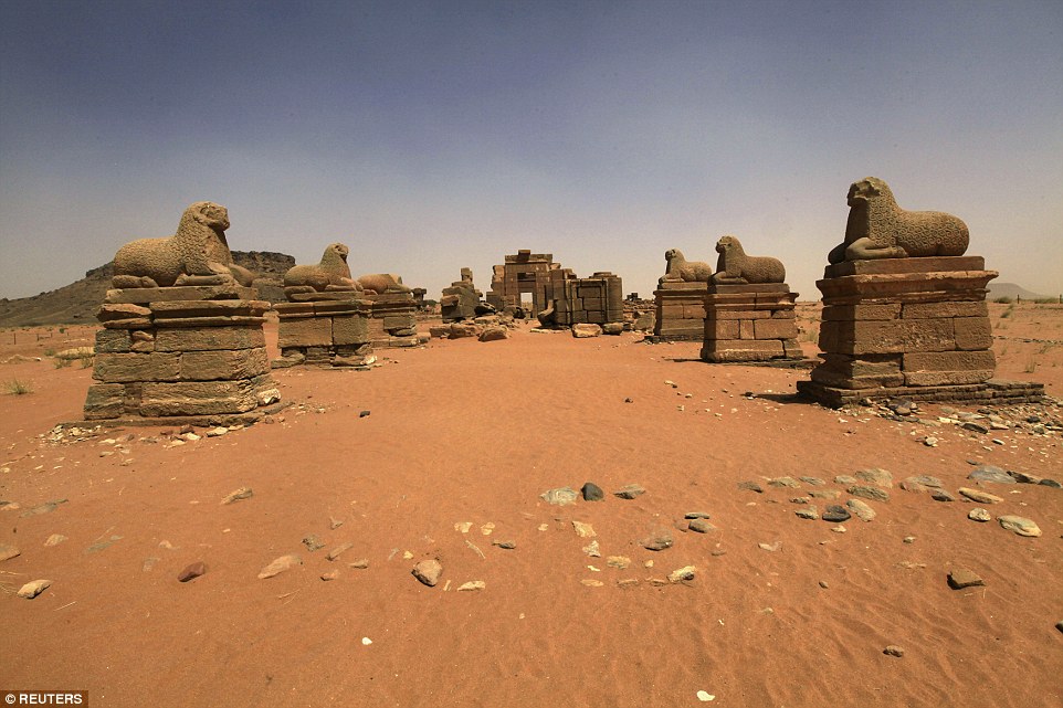
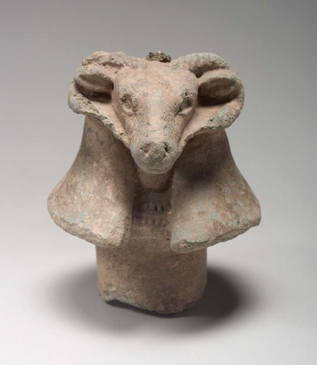
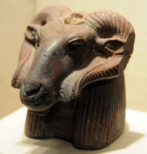
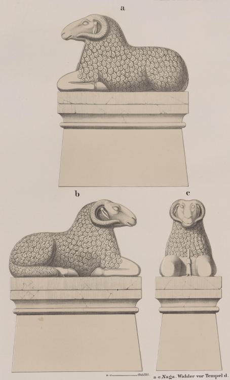
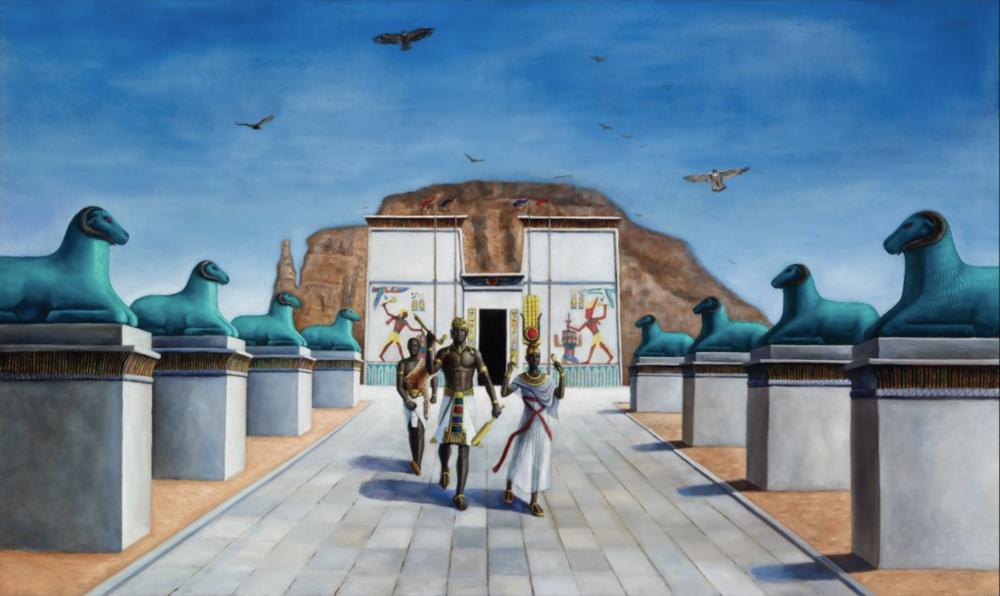
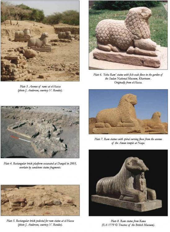
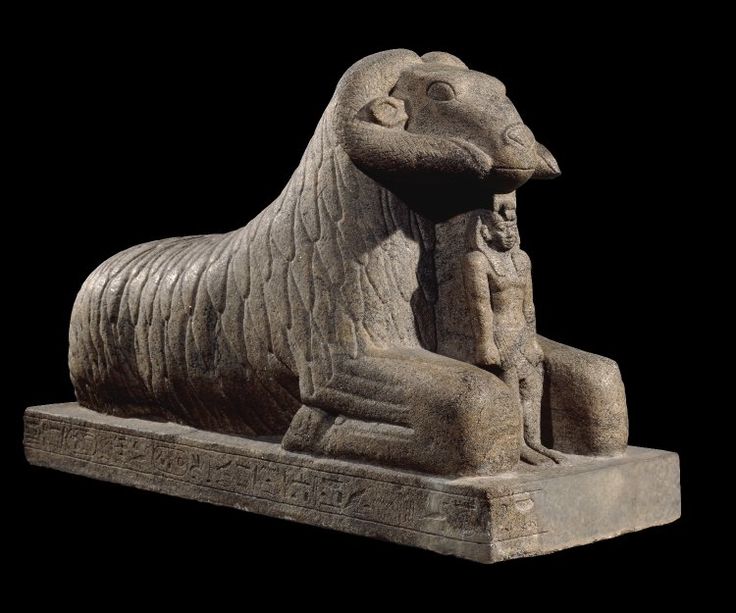
The ram statue with pedestal needs to reach the current height of the Ibis statues. The ibis statues can be about 60% their current size. @LordGood & @Alexandermb For the Ram statues I was thinking something special. To put two of them flanking the "avenue" leading to the doorway of the Amun temple, facing each other. So instead of placed against the pylon of the temple, there would be a walkable space between the Pylon and the rams. Enough for units and siege to pass.. Basically, to apply the principle you used for the Carolingian Abbey: Is possibru?
-
@Alexandermb, luuuvly...
-
Age of Empires definitive edition [remaster]
Sundiata replied to Lion.Kanzen's topic in Introductions & Off-Topic Discussion
-
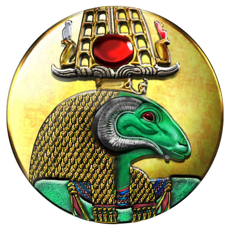
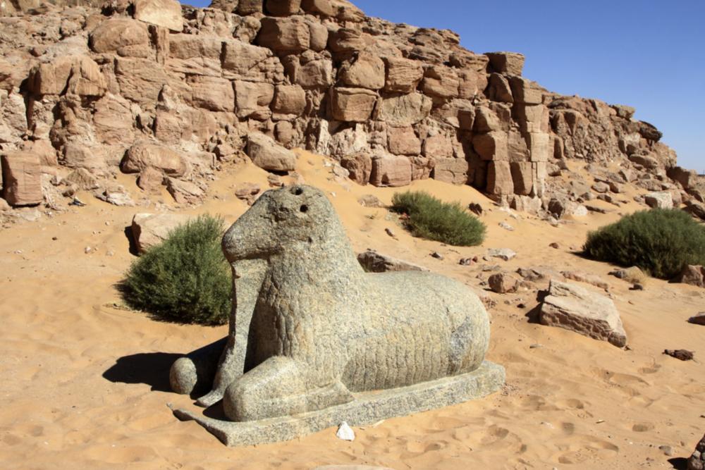
@Alexandermb looking really good! The body is perfect! I have an annoying comment about the head though... It really looks like a lion's head (don't get me wrong, it looks badass), but it should really be a ram's head, with those curved horns (just like the civ-emblem). The Ram represents Amun, which is why you always find these statues lining the processional avenues to the Amun-temples, as well as inside the temples themselves. A pedestal would be nice too
-
-

Gameplay Issues for OSX Users
Sundiata replied to HMS-Surprise's topic in Game Development & Technical Discussion
Yeah, I can corroborate that most of this stuff doesn't work on my MacBook either. Also in Atlas, keyboard inputs are completely futile. -
By all means, feel free to do it if you want (you're a lot better at it than me). You can use the white texture or the same texture as the building itself. What you think looks best...
-
Very good! Impressive...
-
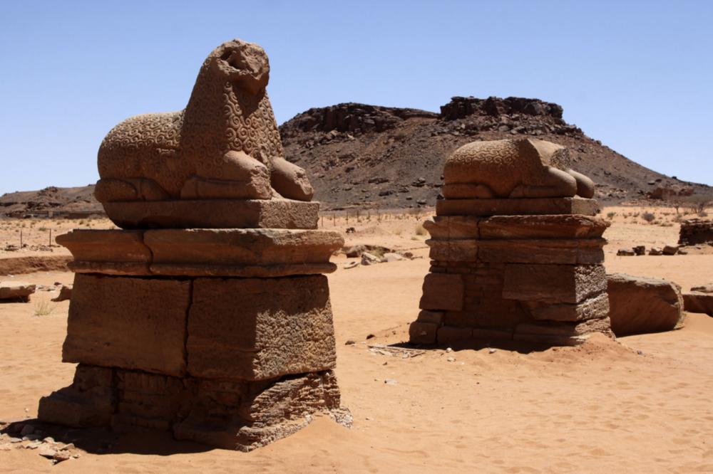
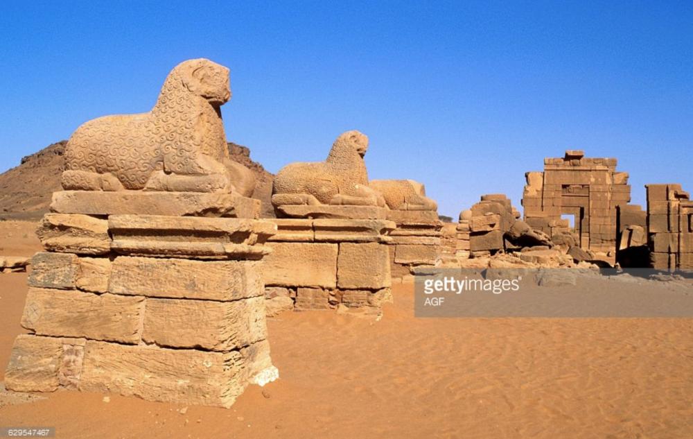
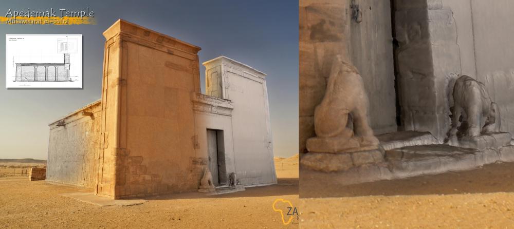
lol... Either one is ok, no need for both... I you feel the insatiable thirst to model more statues, the sitting ram statues for the front of the Amun temple (like the lions for the Lion temple) would be the cherry on the icing of the cake:
-

[Request] Hellenistic ornamentation
Sundiata replied to Lion.Kanzen's topic in Eyecandy, custom projects and misc.
-

[Request] Hellenistic ornamentation
Sundiata replied to Lion.Kanzen's topic in Eyecandy, custom projects and misc.
Wow... Not bad at all! Imagine historically accurate cheats in the form of Mythological creatures... A griffin for the Romans, a minotaur for the Greeks, and Han Chinese could summon a dragon -
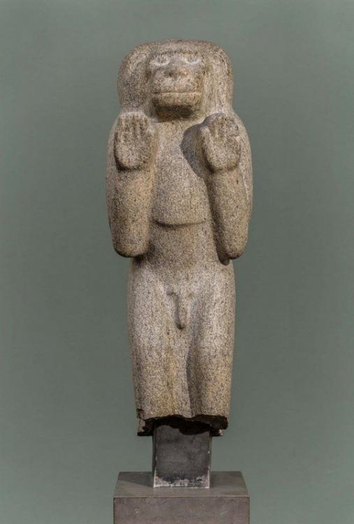
@stanislas69 & @Alexandermb, I see you discussing the ibis statues for the dock. Those are an Egyptian example, so perhaps a Kushite example would be a more appropriate primary reference to use, if you get around to it: I liked this Sun Ape from Kawa a lot. It's the god Thot, disguised as a baboon. Very appropriate, as the Ibis statues also represent Thot
-

Fixing the skybox for maps
Sundiata replied to Stan`'s topic in Game Development & Technical Discussion
This ticket discusses it: https://trac.wildfiregames.com/ticket/3458 There is concern that extending the skybox below it's current height would look weird, but I don't really agree with that. Extending the skybox to come below the map would just make it seem like you're looking at the horizon... Either way, it would look better in 95% of the cases (yes I made that percentage up), and is far better option to solve the ugly black-band-screenshot issue, which is important for promotional stuff. The black band is not good... -

Fixing the skybox for maps
Sundiata replied to Stan`'s topic in Game Development & Technical Discussion
Does this also remove the black bands you see on the horizon? -
- wikipedia - That was one hell of a trailer though! darn... Any experts on Mauryan siege-equipment? I know they had special sections of the army devoted to it, but no specifics...
-

===[COMMITTED]=== Horse winged peytrals and new saddles by Enrique
Sundiata replied to Stan`'s topic in Completed Art Tasks
@Alexandermb, That would be rather cool for champion cav and/or hero cav... I do think it's more of a chariot thing though... That entire Egyptian chariot would be really cool for Queen Amanirenas though, just throwing that out there -
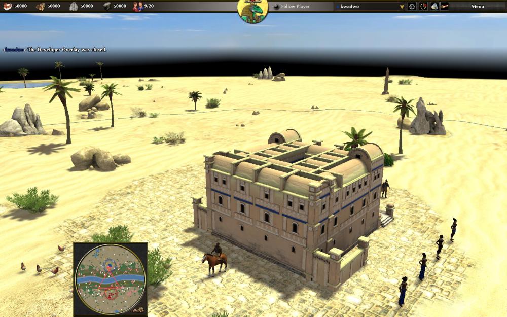
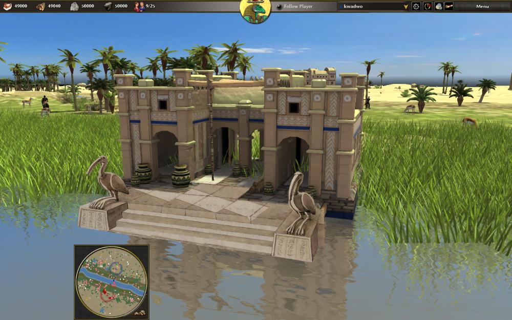
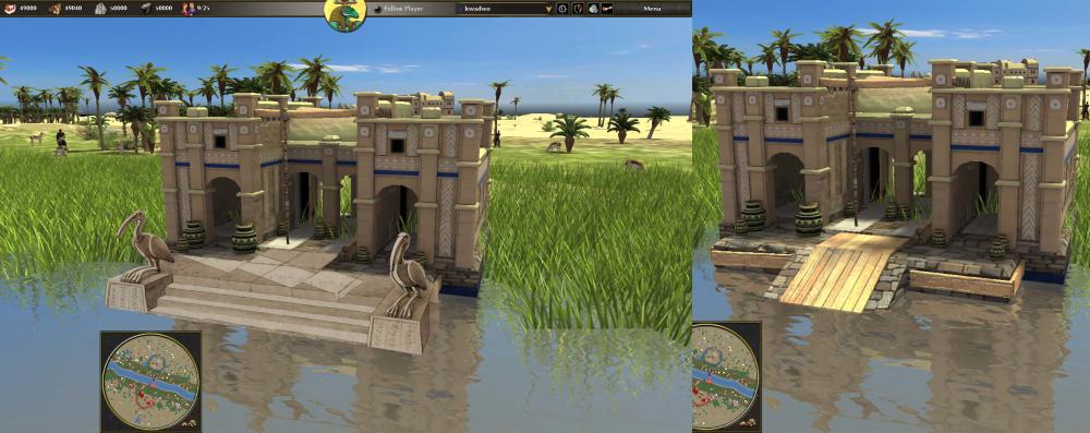
Sundiata's selected nitpickery, part 3, the dock @LordGood, I really like the dock. There's only one suggestion I have for this one, and once again it doesn't pertain to the building itself, but to the quay. One romantic element of Nile Valley culture is the scene of a royal, or a humble servant moving down a handful of stone steps leading directly in to the Nile, to fetch water, or bathe or whatever... Those stone steps are also where a boat would moor, and people could descend without getting totally soaked. The stone construction wouldn't easily wash away during the annual floods either. Since you modelled those lovely Lions, you could also add two of them, one on each corner facing the Nile, like the Ibis statues in my mock-up (shamelessly copy pasting another artists' quay). It's more of a stylistic choice, but it would fit the whole Nile Valley theme very well. It would also be lovely if you could add the lion statues to the Lion temple. Two of them, flanking the doorway, facing each other:
-
- 529 replies
-
- 3
-

-
- delenda est
- terra magna
-
(and 3 more)
Tagged with:
-
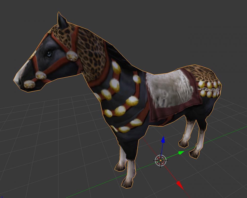
Thanks for the advice.. I'm redoing it starting with the leather bands, pixel by pixel... Though, moving a disk even one pixel can seriously distort them.
- 529 replies
-
- delenda est
- terra magna
-
(and 3 more)
Tagged with:
-
As in, I should try to emphasise the edges of the metal discs? Or because of downscaling? The UV map stretches textures in incredible ways though... A single pixel can show up as a line...
- 529 replies
-
- 2
-

-
- delenda est
- terra magna
-
(and 3 more)
Tagged with:
-
@wackyserious They look so pretty, don't they? If the variations I proposed are good enough for you, they're good enough for me. Of course, if you want to make adjustments, improvements or do something different, I'm always open to suggestions...
- 529 replies
-
- 1
-

-
- delenda est
- terra magna
-
(and 3 more)
Tagged with:
-
- 529 replies
-
- delenda est
- terra magna
-
(and 3 more)
Tagged with:
-
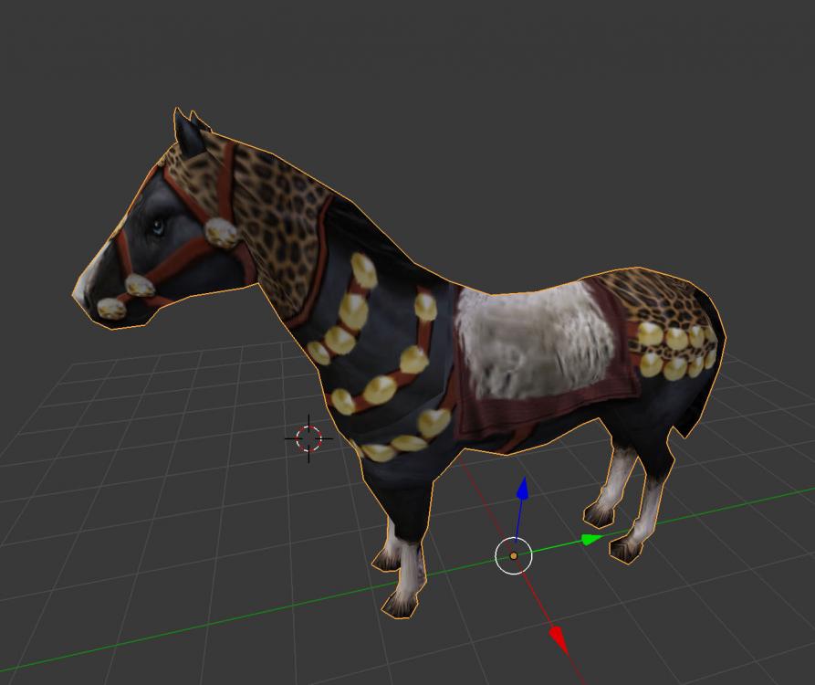
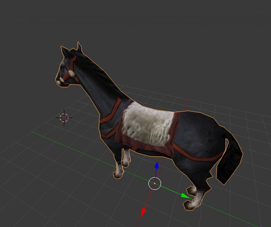
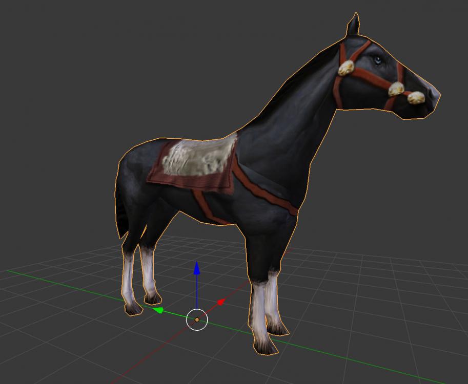
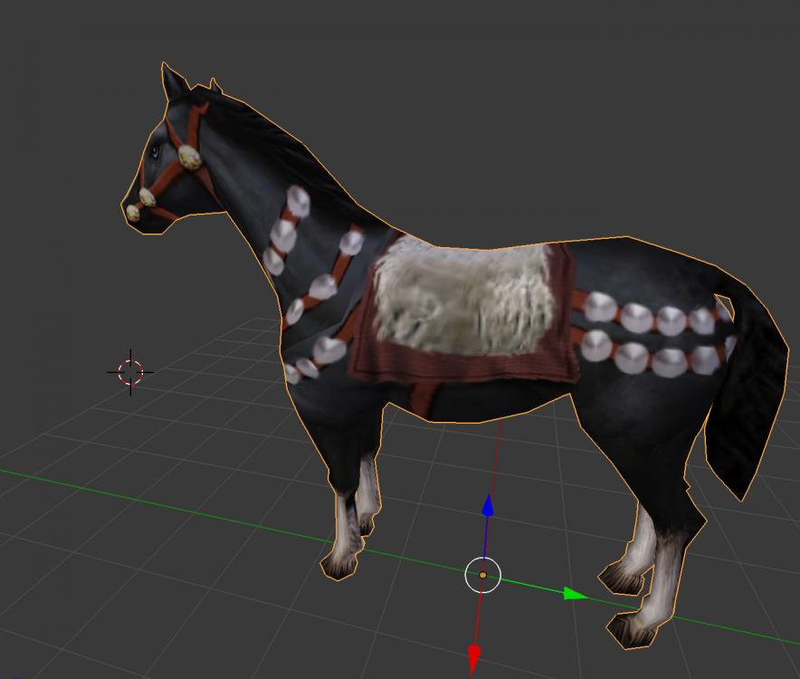
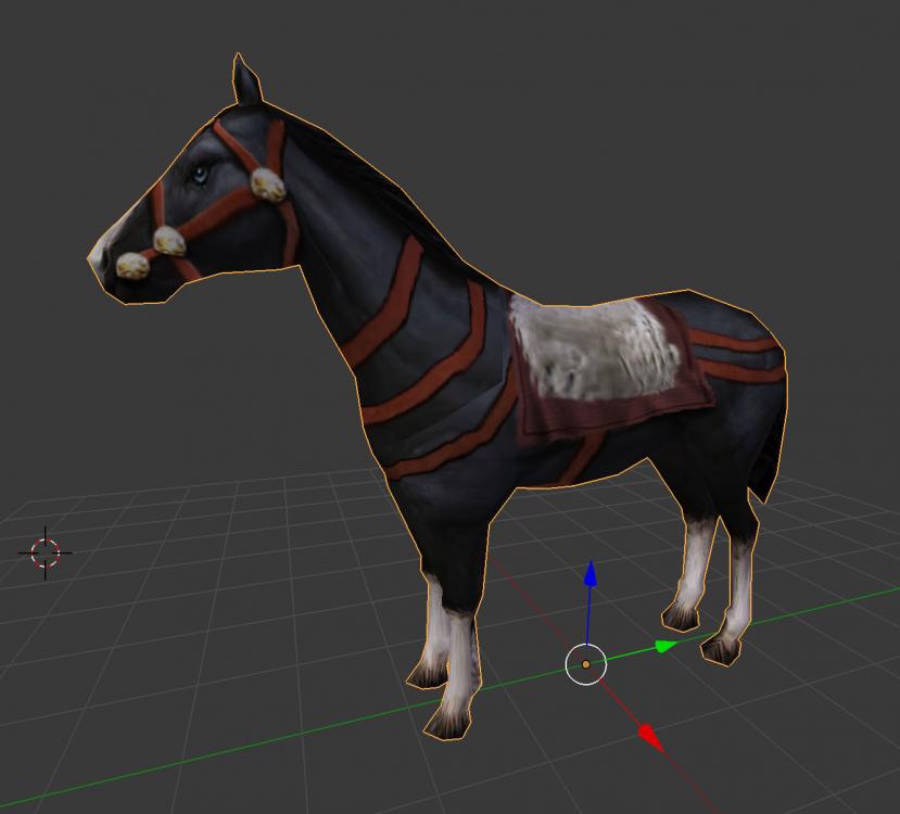
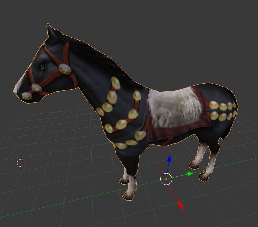
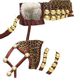
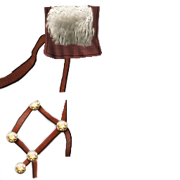
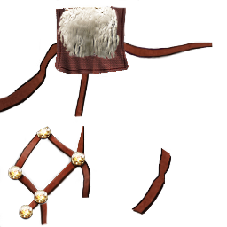
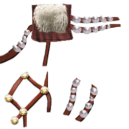
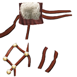
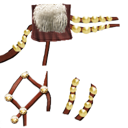
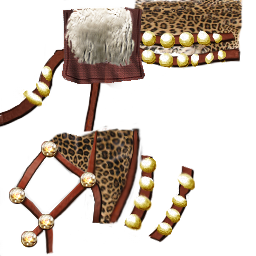
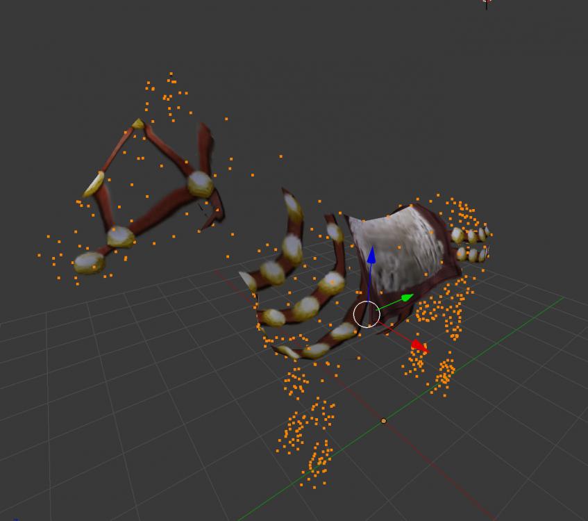
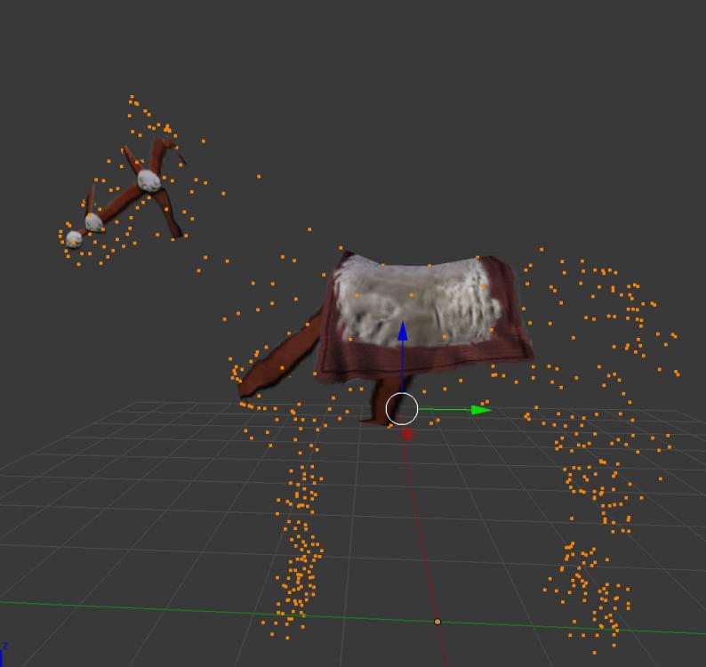
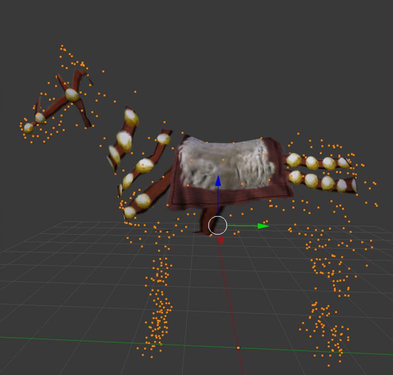
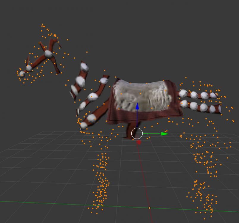
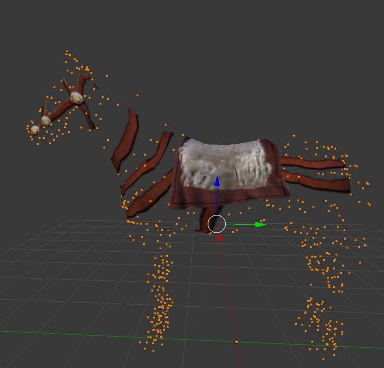
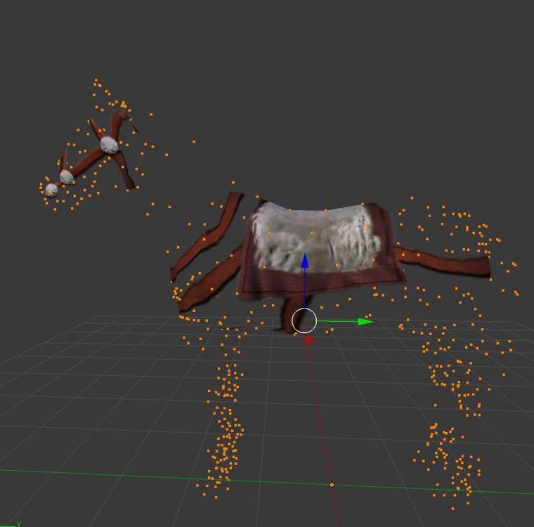
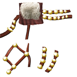
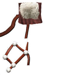
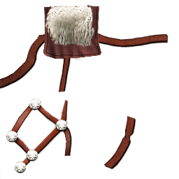
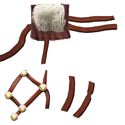
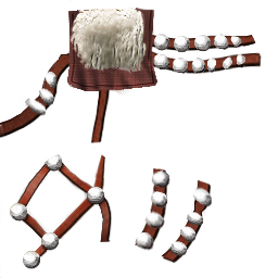
Yeah, the community has been extremely helpful in many ways! And so has youtube. I'll start playing around with blender very soon @wackyserious So, that wasn't easy... lol... But I came up with some variations that were satisfying for me. If you could check if it's up to standard for you, you could use it to deck out our cavalry Variations and PNG files: @Alexandermb Thanks again, that was really helpful!
- 529 replies
-
- delenda est
- terra magna
-
(and 3 more)
Tagged with:
-
OMG, yes, thank you! So I downloaded blender... Hahaha, finally... 144mb (wow...)... I didn't know it could be that straight forward..
- 529 replies
-
- delenda est
- terra magna
-
(and 3 more)
Tagged with:

