-
Posts
2.843 -
Joined
-
Last visited
-
Days Won
67
Everything posted by niektb
-
of course not, you're looking at an ancient announcement topic
- 32 replies
-
- rote
- Rise of the East
-
(and 1 more)
Tagged with:
-
probably not in-game (haven't checked though), but when looking at the texture itself...
-
@stanislas69: the AO don't really make efficient use of the texture (a lot of space inbetween) and I think the amount of samples used is maybe too low (there's quite a bit of noise)
-
Doesn't that cause glitches with the terrain? (and the ship itself is rather wide, compared with the Snekkja)
-

(1000) (Carolingian) ====Abbey (School Proposal)===[COMMITED]
niektb replied to Alexandermb's topic in Art dev
I was wondering what we could use it for... But if it would be added the roman structure texture shouldn't be copied and maybe the bushes should be different so that it doesn't look walk-able -
@stanislas69: yeah, that was my idea with the separate topics too
-
Did you fix the smoothing issues (or parallax bug) in your meshes?
-

==== 1000 (Norse) Defense Tower ====[WAITING FOR AUTHOR]
niektb replied to Alexandermb's topic in Art dev
Yeah -
Alright
-
I think it's maybe a somewhat unlogical blend of different architectural styles. Do you by chance have some references that back you design?
-

==== 1000 (Norse) Defense Tower ====[WAITING FOR AUTHOR]
niektb replied to Alexandermb's topic in Art dev
Can we have a window between those other two windows too? (just to fill up that gap ) -
This for the roads because the pathfinder doesn't take into account movement speed ^ Fortress looks interesting!
-
Looks good!
-
I think even Blender can render into gifs, but the most important part is that the frame rate needs to be high enough (at least 30fps) because otherwise the animations don't appear to be smooth
-
The gifs are really small, do you by chance have them bigger too? As said I'm not so fond of the attacking done by garrisoned units, and tbh the attacking looks a bit weird because they all throw synchronous. I would just be lazy and go with the 'ghost arrow' approach
-
The ship looks good! But on the sail there is a clear horizontal separation... Maybe smooth the sail a bit more (assuming that the mesh causes it and not the texture )
-
Is it the same as that smoothing bug I mentioned?
-
Yeah but there was a topic somewhere too that explained how to do so easily in Blender (or at least I think there was, maybe I'm mistaken)
-

(1000) ===[TASK]=== ANIMATED FISHING SHIP AND FISHER===[COMMITED]
niektb replied to Alexandermb's topic in Art dev
btw, when posting animations it might be cool to upload them as gifs (when possible ofc) like Strannik does here: (makes it easier for us to see what the animation looks like) -
@stanislas69: no that isn't the one I was looking for
-
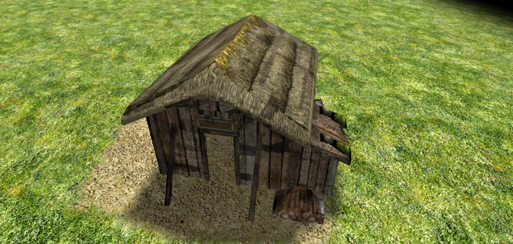
btw, I forgot to check for it earlier but it seems that your meshes suffer from smoothing issues when looking from close distance (look at the roof) Now where was that topic again that explains how to fix it? Also don't forget to generate AO maps for buildings
-
Already happened
-
I'm not so fond of these ship garrison ideas. It creates a lot of unneeded micromanagement and it's an awful lot of work for little benefit (plus we would need to do it for all ships I guess) @Alexandermb: nice! These topics are indeed how I imagined it The only thing that's missing is that the topics in question are for the Norse civ


