Leaderboard
Popular Content
Showing content with the highest reputation on 2025-07-29 in Posts
-
Yes and no, It can give new players bad shackles with advice that is situational. Who will change these tips when the balance team decides to remake pikemen into tank unit? It is better for the player to discover his own strengths and weaknesses by instinct (reading statistics) and experience. ---- To determine the opponent's improvement progress and avoid memes (which are only identifiable by experienced players), we could consider a system of colors. stacked? Or a color system, for example, bronze, silver, and gold (this easily resonates with people). Tech 0: Grayed Tech 1: Bronze Tech 2: Silver Tech 3: Gold Tech 4 (Iberian and Maurya): Diamond To satisfy everyone, we have two display options accessible via a button: the arcade button with the bare minimum of vital information and the detailed button with the full list (stats and future idea like counter kill etc) example just for bronze color, but keep the design of 0AD of course2 points
-
Yeah, I never look at stats in game. But making them completely hidden, including on the structure tree is just hiding the ball. It's something that is frustrating about some techs like the Mace Silver Shield. I shouldn't need to go into the directory to understand how different units differ from one another or how a tech impacts units. This is especially annoying when stats like spread (accuracy) or projectile velocity vary from one unit (or building) to another. There's literally no reason for it2 points
-
Will you tell me the most difficult civ to use for your playing style and the reason?1 point
-
Wildfire Games is proud to announce the release of the Patch Release A27.1 for 0 A.D. Alpha 27: “Agni”. This is the first patch release of 0 A.D., made possible by the new development environment put into place last year. Easy download and install Download and installation instructions are available for Windows, Linux, and macOS. 0 A.D. is free software. This means you can download, redistribute, modify and contribute to the application under the same licenses: GNU Public Licence version 2 (GPL v2) for code and Creative Commons Attribution Share-Alike 3.0 (CC-BY-SA 3.0) for artwork. Although you might find some people selling copies of 0 A.D., either over the internet or on physical media, you will always have the option to download 0 A.D. completely gratis, directly from the developers. No “freemium” model, no in-game advertising, no catch. What is a patch release? A patch release is a minor release of 0 A.D., bringing a few selected fixes from the development version into the latest release of the game. All fixes of the patch release are already present in the development version (the future Release 28). There are two important aspects to a patch release: Patch releases are OOS-compatible with major releases. If your friend has not heard about the patch release, or cannot install it for whatever reason, they should still be able to play multiplayer with you. This limits the kind of fixes we can include in a patch release. Patch releases are prepared on the side, and do not take precedence over our work towards the next major release. We prepare and provide patch releases as our resources allow. This limits the scale of the fixes we can include in a patch release. Changelog Here are the changes included in A27.1: a fix for the large performance issue observed by some players on older hardware several small performance improvements in the calculation of simulation hashes (related to multiplayer stuttering) fixed support of Windows 7 a fix for modifying your lobby password when you have an uppercase letter in your username a fix for the distorted 3D models with GPU Skinning fixes for crashes with Vulkan and/or with GPU Skinning a fix for changing player perspective in replays a fix for an out-of-memory crash in the JS engine when generating random maps a fix for the game crash on pressing Fn key a fix for a crash in Atlas when the map generation fails a fix for a memory leak in the renderer fixes for multiplayer port forwarding package fixes for Linux desktop environments various build fixes for Linux (some sent by package managers) Thanks to all the community for your continued support and enthusiasm, which allow us to deliver these updates! Reporting issues If you experience a technical problem with the game, please report it at gitea.wildfiregames.com. This is also the first address to visit when you wish to dedicate some of your time to help patch the code. Got any further questions or suggestions? Discuss them with other players and developers at the forum or talk with us directly in the IRC chat rooms: #0ad and #0ad-dev on QuakeNet. Subscribe See our LinkTree. For press/media inquiries, please DM @play0ad on Bluesky or webmaster at wildfiregames dot com.1 point
-
A27 has a new bug that occurs, reasonably often where a player will make the game freeze or incredibly slow. What we currently observe : This isn't some kind of lag, the player won't experience network, nor cpu lag when this occurs. Since this isn't creating any logs, how can we help document this bug?1 point
-
Ohh lol ok I went to an art high school, does that sound like a good excuse? I was doing (5+(3)*7) + (8+(3.5)) / 3.5 Why? there is no why1 point
-
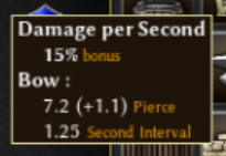
+1 Yes but, please, get rid of that slash and put the attack interval on a new line. This is heresy against the sacred grid btw: where the 49 DPS comes from? my maths are not working there1 point
-
Nice! I wasn't sure the colors made sens to me only because I made it or if they did indeed add that little touch that makes the tooltip easy to read! I find colors codes often easy to understand even when never specified, like in 0ad, Blue for CS, Green for Merc, Red for Champs in unit icons, one can spot the pattern very fast and it never needs to be specified. So for buildings, I use blue for garrison bonus and green for techs, and it (should be?) easy to understand. Right? Worse cases if you don't get it, it doesn't diminish much the readability. y ok I was very slightly preferring this too.1 point
-
I prefer this version with 1 stat (hack, pierce) per line I think this version is more difficult to read and to identify the different stats Also, the green color greatly improved its legibility, as it allows you to identify different types of values within the same block of text (just like the orange used for the stat name), and I think it helps associate the bonus % with the actual bonus value. I love it, @Atrik! Yeah, I'm not sure about this either @Dunedan1 point
-
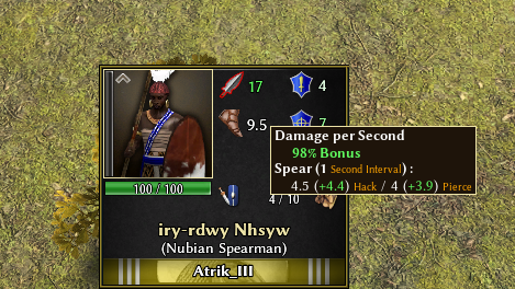
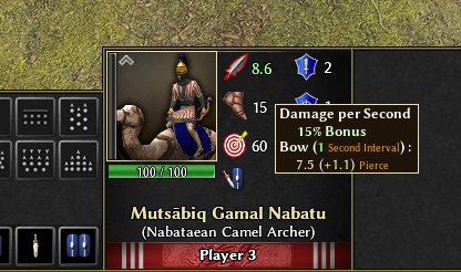
@guerringuerrin does inline rly make it better? I'm kinda neutral on this. However I also wanted to wait to show the color scale idea depending on upgrades, inspired from @Dakara idea but trying to keep it agnostic of how upgrades currently works (tiers would also make limited sens if you have WTF for example). Above, p3 upgraded spear vs p3 + wtf. Below p1 upgraded camel + Cleo aura. Thoughts? Edit For buildings. I don't know if colors are confusing or actually helps. I like them.1 point
-
Yeah that's pretty much what we have been discussed with @Atrikin the previous messages. I do like more a vertical layout design rather than an horizontal you propose (as the vanilla is) because I think it's much more easy to read and identifies the different stats as can be seen here: @Atrikmaybe you could share a screenshot of this same damage tooltip of a melee unit so we can see how is shown? ( I'm at the cellphone rn ) About DPS number shown next to the unit portrait. I rather put the final damage of the unit instead of the DPS calculation as I find it a bit confusing. I guess some would say it's better to compare different units damage per second as different units have different attack intervals.1 point
-
I'm not a designer... dozens of ideas could exist... Either change the color of the sword and shield, bow, etc.? Or highlight it with that color. It's up to you to have fun with what seems best to you.1 point
-
I love the idea, however the current stats are displayed agnostic of sources of the bonuses. I'm still going to try to see if a grayscale of the icon (proportional of the bonuses amount) can look good.1 point
-
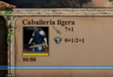
1)Yes the sword icon and number display dps. 2)Why Redundant would mean it's displayed elsewhere? I like to have it clear when some units are trying to chase others (like cavs) to see if enemy have a speed bonus, or just base unit movement. 3)The screenshots scale the icons a bit. In game they look perfect for me. That being said, the stats calculated and displayed here are from base template and unit state. This means you, or anyone could extract theses parts of ModernGUI and tweak/play around with it, without having to import too much of it's code. Probably easier then starting from the vanilla panel if you have an idea of what you want to do. @TheCJ I hate when a games hide stats. Feels like they think your too dumb to compare numbers. In mods like Historical I would go crazy if I couldn't read stats, and having fast/easy way to understand the stats are even more critical.1 point
-
What is much more desireable is a short description of their role in combat (if there isnt one already? Would the encyclopedia contain smt like this? I dont know tbh). Like "The Spearman is a versatile melee unit especially strong against cavalry, but weak against siege units.", "The pikeman is a heavily armoured melee unit with relatively low damage but long range.", "The Swordsman is an offensive melee unit with high damage but a short range. It excels at taking out siege." Much more useful for new players.1 point
-
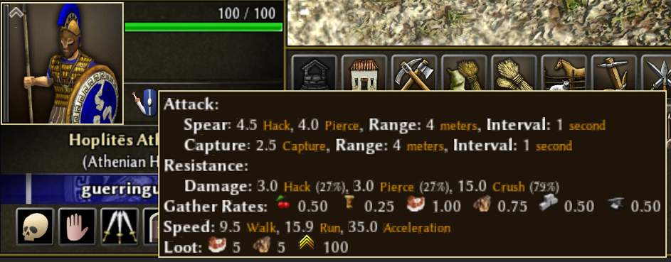
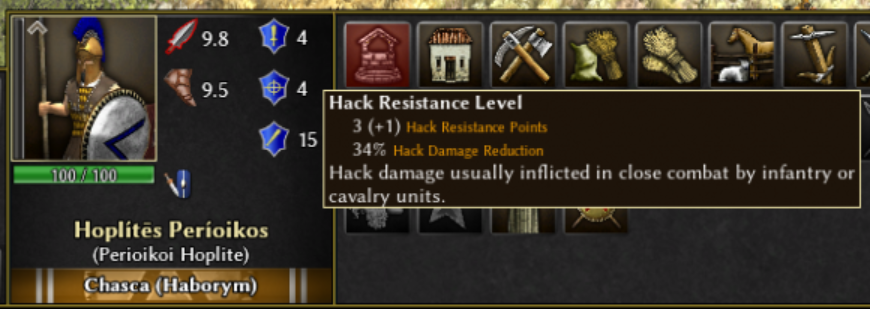
1) Does the number beside the sword icon show the current total damage, or some derivative stat like DPS? It should show all damage types, because of the way damage reduction is calculated in 0 A.D. Example: (sword icon) 3.8 (arrow icon) 6.0 On mouse hover: Damage: 3.0 + 0.8 hack / 5.0 + 1.0 pierce This way, we can also show upgrades cleanly, without cluttering the UI. 2) Movement speed stat is redundant here, no need to show it on combat stats. 3) The icons that are showing resistance levels should look a bit nicer. Too much blue. Perhaps it could look better like this: (gray armor icon similar to AoE2 or AoM) 4/4/15 On mouse hover over the armor icon: Resistance: 3+1 hack (34%) / 3+1 pierce (34%) / 15 crush (79%) You don't need to know it by the time you've learned the game. But new players need to know, and even one of the veterans didn't know about the hack damage of halberdiers. So, more obvious display of stats is desirable.1 point
-
I prefer that the more stats possible are displayed and not having some hidden. But @guerringuerrin indeed, It would be nice to not look like in this meme you posted every time you need to figure out what is the stats of a unit, or how much upgrades enemy has. And the tooltip with the 40 stats vomit could/is still available, just the breakdowns are much faster to read / easier to understand.1 point
-
This is an example for the opposite point because in aoe2 there are lots of different hidden stats per unit that aren't shown. Its actually a great system to only show the basic stats of the unit, because showing all the stats would take up too much space and cloud out critical basic stats that can change with upgrades. I'd say going from this: To this: Is definitely an improvement in that direction1 point
-
1 point
-
I don't think it necessarily says anything. It's interesting, sure. But there is noise here that limits it's usefulness. Notably, this doesn't account for differences in player skill for each civ. You would need to control for player differences to make real conclusions. It also obviously lacks any data for military strength. For example, I personally find ptol to be one of the stronger civs. But, in my perception, it isn't chosen by highly skilled players that often while it is frequently chosen by lesser skilled players. Many players using ptol also build settlements before min 13, which naturally slows down their eco boom, but may give them a strategic advantage that isn’t captured in the statistics I would also consider iber to be a decent to good civ. But whenever it is chosen it automatically boosts other civs too, especially gauls, because of it's team skirm bonus. So it's relative value is depressed.1 point
-
Ain't gonna happen, unless in a mod. When you place a storehouse, it'll turn red to tell you it's too close. Back off by a meter and boom, it's placeable. This takes no more than a second.1 point
-
If the trees from AoE2:DE as seen in the screenshot you provided are your measure of pretty, sure. I think most people would agree that realistic trees are prettier, though?1 point
-
Han. Almost everything about them sucks: Champion play, infantry, small fields, big buildings... Few advantages of them are the cheaper "will to fight" variations and the fact that they can immediately train sword cavalry.1 point
-
Thanks, JDakara. Splitting siege into a separate control group and using shift-right click for pathing sounds like a solid workaround. I’ll try that in my next game.1 point
-
1 point


