Leaderboard

Popular Content
Showing content with the highest reputation on 2025-05-13 in all areas
-
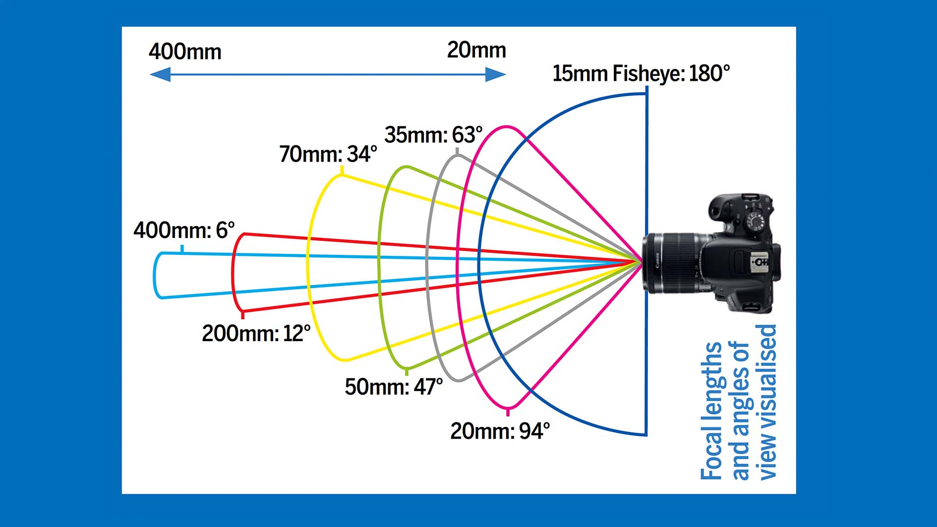
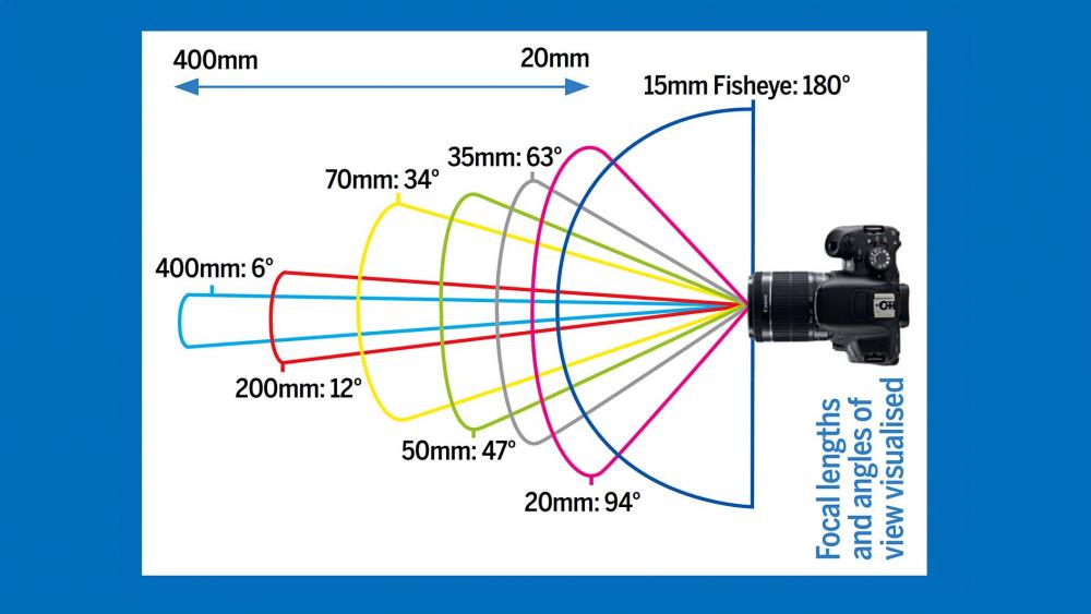
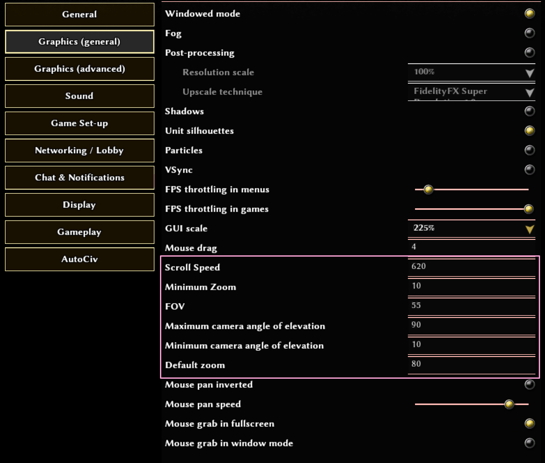
New update: Additional camera settings: These are configurable options that are normally hidden from the settings interface, presumably because it might confuse new players. However, I personally found these camera settings to be essential for players improve their micro. In short: Scroll speed changes how fast your camera pans around the map when you press WASD. The value is the speed of the camera in m/s and the default was 120. I personally use 620 so that I can quickly move myself around my base. I allow up to 1000 but that's a bit too crazy for me. The zoom options control your altitude from the map. Default minimum is 50, but if you have a high resolution screen, you can still see content clearly for up to 10 or even 8. FOV = Field of view
 3 points
 -
In the cinematic mock up you could use the hero icon if there is one, that way it matches what players see when they select the hero in game.2 points
-
It would be really quick to implement. We already have a "cinematic mode" and apart from that it is literally just two black bars, a text field, and a portrait. The only thing a bit more tricky is that exclamation mark above the talking character.2 points
-
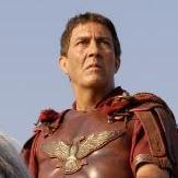
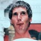
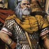
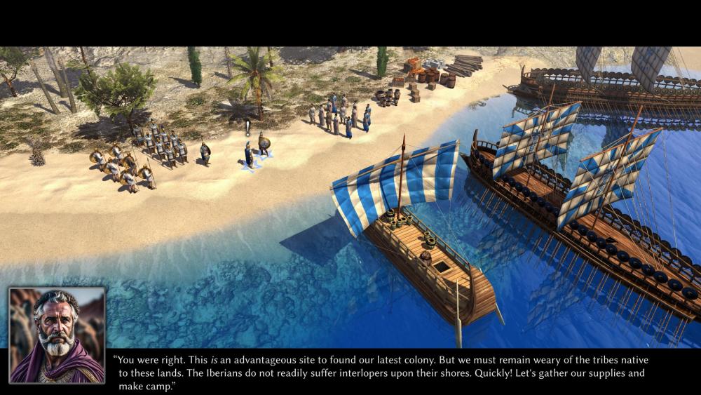
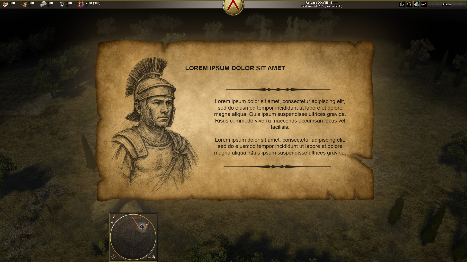
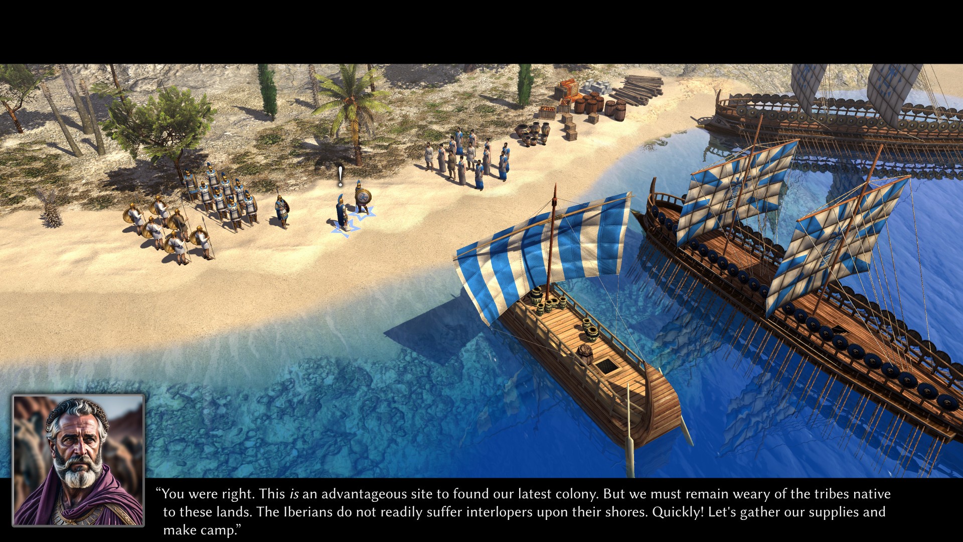
Maybe we can do both. An introduction at the start like this: "It's the year ___. The ___ wars have ended a few years ago. ___ has died and was succeeded by ___... " and then switch over to a monologue of the main characters. We could communicate the difference between the two by adding quotation marks to the last one and showing an image of the character, for example. These images look indeed quite nice and I'll experiment with them. And I agree the charcoal style fits really well. In general, though, I'm very reluctant with using AI images. For actual campaigns we'll have to find an artist somehow. I'm sure this charcoal drawing effect can be replicated in Photoshop. Then there's also the option of having the characters talk in the game view directly (or a cutscene). Here's a mockup created by @wowgetoffyourcellphone:
 2 points
 -
Well done. If we want more color, we can also add a few shields on the sides. Maybe on both ends.2 points
-
The title. I just think it's funny. You have this huge army right at your doorstep, and suddenly it's walking around carrying wood on its shoulders. That's it, that's the thread.1 point
-
Interesting, that could be a path.1 point
-
On the sides suspended or inside the vessel for example on the "deck"?1 point
-
1 point
-
On a side note I think the cimbrian wars would make for an excellent campaign.1 point
-
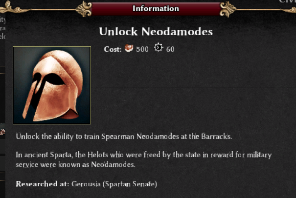
Does anyone research this tech? Is there a point to it, besides interesting historical trivia and an additional spearmen unit for the Spartans?
 1 point
 -
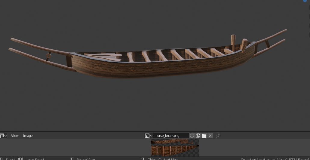
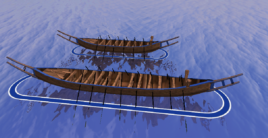
really nice @Lopess! i love them! is there any chance you could add some of the distinguishing features for the larger vessel? curved upper beam at the bow (like @Genava55's reference image above) Straight, shorter lower beam at the bow. like this pic: One prop point on each side of the hull near the bow (for shields, which i have ready) side note @Genava55 very recent publication on trade and simulated sailing trips. https://journals.plos.org/plosone/article?id=10.1371/journal.pone.0320791&utm_source=pr&utm_medium=email&utm_campaign=plos006 https://phys.org/news/2025-04-reveals-bronze-age-scandinavians-sea.html i'm not sure how they came up with that 2 part mast design.
 1 point
 -
Ok, I'll make those changes. Actually, I quite like that "overlapping"; having the image cover everything and then placing the text on top in some free space of it. That's totally possible. The only downside is it could make the text "jump" around quite a lot between slides/screens. Also, it would require specifying the text position for each image separately, although that's a small price to pay in my opinion, and there could be a default layout to fall back on when no custom one is needed. I want to add an image to the mockup, but I don't know what. Do you think stories have to evolve around a specific character? Should they be told in first or third person?1 point
-
HI Thanks for your help1 point
-
Looks great! you could add some paint for the diplomacy color.1 point
-
Why should they lose this ability? I already find the promotion system very op and snowballing1 point
-
It changes horizontal vision range of the camera:
 1 point
 -
Yes and I really like what you did. I just wanted to suggest that it might be helpful to bleach the paper a bit (less orange) and clean up the area where the text will be to make it easier to read. Yeah I think something similar to this could be very cool in terms of layout. Could be much more simplier. Using one side for the text and the other side for the image instead of this example in which there's some overlapping of the image on the text area Yes, it would be great if we could get an artist to illustrate the characters for the campaign.1 point
.thumb.jpg.b21ca1d0c15fb56b42c39b25a0a40815.jpg)