bb_
WFG Programming Team-
Posts
283 -
Joined
-
Last visited
-
Days Won
3
Everything posted by bb_
-
thx for pinging me, seems to be that arc doesn't like copying two files in the same go... original patch was correct, but something went wrong with committing. On the fix, the sacred band icon did got removed, so the fix is to simply change the cav icon: https://code.wildfiregames.com/rP20745
-
Uploading a old outdated patch of mine here that seems related: running_0.6.diff However for this use injury I think you could better keep setting the "move" animation from unitAI, and then set a specific one from the health component.
-
College Assignment, active developers needed
bb_ replied to leukill's topic in Introductions & Off-Topic Discussion
Well if you do want to become a developer, you are invited to contribute to 0ad itself and gather experience with that. Have a look at https://trac.wildfiregames.com/wiki/GettingStartedProgrammers for some information. Also join our IRC channels if there are any question. -
They already do as said, but you have to use a specific formation explicitly, not the default "None" formation, with that every unit moves at his own speed. You can set formation by clicking the icons between the minimap and the selection info (so sorta bottom left-middle).
-
An old branch from @Itms:https://github.com/na-itms/0ad/tree/formation-wip
-
How can I create a map with rivers in Atlas?
bb_ replied to pAris's topic in Scenario Design/Map making
In 0ad there is a map global waterheight, so everything lower than that is water, higher is land. So you have to dig your river or heighten the land, and adjust the waterheight, till you have the river that you want. -
Game Setup Rooms aka games creation room UI "overhaul"
bb_ replied to Dade's topic in General Discussion
In MP it happens rather often that specific players wants to play on a specific map, so following that logic one should first select the players then the map then the rest (civs etc.). But that would be ultra ugly gui wise, since players and civs should be grouped together. However the topic is open for new suggestions for the gamesetup ui, if someone comes up with a nice sketch, I would certainly consider it. -
Game Setup Rooms aka games creation room UI "overhaul"
bb_ replied to Dade's topic in General Discussion
If that is the reason for the extended, why are popcap , starting res an some others then hidden under the extended tag? Personally have nothing against just removing the thing extended thing, the only thing that might stay in extended for this reason is the map name, as that already is shown. But having the thing for just 1 value => meh -
Game Setup Rooms aka games creation room UI "overhaul"
bb_ replied to Dade's topic in General Discussion
A hotkey to swap between tabs (tab) would be easy to implement, so that solves half :P. also do notice that we currently don't have enough space and we need to find it somewhere. Besides that the pixel distance from the "button" (was more options button now the tabs) to the actual options is shortened with screenshots, so that comensates slightly for the more buttons. (This approach is better than putting the more options window, then players have to click and move even more.) Currently no, but it is as easy as removing a check to put it all there. -
Game Setup Rooms aka games creation room UI "overhaul"
bb_ replied to Dade's topic in General Discussion
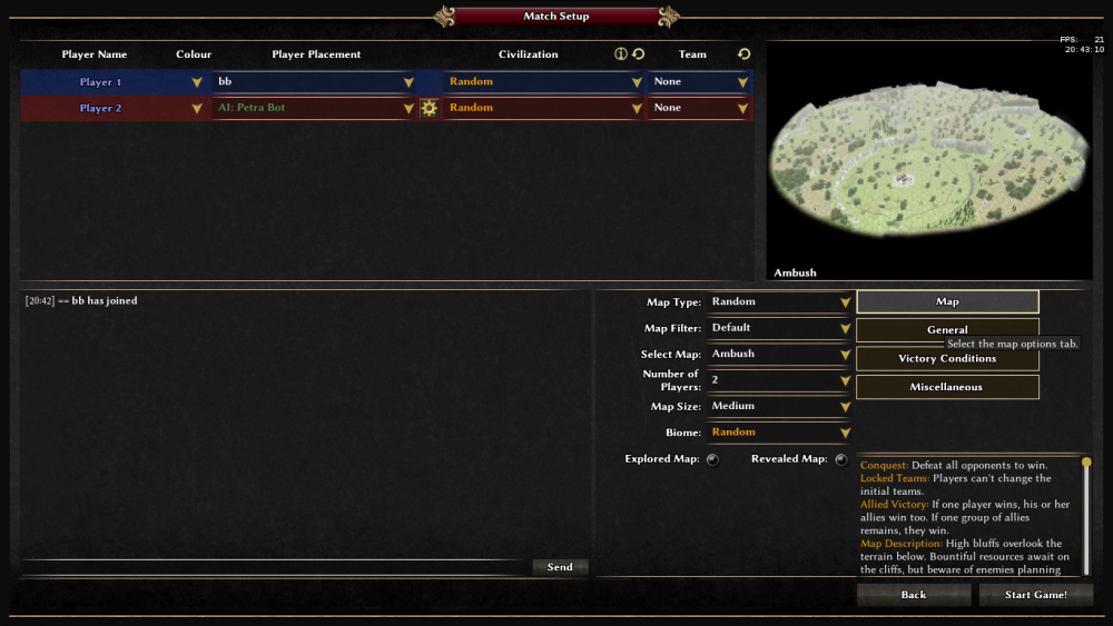
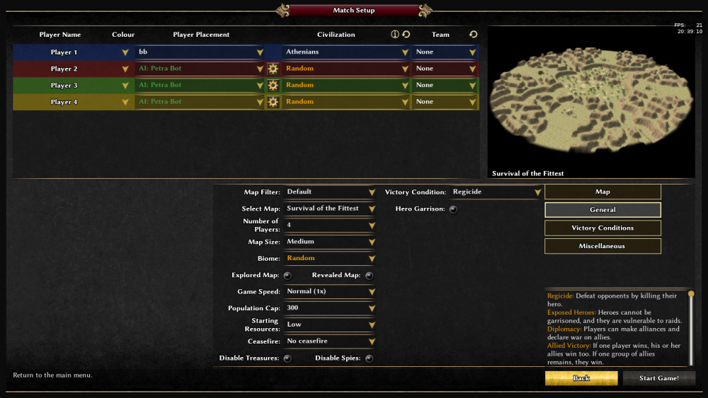
Do notice that the whole option panel can be hidden by clicking again on the tab button, so the gui space is not entirely unused, just temporarily. But indeed the space below the tabs can go into the description space, and maybe evening the rows helps a bit visually (the amount of unused space won't change that way, it might only look better). Also notice I putted way to many options on this single tab just for the screenshot, just to showcase the column behaviour, the actual thing would look much more like the second. If one really hates the space right of the tab buttons, the buttons can be centred or enlarged, but that space is actually free and can be used for future things. Currently one also has to click on the more options button, ofc that is just one button and now we have 4... But there is also the gamedescription for this purpose... -
Game Setup Rooms aka games creation room UI "overhaul"
bb_ replied to Dade's topic in General Discussion
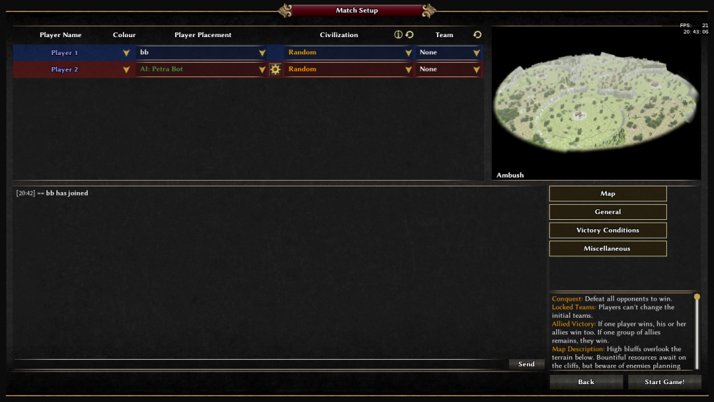
Finally after exams were done and having a free day, had time to rethink and code a bit on this: I took the approach without the more options window, but made the panel where the options are hide-able: This solves both the problem of "not enough chat space", since when hiding the panel, we have the original chat space. And the "asks for scrollbar" problem since it is rather easy (and already code :P) to allow multiple columns of options, so there certainly is enough space (true the chat space become very small as min res is even smaller in width...): Yet there are still some bugs/ ugliness which aren't really visible on the screenshots that needs to be fixed first. -
Random maps: computer generated maps, a map maker just sets some basic things and the computer generates the map further, so every time the map is different and the map is available for all civs and sizes etc. (all options setable) Skirmisch: a solid map, so fixed size and everything on the map is fixed, just players can set there own civ and other settings Scenario: everything fixed, so also civs and stuff (maybe just rated game not or so)
-
Joining observer triggers an OSS
bb_ replied to av93's topic in Game Development & Technical Discussion
Looks like a known OOS: AI's are not serialized, thus will cause an OOS when someone rejoins.- 1 reply
-
- 1
-

-
--FEATURE REQUEST-- minimap buttons
bb_ replied to Nescio's topic in Game Development & Technical Discussion
A technical list is in default.cfg (that is where they are defined). A "should-be-always-updated" list is in intro.txt, which is also accessible via the ingame manual (learn to play => manual). -
Is the string support really broken in there?, In my recent diff I propose to change some misleading array scopes, like `["foo bar"]=="foo+bar"==[["foo", "bar"]]` in where the first syntax is is misleading. And doesn't `"foo bar"` or `"["foo, "bar"]` represents the OR here?
-
--FEATURE REQUEST-- minimap buttons
bb_ replied to Nescio's topic in Game Development & Technical Discussion
Don't we have the "r" hotkey for that? -
Game Setup Rooms aka games creation room UI "overhaul"
bb_ replied to Dade's topic in General Discussion
Just giving some pro's and cons on the pdf: DADE’S POLL | WINNING OPTION - MATCH SETUP: +++ icons seem nice and save some space, since we can remove the description text, and put the in tooltips and stuff, also perhaps with clickable icons the more options window can be removed --- we need icons for everything, which are clear what they mean --- Where to place the tooltips (as they are now placed under the buttons) --- What if the buttons do not fit? DADE’S POLL | LOOSING OPTION - MATCH SETUP +++ icons seem nice and save some space, since we can remove the description text, and put the in tooltips and stuff, also perhaps with clickable icons the more options window can be removed +++ tooltips can stay where the are --- we need icons for everything, which are clear what they mean --- smaller chat window height, not nice on min res to chat in that --- What if the icons do not fit? DADE’S APPROACH TO BB - MATCH SETUP +++ certainly enough space for the option --- not enough space for the tabs, can be solved by putting the map option under a tab too --- gamedescription gone DADE’S APPROACH TO BB | ALTERNATIVE - MATCH SETUP --- map image not aligned (autistic screeching) --- not enough space for icons DADE’S + BB + BONUS TRACK - MATCH SETUP +++ map title on logical place +++ gamedescription on logical place --- needs resize the map image (not too bad though) --- where to place tooltips? ---- not enough space for the tabs, can be solved by putting the map option under a tab too --- what if icons do not fit? Another problem with the icons is that they cost space (which we don't really have) and yet doesn't give new information/options. Since if we remove the gamedescription/more-options in favour of the icons we need good icons for all of them, and every new option needs a new icon. Also how do we get dropdowns into an icon? So I rather remake/remove the more-options window than burning my hands on something which is very hard to maintain (sadly enough thouh, since visually it is nice). -
Game Setup Rooms aka games creation room UI "overhaul"
bb_ replied to Dade's topic in General Discussion
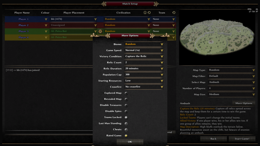
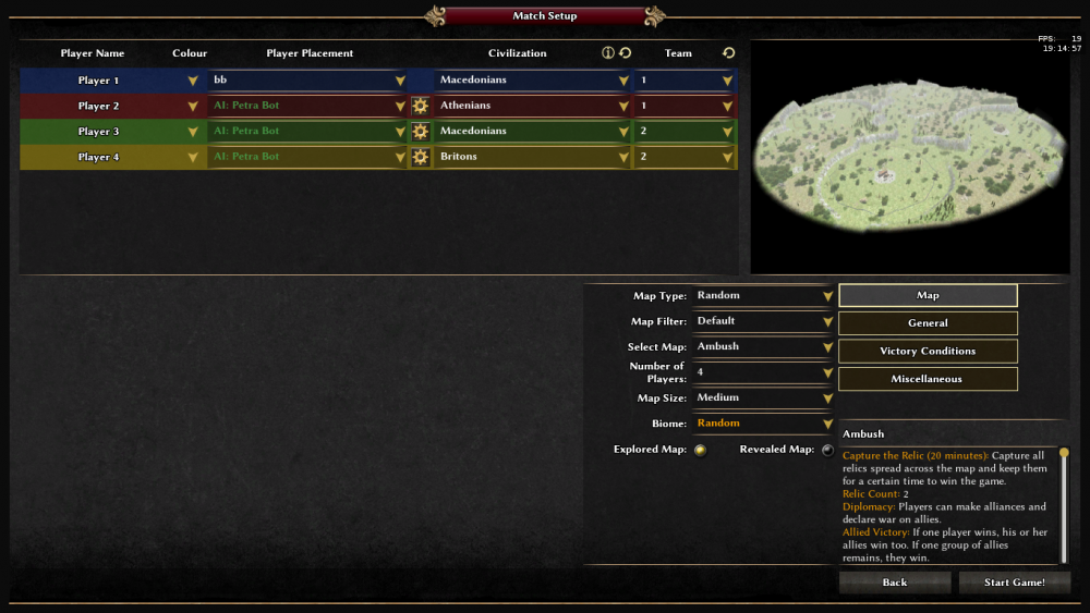
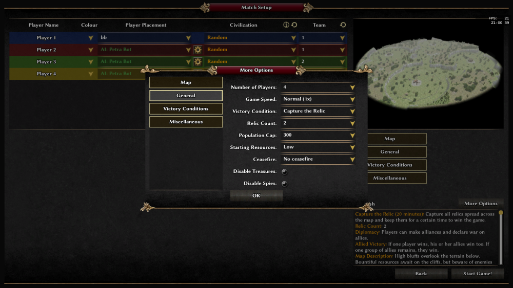
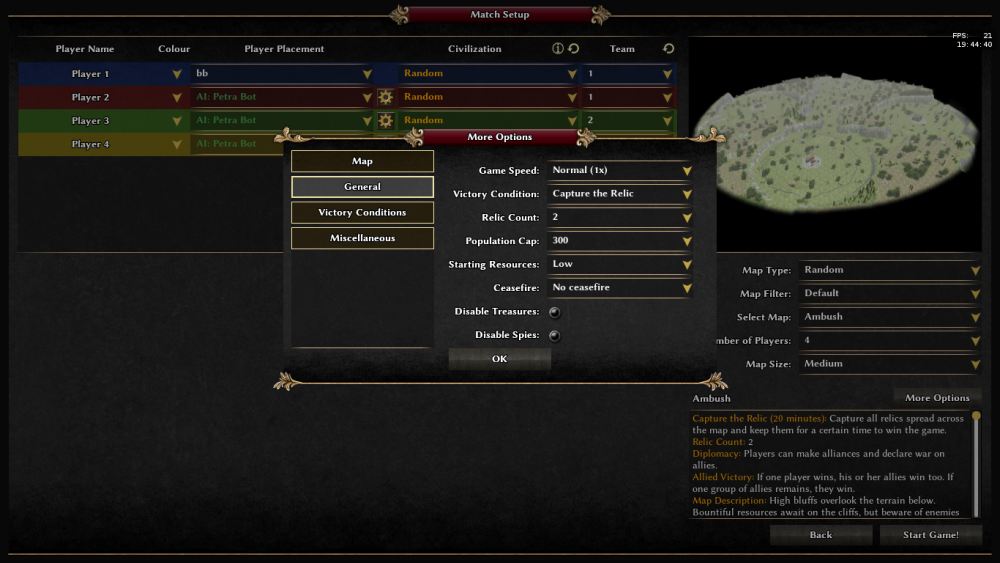
I have indeed worked on changing the more options window since it is too small on min res (screenshots are at 1366x768, so at least min height, which is the problem here mostly). Notice the problem will grow worse when we add more options to the screen. For solving that I created with some hacky code a number of options for solving that, after a some discussion and some more code the the picture below matched our taste best (ok we did say the gamedescription and the tabs should exchange position and probably the two columns also, but those are minor things): However the downside of this approach is that "< elexis> its just asking for scrolling unfortunately". Also since then study and stuff took over so my coding time was limited and the work got stalled a bit. Attaching two more proposals made: remove the more options button and make all tab button toggle the screenon that tab, the buttons in the window could ofc also be removed and stuff. Notice no duplicate buttons, but lots of clicks needed to change just 1 setting. -
That is indeed true, and I fixed that by doing dps/(distance^2-range^2) iirc, and some other code around that when inside the min range or outside the max range.
-
change entityLimits.heroes tag in simulation/templates/special/player.xml
-
32: In current svn or A22 it would be hard i guess, however https://code.wildfiregames.com/D866 would make things easier 33: simulation/data/settings/player_defaults.json
-
the The work hasn't stopped entirely. The patches in the ticket have indeed been decided to be too limited (not that we didn't agree on that though), so I have written a patch (with dps system) that allows N attack-types. But since that patch is too big to drag through the review process at once, so currently a small part is up for review: https://code.wildfiregames.com/D757. In current svn one can indeed set multiple attack (max 4 in total: slaughter, capture, melee, ranged) types in the template. And actually you already can set different animations in the unit actor.
-
27: a few comments: `svn diff` is just putting the diff in your command line, which is useful for checking for typo's, but there is no strict need doing it when pushin patches to phab. svn revert -R ~/0ad/ should be enough and actually better when reverting svn mv indeed broken with phab/arc so its not you 28. after a little deeper look the error is fooling me... is this the exact error you get in the commandline when using current svn? also pinging our ai dev @mimo 29. when already having a patch do it on phab by creating a new revision. Otherwise make a ticket on trac (but ofc search if there isn't one already for the same thing) 30.12 ranks XD, i guess most files in gui/session, single_details_area.xml has the xml object definition didn't look where the correct image is attached to it (it should be some call to Engine.GetGuiObjectByName("rankIcon"), use grep to find it, should be in the gui/session directory)
-
Just some extension on Grugnas comment: svn revert -R ~/0ad/binaries/data/mods/public this will only revert the public mod changes, so if you change something in f.e. the source folder, it won't be reverted this can be fixed by doing svn revert -R ~/0ad/ instead. Also arc can download and apply patches (so if you get a review and there need to be some more changes f.e.) use `arc patch Dn` for that ("n" is a number). Also arc diff (or svn diff) ignores untracked files (so files that show up with a ? when pressing svn status), too add them (so arc will include them) use `svn add path/to/filename` or remove things like grugnas said with `svn remove path/to/filename`. Do notice that arc patch does include new files (don't know if it also remove ones), but svn revert doesn't delete the files!! however the files will be marked as untracked in svn.
-
maybe this helps too: https://trac.wildfiregames.com/wiki/Phabricator#CommonproblemswithArcanist as of the SimpleXML thingies


