Mythos_Ruler
WFG Retired-
Posts
14.941 -
Joined
-
Last visited
-
Days Won
59
Everything posted by Mythos_Ruler
-
Crowd-Sourced Civ: Ptolemaic Egyptians (Ptolemies)
Mythos_Ruler replied to Mythos_Ruler's topic in Official tasks
You could have a couple of "dirty wall" textures in the same texture file for some minor variation. I did that with the Greek houses. -
User Interface concepts
Mythos_Ruler replied to Pureon's topic in Game Development & Technical Discussion
I think the tooltips just need a complete redesign. -
Created sub-forum here: http://www.wildfiregames.com/forum/index.php?showforum=422
-
Created a sub-forum here: http://www.wildfiregames.com/forum/index.php?showforum=423
-
User Interface concepts
Mythos_Ruler replied to Pureon's topic in Game Development & Technical Discussion
I meant to also make a screenshot of AOM's GUI to make a point about buttons. You will notice that there is no "kill unit" skull button (it's not necessary, IMHO, just hit delete). Notice there is no "attack-move" button either and no "stop" button. -
User Interface concepts
Mythos_Ruler replied to Pureon's topic in Game Development & Technical Discussion
Some things I did a long time ago. I particularly like the buttons I did and I prefer the white tooltips as well. I know at least 1 other person prefers the black tooltips, but either way you look at it, the game's tooltips need redesigned and overall text rendering improved greatly. -
Yep! That's what it looks like to me as well. The enemy had been defeated, so the remaining enemy structures converted to Gaia, and the player's ally didn't recognize the Gaia buildings as a threat.
-
User Interface concepts
Mythos_Ruler replied to Pureon's topic in Game Development & Technical Discussion
Yeah, the decorative stuff would go on titles and headers, at the tops of screens or panels or in between lists of items, etc--for things like popups ("You win!") and menus and encyclopedia and loading screen and stuff like that. The in-game GUI design (the minimap area, training panels, top ribbon, etc.) will remain minimalist. -
User Interface concepts
Mythos_Ruler replied to Pureon's topic in Game Development & Technical Discussion
Guys, the decorative stuff would obviously not go on the in-game GUI and take room away from commands. -
Great concepts. For the CC, Like the 4th one. For the fortress, I like the last one. For the temple, it should be Egyptian, not Greek. The Ptolemies and Romans continued to use the ancient Egyptian style when designing their newer temples in Egypt. The first one could be the temple, really. Ptolemies temple could be wider than it is long. Distinctive.
-
http://www.youtube.com/watch?v=onJNUnML3Es
-
This is a GREAT rundown of the Mauryans. He misses the spearmen, but that's okay.
-
User Interface concepts
Mythos_Ruler replied to Pureon's topic in Game Development & Technical Discussion
This isn't "over the top" at all, actually. It would be neat to add these kinds of flourishes everywhere you can. -
User Interface concepts
Mythos_Ruler replied to Pureon's topic in Game Development & Technical Discussion
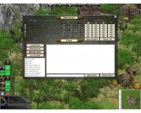
Here's an old mockup I did years ago for a diplomacy pane: Obviously the look and colors are all wrong, but the general layout may be useful. -
Mythos_Ruler's Playlist
Mythos_Ruler replied to Mythos_Ruler's topic in Introductions & Off-Topic Discussion
In love with this song! Makes me smile every time I listen to it! It's as if Michael Jackson was still alive and touring with Daft Punk. -
Mythos_Ruler's Playlist
Mythos_Ruler replied to Mythos_Ruler's topic in Introductions & Off-Topic Discussion
-
I'd say they were fought for many complex reasons. Opening trade routes, opening a "steam-valve" for population release, politics, economics, and religion. Also, keep in mind that Islam had been conquering Christian lands for hundreds of years. A counterattack was inevitable. It wasn't until the Siege of Vienna were the Turks finally pushed back from taking over all of Eastern Europe. It wasn't until the Battle of Tours did the Franks stop the Muslims from taking over Western Europe.
-
Alpha 14 Planning
Mythos_Ruler replied to Mythos_Ruler's topic in Game Development & Technical Discussion
It should also be mentioned that each higher level of armor makes the unit receive 10% less damage per strike. So, going from level 1 hack armor to level 2 hack armor means that unit will receive 10% less damage from hack attacks than before. The same is true if you go from level 8 to level 9. -
My ideas order to improve 0 A.D.
Mythos_Ruler replied to Inchanger's topic in Game Development & Technical Discussion
http://www.moddb.com/mods/rote -
Alpha 14 Planning
Mythos_Ruler replied to Mythos_Ruler's topic in Game Development & Technical Discussion
I've taken a look and the patch works perfectly as far as I can tell. Changing armor stats in all the units now. -
Looking at the Hellenes unit icons... I am wondering if we couldn't use more interesting colored background for each unit portrait, which the same background for each type of unit (all female citizens use the blue background that the Greek female portrait has, etc.).
-
My ideas order to improve 0 A.D.
Mythos_Ruler replied to Inchanger's topic in Game Development & Technical Discussion
Current factions: Athenians Britons Carthaginians Gauls Iberians Macedonians Mauryans Persians Romans Spartans -
Mythos_Ruler's Playlist
Mythos_Ruler replied to Mythos_Ruler's topic in Introductions & Off-Topic Discussion


