
All Activity
- Past hour
-

Closing Old Issues
Atrik replied to ShadowOfHassen's topic in Game Development & Technical Discussion
https://gitea.wildfiregames.com/0ad/0ad/issues?labels=-24 Here you go -

Closing Old Issues
Perzival12 replied to ShadowOfHassen's topic in Game Development & Technical Discussion
If you’ll make a list of the non engine related ones, I’ll maybe take a look and see if there’s anything I could work on. - Today
-
It seems that the @nifa has already done some work.
-
Exactly. For a game overlay, they are the worse thing possible.
-
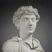
The art on the walls should be updated for the following Roman factions.
.jpeg.a9c19fc036eee736308bb346044ebec8.jpeg)
.jpeg.0c116789dd6b5b7ce548109cc09466cf.jpeg)
.jpeg.a018eede6bd9db72fa35d11fac30a0a1.jpeg)
-
And sidebars or overflow arrows? Which could be hidden but work by scrolling. But I have the feeling these are avoided, even when they could help reduce space used.
-
If you are referring the @Thalatta's last mock, then the dead space would always be less then current ModernGUI layout (10 slots vs current 12) but it's a bit closer to screen center which might look worse as said above. Your other points I acknowledged them in the last comment, so agreed but you always have to make compromises, goal is to make the best ones. We're back to first exchange : too much clutter, too much space used. The second option is just slightly better enough to make it interesting.
-
All true! I don't know why at least one of those possibilities didn't work for me before, and I can't even reproduce the message I was getting... What about having 3 columns showing all possible slots always, with the non-functional for the given selection being greyed out? After all, that's what happens with the other actions (the construction panel). This would also show the player all that is possible. The possibility I like less is not showing buttons for actions that can be performed, it's not about knowing the hotkeys, it's about clearly showing new players what can be done. I think it's good to have the option to hide certain things. Well it had mostly vanilla in mind, and the row ordering criteria I defined was quite generic (mostly economic, civic, military, and special), but yes, those new classes would be needed for it to work.
-
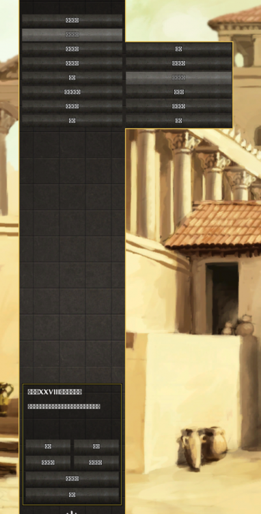
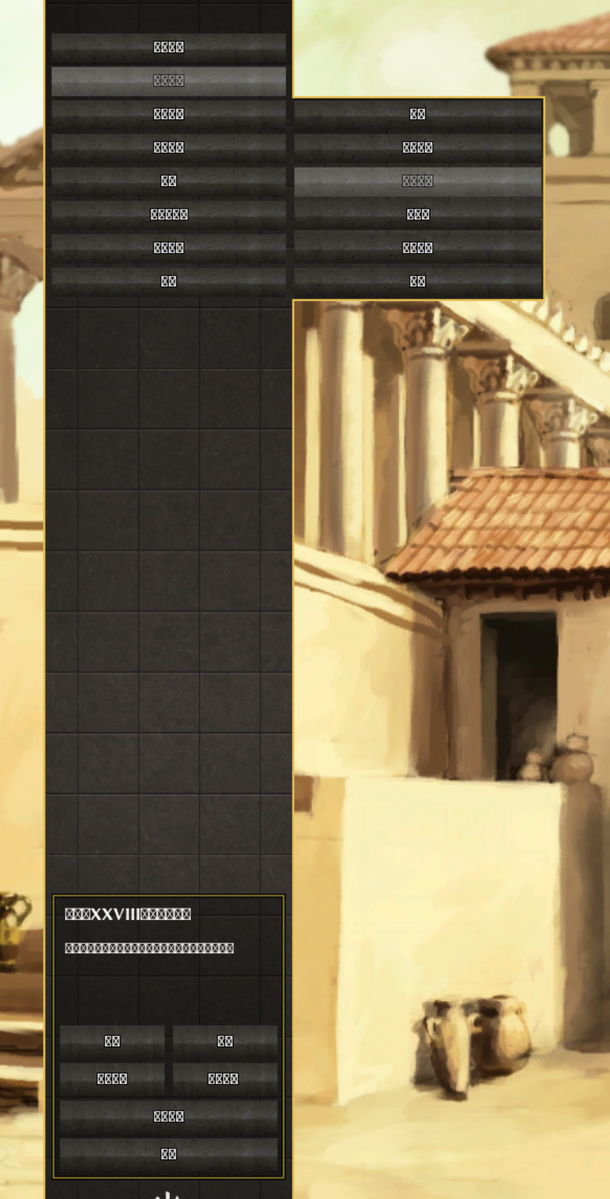
不知道为啥,我按照游戏指引选择了中文-简体,然后安装后打开,结果界面上除了英文字母可以正常显示之外,其他的全部变成带×的方框了 是我哪里没有配置吗 平台:win11 游戏版本:最新的28版本 有谁可以教我怎么解决吗?感谢!
-
Regarding the design, I think the ModernGUI approach makes the best use of the available space. (thanks for preserving this work from boonGUI @Atrik) IMHO adding a separate panel dedicated to these actions introduces a few complications. For example, if only a few actions are available, the panel would need to resize dynamically. Otherwise, it would leave a lot of empty space. This already happens when selecting buildings, where only three actions are available. On the other hand, if more than ten actions become available in the future, the panel would either have to grow or choose which buttons to display, just as the current vanilla implementation does. In fact, this already happens when selecting units together with buildings. So I think some level of tolerance for certain buttons not being shown under specific conditions is necessary. Otherwise, we'd have to resize the bottom panel dynamically, and I don't think that's a desirable solution.
-
 Buildosaur_积木小恐龙 joined the community
 -
I think I'll consider this proposed layout, I see a some benefits. One of them might be an option to hide it as some players like myself already know each unit command hotkey. I also like that you get 10 slots for unit commands which is the exact number to not have any overflow for single-type selection even including new capture button (the 10th is "back to work") but doesn't have much dead space. The overflow in multi-type selection (worker + building) will overflow but that's somewhat fine, not worth adding space for this. About the construction panel layout, it's not worth pursuing your attempt to order building, in my opinion. Due to the fact that the list of construction is very variable : across civs, mods easily add some, and in a multi-type selection (if any of the selection is a trainer, a researcher or can be upgraded) then you cannot keep the ordering. Also on your mock the order isn't even done by any entity classes that would make it possible.
-
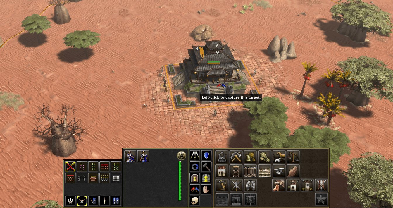
The button does work, but after clicking on it you need to left-click the terrain to issue the command, just like with the other command buttons in the panel. You can try the same with Patrol, Guard, Repair. When using the hotkey instead, the command is issued with a right-click.
-
 ergtrytu joined the community
 -

Closing Old Issues
Gurken Khan replied to ShadowOfHassen's topic in Game Development & Technical Discussion
Good! -

Closing Old Issues
ShadowOfHassen replied to ShadowOfHassen's topic in Game Development & Technical Discussion
That would be a LOT of issues probably at least a thousand of the 1.6k issues we have -
Yes and no We created more templates, so it's: template_structure_civic_civil_tribal
-
It seems there is little hope left for the development of the standalone game; could the development team share the model assets so that someone capable might create a mod?
-
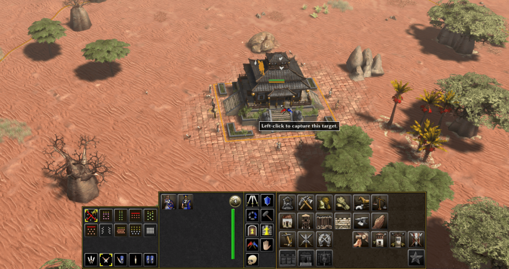
@Atrik considering your four points, and using the Construction Panel layout I proposed long ago, I end up with this, which has the same height as your panels, and the additional width is less than the width of a small button:
-
As a military colony?
-
.thumb.jpeg.67ef5b5dc6d918163efa04cd5336830d.jpeg)
Some AI experiments....
Nicolaus_von_Kues replied to Lion.Kanzen's topic in Tutorials, references and art help
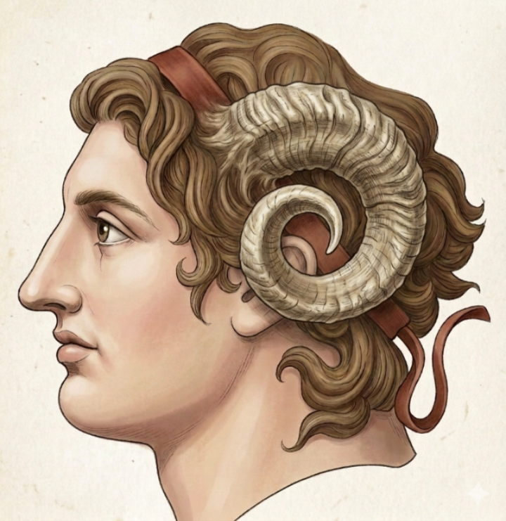
Things have changed so much. Alexander as Amon(Baal-Amon?)..thumb.png.c53bb82293213aee5e9de71e5e83c461.png)
-
At least this should improve some details.



-
so britons build hill forts to 'expand'. We give them (and other trible civs) only one "main civic center" then they expand through "colony" type buildings, brits, gauls, germs can all start doing it p1 with their hill forts, oppidums and encampments. Iber is a tribal civ but cant expand utnil p2 like other civs with its "castro". Castros are a liuttle closer to colonies, maybe a little stronger, id have to check all the stats. Where as the other 3 are weaker than a normal colony and defintely weaker than a cc.
-
I'm not familiar with the mod, what are you using these images for?
-
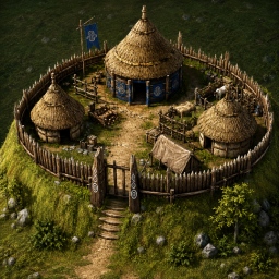
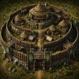
Icons aren't the issue. Im working with ChatGPT to help with things. But we had a problem when we tried to recreate actors to look like some of our ICons. IE the brit hill fort and great hill fort pictured here: I actually don't mind the "cc" actor too much, but it would be nice to get it to include some palisades and look likes its more up on a "hill" if thats possible.
-
What do you need? Which icons?
-
already have a topic






.png.2dd9c28b1139f16f3d84f06acc051eef.png)



-
Latest Topics
-