
maroder
-
Posts
779 -
Joined
-
Last visited
-
Days Won
10
Posts posted by maroder
-
-
Hey there,
You can try to disable the TLS encryption in this case. See here:
https://trac.wildfiregames.com/attachment/wiki/FAQ/lobby_tls.jpg
-
Since there has been some mods made recently which change the territory dynamics:
I thought this might also be something that could be used for more differentiation. So just to put the idea out somewhere:
What if we would group the civs into different classes who have different ways to claim new territory? These classes could be based on their history ( or at least what most pepole know them for ).
I was thinking of something like:
the 'Imperial/ conqueror' civs
- they get only one CC, but every building of them has a larger territory influence and they have buildings like the theatron. So they are constantly building outwards or are trying to capture the buildings of the enemy (possibly with a higher capture rate?)
the 'governor' civs
- they also only get one CC but can build build cheap military colonies / satrapys of some sort who give less territory compared to the starting CC
the 'tribal' civs
- multiple regular CC to represent the different tribes
the 'nomad' civs (yet to come)
- territory doesn't matter
As you can see the only thing that would change are the imperial civs (and the nomads).
-
 5
5
-
-
8 hours ago, wraitii said:
pyramidal notch
mockup:
-
5
-
-
51 minutes ago, wraitii said:
I actually liked the initial pyramidal notch,
same, that's why I made it. haha
51 minutes ago, wraitii said:It's fine on minimal resolution, but I'd rather not inflict this on other resolutions if we don't have to
yes. The problem is that I have then to come up with some css like js/xml stuff to manage that. I.e. switching between fixed position and a relative position depending on the screen size. That may take a while.
-
1 hour ago, wraitii said:
the buttons taking two lines instead of one makes it much uglier
indeed, but that's always the case at the minimum resolution. Only option would be to make the font smaller (which I don't want to do).
1 hour ago, wraitii said:I would definitely keep extending the top border over the whole top regardless.
And having nothing on there?
1 hour ago, wraitii said:I also rather dislike what's happening in the bottom corners on the 0 A.D. box, but I think it's the same as the one I complained about lol. Wow's design didn't have that and it looked much better IMO.
Yeah it's the same one, just shifted to the top. See, the problem is the that the pictures wow posted were just the first design I did with those double lines. But then I asked @Stan` and @wowgetoffyourcellphone how they liked it or if they would prefer one of my other drafts and they both choose the current design you don't like.
So ... you see my problem? Kind of going in a circle :/
-
1
-
-
7 hours ago, wraitii said:
You could probably use javascript to make the width of the top-bar only extend up to a certain point, and then just have empty space on either side. This would fix Vlad's problem I think.
The left and right seems a bit empty
Note: this is fixed width, meaning that this would look different on all screen sizes. Bigger screens would have more empty space on both sides, while the min resolution has no empty space.
-
4
-
-
1 hour ago, hyperion said:
the super ultra wide display
true. It's just hard to come up with a design that works equally well from 3,440x1,440 to 1024x768.
Best would be to just center everything around the vertical axis -> but that also covers most of the art and would be very crowded with the many buttons there are.
If someone wants to show me a draft of how they would imagine it I would be _very_ interested
-
2 hours ago, wowgetoffyourcellphone said:
then the other artwork needs taken into account too
very true.
40 minutes ago, wraitii said:I agree about the 'Empires Ascendant' text, but since I suggested moving the buttons upward, I would suggest putting it below the buttons (Edit -> that being said, maybe moving the buttons further down is better? Seems like it would be for DE's main menus anyways).
Not a good idea since there is a drop down menu that opens to the bottom. That's why I generally wouldn't want to move the center menu lower then half of the screen.
42 minutes ago, wraitii said:You could probably use javascript to make the width of the top-bar only extend up to a certain point, and then just have empty space on either side. This would fix Vlad's problem I think.
sure, would be possible, but I'm still not 100% sure if they were referring to the space within or between the menus.
-
3 hours ago, wowgetoffyourcellphone said:
design by committee
didn't know that expression. kind of true

-
33 minutes ago, vladislavbelov said:
macOS users
well they choose to pay for the quirks
33 minutes ago, vladislavbelov said:I agree that the grouping is a good thing. Though I believe that it needs to be grouped in a more natural way, without a lot of empty space.
different ideas welcome ™
Also, you mean the empty space within the different menus (i.e. learn to play -> Single-player) or between them (top menu, center menu)?
-
51 minutes ago, vladislavbelov said:
Seems like designed for mobiles, not PC displays. Eyes have to walk for a long distance to find important buttons. Which leads to Brownian motion of eyes.
Thanks for the feedback!
Kind of true, that's part of the design.
I can only say that I always have the mod enabled, because the old layout is a bit too small and complicated for my liking.
Arguably there are only very few important buttons a player uses frequently (especially a new player). That's why I decided to put the buttons to start a game prominently in the middle of the screen. Without having data to prove it, I think this is the first thing you see when looking at the page, which I think is important.
That the top menu is very stretched out is a bit unfortunate, but I would argue that this is the standard layout of most desktop programs. Every browser / office software / 2D/3D art software ect. I have ever used, has a top menu which holds the options. Especially the exit button on the top right corner is what I would call "standard". So according to Jakobs law https://lawsofux.com/jakobs-law/ it is a good idea to copy that design decision as users are already used to it.
The bottom menu could be placed elsewhere, those are the less important buttons imo, my only goal was a symmetrical layout. So they could also be columns on the left and right, but I think this doesn't address your concern that everything is far apart.
So overall I would say I like this design, because it clearly separates the thematically similar functionalities, which makes navigation easier for me. You got your options at the top, the game buttons in the middle and informational elements at the bottom. And it is only one click to get to the mod page, which I use very frequently.
But yes a looks a bit like it's made for mobile
-
1
-
-
On 17/01/2022 at 8:05 AM, nwtour said:
In a non-Latin interface, this text looks extremely non-native
On 17/01/2022 at 9:23 AM, Stan` said:He meant russian or asian chars.
") In an old game of mine they'd have all the art assets ready and it'd change depending on the locale.
In an old game of mine they'd have all the art assets ready and it'd change depending on the locale.
Well, that's a good question: Is the 'Empires Ascendant' part of the logo and should look the same all the time (latin letters, saved as png) or is it more of a description / title that is made up of strings, which could be translated to other languages/ alphabets?
-
9 hours ago, ffffffff said:
Maybe the logo without the grey background halfoverlapping the background in the upper Bar? or is in design terms depending on the background image that maybe a mismatch? just curious.
It's possible, but I like it more with a background. Also not sure what to do with the lines on the left and right side in this case.
-
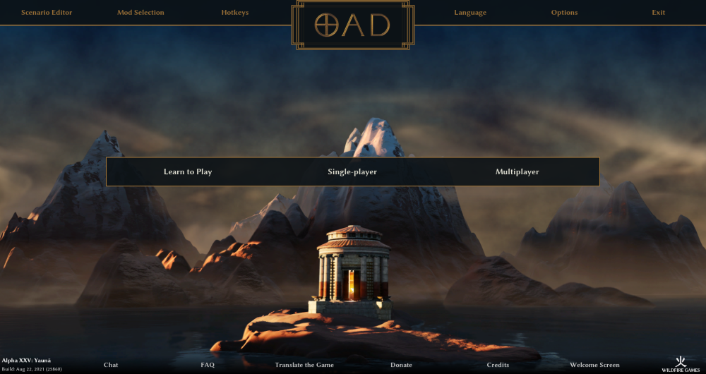
10 hours ago, Stan` said:
The width of the logo border seems smaller than the other border. You might also make the top square extend to the top instead of a closed box.
True, the width should be uniform.
Extending the edge of the logo towards the top of the screen means also lowering the bottom part of the box to keep it symetrical. So the box looks a bit bigger this way. The other option would be to not center the logo at the bottom off the top menu:
-
 1
1
-
-
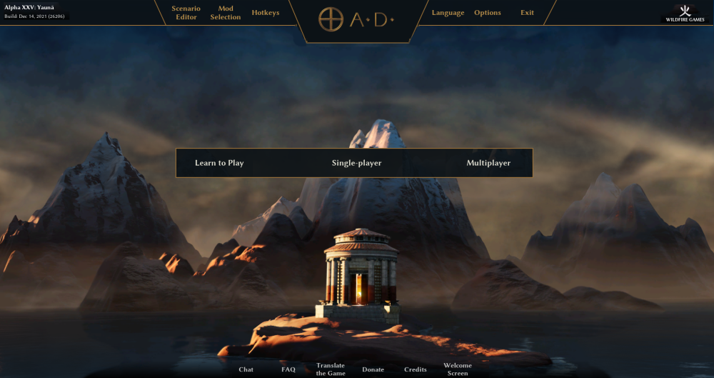
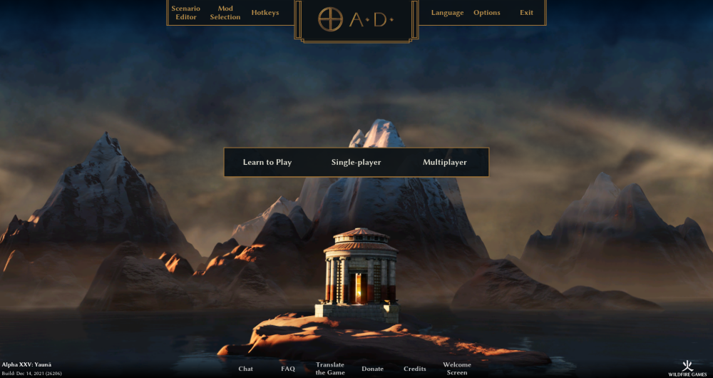
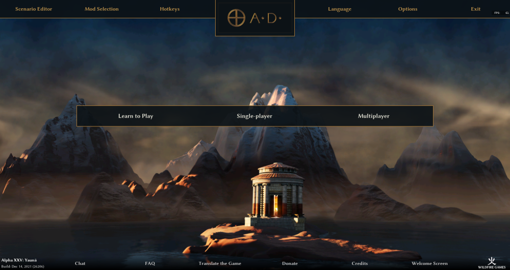
alright, before I update the mod this time, I just want to show how it would look like.
This includes the adjustments for the following remarks: logo & background box smaller | added dots in the logo | logo background more minimal | brightness of the top menu text slightly increased | position of the center menu shifted towards the top
What is still missing is the 'Empires Ascendant'.
I mostly like how it looks; just the logo background is _very_ minimal now. Maybe I will shift it more towards something like @Radiotraining's draft in the future
-
5
-
1
-
-
Thanks everybody for your opinions!
Yes, the main points I'm still not satisfied with are the logo / logo background. This is now about the 30th draft I've made and there are always some minor issues (and different opinions from people
)
should the logo be horizontally centered in / towards the middle of the top menu as seen in @Radiotraining's draft or should it be centered at the bottom line of the top menu ( current version)? How minimal / complicated should the logo background be? How big/ symmetrical / metal looking should the logo be?
Anyways, I really appreciate when someone has the time to make a draft to show me how they would imagine/ like it, so thanks @Radiotraining @wowgetoffyourcellphone
1 hour ago, wraitii said:Other suggestions:
- I think the text in the top row is a tad dark.
- You could perhaps push the middle-button-row a little higher (have it split the screen ⅓ - ⅔), this would leave more room for the background, and possibly any information we might want to show there.
will considers that
1 hour ago, wraitii said:we should consider replacing the main menu.
sure, if enough people like this I can make a patch. Otherwise I planned to put it on modio for a26
-
1
-
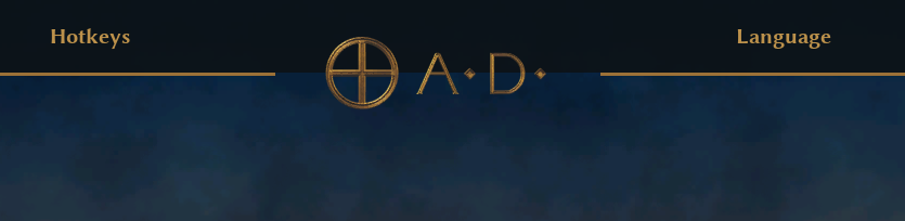
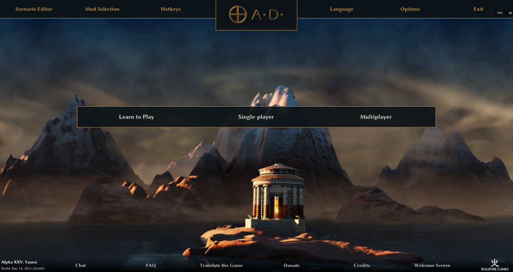
22 minutes ago, Stan` said:
Missing the dots in 0 A.D. But it's looking really nice. I miss not seeing EMPIRES ASCENDANT somewhere though.
yeah I put the dots there in a draft, but they just seem a little "off". I have to find a position and size that doesn't make them seem too small or the logo to imbalanced.
And for the Empires Ascendant -> same, still searching for a nice place to put it
-
small update to 3.2. featuring a slight transparent main menu, experimental new logo design and other small fixes people mentioned.
-
4
-
-
1 hour ago, chrstgtr said:
After acceleration/turn times. That is a major change that will be hard to assess if you add this too
Well, the testing bundle that includes this is already out for testing, but has not generated any big reactions so far:
-
17 hours ago, wraitii said:
Overall, there is little easy gain to make here unless we got much smarter about immediate range queries
After having thought about it a bit more: You're insights explain why ranged attack causes more lag then melee and why this is hard to improve, but even the melee attacking (and especially the unit death part) causes much lag. Do you think this could be a better area for improvements?
-
might also be worth asking if @badosu has any knowledge or insight how the range queries/ attacking is handled over in BAR (and if it is also performance critical there)
-
Thanks for the insights! That explains a lot.
38 minutes ago, wraitii said:Overall, there is little easy gain to make here unless we got much smarter about immediate range queries.
Sad. Cause as the videos show, at least on my system it feels like this is the main reason for the lag.
41 minutes ago, wraitii said:I think you're also compounding the results by having a massive blob of units nearby
 you mean like in every fight situation in every game? I would say that's gold standard.
-
5 hours ago, Stan` said:
Not everything was historically accurate
Mh yes, 100% accuracy before something is included is definitely a noble goal, but it also raises the bar extremely. If we applied the good old 80/20 rule that would mean most of the work to include new civs ist still to do, despite them looking nearly finished and them being fun and playable.
Which, as we can see in the video is frustrating when looking at it from the outside
(Ofc there are also other considerations)
-
1
-
-
45 minutes ago, Yekaterina said:
meh, I have been banned from the lobby already
Well my suggestion would not lead to people being banned for using multiple accounts, only to them actually only being able to use one account.
You could ofc still being banned for other unwanted behavior.
-
1
-


mod - don't capture by default
in Game Modification
Posted · Edited by maroder
To revive this topic:
I support the idea of decoupling attack and capture and would be happy to see a patch for that.
Capturing is an interesting mechanic, but it should only be done when directly tasked.
Current situation is still subpar. It is not only annoying for the player when UnitAI decides to waste the time of your troops by capturing a building, it also severely impairs the strenght of the AI.
See this video for example at min 9:
The AI runs straight towards the houses and tries to capture them, which is a huge waste of time and gives @ValihrAnt an very easy time defending.
Another problem is when your troops capture an enemy building on enemy territory. As you immediately start to loose influence over the building again, your troops have to keep "capturing" it until they are killed or you notice it and manually send them away.