
maroder
-
Posts
779 -
Joined
-
Last visited
-
Days Won
10
Posts posted by maroder
-
-
I also like the buildings, very nice work

few remarks:
I think the textures could be improved
") they look a bit to "unreal".
they look a bit to "unreal".
Something is wrong in the mesh of the wonder -> gives an strange effect when looking at it from the top.
I got the following error: ERROR: Failed to find matching prop point called "projectile" in model "art/meshes/structural/lusi_piedras_short.dae" for actor "structures/lusitanians/wall_tower_stones.xml255"
Why is there a castro and a fortress? Is that not the same?
If you compare the scale of the vases on the wonder and in front of a normal house, there is a big difference in size. I think it would look better if the size of the props would be more uniform. Also the size of the buildings compared to each other could maybe be improved.
The female citizens don't seem to have anything indicating the player color. This may be confusing I guess.
and also this "dependencies": ["0ad => 0.0.26"] should be "dependencies": ["0ad >= 0.0.26"]].
But overall, really nice work, keep it up!
-
 1
1
-
-
looks really nice
-
1
-
-
I think I would be much more interested to see an complete speedrun to win vs the AI.
Settings would be:
two teams: team 1: player vs team 2: (one or more) very hard balanced Petra
settings: Mainland, normal size, whatever biome, whatever civ, standard starting res and pop cap, (no cheats obvs)
-
1 hour ago, wowgetoffyourcellphone said:
Guys, the Princess Camp is a fantasy element that takes the civ so far removed from the other civs that you jeopardize their inclusion.
while I like the idea and new funny mechanics in general, I have to agree. Better to keep this on a separate branch for now
-
-
-
I would definitely prefer rice (mostly cause it is a nice to have something different than the usual fields)
And afaik most people are not against rice per se, only the opinions on the correct depiction diverge.
So imo, yes just make rice the default, so that at least people can try the mod without getting errors
-
 1
1
-
1
-
-
-
mh, maybe @nani can give you some tips.
-
19 hours ago, andy5995 said:
we haven't worked out how to make the roads go around hills, mountains, and shoreline yet.
Iirc, there should just be the option to avoid these tileclasses e.g. avoidClass [clWater,3, clHill,4]
(Without having looked at the code, so no guarantee)
-
1
-
-
I like the idea and the overall look, I just think the roads are a bit much
-
1
-
-
-
-
19 hours ago, artoo said:
Regarding rice, the current fields are also placeholder. I opted for the little ones, because I find them to scale better than this...
It somehow looks odd in my view, and so rice plant naked.
I agree that this ^ looks strange and I'm not sure which version of the fields that is, but the version that is in DE looks nice to me
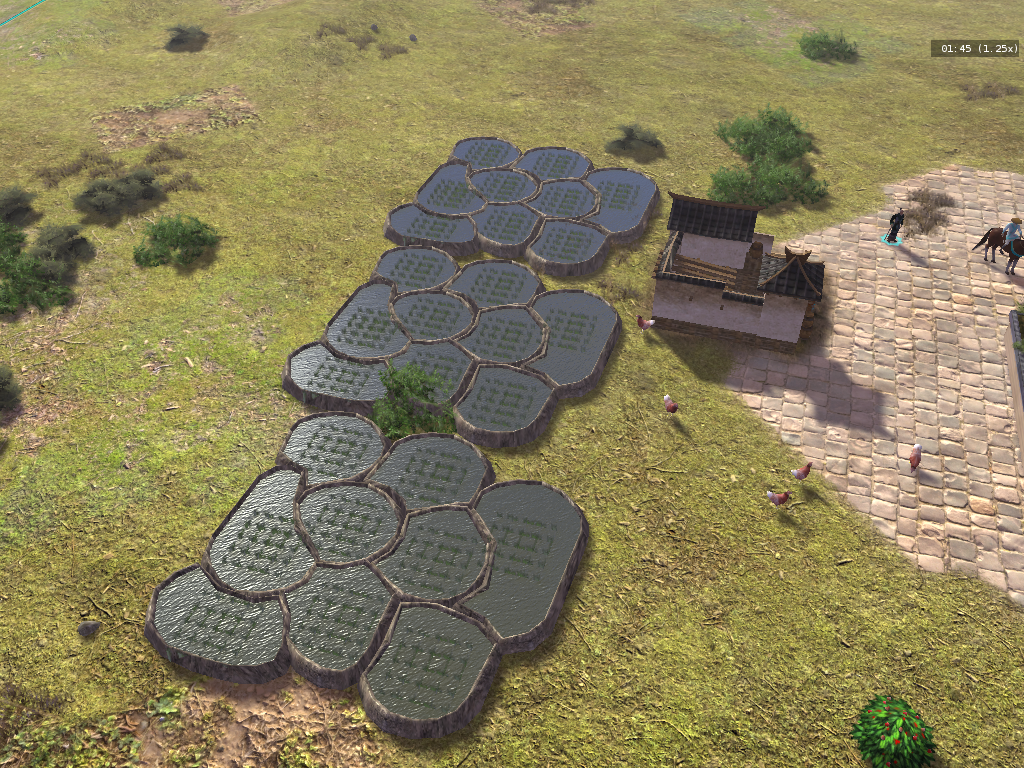
they could be a bit closer to the ground and the rice plants could be a bit more random but overall I like the look.
Or as I already mentioned one of the drafts from this thread:
-
3
-
-
4 minutes ago, m7600 said:
And even if I was, that doesn't mean that you can't work on it too
well doing the same work twice is wasting time
5 minutes ago, m7600 said:You're probably going to make something better than me anyways, so go for it.
I mean I will try, but that is an understatement of your work
-
-
-
considering performance I think its not a good idea to attach an aura to every single unit.
the other values could of course be tweaked.
-
1
-
-
really nice layout to introduce the new version
congrats
It sounds great and I will certainly test it when I have time.
-
1
-
-
2 hours ago, Stan` said:
Just to mention it, I had a lot of good feedback about turn rates in A24 from casual players and some YouTubers which seem to be totally against what's represented on those forums
Yes causal players are very much underrepresented here.
But even if they would voice their opinions more publicly, the question is still if it is possible to find a balance between what causal players want and what competitive players want.
Turn rates/ acceleration is just the tip of the iceberg.
-
1
-
-
3 minutes ago, wowgetoffyourcellphone said:
You decided to not bother balancing it.
Guess the problem is also that any balancing discussions only makes sense if the people actually test the development version. Discussing balance based on the last release is mostly obsolete and /or misleading.
-
2
-
2
-
-
I don't mind acceleration in general, but the problem is that the current pathfinding of large units and formations doesn't fit well to it.
Large units are frequently obstructed by other units and have to stop and turn around and accelerate again and are obstructed again and have to stop... ect.
For me, this makes them more annoying to navigate. This could however be mitigated if unit pushing would also include standing units, so that larger (heavier) units could just push obstructions away.
And it's a similar story for acceleration and formations. If they would have a smoother movement and would shift less, the acceleration wouldn't be an issue for me.
-
1
-
-
One might also want to read the discussion/ watch the videos on the commit
-
2
-
-

For a New Faction: Lusitanian.
in General Discussion
Posted · Edited by maroder
Sorry yes, here are the specific points") :
:
the roof textures (straw) look ok from far away, but when you zoom it they lack details. Something with more detail and or a normal texture would be nice.
Generally I guess all textures would profit from some normal maps to give them a more realistic look.
Also at the moment the buildings use two different kind of roof textures: the old iberian one (e.g. arsenal) and the new one. I guess it would be better if that would be consistent.
I don't particularly like how the stone texture on the temple and wonder looks. A bit too stretched.
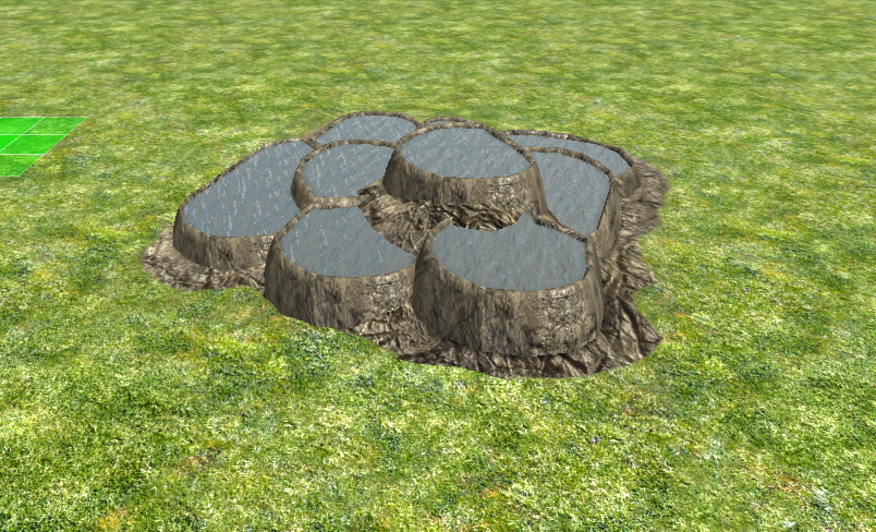
The sauna and the corral use water objects that are just a blue color. Should probably use the player_water material like the wonder.
The ground texture of the wonder is much too coarse.
The ground texture of the castro should be a proper texture. Looks like that is only one color.
_____________________________________________
And another thing I just noticed:
The castro uses unique palisades. It should just use the palisades that are already in the game (iirc how its done for the building of the britons).