-
Posts
1.156 -
Joined
-
Days Won
4
Everything posted by fatherbushido
-
update: release date revision number commits time commit per day 0.0.24 suggestions 2020-09-27 24071 2250 863 2,61 0.0.23 Ken Wood 2018-05-18 21821 1899 295 6,44 0.0.22 Venustas 2017-07-27 19922 1007 261 3,86 0.0.21 Ulysses 2016-11-08 18915 950 222 4,28 0.0.20 Timosthenes 2016-03-31 17965 667 191 3,49 0.0.19 Syllepsis 2015-09-22 17298 887 197 4,50 0.0.18 Rhododaktylos 2015-03-09 16411 562 149 3,77 0.0.17 Quercus 2014-10-11 15849 701 152 4,61 0.0.16 Patañjali 2014-05-12 15148 762 145 5,26 0.0.15 Osiris 2013-12-18 14386 590 107 5,51 0.0.14 Naukratis 2013-09-02 13796 464 154 3,01 0.0.13 Magadha 2013-04-01 13332 337 107 3,15 0.0.12 Loucetios 2012-12-15 12995 359 101 3,55 0.0.11 Kronos 2012-09-05 12636 773 113 6,84 0.0.10 Jhelum 2012-05-15 11863 524 62 8,45 0.0.9 Ides of March 2012-03-14 11339 536 82 6,54 0.0.8 Haxāmaniš 2011-12-23 10803 515 97 5,31 0.0.7 Geronium 2011-09-17 10288 502 71 7,07 0.0.6 Fortuna 2011-07-08 9786 256 52 4,92 0.0.5 Edetania 2011-05-17 9530 481 67 7,18 0.0.4 Daedalus 2011-03-11 9049 217 91 2,38 0.0.3 Cerberus 2010-12-10 8832 419 54 7,76 0.0.2 Bellerophon 2010-10-17 8413 443 63 7,03 0.0.1 Argonaut 2010-08-15 7970 7970
-
Arrow Trajectories
fatherbushido replied to Thorfinn the Shallow Minded's topic in General Discussion
That's it. Projectiles (mostly) don't have a trajectory from the simulation point of view, they are just distant delayed hit. Then a trajectory is rendered. The choice was a parabolic trajectory. <Gravity> is the graphical parameter which will adjust the height of the parabola. For now, artists have to tweak that so it fits what they want to see. Don't bother with anything else. More have to be said, but not enough place on that margin. -
@Cophiansend me a forum pm with the data you need, I'll provide you them
-
@Genava55 oh awesome! are you involved in that project? I am a bit confused about the mentioned locations, is that in the 02 or in the 80?
- 264 replies
-
- britons
- east celtic
-
(and 2 more)
Tagged with:
-

Random map : Alpine Mountains
fatherbushido replied to Feldfeld's topic in Scenario Design/Map making
@Feldfeld@smiley You can talk about that at another interesting place :p https://webchat.freenode.net/#forkad -

Random map : Alpine Mountains
fatherbushido replied to Feldfeld's topic in Scenario Design/Map making
yes that's what I meant ;-) (for the alps you also forgot the purple cow!) -

Random map : Alpine Mountains
fatherbushido replied to Feldfeld's topic in Scenario Design/Map making
@Feldfeld it's more like the "vosges" than the "alpes" :D I would say it looks better than a "try"! -
Salut Dakara ! oui c'est jouable mais on n'a pas encore fait de version complétement publique. J'espère que ça arrivera bientôt ! Si tu as des questions ou des requêtes, n'hésitent pas. Yes it's playable. We haven't yet done a public release though. ;-)
-
Building placement features had been discussed since a long time. Those kind of features are highly dependent of the kind of game, of the obstruction design and so on. Among the specificity of 0AD and derived games, the buildings are rotated rectangles (and don't align on a grid). * Some discussions which occured in the past: https://trac.wildfiregames.com/ticket/3685 (enforcing distance between building for realistic placement) https://trac.wildfiregames.com/ticket/3920 (magnetic grid) https://trac.wildfiregames.com/ticket/3920#comment:2 (dev input) https://trac.wildfiregames.com/wiki/GameplayFeatureStatus (Entity alignment to terrain grid) https://code.wildfiregames.com/rP23330 (building snapping feature) (feedback about snapping feature) * Some other games concept: (placement helpers for batching) * I also remember a person in the lobby having a custom gui mod for building placement (with a nick starting with L) edit: it's @Lefo Now my questions are: What do people want? What players want? What developpers want? Does someone has a proper consistent clear design in mind? Thanks for your inputs!
-
it's the default selection texture for actors in atlas. I guess a zoologist wanted some values or something like that. Multiples of 0.5 sounds good enough for me too. You can't imagine how lazy I am right now! Thanks! Thanks again!
-
Let's use filled texture then :-) More seriously, that's not an issue to have so much texture in the repo (some could even be merged together), the only potential issue is to load too much texture (but those ones are probably nothing compared to all art stuff). By the way, are those 0.1 differences (between walrus and giraffe for example) really visible? (even more when we know that those units are just circle or axis orientated square of radius or half size 0.8 in many other parts of the game?). Also the rectangular footprints need to be seriously reviewed, I had bring a list above. ah indeed, that was my starting point of the discussion. Nice! (is there a name for the second one?) The last one is strangely my favourite one! (finally not so fancy) Anyway, while line overlay works almost fine, quad ones are a bit annoying right now. So indeed simpler is better. Sadly I don't have an a23 public mod available (and I am lazy to get one) so I can't parse the 0abc a23 mod :/ I overlooked at D2503, that's seems clearly more consistent (for example having the same shape for boltshooter and stonethrower). Also a proper review would have pointed out that it's a bad idea to delete the actor texture. - Well I have all the answers I needed. Thanks for the exchange!
-
I understood, we agree about that. It's not my subjective point of view, it's how it was planed and done: a rectangle texture and a circular texture were generated for each rectangle footprint width and depth and each circle footprint radius (rounded to the closest power of 2). Also my personal taste is more for fancier texture but plain ones work very badly with the quad thing. That's also why I asked above about the pixel - size equivalence. Nice I would appreciate you personal taste about that (by entity type and footprint type) to have a proper consistent set. ;-)
-
Yes I understand that, you mean using proper texture to avoid stretching (for rectangular footprints). (That's it?) And indeed, I (we) mix in the discussion different meaning for uniform. The first (circular and rectangular) footprints were script-generated. The goal was to have a (close) shape to avoid thickness issue when resizing. Also at that time, I guess rectangular overlay were for rectangular footprints and circle overlay were for circle footprints. (So there was not yet that other issue you adressed). A restricted set of size could also do the job (one can consider the weight of loaded textures). I would like to fit your new textures in that schema. Also as we both agree, the current footprint are still to be checked and fixed (see the numbers), in shape or in dimensions. There are more width depth ratio than one can expect! In my opinion, that's the first step. Then, and you have a good input about that, the what texture to which shape and which unit has to be done. I almost wonder if ellipsis are actually needed (moving to the rounded square or the stadium/capsule/cartouche is perhaps better? or something even fancier?) for the rectangular shape (it's far better than stretched circle but still not optimal?), but I don't have the eye fitted for that. That's imo the second step. Then I had a third step but it's too shiny outside.
-
-
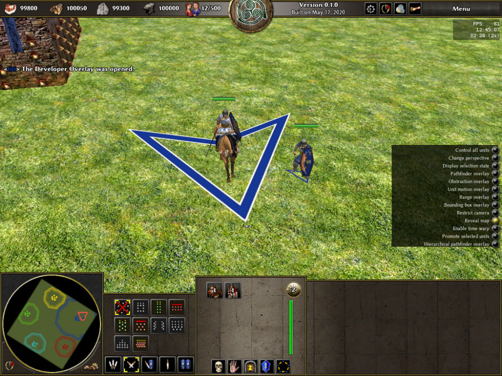
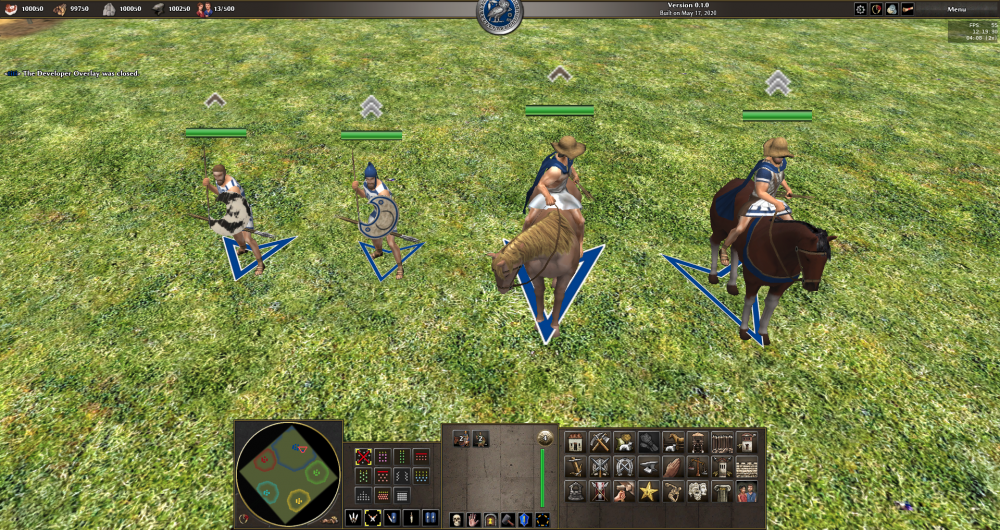
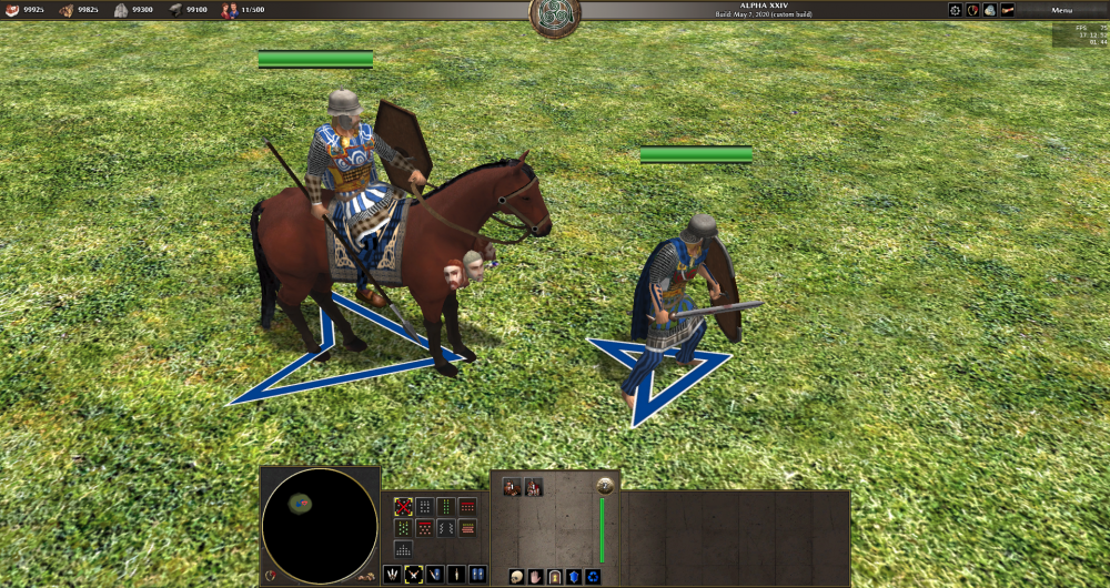
from left to right footprint: 1.5, texture: arrow_128x128 footprint: 1.5, texture: arrow_256x256 footprint: 2.5, texture: arrow_128x128 footprint: 2.5, texture: arrow_256x256 from left to right footprint: 2.5, texture: arrow_256x256 footprint: 1.5, texture: arrow_128x128
-
"map":"maps/skirmishes/Treasure Island (2)"
-
I didn't take the time to respond because I am a bit busy, but I still would like your input (later). Meanwhile, I don't know if you had the numbers for the quad textures, here are some (animals are missing). Column1: radius, Column2: width, Column3: depth, Column4: texture 1.5 NaN NaN arrow/128x128.png 2.5 NaN NaN arrow/256x256.png 3.0 NaN NaN arrow/256x256.png 3.5 NaN NaN arrow/256x256.png NaN 10.0 5.50 arrow/256x256.png NaN 10.0 10.00 arrow/256x256.png NaN 15.0 7.50 arrow/256x256.png NaN 16.0 8.00 arrow/256x256.png 1.5 NaN NaN circle/128x128.png 2.0 NaN NaN circle/128x128.png 4.0 NaN NaN circle/128x128.png NaN 6.0 4.00 circle/128x128.png NaN 8.0 4.00 circle/128x128.png NaN 12.0 5.00 circle/128x128.png NaN 12.0 8.00 circle/128x128.png NaN 9.0 6.75 circle/128x128.png NaN 15.0 7.00 circle/128x128.png NaN 10.0 6.75 circle/128x128.png NaN 20.0 6.00 circle/128x128.png 3.5 NaN NaN circle/256x256.png 4.0 NaN NaN circle/256x256.png NaN 48.0 12.00 circle/256x256.png NaN 12.0 5.00 circle/256x256.png NaN 40.0 10.00 circle/256x256.png NaN 24.0 8.00 circle/256x256.png NaN 10.0 4.00 circle/256x256.png NaN 33.0 8.00 circle/256x256.png NaN 37.0 7.00 circle/256x256.png NaN 42.0 9.00 circle/256x256.png NaN 31.0 8.00 circle/256x256.png NaN 17.0 7.00 circle/256x256.png NaN 5.0 5.00 circle/256x256.png NaN 24.0 12.00 circle/256x256.png NaN 15.0 15.00 circle/256x256.png NaN 43.0 10.00 circle/256x256.png NaN 28.0 12.00 circle/256x256.png NaN 45.0 17.00 circle/256x256.png NaN 36.0 12.00 circle/256x256.png NaN 28.0 8.00 circle/256x256.png NaN 25.0 6.00 circle/256x256.png 1.5 NaN NaN plus/128x128.png NaN 10.0 10.00 square/256x256.png NaN 15.0 6.00 square/256x256.png NaN 15.0 9.00 square/256x256.png 1.5 NaN NaN star/256x256.png 2.5 NaN NaN star/256x256.png 3.0 NaN NaN star/256x256.png NaN 9.0 4.50 star/256x256.png NaN 12.0 6.00 star/256x256.png
-
Thanks for the refs! So not all D2503 had been commited in WFG svn? Back to the circle, the current WFG svn state is messy, isn't it? Also I still don't understand what is the desired scaling for inner stroke and outer stroke (just for the circle). Also do you know what is the game unit proper equivalent in pixel? I asked all that because I just printed a table with a lot of numbers and I would like how to include your new textures in a well thought way.
-

Portrait icon color. Tuto request.
fatherbushido replied to fatherbushido's topic in Art Development
Nice! -
Thanks for the detailed explanations! I don't know if there was a specific 0 A. D. Empires Ascendant topic about those textures, in that case, my post should be moved in that place. If I remember correctly it was planed to use 1:2:1, which has probably changed meanwhile. Anyway what matters is to have a consistent numbers with pleasant visual, that's why I refer to you (and others). Just to understand, I looked at WFG svn (I looked only at the easy case, circles). r11623 introduced the scripted generated textures 32x32 64x64 128x128 (Ideally we should have one quad overlay texture by footprint shape and size) r11628 replaced the 128x128 and introduced the 256x256 r13759 introduced the 512x512 r23636 replaced the 128x128 and 256x256 I will post the images in the next post as the forum is (or I am) bugged.
-
Thanks, I wasn't sure Yes that's it!
-
In Delenda Est: - units/mace_merc_infantry_2.xml (which is the stoa champion mercenary of Empire Ascendant) units/sele_merc_infantry_1.xml (which is probably the current sele mercenary swordman) (and also some thracian peltasts) That sounds something reasonable to not keep that unit in the spart and athen roster.
-
I don't exactly know if DE requires public or not. But there are errors with some female templates it seems (the sueb ones for examples).


