-
Posts
2.762 -
Joined
-
Last visited
-
Days Won
207
Everything posted by LordGood
-
-
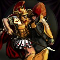
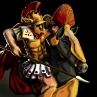
Thanks did a little scribbling to bring out finer detail and changed the horsey color and whatnot sharpened a few ambiguous edges too
-
I'm relying on the scaledown to tighten the loose edges and whatnot, but I can see with the crests that a little texture can go a long way, so I might just reconsider that.
-
-
thanks lion! I used a brighter red
-
Well the sentry towers should be taller than the wall turrets if they work the same as in the main game, wouldn't want shorter towers outranging taller ones. ...again
-
-
-
shadin' maybe a good time to crop? I need to activate the bottom left of the picture somehow, or cut it out completely
-
*gasp Huzzah! I just figured out how to UV map in SU too xP this is great
-
Those are some high walls, it might be difficult to make the tower taller without looking odd it does look very unique though! and yes, primary source materials are the best references.
-
Aaaah! I know! It's driving me nuts! but like you said I can always do it later xP so forward! onwards to the painteroo!
-
Hey thanks! haha that'd be great! Should I make the crop? leave it how it is, or let it out some more?
-
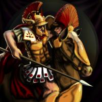
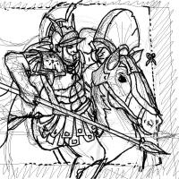
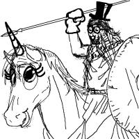
Perhaps a unicorn cheat code ahaha after all, those cheat codes in AOE never made any sense xP Here's another sketch and a possible crop
-
Thanks guys, I think all I really need is to rub out that little light bridge at the end of the muzzle that defines the square, should be ok after that i think
-
-
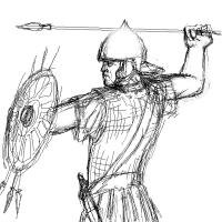
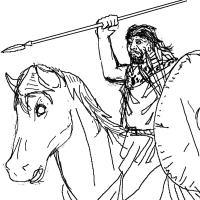
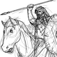
Thanks guys, I fixed it! lol i still need to give him a few more javelins but apart from that I think I fixed his face and the horse's head, maybe his hand so how is this one looking?
-
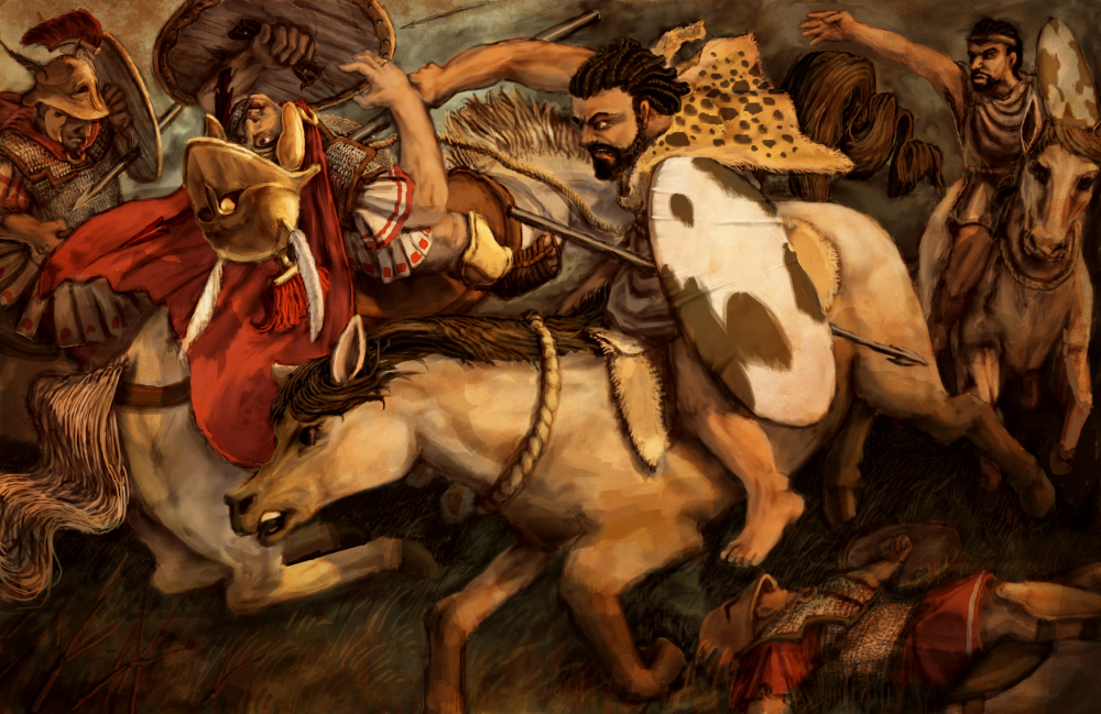
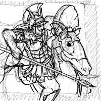
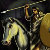
Numidian cavalry sketch? Despite my constant drawing of ponies, my ability to draw equestrians is still sub-par
-
I remember in Age of Empires III there was a little tab in the corner of the unit stats that when pressed would reveal a unit description. Underneath this in-game unit description was a brief yet historically accurate description and context. Could we perhaps implement this here? I loved how I could read through unit descriptions if a game was running a bit slow, and it could be useful in teaching our audience a thing or two.
-
The persian walls seem a bit too... modern for the hittites maybe a little too tall
-
Lion i really think the Italian cavalry spearman should hold his spear below his shoulder, above and he could be confused for a cavalry skirmisher the pose would be great for the Numidian cavalry though
-
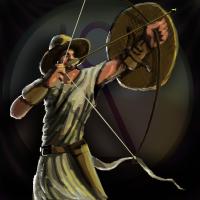
Thanks guys Given the nature of this unit, I don't think I can help but keep the string in his face xP A closer crop might be a bit difficult too, since we should see the bow and his side, at least that's what I think Close crops are going to be a real pain for the cavalry units >.< So I should dilute the white rim light and add a more sand colored one, but the colors I would be using are already dominant on the light side. The white almost seems like a welcome cool chroma I dunno, I'll throw blue at rim and 'trim the fat' on the image I suppose. See what works
-
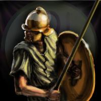
bleep bloop Thanks Ludo! nothing shiny to exploit here, and hey, a face! woot! I added the darks later, to keep more of the true colors I have a feeling that the true colors are not very saturated themselves, like the light brown fabric of the shirt, or the woven hat and shield
-
Darkened the thing in the back defined the clothes and arms a bit more lightened the shadows, put in new darks not sure I can throw anymore light onto the face without it looking weird
-
You're a darn fine artist Pureon! I wonder how many artists have been swayed into their craft by video games? It's kind of hard not to be ill say, but hey, that's coming from me

