Enrique
WFG Retired-
Posts
2.338 -
Joined
-
Last visited
-
Days Won
96
Everything posted by Enrique
-
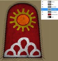
Thanks! I think it's better to work on as many layers as you can, so you can have much more control on the individual pieces that form your design. i.e. I have divided our design in two layers, one with the sun, and the other with the scales. This way if we want to make some changes it's easier to only touch that layer
-
Where is this one in particular? I've searched on the files you uploaded but I cannot find that "clean" design without the scratches and such, could you please point me to it?
-
Sí. Si crees que puedes mejorar alguna textura en concreto, o añadir más variedad (por ejemplo, texturas del terreno, con hierba, con rocas, etc..) puedes trabajar en ello y preguntar las dudas sobre cómo las tienes que hacer. (Mejor preguntar antes para no tener que volver a empezar en el caso de que tengan que ser de alguna manera especial) Las texturas para los edificios ya es más dificil, porque afectaría a todos los edificios a la vez, y es mejor que la persona que está trabajando en los edificios se ocupe de ella. No te vamos a obligar a trabajar en las texturas que necesitemos con mas prioridad (aunque sea mejor para el desarrollo del juego) Cada artista tiene sus fuertes y sus debilidades, y preferimos que trabajes en tus fuertes para que el resultado sea de buena calidad. Dicho esto, en qué te gustaría trabajar? English: Yes, you can ask or decide what you want to work in. If you think you can upgrade any particular texture, or add more variety (i.e. terrain textures, grass textures, etc) you can work on it and ask all doubts about how they have to be. (better to ask before in case the textures need some special treatment and you have to start over) Structures' textures are more difficult, because it would affect every building using the texture, and it's better to leave that work to the person who is making the buildings. We are not going to push you to work on high priority textures (even if it's better for the game developement) Each artists has it's own strongs and weaknesses, and we prefer that you work in your strongs, so the work you make is high quiality. That said, what do you would like to work in?
-
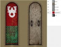
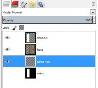
I changed the back shield wood texture in blender and rendered the shields with and without the (things to hold them) with that wood texture. Used the mask layer to select only that portion. I desaturated it (make it black and white) and played a little with the color levels to make it not so dark. Then I turned that layer to multiply blending. You can take a look to the layer's setup in the last picture I posted. The layer called "wood detail" is the one with the wood grain on it. The playercolor test is just for testing how the playercolor would show, but without that red layer, the red parts are almost transparent. When I speak of transparency, I don't refer to have the color partially transparent, like you did on the blue sun shield, but have it completely transparent where the playercolor will show, and leave the wood detail to add the wood grain on it I'm going to re-upload the templates with this "wood grain" layer in all shields. So you'll just have to paint the symbols designs Please be patient, I think I'll have them uploaded this afternoon If you have more questions don't hesitate to ask (or tell me if you prefer the answers in spanish also)
-
The point of making the Art dept forum open was to encourage people to work on the game's art without having to "pass through" an application. If you think you can contribute to the game's art with textures/3D models/whatever, just start doing so like you did Just keep in mind that we are looking for some standards that have to be met, and therefore the team will ask you to change, modify or discard something you worked on. This is something natural, it's not for discouraging people from working on the game, but to keep the game awesome looking. (I've worked on some models and textures that weren't good enough or didn't fit the game visuals and discarded them or heavily modified based on team feedback) So, if you want to work in something else than Mauryan shields, just ask the primary questions you may have about the specific area you want to work in, and start contributing As you know, there are priorities which are always better to have someone working on them (like Mauryan shields ), but it's not mandatory.
-
I'm working on making Lion's designs to make them game-ready while fixing templates. Wood grain incoming on all of them
-
I totally agree with this =)
-
Hey Lion, those look great also! However, if you are going to do more, we need some changes to use those shield's textures: - Main color should be playercolor (transparency): the blue color in the sun shield design should be transparent, with some wood cracks and such on black color with a little transparency to show through the playercolor. The engine will take care of which color has to display depending on the player number. Otherwise, we would need to do variations on each design for every playercolor, which is unnecessary. - I added a shadow layer with multiply blending on the PSD's templates to "integrate" the actual design with the border. It seems you painted directly on the shadow layer. - Painting under the border (base layer) would avoid the "saw" artifacts on the inner part of the border that shows some of your designs. - If you use the layer called "paint here" to paint your designs you can't go off limits and paint "above" the borders. - I'm changing the back of the shield's texture because I couldn't find the source of the texture I used. Do not bother painting on them, they're going to be changed (I'm rendering them now) Spanish: - El color principal tiene que ser playercolor (transparencia): la parte azul del escudo con el sol debería ser transparente, con algunas marcas de madera en negro casi del todo transparentes, para que se pueda ver por encima del playercolor. El juego se encargará de elegir qué color mostrar dependiendo del numero de jugador. Si no, tendríamos que hacer variaciones de cada diseño de escudo para cada color de jugador. - Añadí una capa de sombras con "multiply blending" en los PSD's para integrar el diseño del centro del escudo con el borde. Parece que has trabajado directamente en esta capa de sombras. - Pintando debajo de la capa del borde (base layer) evitaría el efecto sierra que muestra la parte de dentro de algunos de tus diseños cerca del borde. - Si usas la capa llamada "paint here" para pintar los diseños de los escudos, no te puedes salir y pintar los bordes por error. - Estoy cambiando la textura de la parte de atrás de los escudos porque no he podido identificar de donde saqué la textura y no quiero arriesgarme con temas de licencia, asi que no gastes tiempo en pintarlas porque las voy a tener que cambiar. I hope this do not discourage you to keep working on the designs, they really look awesome! but we need those changes to add the textures into the game.
-
I still have to do rubbles for more building sizes and shapes. so I'll modify those while I'm at it. with your feedback. I'm just working on too many things at the same time xD but I have to focus on finishing rubble, since it's already implemented.
-
Not enough, we need at least 200 variations of each shape. Jokes aside, I think we need at least 3 variations for each shield shape but we want more. I think Mythos will know better numbers
-
If you imported an iberian house, you can have a nice scale reference if you didn't scale it after importing That's the method I use.It's better to try UV unwrapping and setting up the UV islands inside the texture space. Unlike blender, Pyrogenesis does not tile the texture if the UV island is out of bounds of the texture space. In edit mode, face selection mode, select all with "A" and then CTRL+F -> triangulate faces I suggest to be the last thing you do before exporting. Our team member Eggbird already made ultra detailed highpoly and lowpoly versions of "ashoka pilar", but it's nice to see your modelling skills in action To quickly fix doubles: In edit mode, vertex selection mode, hit "W" and select "Remove doubles". This will remove all duplicated vertices and "tie" the mesh together. CTRL+N to recalculate normals after removing doubles is a nice habit
-
Any chance to have just the color layers without the wood underneath?
-
Hey Mirek! that looks really nice! About the vertices/polygons, those numbers are nice. What you can do, is make two or three variations of the sizes you already made. Then use them randomly to make "small" "medium" and "big" groups of rocks to put them in-game instead of a single rock You can use textures from gaia as you please, we can later apply other rock textures to fit the biome or have more color variety. I think quarry_ textures are used for mines of stone where the player can gather resources, and it's better to use other texture than that to avoid confusion. Not 100% sure though. -Yes you should use triangles. Pyrogenesis works with triangles, BUT, you can use quads in blender, because I think in the latest version the exporter automatically converts the quads in tris before exporting to DAE. - Smooth/flat in blender does matter on Pyrogenesis. "Smooth groups" are supported, take advantage of that to make the rocks have some hard creases and such (i.e. using edge split modifier and play with the angle degree is a nice technique to quickly have organic look in rocks) Those are also nice!, I think Gen.Kenobi made some of those rocks, but it is always nice to have more variations For these "big rocks" or "big rocks group" You should try to extend them a little "underground". Below ground plane. This is because sometimes the assets are placed in uneven terrain, and the "ends" of the rock could be seen. Very nice work so far Mirek! keep it up
-
You can do whatever you want/feel comfortable/want to gain experience with. There are prior lists, but it's better that you enjoy modelling the asset rather than being tasked to do something. My suggestion is starting with something that can be finished faster or requires less time to get used to the workflow (because probably we'll ask you to change something or you'll find problems/have questions) Your choice
-
I love this one ^ Muy buen trabajo Lion. Tienen muy buena pinta esos escudos After read this I double checked the wood texture of the back side, and although I had it on my old "public domain" folder I couldn't find the texture again. I have more wood textures for the back side, so I'll reupload the PSD templates. Sorry for the inconvenience of re-uploading but I want to be sure + looks better.= win win @Lion: we can still using your creations. When you're done with them, post the files here and I'll change the back sides and/or make transparencies for playercolor (unless you made them that way)
-
I guess you open them in GIMP or Photoshop and save them as PNG, this way you do not need to invert the Y axis on the mapping coordinates. But blender can handle .DDS textures anyway, the only thing in the last version is the Y axis inverted thing If you are referring to get them working in blender, You have to create a new material, go to textures tab, add a new image type texture, select the texture image, and use UV as mapping method.
-
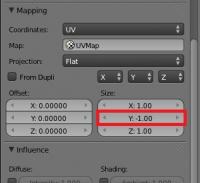
Hello Mirek! welcome to the forums. Thanks for your application, don't worry for your english, Blender is the main application used by Art dept members, so we can help you out if needed. What would be your primary interest modelling? Nature/organic, hardsurface/buildings? We have currently moved our Art department forum to public and there you can see an approximate roadmap our Art Dept Leader made: http://www.wildfireg...showtopic=16220. There are several things already done and it has to be updated but you can get an idea. As you can see, you have a ton of gaia/flora assets to choose as well as some buildings for our last civilization included currently in developement: Mauryans. I recommend you to pick a little asset/building to get to the working pipeline and once you feel comfortable, jump to a more complex one . If you want to take a look to some 3D assets currently in-game, you can open them in blender once you have downloaded the game, or downloading them from our SVN repo: http://svn.wildfireg...hes/structural/ In blender you open them at "file/import/Collada" (.dae) -Depending on the 3D asset imported, you'll have to apply its corresponding texture. Textures folder here (i.e. Roman structures will use rome_struct.png or rome_struct_2.png and Persian structures will use pers_struct.dds) You can ask here as many questions as you want as well as WIP images of your progress for the team to show/ask/review/suggest/critique EDIT: *Note: .DDS images on last blender version (2.64) are flipped on the Y direction. This means that you'll have to invert the Y texture coordinate setting to -1 in order to show them correctly on the model. (PNG textures works as usual)
-
Here are the six Mauryan shields' textures templates. They are in PSD, but you can also open them with GIMP. The textures still in high-res, keep in mind they'll be scaled down. Instructions: -Open the file(s) and paint on the transparent "paint here" layer. -Use transparency where you want to show playercolor. -Be creative but try to reflect Mauryan style and symbols, -If you use other images, they have to be lincesed under CC-BY-SA 3.0 or public domain. -(mask layer is not used, you can delete it if you don't need it) I had to upload it to filefactory (Link coming soon)
-
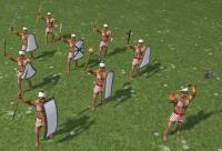
This is what i got so far on Mauryan troops props: I'll provide the shields texture source files in .xcf and .psd ready to be painted if someone wants to help me with the shields Test:
-
Nice begginer info here: http://cgcookie.com/blender/2011/01/21/intro_uvmapping/
-
Post-processing effects test (SSAO/HDR/Bloom)
Enrique replied to myconid's topic in Game Development & Technical Discussion
That's what I did it makes a nice effect EDIT: Commited if you want to try it -
Post-processing effects test (SSAO/HDR/Bloom)
Enrique replied to myconid's topic in Game Development & Technical Discussion
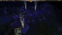
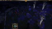
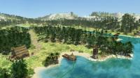
I'm having lots of fun with the post processing manager!! I made night settings version of Belgian bogs and played against the AI. It turned out quite fun -
Post-processing effects test (SSAO/HDR/Bloom)
Enrique replied to myconid's topic in Game Development & Technical Discussion
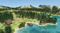
You asked. This one is more subtle. 3rd one you can see how DOF looks with low angles in large maps with many trees ^^ -
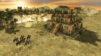
The whole structure is made of different parts, one per different texture used. I think Myconid is talking about those parts: In atlas' object menu, select "Actors (all)" in the dropbox instead of "Entities" and use "gardens" as filter. The search will display all .xml separate actors of the gardens. Try an empty map just with the waterfalls and water to see if those are causing the problem.
-
Post-processing effects test (SSAO/HDR/Bloom)
Enrique replied to myconid's topic in Game Development & Technical Discussion
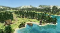
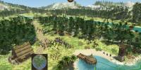
Here's my attempt at using the effects without over saturate the image with them. No DOF, it looks too strong from low angles.

