Enrique
WFG Retired-
Posts
2.338 -
Joined
-
Last visited
-
Days Won
96
Everything posted by Enrique
-
===[COMMITTED]=== Mauryan Defense Tower, City Walls, Wall Gate
Enrique replied to Mythos_Ruler's topic in Completed Art Tasks
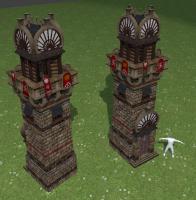
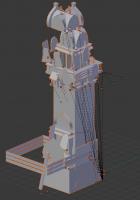
I've UV mapped the defense tower. I retopologized some parts and deleted unnecessary geometry. I tried to keep the same texturing LordGood did except the railings and some minor details. It looks darker because of the way blender multiplies AO. Please suggest any change desired on the texture mapping. I'll commit this european afternoon. -
Really nice screenshots guys! They show nicely how good the game looks Spabod's screenshot would even look better with notmal and AO textures. I have to find time to give some love to the persians ^^ @Ludo: Sandbox maps screenshots look very flat if you take the shot from very low angles. But the closeup details look awesome
-
===[COMMITTED]=== Mauryan Docks and Ships
Enrique replied to Mythos_Ruler's topic in Completed Art Tasks
It's hard to figure out the overall shape from those angles, Could you post some front/side views? preferably orthographic. -
That noise is generated by Texture.005 (cloud texture) which is used on the globe material. The texture is trying to use UV coordinates but the globe is not UV unwrapped, and therefore, the normal bump value you use results in that weird noise. You can fix it disabling that texture (005), or using "global coordinates" with "sphere projection" like you did with the other textures used in the globe.
-
===[COMMITTED]=== Mauryan Farmstead, Mill, and Corral
Enrique replied to Mythos_Ruler's topic in Completed Art Tasks
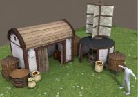
I made this farmstead sketch (not very proud of it xD), with AOE influences for the vertical mill but not sure if it's historically accurate. Mauryan architecture is not my strong... ^^ -
Yes I did. It took me some time realize what was going on. Even after reading the release notes, I couldn't figure out what happened to the UVs until I tried switching mapping orientations.
-
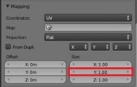
You can easily fix that by mapping the textures' size to -Y coordinates: Texture tab pannel > Mapping options > Set Y size to "-1" The DDS textures will show correctly this way (and exporting/importing works fine, no UVs are messed up)
-
-Flora looks kind of simple -Playercolor in some buildings deserves jail. Way to mess up how nice textures look in some of them. Things I liked: -Terrain texture blending looks good, despite the low texture variety on the screens. -Units drowning on water? -Splash effects of oars on water? -Fire arrows look nice ^^
-
-
===[COMMITTED]=== Mauryan Chariot ("Ratha")
Enrique replied to Mythos_Ruler's topic in Completed Art Tasks
-
===[COMMITTED]=== Mauryan Chariot ("Ratha")
Enrique replied to Mythos_Ruler's topic in Completed Art Tasks
Sure! have to go now, but I'll post it tonight! -
Yes, I saw them. But there isn't good examples about texturing (UV Mapping) and I read that you're not so good at UV mapping. UV mapping is the most time-consuming task, and UV mapping other people's models is even less attractive. But if you are able to make a 3D asset ready for production and looks nice, we will use it.
-
===[COMMITTED]=== Mauryan Chariot ("Ratha")
Enrique replied to Mythos_Ruler's topic in Completed Art Tasks
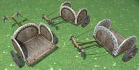
I took it from Lion Kanzen shield designs. I will post it here soon. Yes! you noticed... I was checking it. (really nice model ) and playing around with the UVs, but as you can see, I got frustrated and leave the textures unfinished. Sorry about that. -
===[COMMITTED]=== Mauryan Docks and Ships
Enrique replied to Mythos_Ruler's topic in Completed Art Tasks
Josh, I think you need to change the hull shape. Judging by the screenshot taken from the right, I think the waterplane will intersect with the hull and the ship will look full of water. From the same screenshot I can tell that the curvature of the ship (the part that is inside the water) doesn't seem to be "floating" in a realistic way. (there's very little part of the ship underwater, which would make it very unstable) Also I would like you to work more on the bird head (polygons and texture), or discard it. I don't think a fishing boat would have many decorations like that one. Maybe you can add more overall small details and decorations (even on the texture) to make it look more interesting. -
===[COMMITTED]=== Mauryan Chariot ("Ratha")
Enrique replied to Mythos_Ruler's topic in Completed Art Tasks
-
Hello xF4ake! welcome to the forums! Thanks for your application. As said above, you can work if you want on the open tasks since the art department tasks became public. However, we are looking for contributors with more experience in 3D art. Do you have more work examples? Excluding the characters models, those models are good for someone who has been working with Blender almost a year, but they do not meet 0 A.D. quality standards yet.
-
===[COMMITTED]=== Mauryan Chariot ("Ratha")
Enrique replied to Mythos_Ruler's topic in Completed Art Tasks
-
True. The problem is that not everyone has the appropriate equipment to record the voices
-
===[COMMITTED]=== Mauryan Docks and Ships
Enrique replied to Mythos_Ruler's topic in Completed Art Tasks
Hey Josh, I think there's something that doesn't sell the model. Could you please post more images from different angles to judge better? -
===[COMMITTED]=== Mauryan Chariot ("Ratha")
Enrique replied to Mythos_Ruler's topic in Completed Art Tasks
-
I can't reproduce that in blender 2.64. I tried in object and edit mode, but still everything in the same place. Which Blender version are you using? You could try exporting from Sketchup in .OBJ file or importing .dae in blender, fixing and then posting the .blend file in a .zip
-
I can't fix it that way , could you please be more specific?
-
IIRC, Myconid made the waterfals shader to use the second UV set to define the opacity of the texture. (left full opacity, right full transparency) If we can get a slow animation from left to right of that second UV set... just a thought not sure if it would work. BTW, custom docks rubbles for each civ commited. Check them out and let me know if you find things that need to be fixed.
-
It works for me. The problem seems to be that it is divided in several objects, and their origins are messed up. It has UVs coordinates but they're heavily stretched. I have no knowledge about Sketchup, but if there's an option to join all objects into one mesh it may probably fix the origins issue. here's what I get:
-
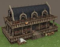
Niiice!! they look great! I'll give a try with the textures

